Install FontSwap
Aesop Uses Suisse Int'l
Walk past an Aesop store and the thing you notice is what isn't there. No gradient, no gloss, no script, no rose gold. Amber bottles, clinical labels, and type that could be a chemistry supplier's.
That restraint is the entire brand, and the typeface is doing most of it.
What's on the page
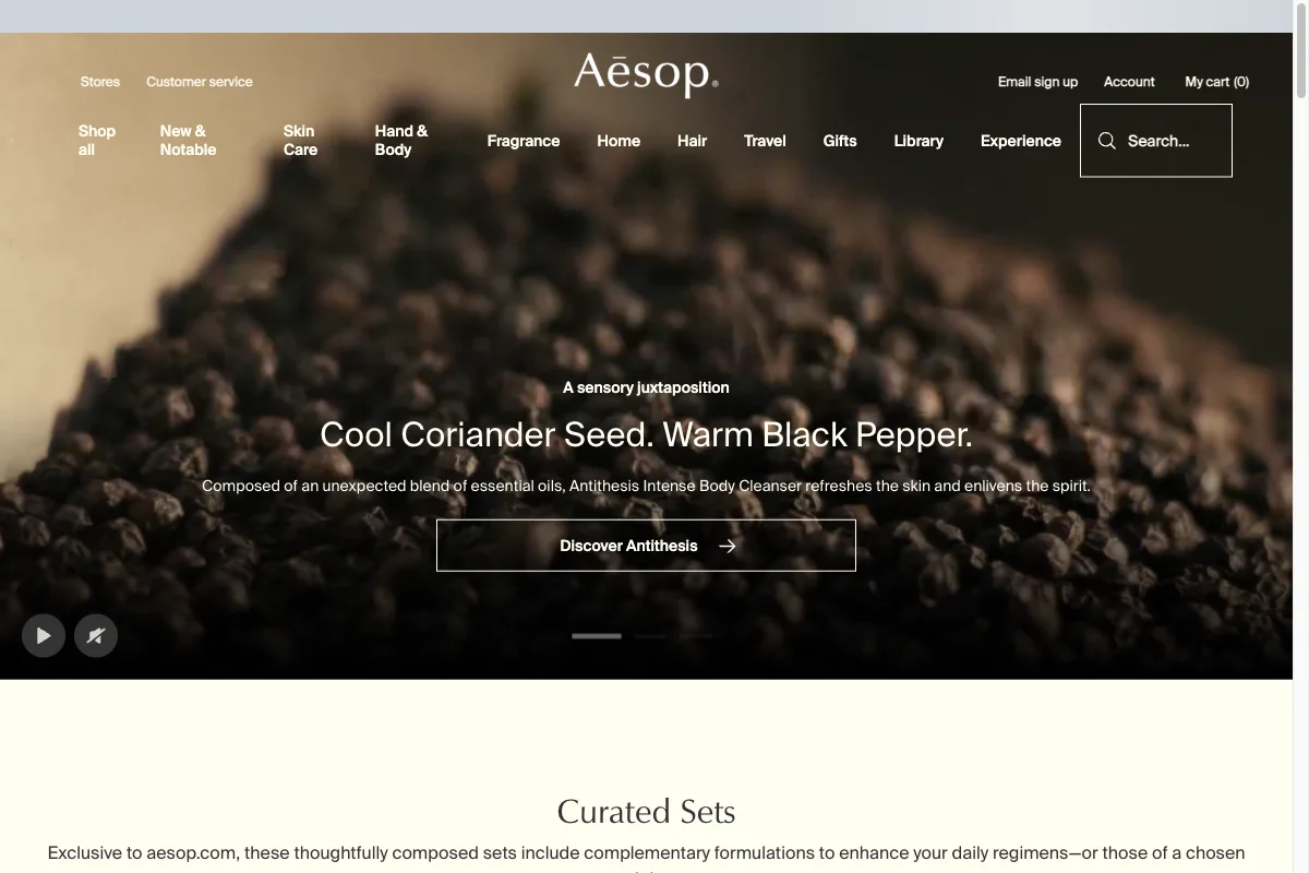
Aesop sets Suisse Int'l — Swiss Typefaces' contemporary grotesque — across navigation, section heads, product copy and buttons. The wordmark and a few display moments use a humanist serif alongside it.
Two families, and the sans is doing almost all the work.
Neutrality as a luxury signal
The beauty and skincare category runs on typographic decoration: high-contrast Didones for prestige, scripts for femininity, thin geometric sans for clinical modernity. It is one of the most visually conventional categories in retail.
Aesop opted out. Suisse Int'l is a Helvetica-adjacent grotesque — rational, tightly fitted, more or less the typeface you'd use for signage in a Swiss railway station.
Applied to a £30 hand balm, that reads as a specific kind of confidence. The typography declines to persuade you. It presents the product as though its merits are self-evident and the packaging's only job is to identify the contents — which is precisely the impression an expensive apothecary brand wants to give.
The formulation copy reinforces it. Aesop writes product descriptions in full, unhurried sentences — "Composed of an unexpected blend of essential oils…" — set in the same neutral face at modest size. It reads like a label rather than an advertisement.
The serif is the exception that proves it
The wordmark is a humanist serif with real calligraphic warmth, and it appears in exactly one register: the brand name, and occasional section heads like "Curated Sets."
That single point of warmth is what stops the identity from being cold. A brand entirely in Suisse Int'l would read as industrial supply. The serif supplies the literary, slightly old-world note that the store interiors and the copywriting also carry, and it does so without ever entering the shopping interface.
It is the same structural idea as Away's Graphik and Lyon split — one face for the machinery, one for the voice — with the proportions reversed. Away lets the serif carry headlines. Aesop restricts it almost to a logotype.
Free Alternatives
Inter is our closest match to Suisse Int'l at 90%. Both are contemporary grotesques with tall x-heights, built for screen. Inter is variable 100–900, which covers the full range Aesop needs.
The gap is fit. Suisse Int'l sets tighter than Inter's default, and that tightness is part of the Swiss character. Close it manually:
:root {
  --font-sans: "Inter", "Helvetica Neue", sans-serif;
  --font-display: "EB Garamond", serif;   /* the wordmark register */
}

nav, body, .product-copy {
  font-family: var(--font-sans);
  letter-spacing: -0.006em;   /* Suisse sets tighter than Inter */
}

h1 {
  font-weight: 400;           /* never bold — the whole point is restraint */
  letter-spacing: -0.015em;
}
Work Sans (82%) is slightly warmer and works if the Swiss coldness is more than you want.
DM Sans (80%) is a touch more geometric and reads a little friendlier — a reasonable choice for a brand in this space that wants approachability without decoration.
For the serif accent, EB Garamond gives you the humanist, slightly old-world quality with genuine historical grounding. Cormorant Garamond if you want it more delicate, but keep it large.
The harder part isn't the font choice. It is the discipline: no second accent colour, no italic for emphasis, no bold except where hierarchy genuinely requires it. The typography works because almost nothing is happening in it.