Free Alternatives to Suisse Int'l

About Suisse Int'l
- Foundry
- Swiss Typefaces
- Classification
- sans-serif
- Style
- neo-grotesque
Brands Using Suisse Int'l
Full e-commerce platform and editorial identity
Magazine editorial typography across print and digital
Brand communications and retail environments
University identity and academic publications
Studio branding and project documentation
Suisse Int'l is a neo-grotesque sans-serif typeface designed by Ian Party and released by Swiss Typefaces in 2011. Part of the larger Suisse superfamily — which includes Suisse Works (serif), Suisse Neue (a softer grotesque), Suisse Screen (optimized for screens), and Suisse Mono — Suisse Int'l is the flagship face: a Helvetica-rooted neo-grotesque refined for contemporary editorial and branding work. Where Helvetica carries six decades of corporate and institutional baggage, Suisse Int'l resets the conversation, offering the same Swiss rationalism with cleaner proportions, better spacing, and a distinctly 21st-century temperament.
Suisse Int'l requires a paid license from Swiss Typefaces. Desktop, web, and app licenses are priced separately, with web licenses tiered by page views. There is no free tier or trial. If your budget cannot accommodate Swiss Typefaces' licensing structure, this page covers the best open-source alternatives and what to evaluate when choosing one.
Why Suisse Int'l Matters
Suisse Int'l occupies a specific and influential position in contemporary type: it is the typeface editorial designers and architects reach for when they want Helvetica's structural clarity without its ubiquity. While Helvetica signals "we didn't think about typography" in most contexts (because it has been the default for so long), Suisse Int'l signals "we thought about typography and chose restraint."
This distinction matters. When Ssense rebuilt its e-commerce platform, Suisse Int'l became the foundation of its editorial-meets-retail identity — clean enough for product grids, characterful enough for longform cultural criticism. Kinfolk magazine used it to reinforce its minimal Scandinavian aesthetic. Architecture firms like Norm Architects adopted it because its proportions echo the precision of architectural drawing without the sterility of a purely technical face.
The Suisse superfamily amplifies this utility. Suisse Works provides a serif companion for editorial contrast. Suisse Neue softens the grotesque for friendlier contexts. Suisse Screen optimizes for digital rendering. This ecosystem means a single license relationship covers an entire brand's typographic needs — a practical advantage that open-source alternatives cannot replicate.
Swiss Typefaces, based in Lausanne, has built a reputation for typefaces that honor Swiss typographic tradition while avoiding nostalgia. Suisse Int'l is their clearest statement of this philosophy.
Design Characteristics
Suisse Int'l's design choices position it precisely between historical Swiss grotesques and their contemporary reinterpretations:
- Moderate x-height with balanced ascenders: Unlike the exaggerated x-heights of screen-first fonts like Inter, Suisse Int'l maintains classical proportions that perform equally well in print editorial and digital contexts
- Open but controlled apertures: The
c,e,s, andahave generous counter openings — more open than Helvetica, less aggressive than Aktiv Grotesk — ensuring legibility without losing typographic density - Flat-sided curves with subtle tension: Bowls in
b,d,p,qfeature the characteristic grotesque flattening, but with a gentle tension that keeps letterforms from feeling purely mechanical - Minimal stroke contrast: Nearly monoline strokes create even typographic color across paragraphs, essential for the dense text columns typical of editorial design
- Horizontal terminals: Clean, horizontal stroke endings give Suisse Int'l its calm, controlled personality — a signature of the Swiss approach
- Ink traps at junctions: Subtle traps where strokes meet prevent thickening at small print sizes, a detail inherited from the metal-type era that remains useful for high-resolution printing
- Extensive width and weight range: Available in multiple widths from Condensed to Extended, with weights from Ultralight to Black, plus matching italics
Where Suisse Int'l Excels
Suisse Int'l is at its best in contexts that demand refined neutrality:
- Editorial publications: The even typographic color and classical proportions handle long-form text and complex layouts with authority
- Architecture and design studios: Its precision mirrors the discipline of architectural practice without resorting to the overworked Helvetica
- Fashion and luxury branding: Suisse Int'l reads as sophisticated and intentional in fashion contexts where Helvetica would feel dated
- Cultural institutions: Museums, galleries, and foundations use it for exhibition materials and publications where neutrality must coexist with curatorial intelligence
- Corporate identity systems: The superfamily's breadth supports complex brand hierarchies from business cards to annual reports
Where Suisse Int'l Struggles
Suisse Int'l is not universally optimal:
- Warm or playful brands: Its Swiss restraint reads as cold and inaccessible for brands targeting families, children, or casual consumer audiences
- High-density UI at small sizes: While well-crafted for print, Suisse Int'l lacks the aggressive screen hinting and optical sizing of fonts engineered specifically for digital-first products like Inter
- Projects requiring broad script support: Suisse Int'l covers Latin and Latin Extended only. Multilingual projects needing Cyrillic, Greek, Arabic, or CJK scripts require fallback strategies
- Budget-constrained teams: The per-project licensing adds up quickly when you need multiple widths and weights across desktop, web, and app
How to Choose a Free Substitute
When evaluating Suisse Int'l replacements, focus on these criteria:
- Proportions and spacing rhythm: Suisse Int'l's moderate x-height and carefully tuned letter-spacing are its most recognizable features. Test your alternative in an editorial context — a magazine spread or a content-heavy webpage — and check whether the reading rhythm feels similarly calm and controlled
- Weight range and distribution: Suisse Int'l ships in a comprehensive range from Ultralight to Black. Your alternative needs at least Light, Regular, Medium, SemiBold, and Bold to replicate common editorial hierarchies
- Typographic color: Set a full paragraph in both typefaces at 10pt and 16px. Suisse Int'l produces very even color without light or dark patches. This is the hardest quality to match
- Print fidelity: If your project includes print, verify that your alternative performs at 9-10pt in continuous text. Many free fonts optimized for screen lose definition at small print sizes
- Personality calibration: The critical question is whether your alternative feels intentionally neutral or merely generic. Suisse Int'l's value is partly positional — it signals design literacy. Inter conveys this; system fonts do not
Premium Font Neighbors
If Suisse Int'l's approach resonates but you want to explore adjacent options:
Cluster A: Swiss neo-grotesques (Suisse's direct competitors)
- Akkurat (Lineto) — Laurenz Brunner's influential grotesque; slightly warmer and more geometric than Suisse
- Graphik (Commercial Type) — the pre-Söhne default for tech companies; more humanist warmth than Suisse
- Haas Unica (Monotype) — the legendary Helvetica-Univers hybrid; closer to Suisse's historical roots
- Söhne (Klim Type Foundry) — Kris Sowersby's "memory of Helvetica"; more tech-focused than Suisse
Cluster B: Editorial and branding grotesques
- Replica (Lineto) — stripped-down, almost brutalist grotesque for conceptual design
- Neue Montreal (Pangram Pangram) — popular in startup and creative branding; more expressive than Suisse
- Basis Grotesque (Colophon Foundry) — compact, efficient grotesque with similar editorial DNA
FAQ
Is Suisse Int'l free?
No. Suisse Int'l is a premium typeface from Swiss Typefaces with per-project licensing. Desktop licenses are priced per style, and web licenses are tiered by monthly page views. There is no free or trial version available.
What is the best free alternative to Suisse Int'l?
Inter is the closest free alternative at 90% similarity. Both share a tall x-height, open apertures, and neo-grotesque construction. Inter adds variable font support, broader language coverage (including Cyrillic and Greek), and optical sizing — features that make it a practical upgrade in some respects.
What is the difference between Suisse Int'l and Helvetica?
Both are Swiss neo-grotesques, but Suisse Int'l was designed in 2011 with contemporary editorial and digital use in mind. It has more open apertures, better spacing for continuous reading, and cleaner proportions at small sizes. Helvetica carries decades of institutional and corporate associations that Suisse avoids.
Is Suisse Int'l a variable font?
No. Suisse Int'l ships as static font files across its weight and width range. Most of its free alternatives (Inter, Work Sans, DM Sans) are available as variable fonts, which offers a web performance advantage.
What is the Suisse superfamily?
The Suisse superfamily includes Suisse Int'l (neo-grotesque sans), Suisse Works (serif), Suisse Neue (softer grotesque), Suisse Screen (screen-optimized), and Suisse Mono (monospace). Each serves a different typographic role while sharing design DNA, making the system suitable for complex brand identities.
Who designed Suisse Int'l?
Ian Party, founder of Swiss Typefaces in Lausanne, Switzerland. Party's work is characterized by deep engagement with Swiss typographic tradition, reinterpreted for contemporary use. Swiss Typefaces has become one of the most respected independent foundries for editorial and branding type.
Does Suisse Int'l support Cyrillic?
No. Suisse Int'l supports Latin and Latin Extended scripts only. For projects requiring Cyrillic, Inter (Cyrillic, Greek) or Source Sans 3 (Cyrillic, Greek) are the standard open-source solutions that maintain a compatible aesthetic.
Why do editorial designers prefer Suisse Int'l over Helvetica?
Suisse Int'l reads as a conscious design choice rather than a default. Helvetica's ubiquity — on tax forms, subway signs, corporate memos — means it communicates "standard" rather than "designed." Suisse Int'l occupies the same structural territory but signals typographic intentionality, which matters in editorial, fashion, and cultural contexts where design literacy is part of the brand.
Is Suisse Int'l on Google Fonts?
No, Suisse Int'l is a premium font from Swiss Typefaces and is not available on Google Fonts.
The closest Google Fonts alternative is Inter with 90% similarity. Get it free on Google Fonts ↗
Free Alternatives (9)


Closest overall match with exceptional screen rendering and full variable font support


Mature editorial sans with comparable weight distribution and restrained character


Geometric-leaning grotesque with clean, modern proportions


Adobe's workhorse sans with broad language support and strong hinting


Swiss-style grotesque from Fontshare with similar heritage


Government-grade neutrality with accessibility-first design


Faithful Franklin Gothic revival with strong editorial pedigree
Swedish neo-grotesque with contemporary refinements for digital use


See where Suisse Int'l is used in the wild and swap to free alternatives live.
Install FontSwap →Replacement Summary
Source: FontAlternatives.com
Premium font: Suisse Int'l
Best free alternative: Inter
FontAlternatives similarity score: 90%
Replacement difficulty: Low
Best for: editorial web layouts, design system foundations, content-heavy interfaces, Swiss-style digital design
Notable users: Ssense, Kinfolk, Acne Studios
Not recommended when: Brand consistency with Ssense requires exact letterforms
What is the best free alternative to Suisse Int'l?
Inter is the best free alternative to Suisse Int'l with a FontAlternatives similarity score of 90%.
Inter shares similar proportions, stroke characteristics, and intended use with Suisse Int'l. It is available under the OFL-1.1 license, which permits both personal and commercial use at no cost.
This alternative works particularly well for: editorial web layouts, design system foundations, content-heavy interfaces, Swiss-style digital design.
Can I safely replace Suisse Int'l with Inter?
Yes, Inter is a high-confidence replacement for Suisse Int'l. The FontAlternatives similarity score of 90% indicates strong structural compatibility.
Licensing: Inter is licensed under OFL-1.1, which allows commercial use without licensing fees or royalties.
Weight coverage: All 4 weights have exact matches available.
When should I NOT replace Suisse Int'l?
While Inter is a strong alternative, there are situations where replacing Suisse Int'l may not be appropriate:
- Brand consistency: Suisse Int'l is commonly seen in Editorial publications contexts where exact letterforms may be required.
- Strict compliance: Verify that OFL-1.1 terms meet your specific legal and compliance requirements.
Weight-Matching Guide
Map Suisse Int'l weights to their closest free alternatives for accurate font substitution.
Inter
| Suisse Int'l | Inter | Match |
|---|---|---|
| Thin (100) | Thin (100) | exact |
| Regular (400) | Regular (400) | exact |
| Medium (500) | Medium (500) | exact |
| Bold (700) | Bold (700) | exact |
Work Sans
| Suisse Int'l | Work Sans | Match |
|---|---|---|
| Light (300) | Light (300) | exact |
| Regular (400) | Regular (400) | exact |
| Medium (500) | Medium (500) | exact |
| Bold (700) | Bold (700) | close |
DM Sans
| Suisse Int'l | DM Sans | Match |
|---|---|---|
| Light (300) | Light (300) | close |
| Regular (400) | Regular (400) | close |
| Medium (500) | Medium (500) | close |
| Bold (700) | Bold (700) | close |
Source Sans 3
| Suisse Int'l | Source Sans 3 | Match |
|---|---|---|
| Light (300) | Light (300) | close |
| Regular (400) | Regular (400) | close |
| Medium (500) | Medium (500) | substitute |
| Bold (700) | Bold (700) | close |
Public Sans
| Suisse Int'l | Public Sans | Match |
|---|---|---|
| Light (300) | Light (300) | close |
| Regular (400) | Regular (400) | close |
| Medium (500) | Medium (500) | close |
| Bold (700) | Bold (700) | close |
Libre Franklin
| Suisse Int'l | Libre Franklin | Match |
|---|---|---|
| Light (300) | Light (300) | close |
| Regular (400) | Regular (400) | close |
| Medium (500) | Medium (500) | substitute |
| Bold (700) | Bold (700) | close |
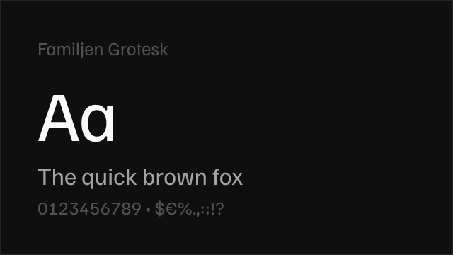
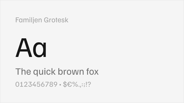
Familjen Grotesk
| Suisse Int'l | Familjen Grotesk | Match |
|---|---|---|
| Regular (400) | Regular (400) | close |
| Medium (500) | Medium (500) | close |
| SemiBold (600) | SemiBold (600) | close |
| Bold (700) | Bold (700) | close |
Performance Guide
Production performance metrics for each alternative.
How to Use Inter
Copy these code snippets to quickly add Inter to your project.
CSS code for Inter
@import url('https://fonts.googleapis.com/css2?family=Inter:wght@100..900&display=swap');HTML code for Inter
<link rel="preconnect" href="https://fonts.googleapis.com">
<link rel="preconnect" href="https://fonts.gstatic.com" crossorigin>
<link href="https://fonts.googleapis.com/css2?family=Inter:wght@100..900&display=swap" rel="stylesheet">
Tailwind code for Inter
// tailwind.config.js
module.exports = {
  theme: {
    extend: {
      fontFamily: {
        'inter': ['Inter', 'sans-serif'],
      },
    },
  },
}

// Usage in HTML:
// <p class="font-inter">Your text here</p>
Next.js code for Inter
// Using next/font (Next.js 13+)
import { Inter } from 'next/font/google';

const inter = Inter({
  subsets: ['latin'],
  weight: ['100', '200', '300', '400', '500', '600', '700', '800', '900'],
});

export default function Component() {
  return (
    <p className={inter.className}>
      Your text here
    </p>
  );
}

// Or using inline styles with Google Fonts link:
// <p style={{ fontFamily: "'Inter'" }}>Your text</p>
Expo and React Native code for Inter
// Install: npx expo install @expo-google-fonts/inter expo-font
import { useFonts, Inter_400Regular } from '@expo-google-fonts/inter';

export default function App() {
  const [fontsLoaded] = useFonts({
    Inter_400Regular,
  });

  if (!fontsLoaded) return null;

  return (
    <Text style={{ fontFamily: 'Inter_400Regular' }}>
      Your text here
    </Text>
  );
}
Recommended Font Pairings
These free fonts pair well with Inter Suisse Int'l for headlines, body text, or accent use.
Literata's warm, contemporary serifs balance Suisse Int'l's clinical precision for editorial layouts that need reading comfort alongside modern UI elements — both share an editorial-first design philosophy
Playfair Display's high-contrast transitional serifs create dramatic editorial contrast against Suisse Int'l's restrained grotesque forms, a classic luxury-editorial pairing for fashion and cultural publications
Libre Caslon Text's sturdy, readable serifs provide warm body-text contrast to Suisse Int'l's clean sans-serif headlines, echoing the traditional editorial pairings of Swiss design
Browse Alternatives by Context
Find Suisse Int'l alternatives filtered by specific use case, style, or language support.
By Style
By Script
Frequently Asked Questions
What is the best free alternative to Suisse Int'l?
Inter is the best free alternative to Suisse Int'l with a FontAlternatives similarity score of 90%. It shares similar proportions and characteristics while being available under the OFL-1.1 license for both personal and commercial use at no cost.
Is there a free version of Suisse Int'l?
There is no official free version of Suisse Int'l. However, Inter is available under the OFL-1.1 open-source license and achieves a FontAlternatives similarity score of 90%. It includes variable weights and supports latin, latin-extended.
What Google Font looks like Suisse Int'l?
The Google Fonts most similar to Suisse Int'l are Inter, Work Sans, DM Sans. Among these alternatives, Inter offers the closest match with a FontAlternatives similarity score of 90% and includes variable weights for flexible typography options.
Can I use Inter commercially?
Yes, Inter can be used commercially. It is licensed under OFL-1.1, which allows free use in websites, applications, print materials, and commercial projects without purchasing a license or paying royalties.
Is Inter similar enough to Suisse Int'l?
Inter achieves a FontAlternatives similarity score of 90% compared to Suisse Int'l. While not identical, it offers comparable letterforms, proportions, and visual style. Most designers find it works excellently as a substitute in web and print projects.
What are the main differences between Suisse Int'l and its free alternatives?
Free alternatives to Suisse Int'l may differ in subtle details like letter spacing, curve refinements, and available weights. Premium fonts typically include more OpenType features, extended language support, and optimized screen rendering. However, for most projects, these differences are negligible.
Where can I download free alternatives to Suisse Int'l?
Download Inter directly from Google Fonts. Click the "Get Font" button on any alternative listed above to visit the official download page. Google Fonts also provides convenient embed codes for seamless web integration.