Free Alternatives to Akkurat

About Akkurat
- Foundry
- Lineto
- Classification
- sans-serif
- Style
- neo-grotesque
Brands Using Akkurat
Station wayfinding, timetable displays, and digital ticketing platforms
Banking interface, marketing materials, and corporate communications
Corporate identity and annual report typography
University branding, publications, and institutional communications
Swiss cultural foundation identity and arts promotion materials
Akkurat is a neo-grotesque sans-serif typeface designed by Laurenz Brunner and released by Lineto in 2004. It is one of the foundational typefaces of twenty-first-century Swiss graphic design — a quiet, precise, almost invisible grotesque that became the default choice for institutions, corporations, and designers who wanted their typography to function rather than perform. Designed two decades ago, Akkurat predates the neo-grotesque boom of the 2010s and in many ways anticipated it.
Akkurat requires a paid license from Lineto. Licensing follows a per-format model with separate desktop, web, and app options. Lineto does not offer free trials or test fonts. If your project cannot accommodate Lineto's licensing structure, this page covers the best free alternatives and what distinguishes them from Akkurat's particular brand of Swiss precision.
Why Akkurat Matters
Akkurat's significance is best understood through what it is not. It is not Helvetica — it lacks Helvetica's closed apertures, idiosyncratic details, and mid-century personality. It is not Arial — it is too carefully designed, too precisely spaced, too intentionally neutral to be mistaken for a system font substitute. And it is not any of the dozens of neo-grotesques that followed it — Söhne, Graphik, ABC Diatype — because Akkurat came first and established the design language they all respond to.
When Laurenz Brunner designed Akkurat in 2004, the Swiss type landscape was dominated by Helvetica and Univers. Both felt increasingly dated for contemporary design work. Akkurat offered a fresh alternative: a grotesque that acknowledged its Swiss heritage while stripping away the historical baggage. The name itself — German for "precise" or "accurate" — declares its intent. This is a typeface designed to be exactly what it is, nothing more.
Swiss Federal Railways (SBB) adopted Akkurat for its digital platforms, replacing a patchwork of typefaces with a single, consistent voice. Raiffeisen bank used it across Switzerland. Swiss Re, one of the world's largest reinsurers, adopted it for corporate communications. ETH Zürich, Switzerland's premier technical university, uses it for institutional publishing. Pro Helvetia, the Swiss arts council, chose it for the quiet irony of using an alternative to Helvetica for Swiss cultural promotion.
These institutions chose Akkurat because it does exactly what institutional typography should do — it delivers information clearly, projects competence and trustworthiness, and stays invisible. In a world where every startup races to express personality through custom type, Akkurat represents the opposite philosophy: the best typeface is one the reader never notices.
Design Characteristics
Akkurat's design is defined by what it restrains rather than what it expresses:
- Open apertures: The
c,e,s, andahave generous counter openings, maximizing legibility at small sizes and preventing the letterform collapse that plagues tight grotesques like Helvetica at 12px on screen - Minimal stroke contrast: Nearly monoline construction creates even typographic color across paragraphs, supporting the "invisible typography" philosophy where the reader absorbs content without noticing the letterforms
- Moderate x-height: Unlike Inter and Söhne, which push x-height as tall as possible, Akkurat maintains traditional Swiss proportions — slightly lower, giving it a quieter, less assertive presence on the page
- Horizontal stroke endings: Terminals are cut cleanly horizontal, contributing to Akkurat's calm, controlled personality and distinguishing it from grotesques with angled or rounded endings
- Compact, even spacing: Letter-spacing is tight but never cramped, creating efficient text blocks that feel dense and deliberate — characteristic of Swiss typographic tradition
- Restrained capital letters: Cap height is proportionally modest relative to the x-height, preventing headlines from feeling overly assertive and maintaining the typeface's characteristic understatement
- No single distinguishing feature: This is deliberate. Akkurat is designed so that no individual letter draws attention. The
a,g,e,R— all are competently, precisely drawn but none are memorable. The typeface's identity emerges from the aggregate, not from any single glyph
The family ships in three weights (Light, Regular, Bold) with matching italics, plus a monospace companion (Akkurat Mono). The limited weight range is intentional — it reflects the Swiss design principle that constraint produces clarity.
Where Akkurat Excels
Akkurat is at its best when typography should serve rather than lead:
- Corporate identity systems: The neutral, trustworthy character works across business cards, annual reports, presentations, signage, and digital platforms without needing style-specific adjustments
- Financial services: Banking, insurance, and fintech interfaces benefit from Akkurat's quiet competence — it projects reliability and precision without the coldness of more clinical faces
- Wayfinding and signage: Akkurat's open apertures and clean terminals ensure legibility at distance and in motion, making it effective for transit systems, hospitals, and campus navigation
- Institutional publishing: University publications, government communications, and cultural institution materials benefit from Akkurat's ability to appear authoritative without being bureaucratic
- UI for enterprise products: The even typographic color and clean spacing handle dense information displays — settings panels, data tables, configuration interfaces — with quiet efficiency
Where Akkurat Struggles
Akkurat's deliberate neutrality has predictable limitations:
- Brand differentiation: If your brand needs to stand out from competitors through typography, Akkurat is the wrong choice. Its purpose is to be invisible, which makes it indistinct in competitive markets
- Display and poster design: At large sizes (48pt+), Akkurat's lack of expressive details makes it feel flat and uninspiring. Faces designed for display use — with contrast, tension, or personality — will outperform it
- Warm or playful brands: Consumer brands targeting families, children, or lifestyle audiences need warmth that Akkurat categorically refuses to provide
- Long-form editorial prose: While functional at body sizes, Akkurat's low contrast and neutral personality create monotonous texture in extended reading. Articles, essays, and books benefit from typefaces with more reading-oriented rhythm
- Limited weight range: Three weights plus italics provide basic hierarchy, but complex design systems requiring Thin, ExtraLight, Medium, SemiBold, ExtraBold, and Black will find Akkurat insufficient
How to Choose a Free Substitute
When evaluating Akkurat replacements, focus on these criteria:
- Neutral personality: Akkurat's core quality is functional invisibility. Test your alternative by setting a paragraph at 16px — does the typeface disappear into the content, or does it call attention to itself? Inter and Public Sans achieve this; more geometric faces like DM Sans do not fully
- Open apertures: Akkurat's
c,e, andsare distinctly open. Alternatives with tighter apertures will feel more closed and less legible at small sizes - Spacing density: Akkurat produces compact, efficient text blocks. Test your alternative in a multi-column layout at 14px — does it maintain similar density, or does it feel looser and more spacious?
- Weight matching: Akkurat's three weights map to specific functional roles. Light is for secondary information, Regular for body text, Bold for emphasis. Your alternative should produce similar visual weight at these three points, even if it offers additional weights
- Swiss reserve: The hardest quality to match. Akkurat has a specific temperature — cool without being cold, professional without being corporate, minimal without being trendy. This is an emotional quality that emerges from the aggregate of design decisions rather than any single measurable attribute
Premium Font Neighbors
If Akkurat's approach resonates but you want to explore adjacent premium options:
Cluster A: Swiss institutional grotesques (Akkurat's direct lineage)
- Suisse (Swiss Typefaces) — the most comprehensive Swiss grotesque system; more weights and widths than Akkurat but the same underlying philosophy
- Replica (Lineto) — Lineto's grid-based alternative; more conceptually charged and austere than Akkurat
- Basis Grotesque (Colophon Foundry) — contemporary grotesque with Akkurat's restraint plus slightly warmer British sensibility
Cluster B: Contemporary neutral grotesques
- ABC Diatype (Dinamo) — similarly clinical, with contemporary details and broader width options
- Söhne (Klim Type Foundry) — "the memory of Helvetica" shares Akkurat's neo-grotesque roots with a more modern, tech-oriented positioning
- Neufile Grotesk (Indian Type Foundry) — affordable Akkurat-adjacent option with broader language support
- Neue Montreal (Pangram Pangram) — more expressive and contemporary than Akkurat; popular in startup and creative branding
FAQ
Is Akkurat free?
No. Akkurat is a premium typeface from Lineto with per-format licensing. Desktop licenses are priced per workstation, with separate web and app licenses. Lineto does not offer test fonts, free trials, or promotional pricing. The typeface is only available directly through Lineto's website.
What is the best free alternative to Akkurat?
Inter is the closest free alternative at 90% similarity. Both share a neo-grotesque skeleton, open apertures, minimal stroke contrast, and a commitment to functional legibility. Inter adds variable font support, optical sizing, and broader language coverage (Cyrillic, Greek, Vietnamese). The main difference is emotional — Akkurat has a specific Swiss coolness that Inter's more universal warmth does not quite replicate.
Why do Swiss institutions use Akkurat?
Akkurat was designed in Switzerland, distributed by a Swiss foundry (Lineto), and embodies Swiss design values — precision, restraint, functionalism, and the primacy of content over form. For Swiss institutions, using Akkurat signals adherence to a specific design tradition while appearing contemporary rather than historically derivative. The Swiss Federal Railways, Raiffeisen bank, ETH Zürich, and Pro Helvetia all adopted Akkurat because it feels authentically Swiss without literally being Helvetica.
Can I use Akkurat on the web?
Yes, with a web font license from Lineto. Web licenses are priced by monthly page views and include WOFF2 files for self-hosting. Akkurat is not available through Google Fonts, Adobe Fonts, or any font hosting service.
What is the difference between Akkurat and Akkurat Mono?
Akkurat is the proportional sans-serif for body text, headlines, and UI. Akkurat Mono is a monospace companion designed for code, tabular data, and technical content. Both share the same design DNA and visual weight, making them a harmonious pair for technical interfaces that mix prose with code.
Does Akkurat support Cyrillic?
No. Akkurat supports Latin and Latin Extended scripts only. For projects requiring Cyrillic support, Inter (90% similarity, includes Cyrillic and Greek) is the strongest free alternative. Within the premium space, Akkurat Pro offers an extended character set, but Cyrillic support is still limited compared to typefaces like Inter or Source Sans 3.
Is Akkurat a variable font?
No. Akkurat ships as static font files in three weights (Light, Regular, Bold) with matching italics — six styles total. This limited range is a deliberate design choice reflecting Swiss minimalist principles. Most free alternatives (Inter, Work Sans, Source Sans 3) offer variable font versions and broader weight ranges, which is a practical advantage for web performance and responsive design.
Who designed Akkurat?
Laurenz Brunner, a Swiss type designer who studied at the Gerrit Rietveld Academie in Amsterdam. Brunner designed Akkurat in 2004, and it was released through Lineto, the type foundry co-founded by Cornel Windlin and Norm (Dimitri Bruni and Manuel Krebs). Brunner's work is characterized by rigorous, systematic thinking applied to letterform design. Akkurat remains his most widely used typeface, though he has designed several other notable faces for Lineto's catalog.
Is Akkurat on Google Fonts?
No, Akkurat is a premium font from Lineto and is not available on Google Fonts.
The closest Google Fonts alternative is Inter with 90% similarity. Get it free on Google Fonts ↗
Free Alternatives (9)


Closest overall match with exceptional screen rendering, variable font support, and broader language coverage


Mature editorial sans with comparable neutral tone and functional clarity


Clean geometric-grotesque blend with similar neutral positioning and modern proportions


Adobe's enterprise workhorse with proven institutional reliability and broad language support


Government-grade neutrality with similar institutional restraint and accessibility focus


American grotesque with systematic construction and comparable editorial authority

Developer-focused neo-grotesque with similar technical precision and rational construction


Swiss grotesque with similar neutral precision


See where Akkurat is used in the wild and swap to free alternatives live.
Install FontSwap →Replacement Summary
Source: FontAlternatives.com
Premium font: Akkurat
Best free alternative: Inter
FontAlternatives similarity score: 90%
Replacement difficulty: Low
Best for: SaaS product dashboards, enterprise web applications, design system foundations, developer documentation
Notable users: Swiss Federal Railways (SBB), Raiffeisen Switzerland, Swiss Re
Not recommended when: Brand consistency with Swiss Federal Railways (SBB) requires exact letterforms
What is the best free alternative to Akkurat?
Inter is the best free alternative to Akkurat with a FontAlternatives similarity score of 90%.
Inter shares similar proportions, stroke characteristics, and intended use with Akkurat. It is available under the OFL-1.1 license, which permits both personal and commercial use at no cost.
This alternative works particularly well for: SaaS product dashboards, enterprise web applications, design system foundations, developer documentation.
Can I safely replace Akkurat with Inter?
Yes, Inter is a high-confidence replacement for Akkurat. The FontAlternatives similarity score of 90% indicates strong structural compatibility.
Licensing: Inter is licensed under OFL-1.1, which allows commercial use without licensing fees or royalties.
Weight coverage: Most weights have close or exact matches available.
When should I NOT replace Akkurat?
While Inter is a strong alternative, there are situations where replacing Akkurat may not be appropriate:
- Brand consistency: Akkurat is commonly seen in Swiss corporate identities contexts where exact letterforms may be required.
- Strict compliance: Verify that OFL-1.1 terms meet your specific legal and compliance requirements.
Weight-Matching Guide
Map Akkurat weights to their closest free alternatives for accurate font substitution.
Inter
| Akkurat | Inter | Match |
|---|---|---|
| Light (300) | Light (300) | exact |
| Regular (400) | Regular (400) | exact |
| Bold (700) | Bold (700) | exact |
| Black (900) | Black (900) | close |
Work Sans
| Akkurat | Work Sans | Match |
|---|---|---|
| Light (300) | Light (300) | exact |
| Regular (400) | Regular (400) | exact |
| Medium (500) | Medium (500) | exact |
| Bold (700) | Bold (700) | close |
DM Sans
| Akkurat | DM Sans | Match |
|---|---|---|
| Light (300) | Light (300) | close |
| Regular (400) | Regular (400) | close |
| Medium (500) | Medium (500) | close |
| Bold (700) | Bold (700) | close |
Source Sans 3
| Akkurat | Source Sans 3 | Match |
|---|---|---|
| Light (300) | Light (300) | close |
| Regular (400) | Regular (400) | close |
| Medium (500) | Medium (500) | substitute |
| Bold (700) | Bold (700) | close |
Public Sans
| Akkurat | Public Sans | Match |
|---|---|---|
| Light (300) | Light (300) | close |
| Regular (400) | Regular (400) | close |
| Medium (500) | Medium (500) | close |
| Bold (700) | Bold (700) | close |
Libre Franklin
| Akkurat | Libre Franklin | Match |
|---|---|---|
| Light (300) | Light (300) | close |
| Regular (400) | Regular (400) | close |
| Medium (500) | Medium (500) | close |
| Bold (700) | Bold (700) | close |
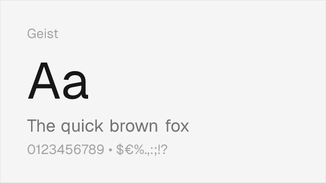
Geist
| Akkurat | Geist | Match |
|---|---|---|
| Light (300) | Light (300) | close |
| Regular (400) | Regular (400) | close |
| Medium (500) | Medium (500) | close |
| Bold (700) | Bold (700) | close |
Performance Guide
Production performance metrics for each alternative.
How to Use Inter
Copy these code snippets to quickly add Inter to your project.
CSS code for Inter
@import url('https://fonts.googleapis.com/css2?family=Inter:wght@100..900&display=swap');HTML code for Inter
<link rel="preconnect" href="https://fonts.googleapis.com">
<link rel="preconnect" href="https://fonts.gstatic.com" crossorigin>
<link href="https://fonts.googleapis.com/css2?family=Inter:wght@100..900&display=swap" rel="stylesheet">
Tailwind code for Inter
// tailwind.config.js
module.exports = {
  theme: {
    extend: {
      fontFamily: {
        'inter': ['Inter', 'sans-serif'],
      },
    },
  },
}

// Usage in HTML:
// <p class="font-inter">Your text here</p>
Next.js code for Inter
// Using next/font (Next.js 13+)
import { Inter } from 'next/font/google';

const inter = Inter({
  subsets: ['latin'],
  weight: ['100', '200', '300', '400', '500', '600', '700', '800', '900'],
});

export default function Component() {
  return (
    <p className={inter.className}>
      Your text here
    </p>
  );
}

// Or using inline styles with Google Fonts link:
// <p style={{ fontFamily: "'Inter'" }}>Your text</p>
Expo and React Native code for Inter
// Install: npx expo install @expo-google-fonts/inter expo-font
import { useFonts, Inter_400Regular } from '@expo-google-fonts/inter';

export default function App() {
  const [fontsLoaded] = useFonts({
    Inter_400Regular,
  });

  if (!fontsLoaded) return null;

  return (
    <Text style={{ fontFamily: 'Inter_400Regular' }}>
      Your text here
    </Text>
  );
}
Recommended Font Pairings
These free fonts pair well with Inter Akkurat for headlines, body text, or accent use.
Lora's contemporary brush-influenced serifs create warm contrast against Akkurat's clinical neo-grotesque headlines — the combination balances Swiss precision with editorial readability for content-heavy layouts
Crimson Pro's refined, classical serifs provide the typographic depth that Akkurat deliberately withholds, creating sophisticated editorial hierarchies for reports, publications, and institutional communications
EB Garamond's historical elegance and high contrast balance Akkurat's low-contrast neutrality in editorial layouts — the old-style serifs add cultural gravitas that complements Akkurat's modern Swiss restraint
Browse Alternatives by Context
Find Akkurat alternatives filtered by specific use case, style, or language support.
By Style
By Script
Frequently Asked Questions
What is the best free alternative to Akkurat?
Inter is the best free alternative to Akkurat with a FontAlternatives similarity score of 90%. It shares similar proportions and characteristics while being available under the OFL-1.1 license for both personal and commercial use at no cost.
Is there a free version of Akkurat?
There is no official free version of Akkurat. However, Inter is available under the OFL-1.1 open-source license and achieves a FontAlternatives similarity score of 90%. It includes variable weights and supports latin, latin-extended.
What Google Font looks like Akkurat?
The Google Fonts most similar to Akkurat are Inter, Work Sans, DM Sans. Among these alternatives, Inter offers the closest match with a FontAlternatives similarity score of 90% and includes variable weights for flexible typography options.
Can I use Inter commercially?
Yes, Inter can be used commercially. It is licensed under OFL-1.1, which allows free use in websites, applications, print materials, and commercial projects without purchasing a license or paying royalties.
Is Inter similar enough to Akkurat?
Inter achieves a FontAlternatives similarity score of 90% compared to Akkurat. While not identical, it offers comparable letterforms, proportions, and visual style. Most designers find it works excellently as a substitute in web and print projects.
What are the main differences between Akkurat and its free alternatives?
Free alternatives to Akkurat may differ in subtle details like letter spacing, curve refinements, and available weights. Premium fonts typically include more OpenType features, extended language support, and optimized screen rendering. However, for most projects, these differences are negligible.
Where can I download free alternatives to Akkurat?
Download Inter directly from Google Fonts. Click the "Get Font" button on any alternative listed above to visit the official download page. Google Fonts also provides convenient embed codes for seamless web integration.