Free Alternatives to Akkurat for UI Design

9 alternatives | 8 highly relevant | sans serif | Best match: Nacelle (68%)

Looking for a free sans serif font for ui design projects? Akkurat by Lineto is a popular choice, but its licensing cost can be prohibitive. We've curated 9 free alternatives that work well in ui design contexts. We've identified 8 that are especially well-suited for this context. Each alternative is scored by visual similarity and contextual relevance, and ships under an open-source license for both personal and commercial use.

Top Picks

Comparison Table

Font Relevance Similarity Weights Variable License Source
Nacelle 73 68% Variable Yes ITF Free Font License fontshare ↗
Source Sans 3 64 78% Variable Yes OFL-1.1 Google Fonts ↗
Public Sans 64 76% Variable Yes OFL-1.1 Google Fonts ↗
Geist 53 72% Variable Yes OFL-1.1 Google Fonts ↗
Switzer 53 72% Variable Yes ITF Free Font License fontshare ↗
DM Sans 46 80% Variable Yes OFL-1.1 Google Fonts ↗
Inter 45 90% Variable Yes OFL-1.1 Google Fonts ↗
Work Sans 44 82% Variable Yes OFL-1.1 Google Fonts ↗
Libre Franklin 17 74% Variable Yes OFL-1.1 Google Fonts ↗

Most Relevant (8)

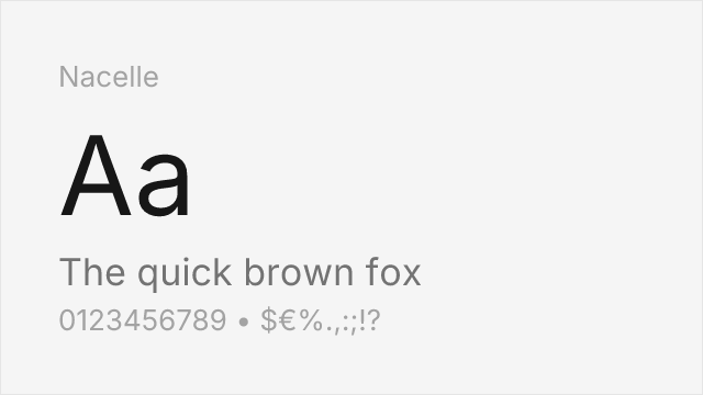
#1 Nacelle 68% Relevant
[fontshare] · ITF Free Font License · Variable

Clean neo-grotesque from Fontshare with a compact variable range

Why it matches: Nacelle shares Akkurat's clean, low-contrast neo-grotesque construction and its preference for function over flourish. Its letterforms are even and quietly modern, well suited to interface text and understated branding. Nacelle's weight range is narrower than the broadest alternatives here, but it still ships as a variable font and covers the core Light-to-Bold span that maps to Akkurat's three weights.
minimal interface texttech and SaaS brandingclean marketing layoutsunderstated product UI
Get Font ↗
#2 Source Sans 3 78% Relevant
[Google Fonts] · OFL-1.1 · Variable

Adobe's enterprise workhorse with proven institutional reliability and broad language support
Why it matches: Source Sans 3 parallels Akkurat's positioning as a serious, institutional typeface designed for reliability above personality. Both excel in contexts where typography should be invisible — enterprise interfaces, government communications, financial documents. Source Sans 3 adds subtle humanist touches that improve long-form readability, and its Adobe engineering ensures consistent rendering across every platform and browser. Its extensive language support (Latin, Cyrillic, Greek, Vietnamese) exceeds Akkurat's Latin-only coverage.
enterprise application interfacesgovernment and institutional sitesdocumentation systemsmultilingual corporate platforms
Get Font ↗
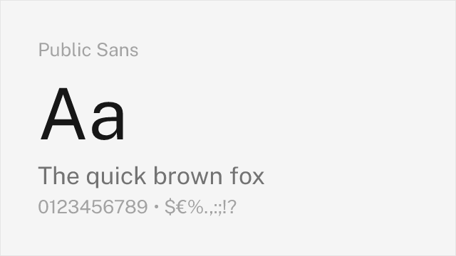
#3 Public Sans 76% Relevant
[Google Fonts] · OFL-1.1 · Variable

Government-grade neutrality with similar institutional restraint and accessibility focus
Why it matches: Public Sans shares Akkurat's goal of invisible, functional typography that lets content take priority. Both were designed for institutional contexts where the typeface should convey trust and authority without personality. Public Sans is slightly wider-set and more deliberately accessible than Akkurat, optimized for the compliance requirements of government digital services. The philosophical alignment is strong — both typefaces believe the best typography is typography you do not notice.
government digital servicesaccessible institutional interfacesform-heavy enterprise toolscompliance-focused applications
Get Font ↗
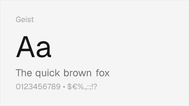
#4 Geist 72% Relevant
[Google Fonts] · OFL-1.1 · Variable

Developer-focused neo-grotesque with similar technical precision and rational construction
Why it matches: Geist shares Akkurat's rational, precision-engineered character, though optimized specifically for developer-facing interfaces rather than institutional and editorial contexts. Both typefaces feature tight, disciplined letterforms with minimal decorative gesture. Geist is slightly more contemporary in its details — it feels more Silicon Valley where Akkurat feels more Zürich — but the underlying commitment to functional clarity is shared. The companion Geist Mono provides a code-ready extension that Akkurat's ecosystem lacks.
developer tools and documentationtech startup brandingdark-mode interfacesAPI and SDK documentation
Get Font ↗
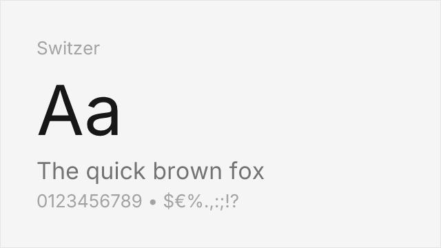
#5 Switzer 72% Relevant
[fontshare] · ITF Free Font License · Variable

Swiss-style grotesque with neutral precision and a full nine-weight variable family
Why it matches: Switzer is drawn in the same Swiss neo-grotesque tradition as Akkurat, with even stroke weights, restrained terminals, and a neutral voice built for interfaces and branding. It covers far more weights than Akkurat and ships as a variable font, so it can fill hierarchy roles Akkurat's three static weights cannot. The trade-off is that Switzer is a touch more generic in its details — it captures Akkurat's temperature without quite matching its precision.
product and marketing interfacesdesign systems needing many weightsstartup brandingresponsive web typography
Get Font ↗
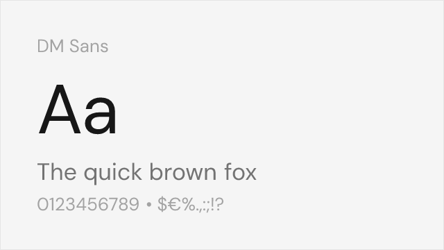
#6 DM Sans 80% Relevant
[Google Fonts] · OFL-1.1 · Variable

Clean geometric-grotesque blend with similar neutral positioning and modern proportions
Why it matches: DM Sans approaches Akkurat's neutral territory from a slightly more geometric direction. Both typefaces produce clean, even text blocks with minimal personality interference and work well across a range of UI and branding contexts. DM Sans has marginally rounder bowls and slightly more open apertures, giving it a touch more warmth at small sizes. Its optical sizing axis provides automatic adjustments between text and display sizes, compensating for the manual optimization that Akkurat's designers built into its static instances.
tech startup brandingmobile app interfacesmarketing landing pagespresentation materials
Get Font ↗
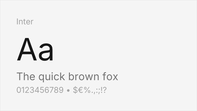
#7 Inter 90% Relevant
[Google Fonts] · OFL-1.1 · Variable

Closest overall match with exceptional screen rendering, variable font support, and broader language coverage

Why it matches: Inter is the most direct free counterpart to Akkurat because both typefaces share the same design philosophy — invisible, functional typography optimized for legibility rather than personality. Both feature tall x-heights, open apertures, minimal stroke contrast, and a neo-grotesque skeleton that prioritizes reading efficiency. Inter's letterforms are structurally very close to Akkurat's: the lowercase `a`, `e`, `g`, and `s` share nearly identical proportions and construction. Where they diverge is in details — Akkurat has subtly tighter spacing and a touch more Swiss reserve in its terminals, while Inter adds optical sizing and warmer curves.
SaaS product dashboardsenterprise web applicationsdesign system foundationsdeveloper documentation
Get Font ↗
#8 Work Sans 82% Relevant
[Google Fonts] · OFL-1.1 · Variable

Mature editorial sans with comparable neutral tone and functional clarity

Why it matches: Work Sans shares Akkurat's preference for functional clarity over decorative personality. Both typefaces feature moderate x-heights, restrained letter-spacing, and an honest, workmanlike character suitable for dense layouts. Work Sans leans slightly more American gothic in its heritage — its DNA traces to Trade Gothic and Franklin Gothic — while Akkurat is purely Swiss. This gives Work Sans marginally more warmth at body sizes, which can be an advantage for long-form content where Akkurat's neutrality becomes monotonous.
editorial and content platformsresponsive marketing sitescross-platform design systemscorporate communications
Get Font ↗

Other Alternatives (1)

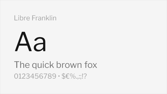
[Google Fonts] · OFL-1.1 · Variable

American grotesque with systematic construction and comparable editorial authority

Why it matches: Libre Franklin shares Akkurat's systematic approach to letterform design and its editorial authority, though from an American gothic rather than Swiss neo-grotesque tradition. Both are workhorse typefaces designed for institutional and editorial use — reliable, authoritative, and restrained. Libre Franklin has slightly more personality through its condensed proportions and American gothic heritage, while Akkurat is more uniformly neutral. For editorial projects, Libre Franklin's journalistic DNA is actually an asset.
editorial and publishing designnews and media organizationsinstitutional brandingpolitical and civic communications
Get Font ↗

Related Pages