Free Alternatives to Verdana for UI Design
Looking for a free sans serif font for ui design projects? Verdana by Microsoft is a popular choice, but its licensing cost can be prohibitive. We've curated 3 free alternatives that work well in ui design contexts. We've identified 2 that are especially well-suited for this context. Each alternative is scored by visual similarity and contextual relevance, and ships under an open-source license for both personal and commercial use.
Top Picks
Comparison Table
| Font | Relevance ⓘ
How well this alternative fits the specific context (use-case or trait) of this page. Score 0–100 based on matching keywords, industries, and font characteristics. Alternatives scoring 25+ are highlighted.
| Similarity ⓘ
How visually similar this free font is to the premium original. Score 0–100 based on x-height, width, stroke contrast, use-case overlap, and language coverage.
Learn more → | Weights | Variable | License | Source |
|---|---|---|---|---|---|---|
| DejaVu Sans | 45 | 85% | 2 | No | Bitstream-Vera | open-font-library ↗ |
| Source Sans Pro | 36 | 75% | Variable | Yes | OFL-1.1 | Google Fonts ↗ |
| Open Sans | 24 | 78% | Variable | Yes | Apache-2.0 | Google Fonts ↗ |
Most Relevant (2)

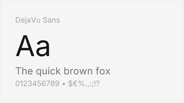
[open-font-library] · Bitstream-Vera · 2 weights
Designed specifically as a Verdana-compatible alternative with extended character set
Why it matches: DejaVu Sans was specifically designed to be metrically compatible with Verdana, sharing nearly identical proportions, x-height, and screen-optimized character shapes. Both feature wide letterforms and open counters that ensure legibility at small screen sizes. DejaVu Sans adds vastly expanded Unicode coverage while maintaining Verdana's essential character.
multilingual applicationsLinux systemsopen-source softwareterminal displays


[Google Fonts] · OFL-1.1 · Variable
Shares emphasis on digital legibility with humanist proportions
Why it matches: Source Sans Pro shares Verdana's emphasis on screen legibility with similar open apertures and clear letterforms. Both were designed with digital reproduction as a priority. Source Sans Pro adds variable font flexibility and coordination with Source Serif and Source Code for comprehensive typographic systems.
user interfacesgovernment websitestechnical documentationenterprise software
Other Alternatives (1)
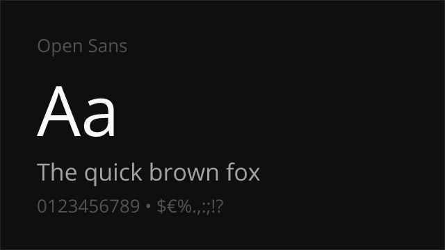

[Google Fonts] · Apache-2.0 · Variable
Similar screen optimization with comparable x-height and clarity
Why it matches: Open Sans shares Verdana's screen-first design philosophy with similar generous x-height, wide letterforms, and optimized hinting. Both prioritize clarity on digital displays while maintaining humanist warmth. Open Sans offers more weight options and variable font flexibility for modern responsive design.
web applicationscorporate communicationsmobile appsprint materials