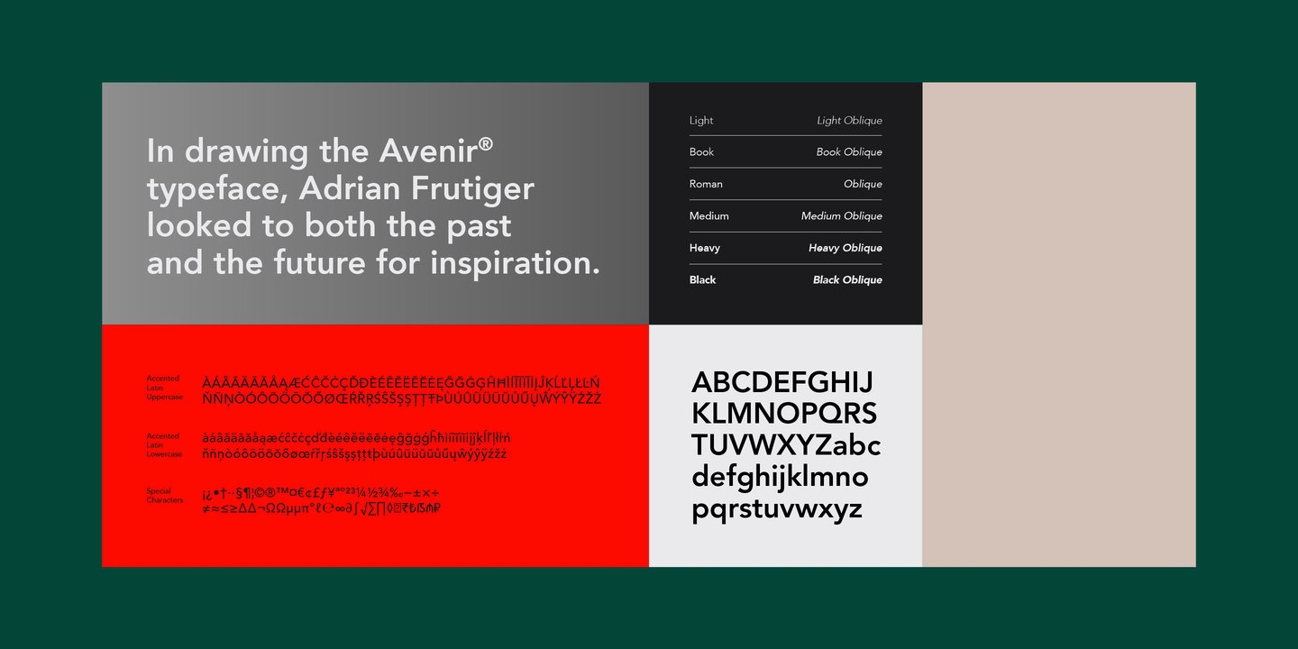
Avenir vs Lato
Avenir is a common reference point; Lato is one of the closest free families to reach for. With 82% similarity, Lato embodies Avenir's humanist warmth with semi-rounded letterforms and professional versatility. If you want the same structure with a friendlier vibe, Lato usually gets you there.
Design DNA
Design overlap:0%
Avenir
Lato
Visual Comparison
Avenir
Premium
Lato
FreeAa Bb Cc 123
The quick brown fox jumps over the lazy dog
ABCDEFGHIJKLMNOPQRSTUVWXYZ
abcdefghijklmnopqrstuvwxyz
0123456789 !@#$%^&*()
Feature Comparison
| Feature | Avenir | Lato |
|---|---|---|
| Type | Premium | Free |
| Classification | sans-serif | sans-serif |
| Variable Font | No | No |
| Weights | Multiple | 100, 300, 400, 700, 900 |
| Italics | Yes | Yes |
| License | Commercial License Required | OFL-1.1 |
| Language Support | latin, latin-extended, cyrillic, greek | latin, latin-extended |
| Source | Linotype | Google Fonts |
Best Use Cases
Typography for established businesses, enterprise software, and professional ser...
Fonts that establish strong brand identity with distinctive character and versat...
Typography suited for magazines, newspapers, and long-form content. Editorial fo...
Fonts optimized for mobile interfaces with excellent small-size legibility, clea...
Typography for medical, wellness, and healthcare applications. Healthcare fonts ...
Typography optimized for online retail, marketplaces, and shopping experiences. ...
Typography for startups, tech companies, and venture-backed businesses. Startup ...
Typography for business documents, reports, and professional communications. Doc...
Typography optimized for websites, landing pages, and web applications. Web font...
Performance Comparison
| Metric | Avenir | Lato |
|---|---|---|
| Score | N/A | 60/100 |
| File Size | N/A | 85.9 KB |
| Weights | N/A | 5 |
| Italics | N/A | Yes |
| Variable Font | N/A | No |
| Language Groups | N/A | 2 |
| CDN Delivery | N/A | Yes |
| x-Height Ratio | N/A | 0.506 |
| Cap Height Ratio | N/A | 0.717 |
Where You'll See These Fonts
Avenir
- Apple products
- Corporate presentations
- Healthcare branding
- Tech startups
- Editorial design
Which Should You Choose?
Consider: Avenir
- Particularly suited for corporate communications and body text
- Delivers a friendly, professional, clean aesthetic
- Popular in education-academia and healthcare-medical design
- Rated as an easy replacement
- Versatile enough to replace 13+ premium fonts
Recommended: Lato
- Original design with refined typographic details
- Designed specifically for corporate and branding
- Used by Apple products, Corporate presentations
- Commercial license with professional support
Browse by Context
Free Alternatives to Consider
Other free alternatives to Avenir