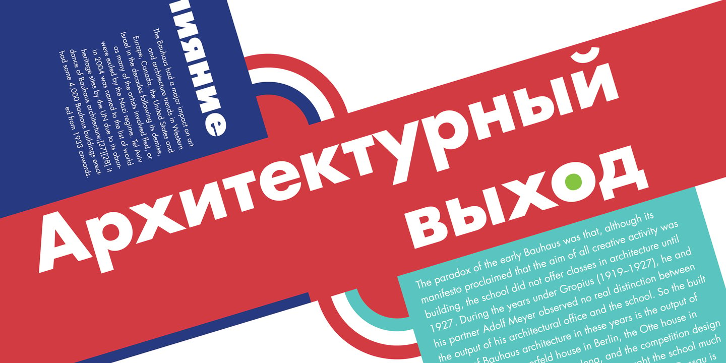
Futura vs Poppins
Choosing between Futura and Poppins comes down to whether you want the original tone or a practical open-source substitute. With 82% similarity, Poppins shares Futura's geometric DNA with perfectly round 'O' shapes and triangular 'A' forms. If you need more weights than Futura offers, Poppins is usually the more flexible family.
Design DNA
Design overlap:17%
Futura
Poppins
Highlighted traits are shared between both fonts
Visual Comparison
Futura
Premium
Poppins
FreeAa Bb Cc 123
The quick brown fox jumps over the lazy dog
ABCDEFGHIJKLMNOPQRSTUVWXYZ
abcdefghijklmnopqrstuvwxyz
0123456789 !@#$%^&*()
Feature Comparison
| Feature | Futura | Poppins |
|---|---|---|
| Type | Premium | Free |
| Classification | sans-serif | sans-serif |
| Variable Font | No | No |
| Weights | Multiple | 100, 200, 300, 400, 500, 600, 700, 800, 900 |
| Italics | Yes | Yes |
| License | Commercial License Required | OFL-1.1 |
| Language Support | latin, latin-extended, cyrillic | latin, latin-extended, devanagari |
| Source | URW Type Foundry | Google Fonts |
Best Use Cases
Fonts that establish strong brand identity with distinctive character and versat...
Typography designed to grab attention at large sizes. Display fonts feature dist...
Typography for fashion brands, style publications, and luxury apparel. Fashion f...
Typography suited for magazines, newspapers, and long-form content. Editorial fo...
Typography for video games, esports, and interactive entertainment. Gaming fonts...
Typography for luxury brands, high-end products, and premium services. Luxury fo...
Typography designed specifically for titles, headers, and attention-grabbing tex...
Typography for established businesses, enterprise software, and professional ser...
Fonts optimized for mobile interfaces with excellent small-size legibility, clea...
Performance Comparison
| Metric | Futura | Poppins |
|---|---|---|
| Score | N/A | 59/100 |
| File Size | N/A | 162.4 KB |
| Weights | N/A | 9 |
| Italics | N/A | Yes |
| Variable Font | N/A | No |
| Language Groups | N/A | 3 |
| CDN Delivery | N/A | Yes |
| x-Height Ratio | N/A | 0.548 |
| Cap Height Ratio | N/A | 0.698 |
Where You'll See These Fonts
Futura
- Fashion brands
- Luxury products
- Film titles
- Architecture signage
- Art galleries
- Museum exhibitions
- Space exploration memorials
Which Should You Choose?
Consider: Futura
- Shares Futura's modern character
- Particularly suited for web design and app interfaces
- 9 weight options for flexible typography
- Delivers a friendly, modern, clean aesthetic
- Popular in education-academia and healthcare-medical design
Recommended: Poppins
- Original design with refined typographic details
- Designed specifically for branding and display
- Used by Fashion brands, Luxury products
- Commercial license with professional support
Browse by Context
Free Alternatives to Consider
Other free alternatives to Futura