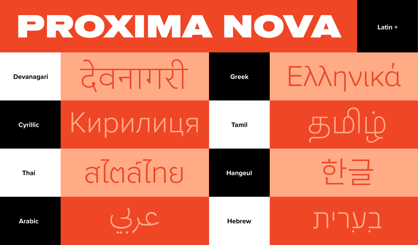
Proxima Nova vs Montserrat
This Proxima Nova vs Montserrat breakdown focuses on the details that usually matter: proportions, texture, and where each one fits best. With 85% similarity, Montserrat shares Proxima Nova's geometric construction with similar x-height and letter proportions. If your goal is neutrality, both fit, but Montserrat tends to be optimized for contemporary screen rendering.
Design DNA
Design overlap:33%
Proxima Nova
Montserrat
Highlighted traits are shared between both fonts
Visual Comparison
Proxima Nova
Premium
Montserrat
FreeAa Bb Cc 123
The quick brown fox jumps over the lazy dog
ABCDEFGHIJKLMNOPQRSTUVWXYZ
abcdefghijklmnopqrstuvwxyz
0123456789 !@#$%^&*()
Feature Comparison
| Feature | Proxima Nova | Montserrat |
|---|---|---|
| Type | Premium | Free |
| Classification | sans-serif | sans-serif |
| Variable Font | No | Yes |
| Weights | Multiple | Variable (100-900) |
| Italics | Yes | Yes |
| License | Commercial License Required | OFL-1.1 |
| Language Support | latin, latin-extended, cyrillic | latin, latin-extended, cyrillic, cyrillic-extended, vietnamese |
| Source | Mark Simonson Studio | Google Fonts |
Best Use Cases
Typography optimized for financial technology applications. These fonts convey t...
Typography designed for software-as-a-service interfaces. SaaS fonts balance pro...
Fonts optimized for mobile interfaces with excellent small-size legibility, clea...
Fonts that establish strong brand identity with distinctive character and versat...
Typography for medical, wellness, and healthcare applications. Healthcare fonts ...
Typography optimized for online retail, marketplaces, and shopping experiences. ...
Typography for startups, tech companies, and venture-backed businesses. Startup ...
Typography optimized for user interfaces, design systems, and digital products. ...
Typography for tech companies, software products, and digital innovation. Tech f...
Performance Comparison
| Metric | Proxima Nova | Montserrat |
|---|---|---|
| Score | N/A | 53/100 |
| File Size | N/A | 418.0 KB |
| Weights | N/A | 9 (var) |
| Italics | N/A | Yes |
| Variable Font | N/A | Yes (1 axes) |
| Language Groups | N/A | 5 |
| CDN Delivery | N/A | Yes |
| x-Height Ratio | N/A | 0.525 |
| Cap Height Ratio | N/A | 0.7 |
Where You'll See These Fonts
Proxima Nova
- SaaS applications
- Fintech products
- Mobile apps
- Startup branding
- E-commerce platforms
Which Should You Choose?
Consider: Proxima Nova
- Shares Proxima Nova's minimal, modern character
- Particularly suited for SaaS products and startup branding
- Variable font with continuous weight adjustment
- Supports 5 scripts including cyrillic and cyrillic-extended
- Delivers a modern, clean, bold aesthetic
Recommended: Montserrat
- Original design with refined typographic details
- Designed specifically for fintech and saas
- Used by SaaS applications, Fintech products
- Commercial license with professional support
Browse by Context
Free Alternatives to Consider
Other free alternatives to Proxima Nova