Free Alternatives to Apercu Supporting Latin Extended
Need a free alternative to Apercu with Latin Extended script support? These 7 options include Latin Extended characters and share visual similarities with Apercu. Each is licensed for free personal and commercial use.
Top Picks
Comparison Table
| Font | Relevance ⓘ
How well this alternative fits the specific context (use-case or trait) of this page. Score 0–100 based on matching keywords, industries, and font characteristics. Alternatives scoring 25+ are highlighted.
| Similarity ⓘ
How visually similar this free font is to the premium original. Score 0–100 based on x-height, width, stroke contrast, use-case overlap, and language coverage.
Learn more → | Weights | Variable | License | Source |
|---|---|---|---|---|---|---|
| Inter | 0 | 82% | Variable | Yes | OFL-1.1 | Google Fonts ↗ |
| Work Sans | 0 | 78% | Variable | Yes | OFL-1.1 | Google Fonts ↗ |
| Space Grotesk | 0 | 76% | Variable | Yes | OFL-1.1 | Google Fonts ↗ |
| DM Sans | 0 | 74% | Variable | Yes | OFL-1.1 | Google Fonts ↗ |
| Familjen Grotesk | 0 | 72% | Variable | Yes | OFL-1.1 | Google Fonts ↗ |
| Libre Franklin | 0 | 70% | Variable | Yes | OFL-1.1 | Google Fonts ↗ |
| Public Sans | 0 | 68% | Variable | Yes | OFL-1.1 | Google Fonts ↗ |
All Alternatives (7)


[Google Fonts] · OFL-1.1 · Variable
Closest functional match with better screen optimization and broader language support
Why it matches: Inter approximates Apercu's fundamental neo-grotesque proportions — both share a tall x-height, moderate apertures, and a preference for clarity at screen sizes. The structural skeleton is close enough that Inter can serve as a functional stand-in for Apercu in product interfaces and editorial web layouts. Where the match breaks down is in personality: Apercu's hybrid heritage from Helvetica, Franklin Gothic, Futura, and Johnston produces distinctive letterforms — the double-storey g, the slightly awkward proportions, the idiosyncratic a — that give it warmth and character Inter deliberately avoids. Inter is the engineered replacement that handles the same jobs but lacks the hand-curated quirkiness that makes Apercu feel chosen rather than defaulted to.
product UI and dashboard interfacesSaaS marketing sitesdesign system foundationsprojects prioritizing screen legibility over personality


[Google Fonts] · OFL-1.1 · Variable
Similar editorial sans-serif character with American gothic warmth
Why it matches: Work Sans shares Apercu's editorial versatility and its capacity to carry personality at text sizes. Both typefaces produce a slightly warm, characterful typographic texture in paragraphs rather than the clinical evenness of pure Swiss grotesques. Work Sans draws from the American gothic tradition — particularly Franklin Gothic — which overlaps with one of Apercu's acknowledged design influences. The humanist touches in Work Sans's stroke terminals create a warmth that parallels what Apercu achieves through its hybrid proportions and slightly awkward charm. Work Sans is more conventionally well-behaved than Apercu, but it carries a similar sense of being designed for editorial contexts where typography should feel intentional rather than invisible.
editorial layouts and magazine designcontent-heavy web applicationsresponsive marketing sitesbrand identity with editorial roots


[Google Fonts] · OFL-1.1 · Variable
Shares quirky geometric details and a contemporary design-conscious feel
Why it matches: Space Grotesk is the free font that comes closest to replicating Apercu's essential quality: a grotesque that refuses to be entirely predictable. Both typefaces feature geometric foundations interrupted by unexpected details — unusual curves, slightly off-kilter proportions, and a rhythm that rewards close inspection. Space Grotesk's origins as a proportional companion to the monospace Space Mono give it a similarly self-aware, design-literate character that overlaps with Apercu's positioning in creative and cultural contexts. The proportions differ — Space Grotesk is more compact and technically inflected — but the sensation of encountering a typeface designed by someone who understands grotesque conventions well enough to deviate from them selectively is shared.
creative agency brandingart and culture websiteseditorial display typographydesign portfolio sites


[Google Fonts] · OFL-1.1 · Variable
Clean modern proportions with geometric precision, less personality
Why it matches: DM Sans approximates Apercu's clean surface presentation — both read as modern, professional sans-serifs at a glance. The geometric-humanist hybrid construction of DM Sans produces a similar overall typographic color at body sizes, and its open apertures support good readability at small sizes. Where DM Sans falls short is personality: Apercu's hybrid heritage creates distinctive letterform quirks — the double-storey g, the unusual proportional relationships, the slightly awkward charm — that DM Sans's engineered smoothness deliberately avoids. At display sizes where Apercu's character becomes most visible, DM Sans reads as competent but forgettable.
startup product interfacesmobile app typographypresentation materialsprojects needing Apercu's readability without its edge
[Google Fonts] · OFL-1.1 · Variable
Contemporary grotesque with similar editorial sensibility and cultural positioning
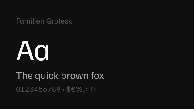
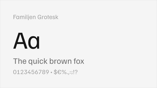
Why it matches: Familjen Grotesk shares Apercu's position as a contemporary neo-grotesque designed for culturally aware audiences. Both typefaces feature clean proportions and restrained sophistication that appeals to editorial and institutional contexts. Familjen Grotesk carries a Scandinavian minimalism that echoes the understated confidence of Apercu's British design heritage, and both produce a refined reading experience at text sizes. The key difference is that Familjen Grotesk is more conventionally well-behaved — it lacks the hybrid quirks and distinctive letterforms (particularly the g and a) that give Apercu its recognizable personality.
gallery and museum websitescultural institution brandingminimal editorial layoutsScandinavian-influenced design


[Google Fonts] · OFL-1.1 · Variable
American grotesque heritage with similar editorial warmth and versatility
Why it matches: Libre Franklin connects to Apercu through the shared influence of Franklin Gothic — one of the four typefaces Apercu explicitly blends in its hybrid design. Both typefaces work well in publishing contexts and carry enough character to feel chosen rather than defaulted to. Libre Franklin draws directly from the American industrial gothic tradition, giving it a more robust, journalistic character compared to Apercu's London-inflected quirkiness. The proportions are more condensed and the personality more straightforward, but the editorial credibility and warmth at text sizes create a functional parallel.
editorial and publishing projectsnews and journalism websitesbrand identity with editorial rootsprint-to-digital conversions


[Google Fonts] · OFL-1.1 · Variable
Neutral grotesque with similar structural bones but less personality
Why it matches: Public Sans shares Apercu's fundamental grotesque construction — clean proportions, moderate x-height, and a preference for functional clarity. Both typefaces can serve the same structural roles in UI and editorial layouts. Public Sans was designed for the U.S. government's design system, which means it optimizes for maximum neutrality and accessibility — the opposite of Apercu's strategy of introducing personality through hybrid heritage and idiosyncratic letterforms. The similarity is primarily skeletal: if you stripped Apercu of its quirkiness and optimized purely for democratic readability, you would arrive somewhere near Public Sans.
government and institutional websitesaccessibility-focused projectsneutral brand identity systemsprojects requiring maximum readability