Free Alternatives to Brown Supporting Latin Extended
Need a free alternative to Brown with Latin Extended script support? These 7 options include Latin Extended characters and share visual similarities with Brown. Each is licensed for free personal and commercial use.
Top Picks
Comparison Table
| Font | Relevance ⓘ
How well this alternative fits the specific context (use-case or trait) of this page. Score 0–100 based on matching keywords, industries, and font characteristics. Alternatives scoring 25+ are highlighted.
| Similarity ⓘ
How visually similar this free font is to the premium original. Score 0–100 based on x-height, width, stroke contrast, use-case overlap, and language coverage.
Learn more → | Weights | Variable | License | Source |
|---|---|---|---|---|---|---|
| DM Sans | 0 | 84% | Variable | Yes | OFL-1.1 | Google Fonts ↗ |
| Nunito Sans | 0 | 81% | Variable | Yes | OFL-1.1 | Google Fonts ↗ |
| Plus Jakarta Sans | 0 | 79% | Variable | Yes | OFL-1.1 | Google Fonts ↗ |
| Cabin | 0 | 77% | Variable | Yes | OFL-1.1 | Google Fonts ↗ |
| Work Sans | 0 | 75% | Variable | Yes | OFL-1.1 | Google Fonts ↗ |
| Mulish | 0 | 73% | Variable | Yes | OFL-1.1 | Google Fonts ↗ |
| Lato | 0 | 72% | 5 | No | OFL-1.1 | Google Fonts ↗ |
All Alternatives (7)


[Google Fonts] · OFL-1.1 · Variable
Closest match for Brown's warm grotesque character with clean, modern proportions
Why it matches: DM Sans captures Brown's core quality — a grotesque that feels warm and approachable rather than cold and institutional. Both typefaces blend geometric construction with subtle humanist touches that soften the mechanical feel common in traditional grotesques. DM Sans features similarly rounded curves and open counters, producing a friendly reading experience at body sizes. The overall proportions are comparable, with moderate x-heights and generous letter-spacing that prioritize readability. Where Brown achieves warmth through carefully rounded terminals, DM Sans arrives at a similar feel through its slightly more geometric bowl construction.
tech company brandingconsumer app interfacesmarketing websitesproduct design systems


[Google Fonts] · OFL-1.1 · Variable
Friendly sans with clean proportions and comparable warmth
Why it matches: Nunito Sans shares Brown's fundamental design philosophy — creating a sans-serif that feels human and inviting without sacrificing professionalism. Both typefaces feature moderate x-heights, generous counters, and balanced proportions that produce comfortable reading at body sizes. Nunito Sans has slightly more rounded terminals than Brown, adding extra softness that works well in consumer and educational contexts. The weight distribution across both typefaces is similar, with regular and medium weights that perform reliably for interface text and editorial body copy.
educational platformshealth and wellness brandsconsumer-facing web appsfriendly corporate communications

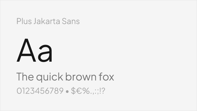
[Google Fonts] · OFL-1.1 · Variable
Modern geometric-grotesque with warm character and excellent screen optimization
Why it matches: Plus Jakarta Sans captures Brown's balance of geometric structure and approachable warmth through a contemporary lens. Both typefaces avoid the coldness of traditional grotesques by introducing subtle curves and rounded elements that humanize the letterforms. Plus Jakarta Sans features a slightly higher x-height than Brown, which improves screen legibility at small sizes. The overall personality is comparable — professional enough for corporate use, warm enough for consumer brands. Both produce clean, even typographic color in running text.
SaaS product interfacesstartup brandingmobile app typographymodern corporate sites
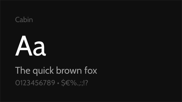
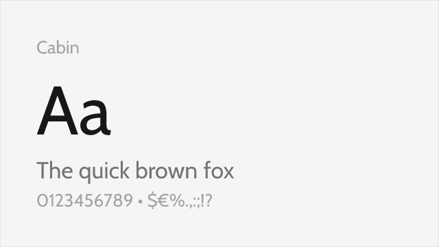
[Google Fonts] · OFL-1.1 · Variable
Humanist sans with warm, friendly proportions and robust construction
Why it matches: Cabin shares Brown's humanist warmth through slightly different means — where Brown softens a grotesque framework, Cabin builds warmth into its humanist skeleton from the ground up. Both typefaces feel approachable and trustworthy at body sizes. Cabin's slightly more pronounced stroke contrast and humanist rhythm give it a marginally more traditional feel than Brown's modern cleanness. The proportions are comparable, and both perform well in corporate and consumer contexts where warmth must coexist with professionalism.
corporate identity systemseditorial layoutsinstitutional communicationscross-platform design


[Google Fonts] · OFL-1.1 · Variable
Versatile editorial sans with restrained warmth and full weight coverage
Why it matches: Work Sans parallels Brown's editorial versatility with a slightly more restrained personality. Both typefaces are designed to perform across a wide range of professional contexts without calling attention to themselves. Work Sans features a moderate x-height and careful letter-spacing optimized for screen reading. While it lacks Brown's distinctive rounded terminals, Work Sans achieves a comparable level of approachable professionalism through its balanced proportions and humanist touches in stroke construction.
content-heavy websitesdesign system foundationseditorial web layoutscross-platform applications
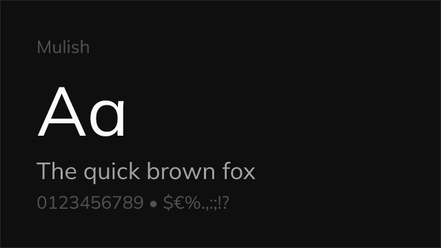
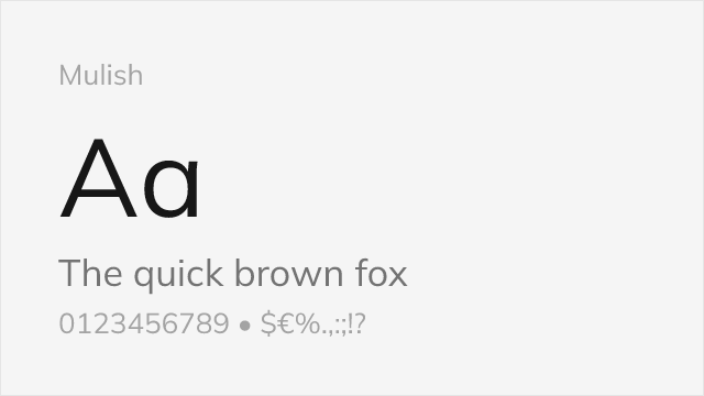
[Google Fonts] · OFL-1.1 · Variable
Clean, modern sans with subtle rounded character and balanced proportions
Why it matches: Mulish approximates Brown's friendly character through clean, slightly rounded letterforms that feel modern and approachable. Both typefaces avoid the extremes of strict geometry and pure grotesque neutrality, landing in a middle ground that reads as warm and professional. Mulish features similar proportions and x-height to Brown, producing comparable typographic color in body text. The rounded quality in Mulish is more subtle than Brown's distinctive terminals, resulting in a slightly more neutral overall feel.
corporate websitesbusiness applicationsmarketing materialsmulti-brand design systems
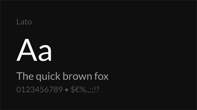

[Google Fonts] · OFL-1.1 · 5 weights
Mature humanist sans with warm details and proven reliability at scale
Why it matches: Lato shares Brown's ambition to be a warm, trustworthy sans-serif that works at scale. Both typefaces use semi-rounded details to create a feeling of approachable stability. Lato's humanist construction produces slightly more stroke contrast than Brown's more uniform weight distribution, giving it a marginally more traditional personality. At body sizes, both produce comfortable, readable text with similar typographic density. Lato's proven performance across billions of web pages confirms its reliability for the same enterprise and consumer contexts where Brown excels.
enterprise web applicationsgovernment and institutional siteslarge-scale web deploymentsprint and digital corporate materials