Free Alternatives to Calibre for Technology
Looking for a free sans serif font for technology projects? Calibre by Klim Type Foundry is a popular choice, but its licensing cost can be prohibitive. We've curated 10 free alternatives that work well in technology contexts. We've identified 3 that are especially well-suited for this context. Each alternative is scored by visual similarity and contextual relevance, and ships under an open-source license for both personal and commercial use.
Top Picks
Comparison Table
| Font | Relevance ⓘ
How well this alternative fits the specific context (use-case or trait) of this page. Score 0–100 based on matching keywords, industries, and font characteristics. Alternatives scoring 25+ are highlighted.
| Similarity ⓘ
How visually similar this free font is to the premium original. Score 0–100 based on x-height, width, stroke contrast, use-case overlap, and language coverage.
Learn more → | Weights | Variable | License | Source |
|---|---|---|---|---|---|---|
| Geist | 44 | 82% | Variable | Yes | OFL-1.1 | Google Fonts ↗ |
| Libre Franklin | 27 | 72% | Variable | Yes | OFL-1.1 | Google Fonts ↗ |
| Inter | 25 | 85% | Variable | Yes | OFL-1.1 | Google Fonts ↗ |
| General Sans | 24 | 75% | Variable | Yes | ITF Free Font License | fontshare ↗ |
| Barlow | 23 | 74% | 9 | No | OFL-1.1 | Google Fonts ↗ |
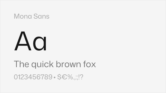
| Mona Sans | 23 | 72% | Variable | Yes | OFL-1.1 | github ↗ |
| Supreme | 23 | 70% | Variable | Yes | ITF Free Font License | fontshare ↗ |
| DM Sans | 16 | 80% | Variable | Yes | OFL-1.1 | Google Fonts ↗ |
| Work Sans | 16 | 78% | Variable | Yes | OFL-1.1 | Google Fonts ↗ |
| Source Sans 3 | 16 | 76% | Variable | Yes | OFL-1.1 | Google Fonts ↗ |
Most Relevant (3)

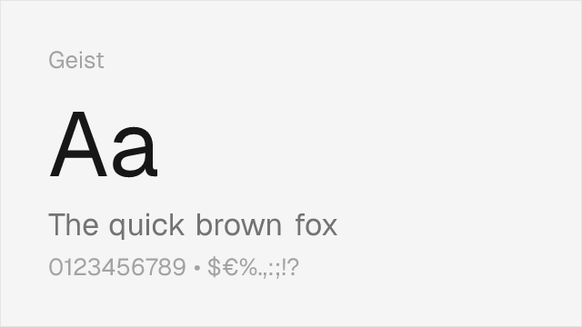
Modern system font with similar tech-forward aesthetics and tight, efficient proportions


Faithful Franklin Gothic revival with workmanlike editorial utility


Closest overall match with comprehensive variable font support and similar screen-first optimization
Other Alternatives (7)


Clean neo-grotesque from Fontshare


Slightly condensed grotesque with utilitarian character that echoes Calibre's space efficiency


Neo-grotesque from Fontshare with wide weight range


Clean geometric-grotesque blend with modern proportions that echo Calibre's contemporary feel


Mature editorial sans with American gothic warmth and comprehensive weight range


Adobe's professional sans with strong hinting and broad language coverage