Free Alternatives to Calibre

About Calibre
- Foundry
- Klim Type Foundry
- Classification
- sans-serif
- Style
- neo-grotesque
Brands Using Calibre
Brand typography across marketing and product communications
Brand typography and product marketing
Brand identity and marketing materials
Brand identities and marketing materials across the Australasian tech ecosystem
Calibre is a sans-serif typeface designed by Kris Sowersby at Klim Type Foundry, released in 2013. Sowersby describes Calibre as "a sans serif for the 21st century" — a utilitarian grotesque stripped of historical nostalgia, designed to work hard in the tight confines of digital interfaces and the expansive canvases of brand campaigns with equal efficiency. Where Sowersby's other grotesques like Founders Grotesk embrace rough-hewn character, Calibre is polished, precise, and deliberately lean. It became a defining typeface of the mid-2010s tech aesthetic, chosen by companies that wanted modernity without affectation.
Calibre requires a paid license from Klim Type Foundry. Desktop, web, and app licenses are priced per style, with web licenses calculated by page views. Klim offers trial fonts for testing. If your budget cannot accommodate Klim Type Foundry's licensing structure, this page covers the best open-source alternatives and what to evaluate when choosing one.
Why Calibre Matters
Calibre matters because it defined the typographic voice of a generation of technology companies. As Klim Type Foundry's reputation grew from its Wellington, New Zealand base, Calibre became the typeface that established the template for what "modern tech brand" looked like typographically: tight, efficient, confident, and free of the retro-grotesque mannerisms that typefaces like Founders Grotesk or Apercu carried. Atlassian, Xero, InVision, and dozens of other technology companies adopted it, making Calibre one of the most commercially successful type designs of the decade — particularly influential in the Australasian tech ecosystem where Klim's foundry roots gave it early traction.
Sowersby's design rationale was explicitly utilitarian. He studied the functional grotesques of the 20th century — DIN, Folio, Neuzeit — and asked what a grotesque designed without nostalgic reference to those forms would look like. The result is a typeface that acknowledges its heritage without quoting it. Calibre's proportions are tighter than Helvetica's, its curves are flatter than Futura's, and its personality is more restrained than Univers's. It is a sans-serif reduced to essentials.
This reductive quality resonated with the tech industry's design culture. In the mid-2010s, companies were moving away from the warm, rounded aesthetic of Proxima Nova and Circular toward something crisper and more serious. Calibre provided exactly that — a typeface that said "we ship product" rather than "we have brand values." The efficiency of its proportions (slightly condensed, tightly spaced) was both a design feature and a cultural signal: these were companies that valued precision and economy over warmth and personality.
Klim Type Foundry, based in Wellington, New Zealand, has built one of the most respected type libraries in the world. Sowersby's work is characterized by deep historical research combined with contemporary pragmatism. Calibre exemplifies this approach — designed with full awareness of the grotesque tradition but optimized for the specific demands of 21st-century screens, interfaces, and brand systems.
The typeface's influence extends beyond its direct users. Calibre helped establish the tight, functional aesthetic that later typefaces like Söhne, Untitled Sans, and Geist would build upon. It was the bridge between the humanist warmth of the early 2010s (Proxima Nova, Avenir) and the sharper, more rationalist aesthetic of the late 2010s (Söhne, ABC Diatype).
Design Characteristics
Calibre's design reveals its utilitarian philosophy through specific structural choices:
- Tall x-height with compact width: The x-height is generous for legibility but the overall character width is tighter than most grotesques, creating space-efficient text that packs more content per line without feeling condensed. This is Calibre's most distinctive structural feature
- Semi-open apertures with controlled terminals: The
c,e, andshave apertures more open than Helvetica but tighter than screen-first fonts like Inter. The terminals are precisely horizontal, contributing to Calibre's controlled, purposeful personality - Near-monolinear strokes with subtle thinning: Strokes maintain consistent thickness with barely perceptible thinning at junctions and curves. This near-uniformity creates even typographic color in paragraph settings — essential for Calibre's role in data-dense interfaces
- Flat-sided bowls with rationalist precision: The
o,b,d, andpfeature pronounced flattening on horizontal extremes — more square than most grotesques, reflecting Sowersby's commitment to efficient use of space. The bowls are taut rather than round - Minimal ink traps at junctions: Subtle notches where strokes meet prevent thickening at small sizes — a detail that reveals Calibre's attention to rendering performance
- Two-storey
aand single-storeyg: Calibre uses a two-storeyafor legibility in body text and a single-storeygthat reinforces its modern, simplified character — a combination that distinguishes it from more traditional grotesques - Six weights from Thin to Black: The weight range supports comprehensive typographic hierarchies, with particularly well-differentiated steps between Light, Regular, Medium, and Semibold — the weights most commonly used in interface design
Where Calibre Excels
Calibre performs best in contexts that reward its tight, efficient character:
- Technology company branding: The lean, purposeful proportions communicate modernity and efficiency — exactly the values that tech companies want their typography to convey
- SaaS product interfaces: Calibre's space efficiency makes it excellent for navigation bars, sidebar menus, data tables, and dense UI patterns where every pixel counts
- Developer documentation and tools: The controlled, rationalist character suits the precision-oriented mentality of developer audiences, and the weight range supports clear heading hierarchies
- Marketing landing pages: The bolder weights have enough impact for hero sections and CTAs while maintaining Calibre's clean, professional personality
- Financial and enterprise communications: The no-nonsense character reads as credible and authoritative in investor decks, annual reports, and enterprise sales materials
- Presentations and pitch decks: Calibre's tight proportions fit more text per slide while maintaining readability, and the weight range creates clear visual hierarchy
Where Calibre Struggles
Calibre has specific contexts where other typefaces perform better:
- Warm or approachable brands: Calibre's utilitarian efficiency reads as cold and impersonal for brands targeting families, wellness audiences, or casual consumer markets. It communicates competence, not comfort
- Long-form editorial reading: The tight proportions and compact spacing that make Calibre efficient in UI contexts reduce reading comfort in sustained long-form text. Looser, more humanist alternatives are better for articles and books
- Script and language coverage: Calibre supports Latin and Latin Extended only. Projects requiring Cyrillic, Greek, Arabic, or CJK scripts need fallback strategies or a different primary typeface
- Variable font workflows: Calibre ships as static files only. Teams using variable font strategies for web performance optimization cannot use Calibre natively
- Width variants: Calibre does not include condensed or extended widths. Projects requiring significant width variation need supplementary typefaces, unlike GT America's six widths
- Expressive or playful contexts: Calibre does not do personality. If your project needs typographic warmth, whimsy, or character, Calibre will feel too restrained
- Very small sizes on low-res screens: While well-crafted, Calibre's tight proportions can reduce legibility at 12-13px on standard-resolution displays where more open fonts like Inter maintain clarity
How to Choose a Free Substitute
When evaluating Calibre replacements, focus on these criteria:
Proportional tightness: Calibre's most recognizable quality is its compact, space-efficient construction. Set a line of text in both Calibre and your candidate at the same font size and compare character counts per line. Inter will be slightly wider; Geist will be closer to Calibre's economy. If the replacement is significantly wider, your layouts will need adjustment.
Weight ramp quality: Calibre's weight steps are carefully calibrated for interface design hierarchies. Set a common pattern — heading in Semibold, subhead in Medium, body in Regular, caption in Light — and verify that each step feels purposeful and distinct. Some free fonts have uneven weight distribution where the Medium-to-Semibold jump is too small or the Regular-to-Light step is too large.
Rationalist character: Calibre feels deliberate and precise — every curve and junction has been considered. Your alternative must share this quality of intentional design. Test by using the typeface in a premium brand context (a fintech product page, a developer tool dashboard) and assess whether it reads as a design choice or a generic fallback. Inter and Geist pass this test; less carefully designed free fonts do not.
Small-size rendering: If your project includes dense UI elements (data tables, form labels, metadata), test your alternative at 12-14px on standard-resolution screens. Calibre's tight proportions make this a challenging test even for Calibre itself — most alternatives with slightly more open proportions will actually perform better here.
Brand tone: Calibre communicates precision, efficiency, and modern professionalism. Evaluate whether your alternative conveys the same tonal qualities in the context of your brand. A typeface that feels warm and friendly instead of efficient and purposeful is not a Calibre substitute — it is a different typographic direction.
Premium Font Neighbors
If Calibre's approach resonates but you want to explore adjacent options:
Cluster A: Utilitarian tech grotesques (Calibre's direct competitors)
- Söhne (Klim Type Foundry) — Sowersby's other major grotesque; crisper and more screen-optimized than Calibre, with Helvetica DNA
- Founders Grotesk (Klim Type Foundry) — Sowersby's earlier, rougher grotesque; more character and vintage flavor than Calibre's polish
- General Sans (Indian Type Foundry) — a contemporary grotesque with similar tech-sector positioning but warmer proportions
- Supreme (Indian Type Foundry) — tight, modern grotesque competing for the same tech-branding space
Cluster B: Editorial and brand grotesques
- Graphik (Commercial Type) — broader and softer than Calibre; the other dominant tech-sector grotesque of the 2010s
- GT America (Grilli Type) — more American in character with a wider superfamily; broader scope than Calibre
- Acumin (Adobe/Robert Slimbach) — a comprehensive neo-grotesque with extensive width and weight options
- Circular (Lineto) — the geometric alternative that competed with Calibre for tech-brand dominance; warmer and rounder
FAQ
Is Calibre free?
No. Calibre is a premium typeface from Klim Type Foundry with per-style licensing. Desktop and web licenses are priced separately, and web licenses are tiered by monthly page views. Klim offers free trial fonts for testing before purchase. The full family (all weights with italics) requires a substantial licensing investment.
What is the best free alternative to Calibre?
Inter is the closest free alternative at 85% similarity. Both share a disciplined neo-grotesque construction with screen-optimized proportions. Inter is slightly wider and more open than Calibre, which improves small-size legibility but reduces Calibre's characteristic space efficiency. Inter's variable font support and broader language coverage provide practical advantages for web projects.
Why was Calibre so popular with tech companies?
Calibre's tight, efficient proportions communicated exactly the values that mid-2010s tech companies wanted to project: precision, modernity, and no-nonsense functionality. It replaced the warmer, rounder typefaces of the early 2010s (Proxima Nova, Brandon Grotesque) with something leaner and more serious, reflecting the tech industry's maturation from startup energy to established product company. The association with companies like Atlassian, Xero, and InVision created a network effect where choosing Calibre signaled membership in the design-conscious tech class.
What is the difference between Calibre and Söhne?
Both are designed by Kris Sowersby at Klim Type Foundry, but they serve different purposes. Calibre is Sowersby's utilitarian grotesque — tight, efficient, and stripped of historical reference. Söhne is his "memory of Helvetica" — crisper, more explicitly screen-optimized, and more directly connected to the Swiss neo-grotesque tradition. Söhne largely succeeded Calibre as the tech-sector default after its release, offering sharper rendering and a more comprehensive superfamily (including Mono and Breit widths). Calibre remains the better choice for tighter, more condensed layouts.
Is Calibre a variable font?
No. Calibre ships as static font files across all weights with matching italics. For SaaS dashboards that typically load three to four weights (Regular, Medium, Semibold, Bold) to build interface hierarchy, this means three to four separate HTTP requests and font files where a single variable font file would suffice. The web performance impact is particularly relevant for Calibre's core audience of tech companies obsessed with page speed metrics. Most of Calibre's free alternatives (Inter, Geist, DM Sans) offer variable font support, providing a meaningful file-size and loading advantage.
Does Calibre support Cyrillic?
No. Calibre supports Latin and Latin Extended scripts only. For projects requiring Cyrillic, Inter (Cyrillic, Greek), IBM Plex Sans (Cyrillic, Greek, Arabic, Devanagari), or Noto Sans (900+ languages) are open-source alternatives that maintain a compatible grotesque aesthetic with broader script coverage.
Who designed Calibre?
Kris Sowersby designed Calibre at Klim Type Foundry, based in Wellington, New Zealand. Sowersby is one of the most influential type designers of his generation, with other notable designs including Söhne, Founders Grotesk, Tiempos, and National. Klim Type Foundry is known for typefaces that combine deep historical research with contemporary pragmatism, and Calibre exemplifies this approach.
How does Calibre compare to Graphik?
Both are neo-grotesque sans-serifs popular in the tech sector, but they differ in character and proportion. Calibre is tighter and more compact, with a utilitarian efficiency that prioritizes space economy. Graphik is wider and softer, with Christian Schwartz's "emphatically vanilla" quality that prioritizes invisible neutrality. Calibre feels more purposeful and directional; Graphik feels more accommodating and adaptable. In practice, Calibre is chosen when the design needs to feel modern and efficient, while Graphik is chosen when it needs to feel neutral and professional.
Can I use Calibre for print?
Yes, Calibre performs well in print. The near-monolinear strokes and careful junction details translate effectively to offset and digital printing at standard body sizes (8-12pt). The tight proportions that serve UI design also make Calibre space-efficient in print contexts — annual reports, white papers, and brochures benefit from the same economy. However, print and desktop licenses are priced separately from web licenses at Klim Type Foundry.
What typefaces did Calibre replace in the market?
Calibre helped accelerate the transition from the warm, humanist-geometric typefaces that dominated tech branding in 2010-2013 (Proxima Nova, Brandon Grotesque, Avenir) to the tighter, more rationalist grotesques that defined 2014-2018. It was part of a broader aesthetic shift in the tech industry from "friendly and approachable" to "efficient and professional" — reflecting the maturation of companies from scrappy startups to established enterprises.
Is Calibre on Google Fonts?
No, Calibre is a premium font from Klim Type Foundry and is not available on Google Fonts.
The closest Google Fonts alternative is Inter with 85% similarity. Get it free on Google Fonts ↗
Free Alternatives (10)


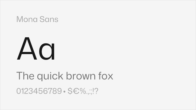
Closest overall match with comprehensive variable font support and similar screen-first optimization

Modern system font with similar tech-forward aesthetics and tight, efficient proportions


Clean geometric-grotesque blend with modern proportions that echo Calibre's contemporary feel


Mature editorial sans with American gothic warmth and comprehensive weight range


Adobe's professional sans with strong hinting and broad language coverage


Clean neo-grotesque from Fontshare


Slightly condensed grotesque with utilitarian character that echoes Calibre's space efficiency


Faithful Franklin Gothic revival with workmanlike editorial utility


Neo-grotesque from Fontshare with wide weight range
See where Calibre is used in the wild and swap to free alternatives live.
Install FontSwap →Replacement Summary
Source: FontAlternatives.com
Premium font: Calibre
Best free alternative: Inter
FontAlternatives similarity score: 85%
Replacement difficulty: Low
Best for: SaaS product interfaces, design system foundations, developer documentation sites, cross-platform brand typography
Notable users: Xero, Atlassian, InVision
Not recommended when: Brand consistency with Xero requires exact letterforms
What is the best free alternative to Calibre?
Inter is the best free alternative to Calibre with a FontAlternatives similarity score of 85%.
Inter shares similar proportions, stroke characteristics, and intended use with Calibre. It is available under the OFL-1.1 license, which permits both personal and commercial use at no cost.
This alternative works particularly well for: SaaS product interfaces, design system foundations, developer documentation sites, cross-platform brand typography.
Can I safely replace Calibre with Inter?
Yes, Inter is a high-confidence replacement for Calibre. The FontAlternatives similarity score of 85% indicates strong structural compatibility.
Licensing: Inter is licensed under OFL-1.1, which allows commercial use without licensing fees or royalties.
Weight coverage: Most weights have close or exact matches available.
When should I NOT replace Calibre?
While Inter is a strong alternative, there are situations where replacing Calibre may not be appropriate:
- Brand consistency: Calibre is commonly seen in Tech startup brand identities contexts where exact letterforms may be required.
- Strict compliance: Verify that OFL-1.1 terms meet your specific legal and compliance requirements.
Weight-Matching Guide
Map Calibre weights to their closest free alternatives for accurate font substitution.
Inter
| Calibre | Inter | Match |
|---|---|---|
| Light (300) | Light (300) | close |
| Regular (400) | Regular (400) | exact |
| Semibold (600) | SemiBold (600) | exact |
| Bold (700) | Bold (700) | close |
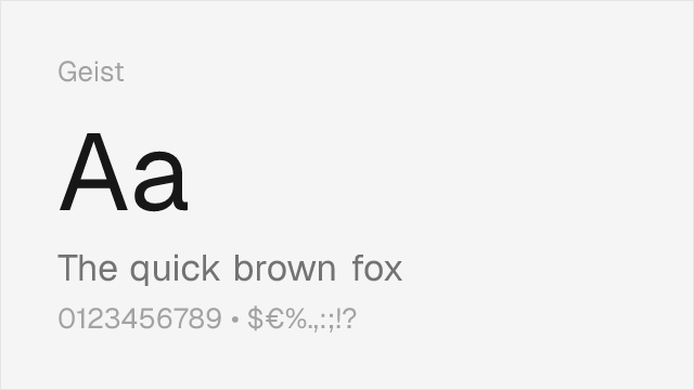
Geist
| Calibre | Geist | Match |
|---|---|---|
| Thin (100) | Thin (100) | close |
| Regular (400) | Regular (400) | exact |
| Medium (500) | Medium (500) | exact |
| Bold (700) | Bold (700) | exact |
DM Sans
| Calibre | DM Sans | Match |
|---|---|---|
| Light (300) | Light (300) | close |
| Regular (400) | Regular (400) | close |
| Medium (500) | Medium (500) | close |
| Bold (700) | Bold (700) | close |
Work Sans
| Calibre | Work Sans | Match |
|---|---|---|
| Light (300) | Light (300) | exact |
| Regular (400) | Regular (400) | exact |
| Medium (500) | Medium (500) | exact |
| Bold (700) | Bold (700) | close |
Source Sans 3
| Calibre | Source Sans 3 | Match |
|---|---|---|
| Light (300) | Light (300) | close |
| Regular (400) | Regular (400) | close |
| Medium (500) | Medium (500) | substitute |
| Bold (700) | Bold (700) | close |
Barlow
| Calibre | Barlow | Match |
|---|---|---|
| Thin (100) | Thin (100) | close |
| Regular (400) | Regular (400) | close |
| Medium (500) | Medium (500) | close |
| Bold (700) | Bold (700) | close |
Libre Franklin
| Calibre | Libre Franklin | Match |
|---|---|---|
| Light (300) | Light (300) | close |
| Regular (400) | Regular (400) | close |
| Medium (500) | Medium (500) | substitute |
| Bold (700) | Bold (700) | close |
Performance Guide
Production performance metrics for each alternative.
How to Use Inter
Copy these code snippets to quickly add Inter to your project.
CSS code for Inter
@import url('https://fonts.googleapis.com/css2?family=Inter:wght@100..900&display=swap');HTML code for Inter
<link rel="preconnect" href="https://fonts.googleapis.com">
<link rel="preconnect" href="https://fonts.gstatic.com" crossorigin>
<link href="https://fonts.googleapis.com/css2?family=Inter:wght@100..900&display=swap" rel="stylesheet">
Tailwind code for Inter
// tailwind.config.js
module.exports = {
  theme: {
    extend: {
      fontFamily: {
        'inter': ['Inter', 'sans-serif'],
      },
    },
  },
}

// Usage in HTML:
// <p class="font-inter">Your text here</p>
Next.js code for Inter
// Using next/font (Next.js 13+)
import { Inter } from 'next/font/google';

const inter = Inter({
  subsets: ['latin'],
  weight: ['100', '200', '300', '400', '500', '600', '700', '800', '900'],
});

export default function Component() {
  return (
    <p className={inter.className}>
      Your text here
    </p>
  );
}

// Or using inline styles with Google Fonts link:
// <p style={{ fontFamily: "'Inter'" }}>Your text</p>
Expo and React Native code for Inter
// Install: npx expo install @expo-google-fonts/inter expo-font
import { useFonts, Inter_400Regular } from '@expo-google-fonts/inter';

export default function App() {
  const [fontsLoaded] = useFonts({
    Inter_400Regular,
  });

  if (!fontsLoaded) return null;

  return (
    <Text style={{ fontFamily: 'Inter_400Regular' }}>
      Your text here
    </Text>
  );
}
Recommended Font Pairings
These free fonts pair well with Inter Calibre for headlines, body text, or accent use.
Literata's warm, contemporary serifs provide rich editorial contrast to Calibre's tight, utilitarian sans-serif forms. Both share a screen-optimized construction, making them a natural pair for digital publications and content platforms that need typographic hierarchy with reading comfort.
Fraunces's expressive variable serif creates dramatic contrast against Calibre's restrained grotesque forms. This pairing works for tech brands that want personality in their display typography while maintaining functional clarity in body text and UI.
Source Serif Pro's rational, sturdy serifs complement Calibre's clean sans-serif headlines in editorial and documentation contexts. Both are designed for sustained reading, making them an effective pair for technical publications and knowledge platforms.
Browse Alternatives by Context
Find Calibre alternatives filtered by specific use case, style, or language support.
By Use Case
By Style
By Script
Frequently Asked Questions
What is the best free alternative to Calibre?
Inter is the best free alternative to Calibre with a FontAlternatives similarity score of 85%. It shares similar proportions and characteristics while being available under the OFL-1.1 license for both personal and commercial use at no cost.
Is there a free version of Calibre?
There is no official free version of Calibre. However, Inter is available under the OFL-1.1 open-source license and achieves a FontAlternatives similarity score of 85%. It includes variable weights and supports latin, latin-extended.
What Google Font looks like Calibre?
The Google Fonts most similar to Calibre are Inter, Geist, DM Sans. Among these alternatives, Inter offers the closest match with a FontAlternatives similarity score of 85% and includes variable weights for flexible typography options.
Can I use Inter commercially?
Yes, Inter can be used commercially. It is licensed under OFL-1.1, which allows free use in websites, applications, print materials, and commercial projects without purchasing a license or paying royalties.
Is Inter similar enough to Calibre?
Inter achieves a FontAlternatives similarity score of 85% compared to Calibre. While not identical, it offers comparable letterforms, proportions, and visual style. Most designers find it works excellently as a substitute in web and print projects.
What are the main differences between Calibre and its free alternatives?
Free alternatives to Calibre may differ in subtle details like letter spacing, curve refinements, and available weights. Premium fonts typically include more OpenType features, extended language support, and optimized screen rendering. However, for most projects, these differences are negligible.
Where can I download free alternatives to Calibre?
Download Inter directly from Google Fonts. Click the "Get Font" button on any alternative listed above to visit the official download page. Google Fonts also provides convenient embed codes for seamless web integration.