Free Alternatives to Founders Grotesk

About Founders Grotesk
- Foundry
- Klim Type Foundry
- Classification
- sans-serif
- Style
- neo-grotesque
Brands Using Founders Grotesk
Previous brand identity and marketing typography
Editorial typography across digital publications
Select digital product interfaces and feature presentations
Book cover typography and promotional materials
Editorial layout and brand identity across print and digital
Founders Grotesk is a neo-grotesque sans-serif typeface designed by Kris Sowersby and released by Klim Type Foundry in 2012. Named after the New Zealand Founders Heritage Park in Nelson, where Sowersby studied 19th-century wood type specimens housed in a working letterpress museum, Founders Grotesk represents something unusual in contemporary type design: a grotesque built not from the Swiss rationalist tradition that dominates the category, but from the cruder, tighter, more characterful grotesques that circulated through the British colonies in the 1800s. It has become Klim's editorial workhorse — the font designers reach for when they need a grotesque with historical depth and tight typographic color.
Founders Grotesk requires a paid license from Klim Type Foundry. Pricing is per-project, with separate licenses for desktop, web, and app usage. There is no free tier or trial version. The family is available in several sub-families: Founders Grotesk (standard), Founders Grotesk Text (optimized for small sizes), Founders Grotesk Condensed, Founders Grotesk X-Condensed, and Founders Grotesk Mono. Each is licensed separately. If your budget cannot accommodate Klim's licensing structure, this page covers the best open-source alternatives and what to evaluate when choosing one.
Why Founders Grotesk Matters
Founders Grotesk occupies a specific and important position in the landscape of contemporary sans-serif design. While most neo-grotesques trace their lineage to Swiss modernism — Helvetica, Univers, Akzidenz-Grotesk — Founders Grotesk looks elsewhere entirely. Its source material is the collection of 19th-century wood and metal type specimens that Kris Sowersby encountered at the Founders Heritage Park, a working letterpress museum in Nelson, New Zealand. These were the functional, everyday grotesques that printers used for newspapers, advertising, and commercial jobbing work — typefaces designed not by theorists pursuing optical perfection but by craftsmen solving practical problems with limited technology.
This origin story matters because it explains what makes Founders Grotesk feel different from its peers. Where Helvetica strives for neutral universality and Söhne reinterprets that neutrality for digital screens, Founders Grotesk carries the DNA of type that was cut to function under pressure: in ink-heavy newspaper presses, on rough paper, at sizes that demanded tight fit and economy of space. The result is a typeface with noticeably tighter spacing, slightly condensed proportions, and a rhythmic density that reads as editorial confidence rather than Swiss restraint.
When Squarespace adopted Founders Grotesk as a central element of its brand identity, it was choosing precisely this quality. The website builder's previous typography had been clean but generic; Founders Grotesk gave it an editorial voice — the sense that there was a point of view behind the design choices. Vox Media recognized the same quality for its digital publications, where the typeface's tight spacing and editorial weight allowed headlines to punch without resorting to the heaviness of traditional display faces. Monocle, the global affairs and lifestyle publication, uses it in contexts where the typography needs to communicate both journalistic seriousness and contemporary design awareness.
The New York Times has deployed Founders Grotesk in select digital products and feature presentations, recognizing that its editorial heritage and tight typographic color suit the kind of designed content experiences that sit alongside the newspaper's traditional serif typography. Penguin Random House has used it on book covers and promotional materials where the font's controlled density creates elegant hierarchy in confined spaces.
What connects these adoptions is a common recognition: Founders Grotesk is not a neutral typeface in the way Helvetica or even Inter are neutral. It has a position. It says "editorial" and "considered" and "historically informed" in a way that generic neo-grotesques do not. Designers choose it when they want their typography to signal that someone with knowledge of type history made the selection — not because the font is showy, but because its character is unmistakably intentional.
Founders Grotesk also benefits from its place within Klim's broader catalog. Sowersby's reputation as one of the most historically rigorous type designers working today lends the typeface credibility that extends beyond its formal qualities. When studios and publications specify Founders Grotesk, they are also aligning themselves with a foundry known for deep research and principled design. This is the same reason Calibre and Söhne carry weight in their respective niches — Klim's name functions as a quality signal in design-literate circles.
The expansion of Founders Grotesk into multiple sub-families — Text, Condensed, X-Condensed, and Mono — further distinguishes it from simpler grotesque offerings. Founders Grotesk Text is specifically optimized for small sizes, with wider spacing and more open counters that maintain legibility where the standard cut's tight spacing would collapse. The Condensed and X-Condensed variants push the family's natural tendency toward compression even further, serving headlines, data-dense layouts, and spaces where economy of width is paramount. Founders Grotesk Mono extends the family's editorial DNA into code and technical contexts. This system-level thinking indicates a typeface designed for sustained, professional deployment rather than one-off brand exercises.
Design Characteristics
Founders Grotesk's design is defined by its departure from the Swiss grotesque orthodoxy that dominates the category:
- Tight letter-spacing: The most immediately recognizable trait. Founders Grotesk sets noticeably tighter than Helvetica, Inter, or most contemporary neo-grotesques. This creates a dense, rhythmic typographic texture that reads as editorial confidence — the kind of spacing associated with well-designed magazine headlines and newspaper mastheads. The tightness is calibrated rather than extreme; text remains legible, but the overall paragraph color is darker and more even than looser-set alternatives
- Slightly condensed proportions: Without being a formally condensed typeface, Founders Grotesk's letterforms are narrower than standard-width grotesques. The
n,o,e, andaare marginally compressed horizontally, contributing to the typeface's efficient use of space and its editorial density. This subtle condensation is part of what makes it effective for headlines in column-based layouts - 19th-century grotesque references: Details like the single-storey
ain certain weights, the slightly squared curves inc,e, ando, and the direct, unembellished stroke terminals all reference the wood type specimens that inspired the design. These are not nostalgic affectations — they give the typeface a grounded, material quality that purely digital-era grotesques lack - Moderate x-height with generous ascenders: Unlike screen-optimized fonts that maximize x-height at the expense of vertical proportion, Founders Grotesk maintains balanced proportions that create elegant vertical rhythm in editorial layouts. The ascenders have room to breathe, giving paragraphs a classical editorial quality
- Flat, horizontal terminals: Stroke endings are clean and decisively horizontal. There are no ball terminals, angled cuts, or soft curves at stroke ends — just the frank, workmanlike finish of functional 19th-century type. This contributes to the typeface's no-nonsense editorial personality
- Minimal stroke contrast: The monoline construction maintains consistent stroke weight across letterforms, creating even typographic color in text blocks. This evenness is critical to the typeface's performance in editorial contexts where large passages of text need to read as a cohesive surface
- Squared curves with subtle tension: The curves in round letterforms like
o,b,d,p, andqcarry a subtle squareness — not enough to read as geometric, but enough to create visual tension against the soft roundness of pure grotesque models. This tension is part of what gives Founders Grotesk its distinctive character - Tabular and proportional figures: Both figure sets are included, supporting the typeface's use in editorial contexts that mix running text with data, dates, and numerical information
The standard family ships in seven weights — Light, Regular, Medium, Semibold, Bold, Extra Bold, and Black — with matching italics. This comprehensive weight range provides full editorial hierarchy from delicate captions to commanding display headlines.
Where Founders Grotesk Excels
Founders Grotesk performs at its best in contexts that value editorial precision and typographic density:
- Magazine and editorial design: The tight spacing and condensed proportions create the dense, authoritative typographic texture that editorial layouts demand. Headlines set in Medium or Bold carry editorial weight without needing oversized point sizes
- Brand identity for media companies: Publications and media organizations find in Founders Grotesk a typeface that communicates journalistic seriousness and design awareness simultaneously. It reads as "we take both content and presentation seriously"
- Headline typography in constrained spaces: The naturally condensed proportions make it efficient in column-based layouts, navigation bars, and anywhere horizontal space is limited. It fits more characters per line than wider grotesques without requiring a formally condensed cut
- Print design: Founders Grotesk's roots in physical type production mean it performs exceptionally well on paper. The tight spacing, material quality, and classical proportions are optimized for the high resolution and reading distances of print
- Cultural and institutional communications: Museums, publishers, and cultural organizations appreciate the typeface's historical depth and editorial authority. It signals curatorial intent without being academic or inaccessible
- Data-adjacent editorial layouts: Feature stories that integrate charts, data callouts, and infographics alongside body text benefit from Founders Grotesk's tabular figures and dense typographic color, which create visual cohesion across disparate content types
Where Founders Grotesk Struggles
Founders Grotesk's distinctive characteristics create corresponding limitations:
- Long-form body text on screen at small sizes: The tight spacing that makes Founders Grotesk effective for headlines can cause crowding at body text sizes (14-16px) on standard-resolution screens. Founders Grotesk Text addresses this with wider spacing and open counters, but requires a separate license
- Warm or casual brand voices: The typeface's editorial authority and historical gravitas read as formal and serious. Brands targeting casual, playful, or family-oriented audiences will find it alienating
- Projects requiring broad script support: Founders Grotesk covers Latin and Latin Extended only. Projects requiring Cyrillic, Greek, Arabic, or CJK scripts need a fallback strategy or a different primary typeface
- UI-heavy product interfaces: Without the optical sizing, aggressive hinting, or screen optimization of fonts engineered for digital interfaces (like Inter or Geist), Founders Grotesk's tight spacing can underperform in dense dashboards and form-heavy applications
- Very large display sizes: At poster or billboard scale, the subtle details that give Founders Grotesk its editorial character become less relevant, and its restrained personality may lack the impact of more expressive display faces
- Budget-constrained digital projects: The per-weight, per-platform licensing model — particularly if you need both the standard and Text sub-families for a responsive editorial site — represents a significant investment compared to free alternatives
How to Choose a Free Substitute
When evaluating Founders Grotesk replacements, the central challenge is replicating its specific combination of tight spacing, editorial density, and historical groundedness. Here is what to prioritize:
- Spacing rhythm and typographic color: Set a full paragraph at 16px in your candidate font and compare it against Founders Grotesk specimens. Founders Grotesk produces a notably dense, even typographic texture — darker and tighter than most free sans-serifs. Your substitute should aim for similar paragraph color, which may require manually tightening the letter-spacing in CSS (typically -0.01em to -0.02em for fonts like Inter or Work Sans)
- Weight distribution for editorial hierarchy: Founders Grotesk's seven-weight system supports fine-grained editorial hierarchy. Your alternative needs at minimum Light, Regular, Medium, and Bold to replicate common editorial patterns — captions in Light, body in Regular, subheads in Medium, headlines in Bold. The availability of a Semibold weight is particularly valuable for secondary headlines
- Condensed feel without formal condensation: Founders Grotesk reads as slightly condensed without being a condensed typeface. Test your alternative in column-based layouts at editorial sizes. Does it achieve similar density and line efficiency, or does it feel too wide and loose?
- Editorial authority versus generic neutrality: The critical distinction is between fonts that read as "chosen by someone who understands typography" and fonts that read as "default." Test your candidate alongside photography in a magazine-style layout. Does it convey editorial intent, or does it disappear into genericness?
- Performance at editorial sizes: Founders Grotesk operates primarily between 10pt and 24pt in print and 14px to 22px on screen. Test your alternative at these sizes specifically. Many free fonts are optimized for UI sizes (12-14px) and have not been tuned for the slightly larger editorial range where Founders Grotesk excels
Inter is the strongest overall substitute when screen rendering and digital product contexts take priority. Work Sans is the better match when editorial character and industrial heritage matter most. For projects where the grotesque tradition and tight proportions are paramount, Libre Franklin offers the closest structural kinship.
One important note on substitution: Founders Grotesk's tight spacing is load-bearing. Simply swapping in a wider-set font will change the feel of layouts designed around Founders Grotesk's density. When migrating, adjust letter-spacing, line-height (Founders Grotesk typically works well at 1.35-1.45 for body text, tighter than most sans-serifs), and paragraph width to preserve the original design intent.
Premium Font Neighbors
If Founders Grotesk's approach resonates but you want to explore adjacent premium options:
Cluster A: Klim Type Foundry editorial grotesques
- Calibre (Klim Type Foundry) — Sowersby's more geometric grotesque; shares the Klim DNA but is wider, more mathematical, and less historically grounded than Founders Grotesk
- Sohne (Klim Type Foundry) — Sowersby's "memory of Helvetica"; a more explicitly digital neo-grotesque that trades Founders Grotesk's 19th-century character for 2020s tech-industry precision
- Atlas Grotesk (Commercial Type) — A wider, more robust grotesque that occupies similar editorial territory but with greater openness and less compression
- Graphik (Commercial Type) — The pre-Founders-Grotesk default for editorial design studios; warmer and more humanist, with wider proportions
Cluster B: Contemporary editorial grotesques
- Duplicata (Commercial Type) — A thoughtful neo-grotesque with editorial credentials that shares Founders Grotesk's interest in balancing historical reference with contemporary functionality
- Ginto (Dinamo) — A broader, more geometric grotesque that shares Founders Grotesk's appeal in publishing and cultural contexts but with more visual weight and presence
- Basis Grotesque (Colophon Foundry) — A quieter editorial grotesque that shares Founders Grotesk's cultural-institution audience while being looser and more humanist in character
- Neue Montreal (Pangram Pangram) — A more accessible, approachable grotesque popular with creative studios; wider and softer than Founders Grotesk but serving overlapping markets
FAQ
Is Founders Grotesk free?
No. Founders Grotesk is a premium typeface from Klim Type Foundry with per-project licensing. Desktop and web licenses are priced separately, and costs vary by scope and usage. There is no free version, trial, or inclusion in any font subscription service. The best free alternative is Inter at 82% similarity.
What is the best free alternative to Founders Grotesk?
Inter is the closest free alternative at 82% similarity. Both share a neo-grotesque skeleton and professional tone, though Inter is wider and more screen-optimized. Work Sans at 80% similarity is the better match for editorial contexts where Founders Grotesk's industrial character and condensed feel matter most. Both are available on Google Fonts under the OFL-1.1 license.
Why is Founders Grotesk named after a museum?
Kris Sowersby named the typeface after the Founders Heritage Park in Nelson, New Zealand, where he studied a collection of 19th-century wood and metal type specimens in a working letterpress museum. These historical grotesques — functional, tightly spaced, and designed for commercial printing — became the source material for Founders Grotesk. The name directly acknowledges this debt to physical type history, distinguishing the typeface from neo-grotesques that reference only the Swiss modernist tradition.
What is the difference between Founders Grotesk and Founders Grotesk Text?
Founders Grotesk (standard) is optimized for headline and display use, with the tight spacing and condensed proportions that define the family's character. Founders Grotesk Text is a separate sub-family redesigned for body text at small sizes, with wider letter-spacing, more open counters, and adjusted proportions that maintain legibility where the standard cut would feel cramped. Both are licensed separately from Klim. If you are using Founders Grotesk for a publication with both headlines and body text, you likely need both sub-families.
What is the difference between Founders Grotesk and Sohne?
Both are Klim Type Foundry neo-grotesques designed by Kris Sowersby, but they draw from different traditions and serve different purposes. Founders Grotesk (2012) references 19th-century colonial grotesques and emphasizes tight spacing, editorial density, and historical groundedness. Sohne (2019) is described as "the memory of Helvetica" and reinterprets the mid-century Swiss tradition for digital screens, with wider spacing, more open apertures, and explicit optimization for UI contexts. Founders Grotesk is the editorial choice; Sohne is the product-interface choice.
Does Founders Grotesk work for body text?
Yes, but with caveats. The standard Founders Grotesk works well for body text in print and at larger screen sizes (16px and above) where its tight spacing creates elegant, dense paragraphs. For body text at smaller screen sizes or in dense reading environments, Founders Grotesk Text is the better option — it was specifically designed with wider spacing and open counters for sustained reading at text sizes. Most editorial implementations use standard Founders Grotesk for headlines and navigation with Founders Grotesk Text for body copy.
Is Founders Grotesk a variable font?
No. Founders Grotesk ships as static font files in seven weights (Light through Black) with matching italics across all sub-families. This means loading individual weight files rather than a single variable font file. For web performance, this is a disadvantage compared to free alternatives like Inter and Work Sans, which offer variable font versions. Plan to load only the specific weights your project requires, typically 3-4 weights for editorial use.
Can I use Founders Grotesk on the web?
Yes, with a web font license from Klim Type Foundry. Web licenses are priced by monthly page views in tiers, and you receive WOFF2 files for self-hosting. Founders Grotesk is not available through Google Fonts, Adobe Fonts, or any font CDN. Because it is not a variable font, budget for loading multiple weight files — a typical editorial implementation needs Regular, Medium, Bold, and their italics, totaling six to eight font files.
Who designed Founders Grotesk?
Kris Sowersby, founder of Klim Type Foundry in Wellington, New Zealand. Sowersby is one of the most respected type designers working today, known for combining deep historical research with contemporary design sensibility. His other notable typefaces include Sohne, Calibre, National, Domaine, Tiempos, and Signifier. Founders Grotesk, released in 2012, established many of the themes Sowersby would continue to explore — the reinterpretation of historical type through a New Zealand lens, the insistence on understanding source material firsthand, and the belief that functional typography carries more meaning when it knows its own history.
Is Founders Grotesk on Google Fonts?
No, Founders Grotesk is a premium font from Klim Type Foundry and is not available on Google Fonts.
The closest Google Fonts alternative is Inter with 82% similarity. Get it free on Google Fonts ↗
Free Alternatives (7)


Strong overall match for UI and product contexts with exceptional screen rendering


Similar editorial character with industrial roots and comparable tightness
Contemporary neo-grotesque with editorial sensibility and refined proportions


Clean modern sans with comparable proportions and professional tone


American grotesque heritage with similar tightness and editorial weight


Reliable workhorse with broader language support and strong hinting


Neutral grotesque for institutional contexts with accessibility focus
See where Founders Grotesk is used in the wild and swap to free alternatives live.
Install FontSwap →Replacement Summary
Source: FontAlternatives.com
Premium font: Founders Grotesk
Best free alternative: Inter
FontAlternatives similarity score: 82%
Replacement difficulty: Medium
Best for: product UI and dashboards, SaaS marketing sites, design system foundations, responsive web applications
Notable users: Squarespace, Vox Media, The New York Times
Not recommended when: Brand consistency with Squarespace requires exact letterforms
What is the best free alternative to Founders Grotesk?
Inter is the best free alternative to Founders Grotesk with a FontAlternatives similarity score of 82%.
Inter shares similar proportions, stroke characteristics, and intended use with Founders Grotesk. It is available under the OFL-1.1 license, which permits both personal and commercial use at no cost.
This alternative works particularly well for: product UI and dashboards, SaaS marketing sites, design system foundations, responsive web applications.
Can I safely replace Founders Grotesk with Inter?
Yes, with some considerations. Inter achieves a FontAlternatives similarity score of 82%, indicating good structural compatibility for most use cases.
Licensing: Inter is licensed under OFL-1.1, which allows commercial use without licensing fees or royalties.
Weight coverage: Most weights have close or exact matches available.
When should I NOT replace Founders Grotesk?
While Inter is a strong alternative, there are situations where replacing Founders Grotesk may not be appropriate:
- Optical precision requirements: Inter has measurable structural differences from Founders Grotesk that may be visible in precise design work.
- Brand consistency: Founders Grotesk is commonly seen in Editorial publications contexts where exact letterforms may be required.
- Strict compliance: Verify that OFL-1.1 terms meet your specific legal and compliance requirements.
Weight-Matching Guide
Map Founders Grotesk weights to their closest free alternatives for accurate font substitution.
Inter
| Founders Grotesk | Inter | Match |
|---|---|---|
| Light (300) | Light (300) | close |
| Regular (400) | Regular (400) | close |
| Medium (500) | Medium (500) | close |
| Semibold (600) | Semi Bold (600) | close |
Work Sans
| Founders Grotesk | Work Sans | Match |
|---|---|---|
| Light (300) | Light (300) | exact |
| Regular (400) | Regular (400) | exact |
| Medium (500) | Medium (500) | exact |
| Bold (700) | Bold (700) | close |
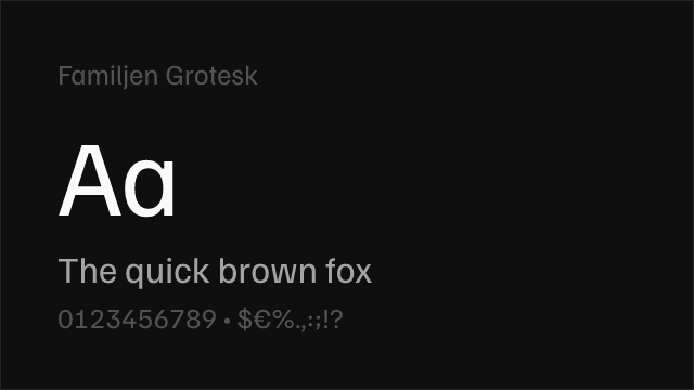
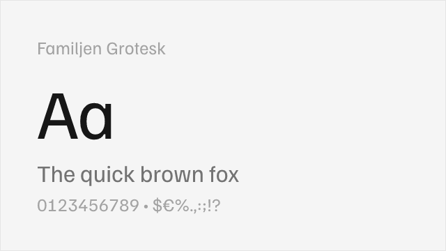
Familjen Grotesk
| Founders Grotesk | Familjen Grotesk | Match |
|---|---|---|
| Regular (400) | Regular (400) | close |
| Medium (500) | Medium (500) | close |
| Bold (700) | Bold (700) | close |
DM Sans
| Founders Grotesk | DM Sans | Match |
|---|---|---|
| Light (300) | Light (300) | close |
| Regular (400) | Regular (400) | close |
| Medium (500) | Medium (500) | close |
| Semibold (600) | Semi Bold (600) | close |
Libre Franklin
| Founders Grotesk | Libre Franklin | Match |
|---|---|---|
| Light (300) | Light (300) | close |
| Regular (400) | Regular (400) | close |
| Medium (500) | Medium (500) | close |
| Bold (700) | Bold (700) | close |
Source Sans 3
| Founders Grotesk | Source Sans 3 | Match |
|---|---|---|
| Light (300) | Light (300) | close |
| Regular (400) | Regular (400) | close |
| Medium (500) | Medium (500) | substitute |
| Bold (700) | Bold (700) | close |
Public Sans
| Founders Grotesk | Public Sans | Match |
|---|---|---|
| Light (300) | Light (300) | close |
| Regular (400) | Regular (400) | close |
| Medium (500) | Medium (500) | close |
| Bold (700) | Bold (700) | close |
Performance Guide
Production performance metrics for each alternative.
How to Use Inter
Copy these code snippets to quickly add Inter to your project.
CSS code for Inter
@import url('https://fonts.googleapis.com/css2?family=Inter:wght@100..900&display=swap');HTML code for Inter
<link rel="preconnect" href="https://fonts.googleapis.com">
<link rel="preconnect" href="https://fonts.gstatic.com" crossorigin>
<link href="https://fonts.googleapis.com/css2?family=Inter:wght@100..900&display=swap" rel="stylesheet">
Tailwind code for Inter
// tailwind.config.js
module.exports = {
  theme: {
    extend: {
      fontFamily: {
        'inter': ['Inter', 'sans-serif'],
      },
    },
  },
}

// Usage in HTML:
// <p class="font-inter">Your text here</p>
Next.js code for Inter
// Using next/font (Next.js 13+)
import { Inter } from 'next/font/google';

const inter = Inter({
  subsets: ['latin'],
  weight: ['100', '200', '300', '400', '500', '600', '700', '800', '900'],
});

export default function Component() {
  return (
    <p className={inter.className}>
      Your text here
    </p>
  );
}

// Or using inline styles with Google Fonts link:
// <p style={{ fontFamily: "'Inter'" }}>Your text</p>
Expo and React Native code for Inter
// Install: npx expo install @expo-google-fonts/inter expo-font
import { useFonts, Inter_400Regular } from '@expo-google-fonts/inter';

export default function App() {
  const [fontsLoaded] = useFonts({
    Inter_400Regular,
  });

  if (!fontsLoaded) return null;

  return (
    <Text style={{ fontFamily: 'Inter_400Regular' }}>
      Your text here
    </Text>
  );
}
Recommended Font Pairings
These free fonts pair well with Inter Founders Grotesk for headlines, body text, or accent use.
Source Serif Pro's structured, rational serifs create disciplined editorial contrast against Founders Grotesk's tight grotesque headlines, echoing the kind of sans-serif/serif pairing found in quality newspaper and magazine design
Literata's warm, contemporary serifs provide reading comfort in body text that balances Founders Grotesk's crisp editorial precision in headlines and navigation, creating a pairing suited to digital publications and content-heavy platforms
Lora's calligraphic serifs introduce organic warmth that offsets Founders Grotesk's mechanical tightness, producing an editorial pairing with visual tension that works well for literary magazines, cultural publications, and long-form storytelling
Browse Alternatives by Context
Find Founders Grotesk alternatives filtered by specific use case, style, or language support.
By Script
Frequently Asked Questions
What is the best free alternative to Founders Grotesk?
Inter is the best free alternative to Founders Grotesk with a FontAlternatives similarity score of 82%. It shares similar proportions and characteristics while being available under the OFL-1.1 license for both personal and commercial use at no cost.
Is there a free version of Founders Grotesk?
There is no official free version of Founders Grotesk. However, Inter is available under the OFL-1.1 open-source license and achieves a FontAlternatives similarity score of 82%. It includes variable weights and supports latin, latin-extended.
What Google Font looks like Founders Grotesk?
The Google Fonts most similar to Founders Grotesk are Inter, Work Sans, Familjen Grotesk. Among these alternatives, Inter offers the closest match with a FontAlternatives similarity score of 82% and includes variable weights for flexible typography options.
Can I use Inter commercially?
Yes, Inter can be used commercially. It is licensed under OFL-1.1, which allows free use in websites, applications, print materials, and commercial projects without purchasing a license or paying royalties.
Is Inter similar enough to Founders Grotesk?
Inter achieves a FontAlternatives similarity score of 82% compared to Founders Grotesk. While not identical, it offers comparable letterforms, proportions, and visual style. Most designers find it works excellently as a substitute in web and print projects.
What are the main differences between Founders Grotesk and its free alternatives?
Free alternatives to Founders Grotesk may differ in subtle details like letter spacing, curve refinements, and available weights. Premium fonts typically include more OpenType features, extended language support, and optimized screen rendering. However, for most projects, these differences are negligible.
Where can I download free alternatives to Founders Grotesk?
Download Inter directly from Google Fonts. Click the "Get Font" button on any alternative listed above to visit the official download page. Google Fonts also provides convenient embed codes for seamless web integration.