Free Alternatives to Campton with Minimal Style
Campton is known for its minimal aesthetic. If you're looking for a free sans serif font with a similar minimal feel, these 8 alternatives offer comparable characteristics. We've identified 8 that are especially well-suited for this context. All are available under open-source licenses for unrestricted commercial use.
Top Picks
Comparison Table
| Font | Relevance ⓘ
How well this alternative fits the specific context (use-case or trait) of this page. Score 0–100 based on matching keywords, industries, and font characteristics. Alternatives scoring 25+ are highlighted.
| Similarity ⓘ
How visually similar this free font is to the premium original. Score 0–100 based on x-height, width, stroke contrast, use-case overlap, and language coverage.
Learn more → | Weights | Variable | License | Source |
|---|---|---|---|---|---|---|
| Jost | 87 | 86% | Variable | Yes | OFL-1.1 | Google Fonts ↗ |
| DM Sans | 86 | 78% | Variable | Yes | OFL-1.1 | Google Fonts ↗ |
| Nunito Sans | 85 | 76% | Variable | Yes | OFL-1.1 | Google Fonts ↗ |
| Montserrat | 75 | 74% | Variable | Yes | OFL-1.1 | Google Fonts ↗ |
| Libre Franklin | 59 | 72% | Variable | Yes | OFL-1.1 | Google Fonts ↗ |
| Poppins | 52 | 83% | 9 | No | OFL-1.1 | Google Fonts ↗ |
| Raleway | 46 | 80% | Variable | Yes | OFL-1.1 | Google Fonts ↗ |
| Montserrat Alternates | 34 | 70% | 9 | No | OFL-1.1 | Google Fonts ↗ |
All Alternatives (8)
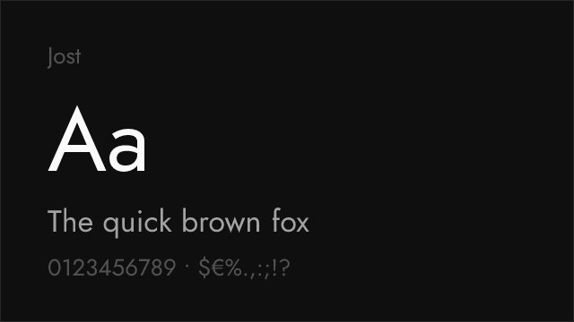

Closest geometric match with Futura-rooted proportions and clean personality


Modern geometric grotesque with clean proportions and excellent screen rendering


Friendly geometric sans with clean proportions and broad language support


Geometric sans inspired by Buenos Aires signage with extensive weight range


Clean American gothic with editorial pedigree and restrained character


Widely adopted geometric sans with comparable friendly warmth and full weight range


Elegant geometric with distinctive thin weights and refined character
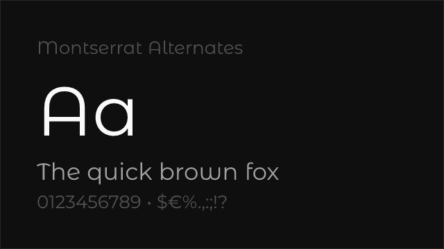
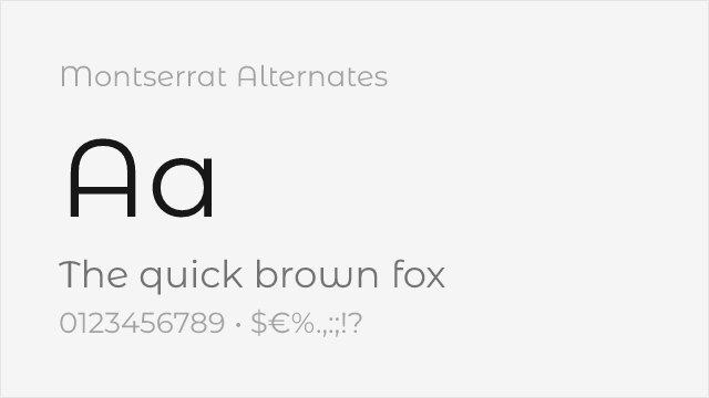
Montserrat variant with softer, curved alternate letterforms