Free Alternatives to Campton

About Campton
- Foundry
- Rene Bieder
- Classification
- sans-serif
- Style
- geometric
Brands Using Campton
Former brand typeface used across marketing and product before switching to Uber Move
E-commerce brand identity and editorial typography
Banking app and marketing materials across European markets
Brand identity across web and mobile booking platform
Campton is a geometric sans-serif typeface designed by Rene Bieder, an independent German type designer known for crafting versatile workhorse families. Released in 2014, Campton draws its inspiration from the early 20th-century geometric sans-serif tradition — the lineage of Futura, Kabel, and Erbar — but filters that heritage through a contemporary lens that prioritizes screen legibility and brand versatility. Where Futura's strict geometry can feel academic and cold, Campton introduces subtle humanist warmth that makes it comfortable in both display and body text roles. The typeface has become a staple in European branding and editorial design, valued for its ability to feel simultaneously modern and timeless.
Campton requires a paid license from Rene Bieder. Desktop, web, and app licenses are available through the Rene Bieder Type foundry website, with pricing that scales by usage type. There is no free trial version. If your project cannot accommodate the licensing cost, this page covers the best open-source alternatives and the criteria for evaluating them.
Why Campton Matters
Campton matters because Rene Bieder — an independent German type designer working without the resources of a major foundry — produced a geometric sans-serif that went head-to-head with Futura, Avenir, and Circular and won real market share. Bieder was not backed by Lineto's Swiss prestige or Monotype's distribution network. He built Campton as a solo practitioner, priced it more accessibly than the Klim and Commercial Type alternatives that dominated the premium market, and found an audience among the smaller studios and mid-market brands that could not justify CHF 50+ per font style. This pricing strategy, combined with genuine design quality, made Campton one of the most commercially successful independent type releases of the 2010s.
What Campton solved was Futura's body-text problem. Futura's strict mathematical geometry — the perfectly circular o, the rigidly even strokes — creates striking headlines but produces uncomfortable, uneven paragraphs at reading sizes. Text set in Futura at 14px feels mechanical and cold. Campton keeps the geometric proportions that make Futura headlines compelling but introduces enough humanist warmth in its x-height calibration and stroke-weight distribution that running text at body sizes reads naturally. This dual-size competence — geometric impact at display, humanist comfort at text — is what made Uber, N26, and Farfetch choose it over Futura itself.
What distinguishes Campton from the dozens of geometric sans-serifs released in the 2010s is Rene Bieder's attention to proportional balance. Many geometric sans-serifs sacrifice readability at body sizes for dramatic impact at display sizes. Campton avoids this trap through careful x-height calibration and stroke weight distribution that keeps paragraphs readable without losing the geometric clarity that makes headlines distinctive. This dual utility — performing equally well at 12px body text and 72px headlines — is what made it a go-to choice for branding agencies building complete identity systems.
The typeface's European origin also contributes to its character. German precision in engineering meets a warmth that prevents the clinical feeling common in purely rationalist type design. This balance has made Campton popular with Scandinavian, German, and Dutch design studios who value functional clarity but reject coldness.
Rene Bieder has built a reputation for independently produced typefaces that compete with major foundry releases in both quality and versatility. Campton remains his most commercially successful design, speaking to the sustained demand for geometric sans-serifs that feel contemporary without being trendy.
Design Characteristics
Campton's design positions it squarely in the geometric sans-serif tradition while incorporating enough humanist nuance to remain comfortable in long-form reading:
- Moderate x-height with generous ascenders: The x-height is slightly taller than Futura but shorter than screen-optimized fonts like Inter, creating proportions that work equally well in print and digital contexts
- Circular bowl construction: The
o,b,d,p, andqfeature nearly circular bowls that define Campton's geometric identity, though subtle flattening at the extremes prevents the mechanical perfection of pure geometric types - Single-story lowercase a: The default single-story
areinforces the geometric character and gives Campton a more modern, approachable feel than double-story alternatives - Even stroke weight distribution: Nearly monoline construction produces consistent typographic color across paragraphs, essential for the editorial density typical of magazine and corporate layouts
- Slightly squared terminals: Stroke endings carry a subtle squareness that adds crispness without the softness of rounded terminals, distinguishing Campton from friendlier geometric sans-serifs like Nunito
- Generous letter-spacing: Default tracking is calibrated for comfortable reading at body sizes, with enough air between characters to maintain clarity in dense text blocks
- Comprehensive weight range: Available from Thin through Black with matching italics, providing the full typographic hierarchy needed for complex identity systems
Where Campton Excels
Campton performs at its best in contexts that need geometric clarity with warmth:
- Brand identity systems: The comprehensive weight range and balanced proportions support everything from logo lockups to body copy within a single typeface family
- Corporate communications: Annual reports, investor presentations, and internal documents benefit from Campton's professional clarity without the coldness of purely rationalist alternatives
- Editorial layouts: Magazine spreads and content-heavy websites use Campton effectively for both headlines and running text, a versatility many geometric sans-serifs lack
- Technology product marketing: Landing pages, pitch decks, and product marketing materials leverage Campton's modern, trustworthy character
- Packaging design: Campton's clean geometry reproduces well across packaging substrates, maintaining legibility at small sizes on labels and cartons
- Signage and wayfinding: The even stroke weights and open letterforms perform reliably at large sizes and viewing distances
Where Campton Struggles
Campton is not the optimal choice for every context:
- High-density user interfaces: Screen-optimized typefaces like Inter or SF Pro outperform Campton in data-heavy dashboards and complex form layouts where aggressive hinting and tighter metrics matter
- Display and editorial drama: Campton's balanced neutrality means it lacks the personality to carry dramatic editorial headlines — typefaces like Clash Display or Right Grotesk make stronger statements
- Projects requiring Cyrillic or Greek: Campton supports Latin and Latin Extended only, requiring fallback strategies for multilingual deployments
- Budget-constrained web projects: The per-project licensing model can be prohibitive for small teams needing desktop, web, and app coverage
- Ultra-compact UI: Campton's generous default spacing, while excellent for readability, consumes more horizontal space than condensed alternatives in tight interface layouts
- Avant-garde or experimental contexts: Campton's mainstream professionalism makes it unsuitable for projects that need to signal creative risk-taking or countercultural energy
How to Choose a Free Substitute
When evaluating free replacements for Campton, focus on these criteria:
Geometric proportions and bowl shapes: Campton's circular bowls and moderate x-height are its most recognizable features. Test alternatives by setting lowercase
o,b,d, andpside by side — the rounder and more consistent the bowls, the closer the match. Jost and Poppins approximate this geometry most faithfully.Weight range coverage: Campton ships from Thin to Black with full italic support. Your alternative needs at least Light, Regular, Medium, SemiBold, and Bold to replicate common branding hierarchies. Variable font alternatives offer an advantage here, allowing continuous weight adjustment.
Typographic color in body text: Set a full paragraph at 14-16px in both Campton and your candidate. Campton produces very even color without light or dark spots. Alternatives that are too geometric (like strict Futura revivals) will produce uneven color due to extreme bowl shapes.
Single-story vs. double-story a: Campton's default single-story
acontributes significantly to its geometric character. If your alternative uses a double-storyaby default, check whether stylistic alternates are available, or evaluate whether the difference matters at your target sizes.Spacing and rhythm: Campton's generous but controlled letter-spacing is key to its readability. Test your alternative in a real layout context — a branding spread or a marketing landing page — and verify that the text feels similarly airy and balanced without being loose.
Premium Font Neighbors
If Campton's geometric approach resonates but you want to explore the premium landscape:
Cluster A: Modern geometric sans-serifs (direct competitors)
- Avenir (Linotype) — Adrian Frutiger's refined geometric; more reserved and classical than Campton
- Circular (Lineto) — the dominant geometric sans of the 2010s tech scene; rounder and more uniform than Campton
- Brandon Grotesque (HvD Fonts) — similar friendly geometry with a more vintage, art-deco flavor
Cluster B: Versatile sans-serifs with geometric DNA
- Graphik (Commercial Type) — blends geometric structure with grotesque clarity; more neutral than Campton
- Messina Sans (Luzi Type) — contemporary geometric with excellent screen optimization
- Geograph (Rene Bieder) — Bieder's own companion to Campton with more humanist warmth
- Rational (Rene Bieder) — Bieder's more rationalist geometric, sharing Campton's DNA but with sharper precision
FAQ
Is Campton free?
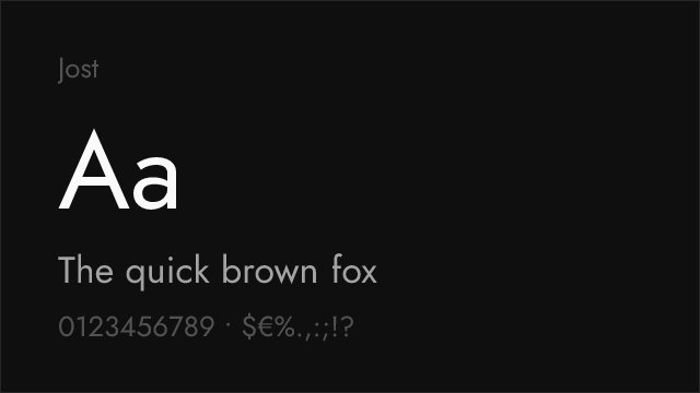
No. Campton is a premium typeface from Rene Bieder with per-project licensing. Desktop, web, and app licenses are priced separately. There is no free tier, trial version, or student discount publicly available. The best free alternative is Jost at 86% similarity.
What is the best free alternative to Campton?
Jost is the closest free alternative at 86% similarity. Both share geometric foundations rooted in the early 20th-century tradition, with circular bowls, even stroke weights, and a friendly personality. Jost adds variable font support and optical sizing, making it technically superior for web deployment in some respects.
Is Campton a variable font?
No. Campton ships as individual static font files across its weight range. Notably, Jost — Campton's closest free alternative at 86% similarity — is a variable font with an optical sizing axis, giving it a concrete practical advantage over Campton for web deployment: a single Jost variable file replaces what would be multiple Campton static files. Most other free alternatives (Raleway, DM Sans, Montserrat) also offer variable font support.
Who designed Campton?
Rene Bieder, an independent German type designer. Bieder operates his own foundry and has produced a catalog of geometric and grotesque typefaces including Geograph, Rational, and Argument. Campton remains his most widely recognized and commercially successful design.
What fonts are similar to Campton?
In the premium space, Campton's closest relatives include Circular (Lineto), Avenir (Linotype), and Brandon Grotesque (HvD Fonts). Among free alternatives, Jost (86% similarity), Poppins (83%), and Raleway (80%) offer the closest geometric match. All share the clean, friendly geometric character that defines Campton's identity.
Does Campton support Cyrillic?
No. Campton supports Latin and Latin Extended scripts only. For projects requiring Cyrillic support with a similar geometric aesthetic, Jost, Poppins, and Montserrat are the standard open-source options, all offering Cyrillic coverage alongside their Latin character sets.
Why did Uber stop using Campton?
Uber transitioned from Campton to their custom-designed Uber Move typeface as part of a broader brand identity overhaul. Custom typefaces give large brands precise control over their visual identity and eliminate ongoing licensing costs at scale. This is a common trajectory for major tech companies — Campton served Uber well during its growth phase before the brand matured enough to justify custom type investment.
Is Campton good for body text?
Yes. Unlike many geometric sans-serifs that only perform well at display sizes, Campton was specifically designed for both headline and body text use. Its moderate x-height, even stroke distribution, and generous spacing maintain readability at body sizes (12-16px) in both print and digital contexts. This dual utility is one of its key advantages.
How does Campton compare to Futura?
Both are geometric sans-serifs, but they serve different purposes. Futura (1927) is the foundational geometric typeface with strict, almost mathematical construction. Campton incorporates subtle humanist warmth that makes it more comfortable for extended reading. Campton also has more contemporary proportions optimized for screen use, whereas Futura was designed for metal type and can feel rigid in digital contexts.
What weight of Campton should I use for body text?
Campton Regular (400) or Book (350, if available in your license) are the standard choices for body text. For screen use at small sizes, Medium (500) can improve legibility on lower-resolution displays. For print at 9-10pt, Regular works well on coated paper, while Book provides a slightly lighter touch on uncoated stock.
Is Campton on Google Fonts?
No, Campton is a premium font from Rene Bieder and is not available on Google Fonts.
The closest Google Fonts alternative is Jost with 86% similarity. Get it free on Google Fonts ↗
Free Alternatives (8)

Closest geometric match with Futura-rooted proportions and clean personality


Widely adopted geometric sans with comparable friendly warmth and full weight range


Elegant geometric with distinctive thin weights and refined character


Modern geometric grotesque with clean proportions and excellent screen rendering


Friendly geometric sans with clean proportions and broad language support


Geometric sans inspired by Buenos Aires signage with extensive weight range


Clean American gothic with editorial pedigree and restrained character
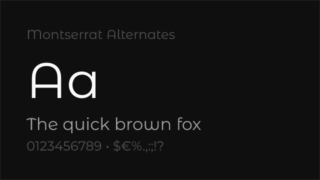
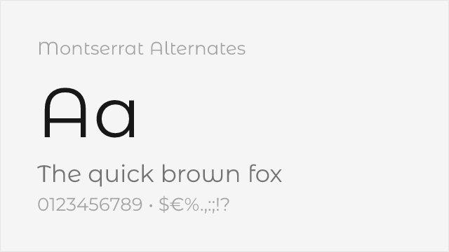
Montserrat variant with softer, curved alternate letterforms
See where Campton is used in the wild and swap to free alternatives live.
Install FontSwap →Replacement Summary
Source: FontAlternatives.com
Premium font: Campton
Best free alternative: Jost
FontAlternatives similarity score: 86%
Replacement difficulty: Low
Best for: brand identity systems, corporate presentations, editorial layouts, packaging design
Notable users: Uber, Farfetch, N26
Not recommended when: Brand consistency with Uber requires exact letterforms
What is the best free alternative to Campton?
Jost is the best free alternative to Campton with a FontAlternatives similarity score of 86%.
Jost shares similar proportions, stroke characteristics, and intended use with Campton. It is available under the OFL-1.1 license, which permits both personal and commercial use at no cost.
This alternative works particularly well for: brand identity systems, corporate presentations, editorial layouts, packaging design.
Can I safely replace Campton with Jost?
Yes, Jost is a high-confidence replacement for Campton. The FontAlternatives similarity score of 86% indicates strong structural compatibility.
Licensing: Jost is licensed under OFL-1.1, which allows commercial use without licensing fees or royalties.
Weight coverage: All 4 weights have exact matches available.
When should I NOT replace Campton?
While Jost is a strong alternative, there are situations where replacing Campton may not be appropriate:
- Brand consistency: Campton is commonly seen in European corporate identity systems contexts where exact letterforms may be required.
- Strict compliance: Verify that OFL-1.1 terms meet your specific legal and compliance requirements.
Weight-Matching Guide
Map Campton weights to their closest free alternatives for accurate font substitution.
Jost
| Campton | Jost | Match |
|---|---|---|
| Thin (100) | Thin (100) | exact |
| Light (300) | Light (300) | exact |
| Regular (400) | Regular (400) | exact |
| Bold (700) | Bold (700) | exact |
Poppins
| Campton | Poppins | Match |
|---|---|---|
| Light (300) | Light (300) | exact |
| Regular (400) | Regular (400) | exact |
| Medium (500) | Medium (500) | exact |
| Bold (700) | Bold (700) | exact |
Raleway
| Campton | Raleway | Match |
|---|---|---|
| Thin (100) | Thin (100) | exact |
| Light (300) | Light (300) | exact |
| Regular (400) | Regular (400) | close |
| Bold (700) | Bold (700) | close |
DM Sans
| Campton | DM Sans | Match |
|---|---|---|
| Light (300) | Light (300) | close |
| Regular (400) | Regular (400) | close |
| Medium (500) | Medium (500) | close |
| Bold (700) | Bold (700) | close |
Nunito Sans
| Campton | Nunito Sans | Match |
|---|---|---|
| Light (300) | Light (300) | close |
| Regular (400) | Regular (400) | close |
| Medium (500) | Medium (500) | close |
| Bold (700) | Bold (700) | close |
Montserrat
| Campton | Montserrat | Match |
|---|---|---|
| Light (300) | Light (300) | close |
| Regular (400) | Regular (400) | close |
| Medium (500) | Medium (500) | close |
| Bold (700) | Bold (700) | close |
Libre Franklin
| Campton | Libre Franklin | Match |
|---|---|---|
| Light (300) | Light (300) | close |
| Regular (400) | Regular (400) | close |
| Medium (500) | Medium (500) | substitute |
| Bold (700) | Bold (700) | close |
Performance Guide
Production performance metrics for each alternative.
How to Use Jost
Copy these code snippets to quickly add Jost to your project.
CSS code for Jost
@import url('https://fonts.googleapis.com/css2?family=Jost:wght@100..900&display=swap');HTML code for Jost
<link rel="preconnect" href="https://fonts.googleapis.com">
<link rel="preconnect" href="https://fonts.gstatic.com" crossorigin>
<link href="https://fonts.googleapis.com/css2?family=Jost:wght@100..900&display=swap" rel="stylesheet">
Tailwind code for Jost
// tailwind.config.js
module.exports = {
  theme: {
    extend: {
      fontFamily: {
        'jost': ['Jost', 'sans-serif'],
      },
    },
  },
}

// Usage in HTML:
// <p class="font-jost">Your text here</p>
Next.js code for Jost
// Using next/font (Next.js 13+)
import { Jost } from 'next/font/google';

const jost = Jost({
  subsets: ['latin'],
  weight: ['100', '200', '300', '400', '500', '600', '700', '800', '900'],
});

export default function Component() {
  return (
    <p className={jost.className}>
      Your text here
    </p>
  );
}

// Or using inline styles with Google Fonts link:
// <p style={{ fontFamily: "'Jost'" }}>Your text</p>
Expo and React Native code for Jost
// Install: npx expo install @expo-google-fonts/jost expo-font
import { useFonts, Jost_400Regular } from '@expo-google-fonts/jost';

export default function App() {
  const [fontsLoaded] = useFonts({
    Jost_400Regular,
  });

  if (!fontsLoaded) return null;

  return (
    <Text style={{ fontFamily: 'Jost_400Regular' }}>
      Your text here
    </Text>
  );
}
Recommended Font Pairings
These free fonts pair well with Jost Campton for headlines, body text, or accent use.
Source Serif Pro's transitional serifs create a warm, authoritative contrast against Campton's clean geometric forms — both share a commitment to readability and editorial precision that makes them natural partners for magazine and corporate layouts
Playfair Display's high-contrast didone serifs provide dramatic visual tension against Campton's restrained geometry, a classic editorial pairing that works for fashion, culture, and luxury brand applications
Crimson Pro's refined book serifs complement Campton's geometric clarity in long-form reading contexts, bringing warmth and traditional readability to editorial layouts where Campton handles headlines and navigation
Browse Alternatives by Context
Find Campton alternatives filtered by specific use case, style, or language support.
By Script
Frequently Asked Questions
What is the best free alternative to Campton?
Jost is the best free alternative to Campton with a FontAlternatives similarity score of 86%. It shares similar proportions and characteristics while being available under the OFL-1.1 license for both personal and commercial use at no cost.
Is there a free version of Campton?
There is no official free version of Campton. However, Jost is available under the OFL-1.1 open-source license and achieves a FontAlternatives similarity score of 86%. It includes variable weights and supports latin, latin-extended.
What Google Font looks like Campton?
The Google Fonts most similar to Campton are Jost, Poppins, Raleway. Among these alternatives, Jost offers the closest match with a FontAlternatives similarity score of 86% and includes variable weights for flexible typography options.
Can I use Jost commercially?
Yes, Jost can be used commercially. It is licensed under OFL-1.1, which allows free use in websites, applications, print materials, and commercial projects without purchasing a license or paying royalties.
Is Jost similar enough to Campton?
Jost achieves a FontAlternatives similarity score of 86% compared to Campton. While not identical, it offers comparable letterforms, proportions, and visual style. Most designers find it works excellently as a substitute in web and print projects.
What are the main differences between Campton and its free alternatives?
Free alternatives to Campton may differ in subtle details like letter spacing, curve refinements, and available weights. Premium fonts typically include more OpenType features, extended language support, and optimized screen rendering. However, for most projects, these differences are negligible.
Where can I download free alternatives to Campton?
Download Jost directly from Google Fonts. Click the "Get Font" button on any alternative listed above to visit the official download page. Google Fonts also provides convenient embed codes for seamless web integration.