Free Alternatives to Comic Sans

About Comic Sans
- Foundry
- Microsoft
- Classification
- display
- Style
- handwritten
Commonly Seen In
Comic Sans MS was designed by Vincent Connare at Microsoft in 1994. The brief was specific: create a casual typeface for speech bubbles in Microsoft Bob, a short-lived software product that used cartoon characters to guide users through tasks. Connare drew inspiration from comic book lettering — particularly the hand-lettered dialogue in The Dark Knight Returns and Watchmen — and the result was a typeface that felt human in a way no system font had before.
When Comic Sans shipped with Windows 95, it escaped its intended context entirely. Teachers printed worksheets in it. Office workers set memos in it. Churches used it for bulletins. Comic Sans became the default choice for anyone who wanted text to feel "friendly" — and, inevitably, it appeared in contexts where friendliness was wildly inappropriate: medical consent forms, police reports, gravestones.
Why People Search for Alternatives
The case against Comic Sans is rarely about the design itself. The letterforms are legible, the personality is genuine, and the proportions work at text sizes. The problem is context collapse: a typeface designed for cartoon speech bubbles carries those associations wherever it goes. A legal brief set in Comic Sans reads as unserious not because the letters are poorly drawn, but because the reader's brain has filed this font under "birthday party invitation."
People searching for Comic Sans alternatives generally want one of two things: the same casual warmth without the cultural baggage, or a more refined version of the informal handwritten genre.
Design Anatomy
Comic Sans has several distinctive characteristics:
- Irregular stroke widths: Strokes vary in weight as a hand-drawn pen would, thickening at turns
- Rounded terminals: Stroke endings are soft and open, never sharp
- Bouncy baseline: Letters sit at slightly different heights, mimicking handwriting
- Open counters: The interiors of letters like 'e', 'a', and 'g' are generous, aiding legibility
- No true italic: The "italic" is simply the regular design slanted mechanically
- Limited weights: Regular and Bold only — no light, medium, or semibold
The Accessibility Angle
Comic Sans has genuine advocates in the accessibility community. The British Dyslexia Association has noted that its letter differentiation — particularly the distinct 'b', 'd', 'p', and 'q' shapes — helps some dyslexic readers. The irregular forms reduce the "mirroring" effect that causes confusion in more symmetrical typefaces. While purpose-built dyslexia fonts like OpenDyslexic exist, Comic Sans remains widely available and familiar.
Where Comic Sans Still Works
Strip away the snobbery and Comic Sans serves real purposes:
- Elementary education: Young readers benefit from letterforms that resemble handwriting
- Children's content: Games, apps, and books targeting ages 4-10
- Informal personal communication: Party invitations, family newsletters, refrigerator notes
- Accessibility contexts: Documents designed for readers who struggle with conventional typography
- Intentional humor: When the casual tone is the point, not an accident
Where It Fails
Comic Sans is the wrong choice for anything requiring credibility, authority, or professional polish. Corporate presentations, academic papers, marketing materials for serious products, legal documents, financial reports — these contexts demand typography that signals competence. The font's association with amateur design is so strong that using it in professional settings actively undermines the content.
Choosing a Replacement
Comic Neue is the closest match — it was literally designed as a refined Comic Sans. If you need the exact same personality but cleaner, start there. Patrick Hand offers a more authentic handwritten feel with better-drawn letterforms. Caveat provides a variable weight range and a sketchier, more organic character that works well in note-taking and annotation contexts.
Is Comic Sans on Google Fonts?
No, Comic Sans is a premium font from Microsoft and is not available on Google Fonts.
The closest Google Fonts alternative is Comic Neue with 90% similarity. Get it free on Google Fonts ↗
Free Alternatives (3)
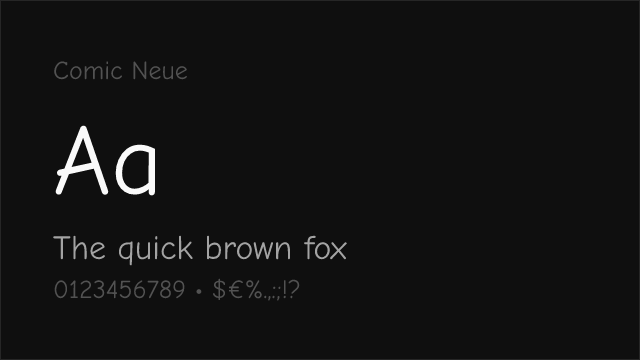
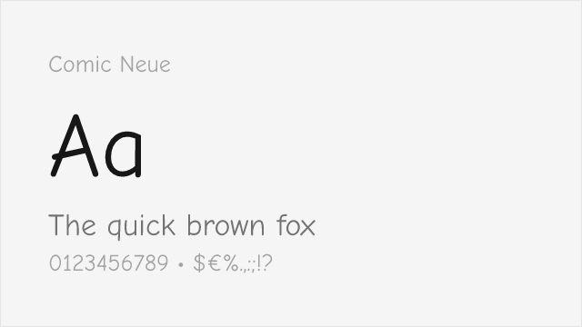
Purpose-built Comic Sans replacement by Craig Rozynski — same casual spirit with harmonized proportions, consistent stroke widths, and three weights instead of two
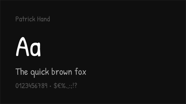
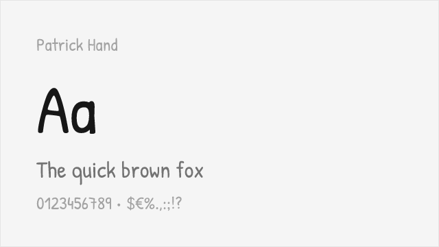
Genuine handwritten feel with cleaner letterforms than Comic Sans, though only available in regular weight — best for informal display text
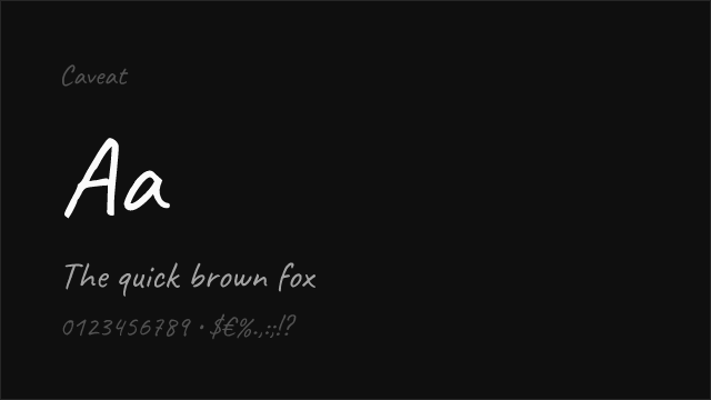
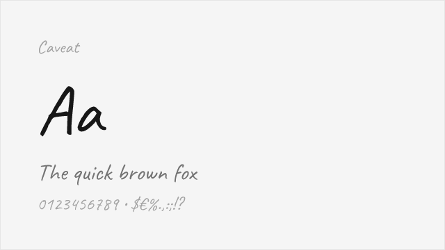
Variable handwritten font (400-700) with more organic, sketchy character — less structured than Comic Sans but captures the same casual warmth
See where Comic Sans is used in the wild and swap to free alternatives live.
Install FontSwap →Performance Guide
Production performance metrics for each alternative.
How to Use Comic Neue
Copy these code snippets to quickly add Comic Neue to your project.
CSS code for Comic Neue
@import url('https://fonts.googleapis.com/css2?family=Comic+Neue:wght@300;400;700&display=swap');HTML code for Comic Neue
<link rel="preconnect" href="https://fonts.googleapis.com">
<link rel="preconnect" href="https://fonts.gstatic.com" crossorigin>
<link href="https://fonts.googleapis.com/css2?family=Comic+Neue:wght@300;400;700&display=swap" rel="stylesheet">
Tailwind code for Comic Neue
// tailwind.config.js
module.exports = {
  theme: {
    extend: {
      fontFamily: {
        'comic-neue': ['"Comic Neue"', 'sans-serif'],
      },
    },
  },
}

// Usage in HTML:
// <p class="font-comic-neue">Your text here</p>
Next.js code for Comic Neue
// Using next/font (Next.js 13+)
import { Comic_Neue } from 'next/font/google';

const comic_neue = Comic_Neue({
  subsets: ['latin'],
  weight: ['300', '400', '700'],
});

export default function Component() {
  return (
    <p className={comic_neue.className}>
      Your text here
    </p>
  );
}

// Or using inline styles with Google Fonts link:
// <p style={{ fontFamily: '"Comic Neue"' }}>Your text</p>
Expo and React Native code for Comic Neue
// Install: npx expo install @expo-google-fonts/comic-neue expo-font
import { useFonts, Comic_Neue_400Regular } from '@expo-google-fonts/comic-neue';

export default function App() {
  const [fontsLoaded] = useFonts({
    Comic_Neue_400Regular,
  });

  if (!fontsLoaded) return null;

  return (
    <Text style={{ fontFamily: 'Comic_Neue_400Regular' }}>
      Your text here
    </Text>
  );
}
Recommended Font Pairings
These free fonts pair well with Comic Neue Comic Sans for headlines, body text, or accent use.
Browse Alternatives by Context
Find Comic Sans alternatives filtered by specific use case, style, or language support.
By Style
By Script
Frequently Asked Questions
What is the best free alternative to Comic Sans?
Comic Neue is the best free alternative to Comic Sans with a FontAlternatives similarity score of 90%. It shares similar proportions and characteristics while being available under the OFL-1.1 license for both personal and commercial use at no cost.
Is there a free version of Comic Sans?
There is no official free version of Comic Sans. However, Comic Neue is available under the OFL-1.1 open-source license and achieves a FontAlternatives similarity score of 90%. It includes 3 weights and supports latin, latin-extended.
What Google Font looks like Comic Sans?
The Google Fonts most similar to Comic Sans are Comic Neue, Patrick Hand, Caveat. Among these alternatives, Comic Neue offers the closest match with a FontAlternatives similarity score of 90% and includes 3 weights for design flexibility.
Can I use Comic Neue commercially?
Yes, Comic Neue can be used commercially. It is licensed under OFL-1.1, which allows free use in websites, applications, print materials, and commercial projects without purchasing a license or paying royalties.
Is Comic Neue similar enough to Comic Sans?
Comic Neue achieves a FontAlternatives similarity score of 90% compared to Comic Sans. While not identical, it offers comparable letterforms, proportions, and visual style. Most designers find it works excellently as a substitute in web and print projects.
What are the main differences between Comic Sans and its free alternatives?
Free alternatives to Comic Sans may differ in subtle details like letter spacing, curve refinements, and available weights. Premium fonts typically include more OpenType features, extended language support, and optimized screen rendering. However, for most projects, these differences are negligible.
Where can I download free alternatives to Comic Sans?
Download Comic Neue directly from Google Fonts. Click the "Get Font" button on any alternative listed above to visit the official download page. Google Fonts also provides convenient embed codes for seamless web integration.