 Install FontSwap
Free Alternatives to Didot Supporting Cyrillic
Need a free alternative to Didot with Cyrillic script support? These 3 options include Cyrillic characters and share visual similarities with Didot. Each is licensed for free personal and commercial use.
Top Picks
Comparison Table
| Font | Relevance ⓘ
How well this alternative fits the specific context (use-case or trait) of this page. Score 0–100 based on matching keywords, industries, and font characteristics. Alternatives scoring 25+ are highlighted.
| Similarity ⓘ
How visually similar this free font is to the premium original. Score 0–100 based on x-height, width, stroke contrast, use-case overlap, and language coverage.
Learn more → | Weights | Variable | License | Source |
|---|---|---|---|---|---|---|
| Playfair Display | 0 | 85% | Variable | Yes | OFL-1.1 | Google Fonts ↗ |
| Cormorant Garamond | 0 | 72% | Variable | Yes | OFL-1.1 | Google Fonts ↗ |
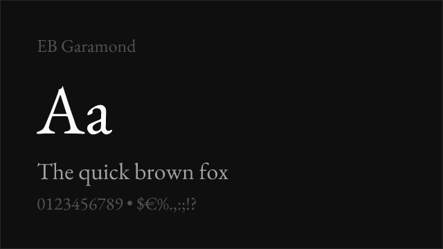
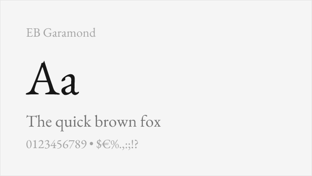
| EB Garamond | 0 | 58% | Variable | Yes | OFL-1.1 | Google Fonts ↗ |
All Alternatives (3)
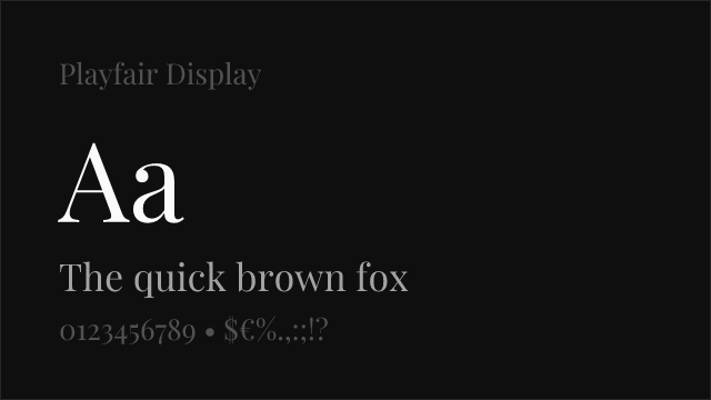
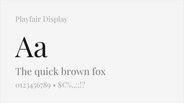
[Google Fonts] · OFL-1.1 · Variable
Contemporary interpretation with similar dramatic contrast for display use
Why it matches: Playfair Display captures the essential Didone aesthetic—high contrast, elegant proportions, and sophisticated character—while adding subtle refinements for digital reproduction. Both share the dramatic thick-thin variation and refined letterforms that define French neoclassical typography. Playfair's slightly softer details improve screen rendering without sacrificing the aspirational elegance Didot represents.
fashion editorialsmagazine headlineswedding stationeryluxury branding
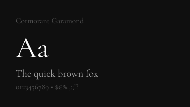
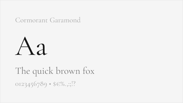
[Google Fonts] · OFL-1.1 · Variable
High-contrast display serif with elegant, Didot-adjacent thins
Why it matches: Cormorant Garamond pushes an old-style skeleton toward high contrast and fine, refined thins, landing far closer to Didot's fashionable elegance than a plain text serif. At display sizes its delicate strokes and graceful curves echo Didot's luxury character, a strong free pick for headlines.
display headlinesluxury brandingeditorial titles
[Google Fonts] · OFL-1.1 · Variable
Low-contrast text serif — the readable companion for Didot's fragile display
Why it matches: EB Garamond is not a visual match for Didot — it is an old-style, low-contrast face — but it solves Didot's biggest practical problem. Where Didot's hairlines fall apart at text sizes, EB Garamond stays sturdy and readable, so it is the free serif to set body copy in beneath a Didot-style headline.
body text under Didot headlineslong-form readingeditorial body