Free Alternatives to GT Canon Supporting Cyrillic
Need a free alternative to GT Canon with Cyrillic script support? These 5 options include Cyrillic characters and share visual similarities with GT Canon. Each is licensed for free personal and commercial use.
Top Picks
Comparison Table
| Font | Relevance ⓘ
How well this alternative fits the specific context (use-case or trait) of this page. Score 0–100 based on matching keywords, industries, and font characteristics. Alternatives scoring 25+ are highlighted.
| Similarity ⓘ
How visually similar this free font is to the premium original. Score 0–100 based on x-height, width, stroke contrast, use-case overlap, and language coverage.
Learn more → | Weights | Variable | License | Source |
|---|---|---|---|---|---|---|
| Source Serif Pro | 0 | 80% | Variable | Yes | OFL-1.1 | Google Fonts ↗ |
| Lora | 0 | 76% | Variable | Yes | OFL-1.1 | Google Fonts ↗ |
| EB Garamond | 0 | 74% | Variable | Yes | OFL-1.1 | Google Fonts ↗ |
| Cormorant Garamond | 0 | 72% | 5 | No | OFL-1.1 | Google Fonts ↗ |
| Playfair Display | 0 | 70% | Variable | Yes | OFL-1.1 | Google Fonts ↗ |
All Alternatives (5)
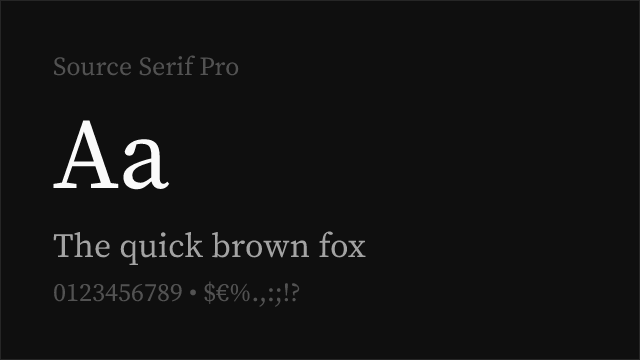

[Google Fonts] · OFL-1.1 · Variable
Adobe's transitional serif with optical sizing and variable font support
Why it matches: Source Serif Pro shares GT Canon's commitment to a systematic serif family that performs across sizes. Both feature transitional construction with moderate stroke contrast, designed for sustained reading. Source Serif Pro's optical sizing provides size-specific optimization comparable to GT Canon's three optical size subfamilies (Small, Regular, Large). The proportions and x-height are similar, making it the closest structural match among free serifs.
long-form editorial contentacademic and technical publishingcross-platform reading applicationscorporate documents and reports
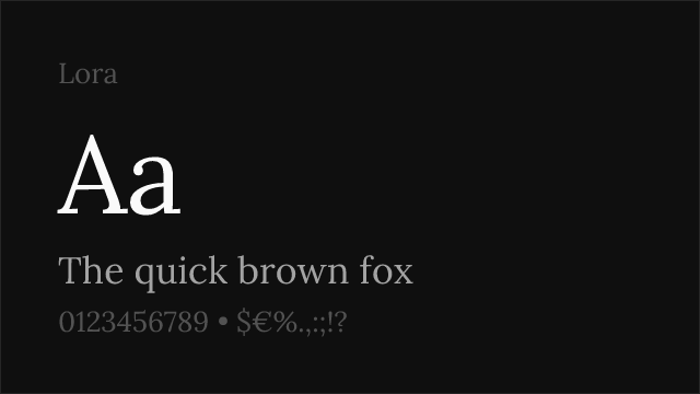

[Google Fonts] · OFL-1.1 · Variable
Calligraphy-influenced serif with variable support and strong screen rendering
Why it matches: Lora shares GT Canon's balance between classical serif forms and contemporary sensibility. Both produce warm, inviting text suitable for extended reading. Lora's slightly calligraphic curves give it more visible personality than GT Canon's more restrained transitional forms, but the overall reading experience is comparable. Lora's variable font support and four-weight range cover most editorial needs.
literary and editorial websitesbook typography for digitalbranding with serif warmthcontent platforms and blogs
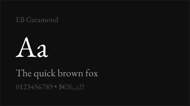

[Google Fonts] · OFL-1.1 · Variable
Scholarly revival of Claude Garamont's originals with meticulous historical accuracy
Why it matches: EB Garamond represents the humanist and old-style tradition that GT Canon deliberately bridges with its transitional construction. Both typefaces are designed for serious editorial contexts and extended reading. EB Garamond's sharper contrast and Renaissance proportions produce a more classical atmosphere, but its text-setting quality at small sizes is comparable to GT Canon's Small optical size.
scholarly and academic publishingliterary and cultural institutionsluxury print designclassical editorial aesthetics


[Google Fonts] · OFL-1.1 · 5 weights
High-contrast display Garamond with dramatic presence and variable support
Why it matches: Cormorant Garamond captures the expressive end of the serif spectrum that GT Canon reaches through its Large optical size. Both typefaces can produce dramatic headlines and refined display typography. Cormorant's higher contrast and sharper serifs give it more visual drama than GT Canon's more restrained transitional approach, making it particularly effective at display sizes.
display and headline typographyluxury brand communicationsfashion editorialcultural event materials


[Google Fonts] · OFL-1.1 · Variable
High-contrast transitional display serif designed for headlines and titles
Why it matches: Playfair Display shares GT Canon's transitional framework but pushes contrast to dramatic extremes suited for display typography. Both typefaces can anchor editorial layouts with authoritative serif headlines. Playfair's sharper thin strokes and more pronounced ball terminals give it a more decorative character than GT Canon's measured approach, but the underlying proportional logic is related.
editorial headlinesfashion and lifestyle brandingluxury packagingmagazine covers and titles