Free Alternatives to GT Canon

About GT Canon
- Foundry
- Grilli Type
- Classification
- serif
- Style
- transitional
Brands Using GT Canon
Flagship serif spanning 224 styles across five widths plus a monospaced companion
Long-form editorial and magazine typography requiring optical size, width, and weight flexibility
Brand identity systems requiring a serif that scales from business cards to billboards
High-contrast display type for fashion magazines and luxury branding, using the Large optical size for headlines and covers
 See GT Canon live on these sites with FontSwap →
GT Canon is a serif typeface by Grilli Type, released in 2026. Grilli Type frames it as its answer to what a contemporary serif should be, in both form and function. GT Canon spans 224 discrete styles across six subfamilies: the five widths — Condensed, Narrow, Standard, Extended, and Expanded — plus a monospaced companion (GT Canon Mono). Each of the five proportional widths is drawn in three optical sizes (Small, Medium, Large) and seven weights with matching italics, while GT Canon Mono covers a single optical size. Every style is an individually drawn static cut rather than an instance interpolated from a variable axis.
GT Canon requires a commercial license from Grilli Type. Licensing is available through grillitype.com. Trial fonts are available for testing. There is no free tier or Google Fonts availability. For projects that need a similar serif system without the license cost, the alternatives below cover the best open-source options.
Why GT Canon Matters
The serif landscape has been bifurcated for years. On one side: text serifs designed for reading, optimized at 10-12pt, with modest contrast and conservative proportions. On the other: display serifs designed for impact, with high contrast, dramatic details, and proportions that fall apart below 16px. Most projects need both, which means licensing two separate serif families and managing the visual seam between them.
GT Canon's significance is its ambition to unify these two roles in a single system. The three optical sizes (Small, Medium, Large) are not just scaled versions of the same design — they are structurally different typefaces that share a common design language. GT Canon Small has lower contrast, open counters, and sturdy serifs for text legibility. GT Canon Large has high contrast, refined details, and the visual drama expected of display typography. The Medium sits between them.
The name is a clue to that ambition. In traditional typography, "Canon" was one of the largest standard body sizes, a display grade of type used for titling and the opening pages of important texts. A family that borrows the name is announcing its display credentials up front, and the Large optical size is where GT Canon pays that promise off: hairline thins, sharp bracketing, and the kind of contrast that carries a magazine cover. The Small size is the counterweight, drawn to survive the exact conditions where a display face falls apart.
Why does this matter in practice? Most serifs force a compromise. Set a text serif large and it looks bland and underpowered. Set a display serif small and the hairlines vanish and the counters clog. GT Canon's optical range means a single family can carry a masthead, a standfirst, and a caption without any of them looking borrowed from a different typeface. That coherence is the real product.
Combined with five widths and seven weights, this creates a typographic matrix of 224 discrete styles that can handle any editorial context from footnotes to billboards. Each of those styles is a separately drawn static cut, so the range is resolved by hand across every optical size, width, and weight rather than derived on the fly from an axis.
Design Characteristics
GT Canon reads as a functional, contemporary serif rather than a period revival. It uses the familiar transitional serif structure — a broadly vertical stress and bracketed serifs — but, in Grilli Type's framing, pursues modern functionality rather than stylistic reinvention:
- Three optical sizes: Small (text), Medium (intermediate), and Large (display), each structurally optimized for its target size range. This is not just thinning or thickening strokes — the skeleton, serif construction, and proportions change between sizes.
- Five widths: Condensed, Narrow, Standard, Extended, and Expanded. Each width is independently designed across all weights and optical sizes.
- Seven weights: Light, Regular, Medium, Semibold, Bold, Heavy, and Black — from Light to Black, providing extensive typographic hierarchy within a single family.
- Transitional construction: Vertical stress axis, bracketed serifs, and moderate stroke contrast in the Medium optical size. The Small size reduces contrast for text resilience; the Large size increases it for display impact.
- Monospaced companion: GT Canon Mono extends the system to tabular data, code, and technical content, with proportions harmonized to the proportional designs.
- Discrete static styles: The 224 styles are delivered as individually drawn static cuts, with each optical size, width, and weight resolved by hand rather than interpolated from an axis.
What ties the system together is a single decision about contrast, applied at three intensities. Grilli Type describes the family less as a historical revival than as a functional, contemporary serif, and that shows in the details: the thickening of the verticals, the way the serifs sit down onto the baseline, the restraint in the terminals. There is movement in the letterforms without ornament for its own sake. Nothing here is fussy.
The contrast axis is the part worth understanding before you license it. In the Small size, thick and thin strokes stay close together, which keeps the letters solid at 9 or 10 point. In the Large size, the same skeleton is stretched into a high-contrast display cut, with hairlines thin enough to feel elegant on a poster and fragile anywhere else. The Medium size holds the middle ground for subheads, pull quotes, and shorter passages. Choosing the wrong optical size for the job is the most common way to make GT Canon look worse than a cheaper serif would.
The overall aesthetic is sophisticated without being precious. GT Canon aims for the broadest possible utility, functioning as reliably in a legal brief as in a fashion editorial.
Where GT Canon Excels
GT Canon rewards projects that need one serif to do several jobs at once. The moment a brand or publication has to move between headline, deck, and caption, the optical range starts earning its license.
- Editorial design: Magazines, newspapers, and digital publications where a single serif system must handle everything from captions to headlines
- Brand identity: Organizations that want a serif anchor for their typographic system with the flexibility to cover every touchpoint
- Publishing: Book and journal typography where optical sizing ensures quality across text, chapter titles, and cover designs
- Corporate communications: Annual reports, whitepapers, and institutional documents requiring authoritative serif typography
- Luxury and fashion: The Large optical size provides the high-contrast drama these sectors demand
Fashion and luxury are where GT Canon looks most at home. The high-contrast Large cut has the poise these categories expect from display serifs, and because it belongs to the same family as the text sizes, a magazine or lookbook can run a dramatic cover and a readable feature well without switching typefaces. That continuity is hard to fake with two unrelated fonts, and it is the specific reason to reach for a system this large rather than a single display serif.
Where It Struggles
No typeface this ambitious is without trade-offs, and most of GT Canon's come down to matching the optical size to the medium and paying for range you may not use.
- Hairlines on low-resolution screens: The Large optical size is high-contrast by design, and those thin strokes can shimmer, alias, or drop out entirely on standard-density displays. It was drawn for print and high-DPI screens. Push it small on an ordinary monitor and the elegance turns to noise.
- Care required at text sizes: The family only reads well when the optical size matches the setting. Use the Large cut for body copy and the counters tighten and the thins weaken; use the Small cut for a cover and it looks underpowered. GT Canon punishes the lazy default of setting everything in one size more than a single-purpose serif would.
- Budget-constrained projects: GT Canon's comprehensive nature means licensing can be significant. The full 224-style library, web fonts, and app embedding add up quickly, and for a project that only needs a text serif, most of that range sits unused. There is no free tier and no Google Fonts version, so the cost is real up front.
- Minimal brand systems: If your brand only needs one weight of serif for occasional use, GT Canon's systematicity is wasted. A focused family like Source Serif Pro serves the purpose at no cost.
- Sans-serif-dominant contexts: In UI-heavy applications where serif is used sparingly, GT Canon's depth offers no advantage over a simpler serif like Lora or Libre Baskerville.
How to Choose a Free Substitute
When evaluating free alternatives to GT Canon, prioritize:
- Text performance at 10-14px: Test body text rendering at the sizes you will actually use. GT Canon Small is optimized for this range; your substitute needs to perform similarly.
- Weight range: GT Canon spans Light to Black. Ensure your substitute covers at least Regular through Bold for basic typographic hierarchy.
- Optical sizing: Source Serif Pro's optical sizing is the closest free equivalent to GT Canon's three-size system.
- Variable font availability: GT Canon itself is offered as discrete static styles, but for web projects a free serif with a variable weight axis reduces file count and enables precise weight tuning on your side.
- Width variants: GT Canon's five widths are difficult to replicate with free fonts. If you need condensed and expanded variants, you may need to combine two free serif families.
- Italic quality: GT Canon's italics are carefully drawn across all sizes and widths. Verify your substitute's italics are not afterthoughts.
No single free serif replaces the whole system, so the practical move is to pick by the job in front of you. The choice usually comes down to which optical role you are trying to cover:
- Closest all-round match → Source Serif Pro. Its optical sizing and variable weight range make it the nearest free equivalent to GT Canon's structure, and it is the safe default when you need one font to behave across text and subhead sizes.
- Screen body text → Libre Baskerville or Lora. Both were tuned for the screen. Libre Baskerville is the more neutral, institutional choice; Lora adds a little calligraphic warmth when the reading should feel inviting rather than official.
- Book and long-form publishing → Crimson Pro or EB Garamond. These lean older and more classical than GT Canon's contemporary line, but they hold text color beautifully over pages of running type, which is exactly where a display-leaning family is the wrong tool.
- Display and headlines → Cormorant Garamond or Playfair Display. This is the closest free stand-in for what GT Canon's Large optical size does. Both push contrast for impact, so they earn their keep on covers, titles, and fashion mastheads, and both weaken if you drag them down into body copy — the same discipline GT Canon demands.
A useful rule mirrors the font itself: choose by size role, not by overall resemblance. Pair a text-optimized free serif for the small stuff with a high-contrast one for the display, and you approximate GT Canon's optical range with two free families instead of one paid system.
Premium Font Neighbors
If GT Canon's approach appeals to you, these premium serifs occupy adjacent territory:
Cluster A: Systematic editorial serifs
- Freight Text / Freight Display (GarageFonts) — a two-family system separating text and display optimization
- Chronicle / Chronicle Display (Hoefler&Co) — text and display variants with coordinated design
- Miller (Font Bureau) — Scotch Roman with text and display versions
- Tiempos (Klim Type Foundry) — elegant text serif with a strong body text heritage
Cluster B: Contemporary transitional serifs
- Signifier (Klim Type Foundry) — a serif inspired by early laser printer technology with sharp, contemporary detailing
- GT Sectra (Grilli Type) — Grilli's other serif, with more angular, cut-stone character
- Editorial New (Pangram Pangram) — contemporary transitional with editorial focus
- Utopia (Adobe) — Robert Slimbach's transitional serif with optical sizing
- Canela (Commercial Type) — a high-contrast serif with subtle flared terminals, popular in fashion and luxury branding; the closest neighbor to what GT Canon's Large optical size sets out to do
All fonts listed above are premium/commercial typefaces requiring paid licenses.
If your interest in GT Canon is really about the display end — the high-contrast, fashion-facing headline voice — Canela and Signifier are the two neighbors worth auditioning first. If it is about the systematic, size-aware structure, Freight and Chronicle are the closer comparisons.
FAQ
What is the best free alternative to GT Canon?
Source Serif Pro is the closest free alternative at 80% similarity. It shares GT Canon's transitional construction, optical sizing, and systematic approach to serif typography. For display contexts, Crimson Pro or Cormorant Garamond offer comparable elegance.
How many styles does GT Canon include?
GT Canon includes 224 styles organized into six subfamilies: the five widths — Condensed, Narrow, Standard, Extended, and Expanded — plus a monospaced companion (GT Canon Mono). Each of the five proportional widths is drawn in three optical sizes (Small, Medium, Large) and seven weights with matching italics, while GT Canon Mono covers a single optical size, so (5 × 3 optical + Mono) × 7 weights × 2 for italics works out to 224. Every style is a discrete, individually drawn cut.
Is GT Canon available as a variable font?
Grilli Type presents GT Canon as 224 discrete, individually drawn styles rather than a variable font, so plan on choosing the specific optical sizes, widths, and weights you need rather than interpolating along an axis. If a variable serif is a hard requirement for your build, a free family such as Source Serif Pro or Crimson Pro offers a genuine variable weight axis.
What is the difference between GT Canon and GT Sectra?
Both are Grilli Type serifs, but they occupy different territory. GT Canon is a smooth, contemporary transitional serif, with rounded curves and bracketed serifs. GT Sectra is more angular, with sharp wedge serifs inspired by the process of cutting letterforms in stone. GT Canon is warmer and more classical; GT Sectra is more distinctive and cut-stone in character.
Can GT Canon be used for body text?
Yes. GT Canon Small is specifically designed for body text at 8-14pt, with reduced contrast, open counters, and sturdy serifs that maintain legibility at small sizes. The Medium and Large optical sizes are intended for intermediate and display use, respectively.
Is GT Canon suitable for web typography?
Yes. Grilli Type offers web font licenses, and the family's range of optical sizes lets you match the cut to the setting. Because GT Canon is delivered as discrete styles rather than a single variable file, load only the specific widths, weights, and optical sizes a given page needs to keep web font payloads reasonable. For projects that cannot justify the license, Source Serif Pro — with its variable font and optical sizing — provides the closest free web equivalent. One caution: reserve the Large optical size for headline sizes and high-density screens, because its high-contrast hairlines can shimmer or thin out in small on-screen text.
Why is it called GT Canon?
"Canon" is a historical name for one of the largest standard type sizes, a display grade used for titling and important openings. The name signals the family's display ambition, which lands in the high-contrast Large optical size. It is a nod to a typographic size rather than to any single historical style — Grilli Type describes the design as a contemporary, functional serif rather than a strict revival.
Is GT Canon good for fashion and luxury branding?
Yes, and this is one of its strongest use cases. The Large optical size delivers the high-contrast, refined display look that fashion and luxury projects expect, while the Small and Medium sizes handle captions, credits, and body copy in the same voice. That range lets a brand run dramatic covers and readable interiors from one family. Among free stand-ins, Cormorant Garamond and Playfair Display come closest to the display end, though neither offers GT Canon's matched text sizes.
Is GT Canon on Google Fonts?
No, GT Canon is a premium font from Grilli Type and is not available on Google Fonts.
The closest Google Fonts alternative is Source Serif Pro with 80% similarity. Get it free on Google Fonts ↗
Free Alternatives (7)
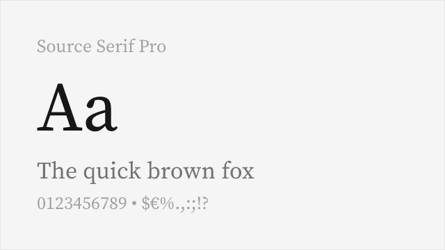
Adobe's transitional serif with optical sizing and variable font support
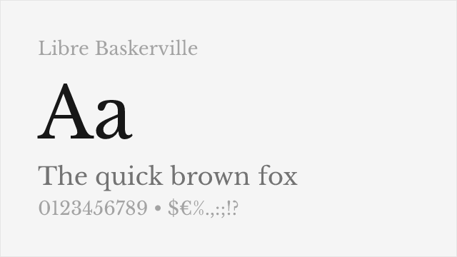
Optimized for body text on screen with traditional transitional proportions
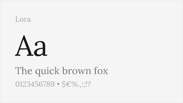
Calligraphy-influenced serif with variable support and strong screen rendering
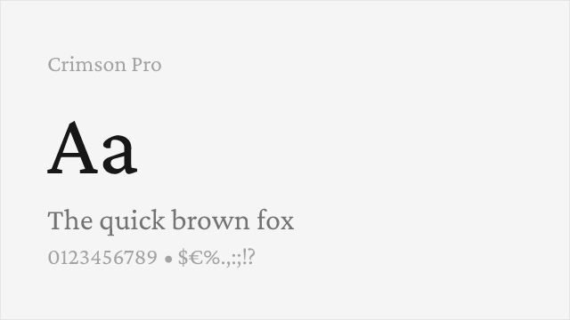
Renaissance-inspired text serif with variable weight and comprehensive OpenType features
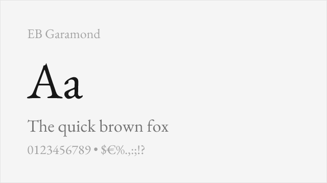
Scholarly revival of Claude Garamont's originals with meticulous historical accuracy
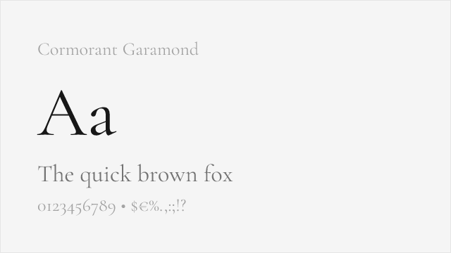
High-contrast display Garamond with dramatic presence and variable support
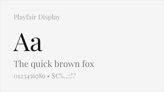
High-contrast transitional display serif designed for headlines and titles
Compare the alternatives
See how GT Canon compares to its top alternatives — and how those alternatives compare to each other — side by side.
See where GT Canon is used in the wild and swap to free alternatives live.
Install FontSwap →Replacement Summary
Source: FontAlternatives.com
Premium font: GT Canon
Best free alternative: Source Serif Pro
FontAlternatives similarity score: 80%
Replacement difficulty: Medium
Best for: long-form editorial content, academic and technical publishing, cross-platform reading applications, corporate documents and reports
Notable users: Grilli Type, Editorial Publishers, Luxury Brands
Not recommended when: Brand consistency with Grilli Type requires exact letterforms
What is the best free alternative to GT Canon?
Source Serif Pro is the best free alternative to GT Canon with a FontAlternatives similarity score of 80%.
Source Serif Pro shares similar proportions, stroke characteristics, and intended use with GT Canon. It is available under the OFL-1.1 license, which permits both personal and commercial use at no cost.
This alternative works particularly well for: long-form editorial content, academic and technical publishing, cross-platform reading applications, corporate documents and reports.
Can I safely replace GT Canon with Source Serif Pro?
Yes, with some considerations. Source Serif Pro achieves a FontAlternatives similarity score of 80%, indicating good structural compatibility for most use cases.
Licensing: Source Serif Pro is licensed under OFL-1.1, which allows commercial use without licensing fees or royalties.
Weight coverage: Most weights have close or exact matches available.
When should I NOT replace GT Canon?
While Source Serif Pro is a strong alternative, there are situations where replacing GT Canon may not be appropriate:
- Optical precision requirements: Source Serif Pro has measurable structural differences from GT Canon that may be visible in precise design work.
- Strict compliance: Verify that OFL-1.1 terms meet your specific legal and compliance requirements.
Weight-Matching Guide
Map GT Canon weights to their closest free alternatives for accurate font substitution.
Source Serif Pro
| GT Canon | Source Serif Pro | Match |
|---|---|---|
| Light | Light (300) | close |
| Regular | Regular (400) | close |
| Semi Bold | Semi Bold (600) | close |
| Bold | Bold (700) | close |
Libre Baskerville
| GT Canon | Libre Baskerville | Match |
|---|---|---|
| Regular | Regular (400) | close |
| Bold | Bold (700) | close |
| Italic | Italic (400) | close |
| Bold Italic | Bold Italic (700) | close |
Lora
| GT Canon | Lora | Match |
|---|---|---|
| Regular | Regular (400) | close |
| Medium | Medium (500) | close |
| Semi Bold | Semi Bold (600) | close |
| Bold | Bold (700) | close |
Crimson Pro
| GT Canon | Crimson Pro | Match |
|---|---|---|
| Light | Light (300) | close |
| Regular | Regular (400) | close |
| Semi Bold | Semi Bold (600) | close |
| Bold | Bold (700) | close |
EB Garamond
| GT Canon | EB Garamond | Match |
|---|---|---|
| Regular | Regular (400) | close |
| Medium | Medium (500) | close |
| Semi Bold | Semi Bold (600) | close |
| Bold | Extra Bold (800) | substitute |
Cormorant Garamond
| GT Canon | Cormorant Garamond | Match |
|---|---|---|
| Light | Light (300) | close |
| Regular | Regular (400) | close |
| Medium | Medium (500) | close |
| Bold | Bold (700) | close |
Playfair Display
| GT Canon | Playfair Display | Match |
|---|---|---|
| Regular | Regular (400) | close |
| Medium | Medium (500) | close |
| Bold | Bold (700) | close |
| Black | Black (900) | close |
Performance Guide
Production performance metrics for each alternative.
How to Use Source Serif Pro
Copy these code snippets to quickly add Source Serif Pro to your project.
CSS code for Source Serif Pro
@import url('https://fonts.googleapis.com/css2?family=Source+Serif+Pro:wght@100..900&display=swap');HTML code for Source Serif Pro
<link rel="preconnect" href="https://fonts.googleapis.com">
<link rel="preconnect" href="https://fonts.gstatic.com" crossorigin>
<link href="https://fonts.googleapis.com/css2?family=Source+Serif+Pro:wght@100..900&display=swap" rel="stylesheet">
Tailwind code for Source Serif Pro
// tailwind.config.js
module.exports = {
  theme: {
    extend: {
      fontFamily: {
        'source-serif-pro': ['"Source Serif Pro"', 'sans-serif'],
      },
    },
  },
}

// Usage in HTML:
// <p class="font-source-serif-pro">Your text here</p>
Next.js code for Source Serif Pro
// Using next/font (Next.js 13+)
import { Source_Serif_Pro } from 'next/font/google';

const source_serif_pro = Source_Serif_Pro({
  subsets: ['latin'],
  weight: ['100', '200', '300', '400', '500', '600', '700', '800', '900'],
});

export default function Component() {
  return (
    <p className={source_serif_pro.className}>
      Your text here
    </p>
  );
}

// Or using inline styles with Google Fonts link:
// <p style={{ fontFamily: '"Source Serif Pro"' }}>Your text</p>
Expo and React Native code for Source Serif Pro
// Install: npx expo install @expo-google-fonts/source-serif-pro expo-font
import { useFonts, Source_Serif_Pro_400Regular } from '@expo-google-fonts/source-serif-pro';

export default function App() {
  const [fontsLoaded] = useFonts({
    Source_Serif_Pro_400Regular,
  });

  if (!fontsLoaded) return null;

  return (
    <Text style={{ fontFamily: 'Source_Serif_Pro_400Regular' }}>
      Your text here
    </Text>
  );
}
Recommended Font Pairings
These free fonts pair well with Source Serif Pro GT Canon for headlines, body text, or accent use.
Inter's clean neo-grotesk character provides excellent contrast with GT Canon's serif refinement, creating a versatile editorial pairing for digital publications and brand systems
Space Grotesk's geometric grotesk personality creates dynamic tension with GT Canon's transitional serif forms, suitable for contemporary editorial and cultural institution design
Source Code Pro's monospace clarity pairs naturally with GT Canon's editorial authority for technical publications, documentation, and developer-facing content
Browse Alternatives by Context
Find GT Canon alternatives filtered by specific use case, style, or language support.
By Style
By Script
Frequently Asked Questions
What is the best free alternative to GT Canon?
Source Serif Pro is the best free alternative to GT Canon with a FontAlternatives similarity score of 80%. It shares similar proportions and characteristics while being available under the OFL-1.1 license for both personal and commercial use at no cost.
Is there a free version of GT Canon?
There is no official free version of GT Canon. However, Source Serif Pro is available under the OFL-1.1 open-source license and achieves a FontAlternatives similarity score of 80%. It includes variable weights and supports latin, latin-extended.
What Google Font looks like GT Canon?
The Google Fonts most similar to GT Canon are Source Serif Pro, Libre Baskerville, Lora. Among these alternatives, Source Serif Pro offers the closest match with a FontAlternatives similarity score of 80% and includes variable weights for flexible typography options.
Can I use Source Serif Pro commercially?
Yes, Source Serif Pro can be used commercially. It is licensed under OFL-1.1, which allows free use in websites, applications, print materials, and commercial projects without purchasing a license or paying royalties.
Is Source Serif Pro similar enough to GT Canon?
Source Serif Pro achieves a FontAlternatives similarity score of 80% compared to GT Canon. While not identical, it offers comparable letterforms, proportions, and visual style. Most designers find it works excellently as a substitute in web and print projects.
What are the main differences between GT Canon and its free alternatives?
Free alternatives to GT Canon may differ in subtle details like letter spacing, curve refinements, and available weights. Premium fonts typically include more OpenType features, extended language support, and optimized screen rendering. However, for most projects, these differences are negligible.
Where can I download free alternatives to GT Canon?
Download Source Serif Pro directly from Google Fonts. Click the "Get Font" button on any alternative listed above to visit the official download page. Google Fonts also provides convenient embed codes for seamless web integration.