Free Alternatives to GT Sectra

About GT Sectra
- Foundry
- Grilli Type
- Classification
- serif
- Style
- contemporary
Brands Using GT Sectra
Long-form editorial content and book publishing arm of Stripe
Blog and editorial content typography
Global affairs and lifestyle magazine editorial design
Luxury fashion e-commerce editorial and product content
GT Sectra is a contemporary editorial serif designed by Noël Leu with Marc Kappeler and released by Grilli Type. Its most distinctive feature is the sharp, angular wedge terminals that result from what Grilli Type describes as a "pen-meets-scalpel" construction — the organic stroke movement of a broad-nib pen intersected by the precise cuts of an engraving tool. This hybrid approach produces a serif that is simultaneously warm and sharp, historical and modern, making GT Sectra one of the most recognizable editorial typefaces of the 2010s and 2020s.
GT Sectra requires a paid license from Grilli Type. Licensing is per-project with separate desktop, web, and app tiers. There is no free tier or trial version. If your budget cannot accommodate Grilli Type's licensing structure, this page covers the best open-source alternatives — though GT Sectra's distinctive wedge terminals make it harder to replace than most editorial serifs.
Why GT Sectra Matters
GT Sectra emerged at a moment when the design world was rediscovering serifs. After years of sans-serif dominance in digital design — driven by Inter, Graphik, and the neo-grotesque wave — editorial teams and tech companies began seeking serifs that felt contemporary rather than nostalgic. GT Sectra answered that need perfectly.
When Stripe Press chose GT Sectra for its book publishing program, it signaled that a financial technology company could produce editorial content with the typographic sophistication of a literary publisher. When Figma used it for blog content, it demonstrated that a design tool company could signal cultural awareness through serif typography without feeling retrograde. Ssense, the luxury fashion platform, deploys GT Sectra to bridge high fashion's visual language with e-commerce functionality.
What these brands recognized is that GT Sectra occupies unique territory: it reads as a serif (authoritative, editorial, serious) while looking distinctly modern (sharp, geometric, precise). The wedge terminals are the key differentiator — they catch the eye at headline sizes while maintaining comfortable reading rhythm at text sizes. No other serif manages this combination in quite the same way.
The typeface's intellectual credibility extends to its construction method. Rather than starting from a historical model and modernizing it (as most contemporary serifs do), GT Sectra starts from the physical act of writing and cuts into it with geometric precision. The result feels discovered rather than designed — as if the letterforms emerged from the collision of two different mark-making traditions.
Design Characteristics
GT Sectra's design is defined by the tension between calligraphic warmth and geometric precision:
- Sharp wedge terminals: The most distinctive feature — stroke endings are cut at sharp angles rather than tapering to points or ending in balls, creating an angular, architectural quality visible at all sizes
- Broad-nib pen skeleton: The underlying stroke structure follows the logic of a broad-nib pen, with natural thick-thin transitions that give the typeface calligraphic warmth despite its geometric surface
- Moderate contrast: The difference between thick and thin strokes is controlled — enough to give GT Sectra editorial presence without the fragility of high-contrast designs that fail on screen
- Generous x-height: Lowercase letters occupy a large proportion of the body height, ensuring legibility at the text sizes where GT Sectra Fine (the body text variant) operates
- Open apertures at text sizes: GT Sectra Fine features more open counters and apertures than the Display variant, optimizing for readability in dense editorial columns
- Three optical variants: GT Sectra Fine for body text, GT Sectra for general use, and GT Sectra Display for headlines — each tuned for its intended scale
- Distinctive uppercase: Capital letters feature the same sharp wedge terminals, creating a commanding presence in headlines and acronyms that sets GT Sectra apart from smoother serif alternatives
- Refined italic: The italic forms maintain the wedge terminal character while introducing additional calligraphic movement, suitable for emphasis in literary and cultural publishing
The family ships in five weights (Thin through Black) with matching italics across Fine, regular, and Display variants.
Where GT Sectra Excels
GT Sectra is at its best in design-forward editorial and cultural contexts:
- Tech company editorial content: Stripe Press, Figma, and similar companies use GT Sectra to produce editorial content that signals cultural sophistication alongside technical credibility
- Contemporary art and design publications: The sharp, architectural character aligns with the visual language of museums, galleries, and design studios
- Fashion editorial: GT Sectra's distinctive personality suits the high-contrast, visually demanding contexts of fashion publishing and luxury branding
- Architectural presentations: The geometric precision and sharp terminals resonate with the language of architectural design
- Independent magazine design: Design-aware publications use GT Sectra to differentiate themselves from the classical serifs of traditional publishing
Where GT Sectra Struggles
No typeface is universal. GT Sectra underperforms in certain contexts:
- High-volume news production: GT Sectra's distinctive character is an asset in considered editorial design but a distraction in the rapid-turnaround, content-dense layouts of daily news production
- Conservative institutional contexts: Banks, law firms, and government agencies typically need serifs that convey tradition and stability rather than GT Sectra's modern sharpness
- Projects requiring extensive language support: GT Sectra covers Latin scripts only. Multilingual projects beyond Western European languages need a fallback strategy
- Budget-conscious web projects: GT Sectra's licensing costs and per-pageview web pricing make it expensive for high-traffic sites. Free alternatives offer 90% of the editorial performance at zero cost
- Contexts where the wedge terminals are distracting: In some body text applications, particularly at smaller sizes on mobile devices, the sharp terminals can create visual noise that interferes with comfortable reading
How to Choose a Free Substitute
When evaluating GT Sectra replacements, accept upfront that the wedge terminals cannot be replicated in any free font. Instead, prioritize these criteria:
- Contemporary editorial personality: GT Sectra's value is partly positional — it signals design awareness and cultural sophistication. Your alternative needs to convey "someone chose this deliberately" rather than "this was the default." Merriweather, Lora, and Literata all achieve this
- Text-size performance: GT Sectra Fine is engineered for body copy. Test your alternative at 14-16px in a two-column layout with 500+ words. The reading comfort should be comparable even if the aesthetic is different
- Weight range for editorial hierarchy: Magazine and publication design requires at least Regular, Semibold, and Bold for article hierarchy. GT Sectra's five weights set a high bar — look for alternatives with at least four
- Screen rendering consistency: Test on Windows, macOS, and mobile. GT Sectra's Grilli Type engineering ensures consistent rendering; your alternative should match this reliability
- Pairing compatibility: GT Sectra pairs naturally with geometric and neo-grotesque sans-serifs. Verify that your serif alternative creates the same kind of clean contrast with your chosen sans-serif
Premium Font Neighbors
If GT Sectra's approach resonates but you want to explore adjacent options:
Cluster A: Contemporary editorial serifs with distinctive character
- Domaine (Klim Type Foundry) — shares GT Sectra's contemporary editorial positioning with more overt historical roots and warmer personality
- GT Super (Grilli Type) — GT Sectra's softer sibling; retro-inflected serif with rounder forms and nostalgic warmth
- Canela (Commercial Type) — bridges serif and sans-serif with soft, organic forms; occupies adjacent design-forward territory
Cluster B: Refined editorial serifs for publication use
- Freight Text (GarageFonts) — a versatile text serif with classical proportions and modern refinement; widely used in book and magazine design
- Arnhem (OurType) — a Dutch editorial serif with strong text performance and distinctive character; similar intellectual positioning
- Tiempos (Klim Type Foundry) — contemporary newsroom serif with softer personality than GT Sectra but similar editorial versatility
- Publico (Commercial Type) — robust editorial serif from the Guardian redesign; more utilitarian than GT Sectra but equally reliable
- Lyon (Commercial Type) — refined literary serif with similar cultural positioning but smoother, less angular personality
FAQ
Is GT Sectra free?
No. GT Sectra is a premium typeface from Grilli Type with per-project licensing. Desktop licenses start around CHF 60 per style, and web licenses are priced by monthly page views. There is no free tier or trial version. For open-source alternatives, Merriweather (78% similarity) is the most practical replacement.
What is the best free alternative to GT Sectra?
Merriweather is the closest practical free alternative at 78% similarity. However, no free font replicates GT Sectra's distinctive wedge terminals — that sharp, architectural quality is unique to GT Sectra's design. Merriweather matches the editorial text performance and screen reliability, making it the best substitute for body text contexts where the specific visual character is less critical.
What makes GT Sectra's design unique?
GT Sectra's distinctive feature is its sharp wedge terminals — stroke endings that are cut at angular, geometric angles rather than tapering gradually. Grilli Type describes the construction as "pen meets scalpel," combining the organic movement of broad-nib calligraphy with the precise cuts of an engraving tool. This produces letterforms that feel simultaneously warm and sharp, historical and modern.
Can I use GT Sectra on the web?
Yes, with a web font license from Grilli Type. Web licenses are priced by monthly page views in tiers. You receive WOFF2 files for self-hosting. GT Sectra is not available through Google Fonts, Adobe Fonts, or any font CDN service.
What is the difference between GT Sectra, GT Sectra Fine, and GT Sectra Display?
GT Sectra Fine is the body text variant, optimized for small sizes with sturdier strokes, wider spacing, and more open counters. GT Sectra is the standard variant for general use. GT Sectra Display features higher contrast and tighter fitting for headline and poster-size applications. Each optical size is tuned for its intended scale.
Does GT Sectra support Cyrillic?
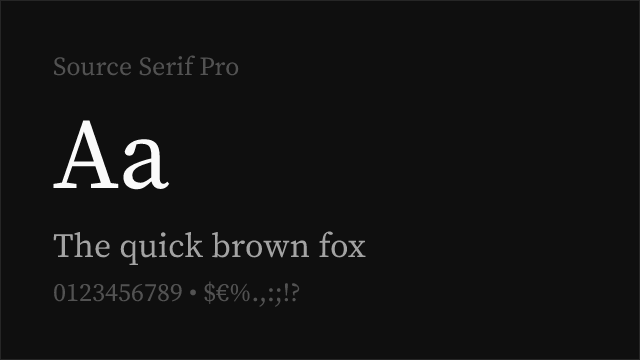
No. GT Sectra supports Latin scripts only (Latin, Latin Extended). For editorial projects requiring Cyrillic, Merriweather or Source Serif Pro are recommended alternatives that offer comparable editorial quality with Cyrillic support.
Who designed GT Sectra?
Noël Leu, with Marc Kappeler, at Grilli Type in Zurich, Switzerland. Leu is known for type designs that explore the intersection of calligraphic tradition and contemporary construction. GT Sectra was one of Grilli Type's early releases and helped establish the foundry's reputation for distinctive, design-forward typefaces.
Why is GT Sectra rated as "hard" to replace?
The wedge terminal construction is GT Sectra's most recognizable feature, and no free font replicates it. Free serifs can match the overall editorial text performance and reading comfort, but the specific sharp, architectural quality that makes GT Sectra distinctive — and the reason brands choose it — is lost in any substitution. If the wedge terminals are central to your design intent, there is no true free equivalent.
Is GT Sectra on Google Fonts?
No, GT Sectra is a premium font from Grilli Type and is not available on Google Fonts.
The closest Google Fonts alternative is Merriweather with 78% similarity. Get it free on Google Fonts ↗
Free Alternatives (7)


Robust editorial serif with strong screen performance as a practical substitute

Contemporary serif with calligraphic warmth as a modern editorial alternative

Google's reading-optimized serif with contemporary refinement and optical sizing


Refined old-style serif with classical elegance and broad weight range

Versatile transitional serif with strong editorial credentials and broad support


Scholarly humanist serif with intellectual authority and exceptional language support

Web-optimized transitional serif with classical editorial reliability
See where GT Sectra is used in the wild and swap to free alternatives live.
Install FontSwap →Replacement Summary
Source: FontAlternatives.com
Premium font: GT Sectra
Best free alternative: Merriweather
FontAlternatives similarity score: 78%
Replacement difficulty: Medium
Best for: editorial body text at scale, content-heavy websites and blogs, corporate editorial communications, digital-first publishing platforms
Notable users: Stripe Press, Figma, Monocle
Not recommended when: Precise optical matching is needed - Merriweather has measurable structural differences
What is the best free alternative to GT Sectra?
Merriweather is the best free alternative to GT Sectra with a FontAlternatives similarity score of 78%.
Merriweather shares similar proportions, stroke characteristics, and intended use with GT Sectra. It is available under the OFL-1.1 license, which permits both personal and commercial use at no cost.
This alternative works particularly well for: editorial body text at scale, content-heavy websites and blogs, corporate editorial communications, digital-first publishing platforms.
Can I safely replace GT Sectra with Merriweather?
Yes, with some considerations. Merriweather achieves a FontAlternatives similarity score of 78%, indicating good structural compatibility for most use cases.
Licensing: Merriweather is licensed under OFL-1.1, which allows commercial use without licensing fees or royalties.
Weight coverage: Most weights have close or exact matches available.
When should I NOT replace GT Sectra?
While Merriweather is a strong alternative, there are situations where replacing GT Sectra may not be appropriate:
- Optical precision requirements: Merriweather has measurable structural differences from GT Sectra that may be visible in precise design work.
- Brand consistency: GT Sectra is commonly seen in Tech company editorial content contexts where exact letterforms may be required.
- Strict compliance: Verify that OFL-1.1 terms meet your specific legal and compliance requirements.
Weight-Matching Guide
Map GT Sectra weights to their closest free alternatives for accurate font substitution.
Merriweather
| GT Sectra | Merriweather | Match |
|---|---|---|
| Light (300) | Light (300) | close |
| Regular (400) | Regular (400) | exact |
| Bold (700) | Bold (700) | exact |
| Black (800) | Black (900) | close |
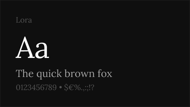
Lora
| GT Sectra | Lora | Match |
|---|---|---|
| Regular (400) | Regular (400) | exact |
| Medium (500) | Medium (500) | exact |
| Semi Bold (600) | Semi Bold (600) | exact |
| Bold (700) | Bold (700) | exact |
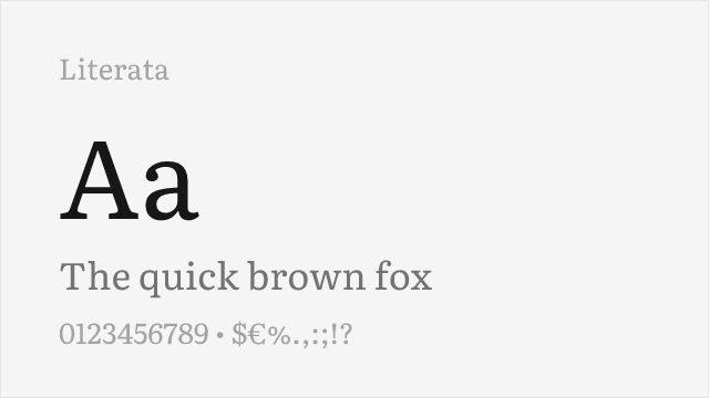
Literata
| GT Sectra | Literata | Match |
|---|---|---|
| Light (300) | Light (300) | close |
| Regular (400) | Regular (400) | exact |
| Semi Bold (600) | Semibold (600) | exact |
| Bold (700) | Bold (700) | exact |
Crimson Pro
| GT Sectra | Crimson Pro | Match |
|---|---|---|
| Light (300) | Light (300) | close |
| Regular (400) | Regular (400) | exact |
| Semi Bold (600) | Semibold (600) | exact |
| Bold (700) | Bold (700) | exact |
Source Serif Pro
| GT Sectra | Source Serif Pro | Match |
|---|---|---|
| Light (300) | Light (300) | close |
| Regular (400) | Regular (400) | exact |
| Semi Bold (600) | Semibold (600) | exact |
| Bold (700) | Bold (700) | exact |
EB Garamond
| GT Sectra | EB Garamond | Match |
|---|---|---|
| Regular (400) | Regular (400) | exact |
| Medium (500) | Medium (500) | exact |
| Semi Bold (600) | Semibold (600) | close |
| Bold (700) | Bold (700) | exact |
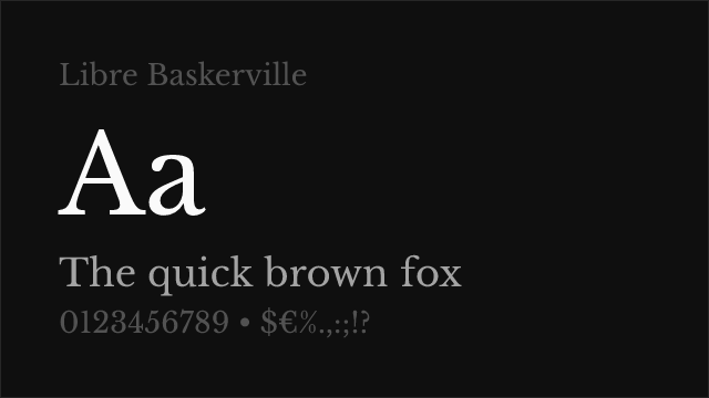
Libre Baskerville
| GT Sectra | Libre Baskerville | Match |
|---|---|---|
| Regular (400) | Regular (400) | exact |
| Bold (700) | Bold (700) | exact |
Performance Guide
Production performance metrics for each alternative.
How to Use Merriweather
Copy these code snippets to quickly add Merriweather to your project.
CSS code for Merriweather
@import url('https://fonts.googleapis.com/css2?family=Merriweather:wght@300;400;700;900&display=swap');HTML code for Merriweather
<link rel="preconnect" href="https://fonts.googleapis.com">
<link rel="preconnect" href="https://fonts.gstatic.com" crossorigin>
<link href="https://fonts.googleapis.com/css2?family=Merriweather:wght@300;400;700;900&display=swap" rel="stylesheet">
Tailwind code for Merriweather
// tailwind.config.js
module.exports = {
  theme: {
    extend: {
      fontFamily: {
        'merriweather': ['Merriweather', 'sans-serif'],
      },
    },
  },
}

// Usage in HTML:
// <p class="font-merriweather">Your text here</p>
Next.js code for Merriweather
// Using next/font (Next.js 13+)
import { Merriweather } from 'next/font/google';

const merriweather = Merriweather({
  subsets: ['latin'],
  weight: ['300', '400', '700', '900'],
});

export default function Component() {
  return (
    <p className={merriweather.className}>
      Your text here
    </p>
  );
}

// Or using inline styles with Google Fonts link:
// <p style={{ fontFamily: "'Merriweather'" }}>Your text</p>
Expo and React Native code for Merriweather
// Install: npx expo install @expo-google-fonts/merriweather expo-font
import { useFonts, Merriweather_400Regular } from '@expo-google-fonts/merriweather';

export default function App() {
  const [fontsLoaded] = useFonts({
    Merriweather_400Regular,
  });

  if (!fontsLoaded) return null;

  return (
    <Text style={{ fontFamily: 'Merriweather_400Regular' }}>
      Your text here
    </Text>
  );
}
Recommended Font Pairings
These free fonts pair well with Merriweather GT Sectra for headlines, body text, or accent use.
Inter's rational neo-grotesque construction creates a compelling contemporary contrast against GT Sectra's sharp serif forms — both typefaces share screen-first engineering and design-forward positioning that suits tech and cultural editorial contexts
Barlow's slightly condensed grotesque proportions pair efficiently with GT Sectra's editorial presence, creating clear typographic hierarchies in design-aware layouts where navigation and body text need distinct voices
Plus Jakarta Sans's geometric warmth balances GT Sectra's architectural sharpness, creating pairings that feel modern and approachable for tech companies and design studios that use GT Sectra in their editorial content
Browse Alternatives by Context
Find GT Sectra alternatives filtered by specific use case, style, or language support.
By Style
By Script
Frequently Asked Questions
What is the best free alternative to GT Sectra?
Merriweather is the best free alternative to GT Sectra with a FontAlternatives similarity score of 78%. It shares similar proportions and characteristics while being available under the OFL-1.1 license for both personal and commercial use at no cost.
Is there a free version of GT Sectra?
There is no official free version of GT Sectra. However, Merriweather is available under the OFL-1.1 open-source license and achieves a FontAlternatives similarity score of 78%. It includes 4 weights and supports latin, latin-extended.
What Google Font looks like GT Sectra?
The Google Fonts most similar to GT Sectra are Merriweather, Lora, Literata. Among these alternatives, Merriweather offers the closest match with a FontAlternatives similarity score of 78% and includes 4 weights for design flexibility.
Can I use Merriweather commercially?
Yes, Merriweather can be used commercially. It is licensed under OFL-1.1, which allows free use in websites, applications, print materials, and commercial projects without purchasing a license or paying royalties.
Is Merriweather similar enough to GT Sectra?
Merriweather achieves a FontAlternatives similarity score of 78% compared to GT Sectra. While not identical, it offers comparable letterforms, proportions, and visual style. Most designers find it works excellently as a substitute in web and print projects.
What are the main differences between GT Sectra and its free alternatives?
Free alternatives to GT Sectra may differ in subtle details like letter spacing, curve refinements, and available weights. Premium fonts typically include more OpenType features, extended language support, and optimized screen rendering. However, for most projects, these differences are negligible.
Where can I download free alternatives to GT Sectra?
Download Merriweather directly from Google Fonts. Click the "Get Font" button on any alternative listed above to visit the official download page. Google Fonts also provides convenient embed codes for seamless web integration.