Free Alternatives to Tiempos

About Tiempos
- Foundry
- Klim Type Foundry
- Classification
- serif
- Style
- editorial
Brands Using Tiempos
Former default editorial serif for premium publication layouts (reported)
Brand editorial content and environmental storytelling (reported)
Editorial serif used across feature stories and digital publishing
Feature article typography and long-form editorial layouts
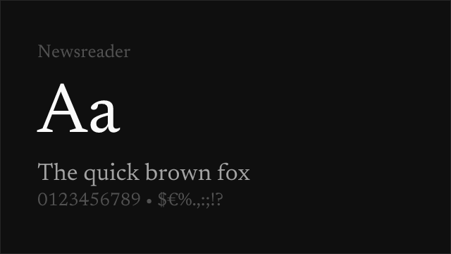
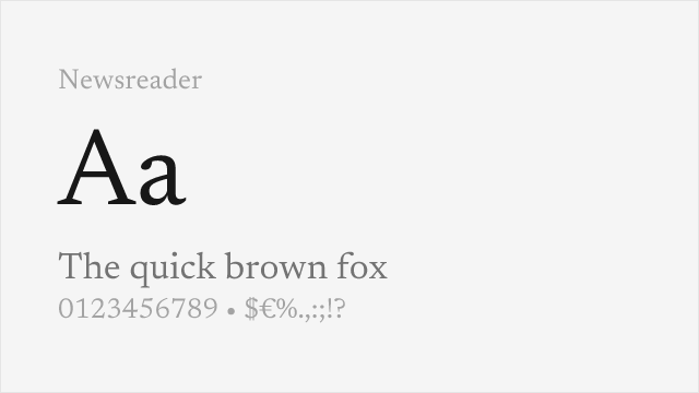
Tiempos is a contemporary editorial serif typeface designed by Kris Sowersby and released by Klim Type Foundry. Built as a modern reinterpretation of the Times tradition, Tiempos distills the best qualities of newspaper serifs — economy, clarity, authority — into a refined family that performs equally well on screen and in print. The family ships in two optical sizes: Tiempos Text for body copy and Tiempos Headline for display, each meticulously calibrated for its intended scale. Since its release, Tiempos has become one of the most trusted editorial serifs in contemporary publishing.
Tiempos requires a paid license from Klim Type Foundry. Pricing follows Klim's per-project licensing model with separate desktop, web, and app tiers. There is no free trial or gratis tier. If your budget cannot accommodate Klim's licensing, this page covers the best open-source alternatives and what to consider when selecting one.
Why Tiempos Matters
Tiempos occupies a critical position in contemporary typography: the credible, modern news serif. When designers need a typeface that conveys journalistic authority without the baggage of Times New Roman, Tiempos is consistently among the first options considered. Its significance lies in solving a problem that plagued editorial design for decades — how to achieve the functional economy of newspaper serifs while looking deliberately chosen rather than defaulted to.
Kris Sowersby designed Tiempos by studying the lineage of Times-influenced serifs and identifying what made them work at a structural level: compact proportions that conserve column space, moderate contrast that maintains even typographic color across dense text blocks, and a rhythm that supports fast, comfortable reading over thousands of words. Then he rebuilt those qualities with contemporary precision, adding the subtle refinements in curve quality, serif bracketing, and spacing that distinguish a premium editorial serif from a utilitarian one.
The result is a typeface that publications adopt when they want to signal both seriousness and design awareness. The New Zealand Herald, Medium, and numerous digital-first publications have deployed Tiempos because it communicates editorial authority — readers unconsciously trust content set in Tiempos the way they trust content from publications that invest in their design. The typeface reads as professional and considered without being cold or academic.
What separates Tiempos from other contemporary editorial serifs is its warmth. Lyon is more restrained, Mercury is more assertive, and Publico is more utilitarian. Tiempos occupies the middle ground — authoritative enough for news, warm enough for lifestyle editorial, refined enough for cultural criticism. This versatility has made it one of the most widely licensed editorial serifs of the past decade.
The two optical sizes are essential to understanding the family. Tiempos Text features sturdier strokes, wider letter spacing, and reduced contrast for comfortable reading at body sizes. Tiempos Headline opens up the contrast, tightens the spacing, and refines the details for display use. Both share the same design DNA but are optimized for radically different contexts — a distinction that separates professional editorial typefaces from fonts that simply come in multiple weights.
Design Characteristics
Tiempos's design reflects Sowersby's deep study of the Times tradition, refined through a contemporary New Zealand lens:
- Moderate, controlled contrast: The thick-thin stroke variation is present but disciplined, giving Tiempos enough serif personality for editorial contexts while maintaining the even typographic color needed for dense news columns and long-form reading
- Compact, efficient proportions: Letters are slightly narrower than classical transitional serifs, creating economical text blocks that conserve column space without sacrificing readability — a direct inheritance from the Times newspaper tradition
- Refined bracketed serifs: The serif transitions are smooth and precisely calibrated, substantial enough to anchor text on screen while refined enough to avoid the blunt heaviness of slab serifs
- Generous x-height: Lowercase letters are proportioned for maximum legibility at the text sizes (10-14pt) where Tiempos Text is designed to operate, ensuring comfortable reading even in tight editorial layouts
- Warm, humanist undertone: Despite its transitional structure, Tiempos carries a subtle warmth in its curves and terminals that distinguishes it from the mechanical precision of Linotype-era news serifs
- True italic with distinct personality: Tiempos's italic is a genuine cursive design with calligraphic character, providing real rhythmic contrast for emphasis, titles, and pull quotes
- Two carefully tuned optical sizes: Tiempos Text and Tiempos Headline are separate designs, not just weight adjustments — each is drawn from scratch for its intended scale
The family ships in six weights (Light through Black) with matching italics across both Text and Headline variants, providing comprehensive hierarchy for complex editorial systems.
Where Tiempos Excels
Tiempos is at its best in editorial, publishing, and journalistic contexts:
- News and magazine editorial: Tiempos's compact proportions and even typographic color make it ideal for multi-column editorial layouts where space efficiency and sustained readability are both essential
- Long-form journalism platforms: The comfortable reading rhythm and warm authority suit feature articles, investigative pieces, and literary journalism that demand sustained attention
- Premium brand editorial content: Companies use Tiempos for blog posts, annual reports, and thought leadership content where they need to convey editorial credibility alongside brand sophistication
- Cultural and lifestyle publications: Tiempos's warmth distinguishes it from more austere news serifs, making it well-suited for food, travel, architecture, and lifestyle editorial contexts
- Book and journal design: The comprehensive weight range and optical sizing provide the hierarchy depth and text performance that serious publishing demands
- Corporate communications: Annual reports, white papers, and stakeholder communications benefit from Tiempos's balance of authority and approachability
Where Tiempos Struggles
Tiempos was designed for editorial contexts, and its strengths become limitations outside that world:
- High-fashion and luxury display: Tiempos's editorial practicality reads as too understated for the dramatic, high-contrast display typography that fashion brands require — Ogg, Canela, or GT Super serve that market better
- UI and product interfaces: Tiempos's editorial personality is misplaced in SaaS dashboards and app interfaces where sans-serifs dominate for practical and convention-based reasons
- Very small sizes on low-resolution screens: While Tiempos Text is well-optimized, its slightly compact proportions can struggle below 12px on non-retina displays
- Projects requiring Cyrillic or Greek: Tiempos supports Latin scripts only, requiring a fallback typeface for multilingual publications covering Slavic or Greek-language content
- Casual or youth-oriented brands: Tiempos's journalistic authority reads as overly serious for brands targeting younger, casual, or entertainment-focused audiences
- Display-only projects: If you only need a headline font with no body text, Tiempos Headline alone is an expensive choice when more distinctive display serifs exist at similar price points
How to Choose a Free Substitute
When evaluating Tiempos replacements, prioritize these criteria:
- Reading rhythm at text sizes: Tiempos's defining quality is how it feels during sustained reading — a steady, comfortable rhythm with the efficiency of a news serif and the warmth of a literary one. Set your alternative in a three-column editorial layout at 14-16px and read a full paragraph. Does it maintain that same balanced cadence?
- Typographic color and economy: Tiempos produces remarkably even gray value across dense editorial columns while conserving space. Test your alternative in a full page of body text at small sizes and squint — uneven color (dark spots, light gaps) indicates spacing or weight distribution issues that will be amplified in real editorial production
- Serif weight and bracketing: Tiempos's serifs are precisely calibrated — neither hairline nor heavy. Alternatives with overly delicate serifs (Garamond-style) will read as too fragile; heavy slab-style serifs will feel too blunt for Tiempos's contexts
- Weight range for editorial hierarchy: Magazine and news design requires at least Regular, Semibold, and Bold to create article hierarchy. Check that your alternative covers these weight stations with consistent quality across all weights
- Italic quality: Tiempos's true cursive italic is essential for emphasis, attributions, and pull quotes in editorial contexts. Verify that your alternative has a genuine italic design with distinct calligraphic character, not just a sloped roman
Premium Font Neighbors
If Tiempos's approach resonates but you want to explore adjacent options:
Cluster A: Contemporary news serifs (Tiempos's direct competitors)
- Lyon (Commercial Type) — similar literary editorial positioning with a slightly cooler, more restrained personality; the default serif for culturally literate magazines
- Publico (Commercial Type) — more robust and newsroom-oriented than Tiempos; designed for the high-stress production environment of The Guardian
- Mercury (Hoefler&Co) — sharper contrast and more assertive presence; the standard for prestige American newspapers and financial journalism
Cluster B: Editorial serifs with different inflections
- Financier (Klim Type Foundry) — Sowersby's financial-sector serif with more formal authority than Tiempos; suits newspapers of record and institutional publishing
- Newzald (Klim Type Foundry) — more idiosyncratic and personality-driven than Tiempos; suits publications that want editorial warmth with distinctive character
- Guardian Egyptian (Commercial Type) — a slab-serif cousin with more visual weight; suits institutional and news contexts that need stronger presence
- Domaine (Klim Type Foundry) — Sowersby's contemporary serif with more overt historical character and calligraphic warmth
- Blanco (FourstaType) — shares Tiempos's warm editorial positioning with a slightly more expressive, less news-oriented personality
FAQ
Is Tiempos free?
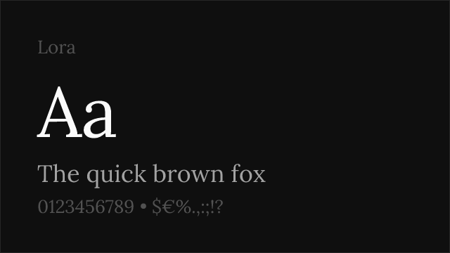
No. Tiempos is a premium typeface from Klim Type Foundry with per-project licensing. Desktop, web, and app licenses are priced separately based on usage. There is no free tier or trial version. For open-source alternatives, Lora (85% similarity) is the closest match.
What is the best free alternative to Tiempos?
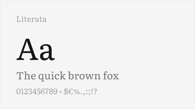
Lora is the closest free alternative at 85% similarity. Both share refined contemporary serif construction with calligraphic warmth optimized for editorial readability. Lora adds variable font support and Cyrillic coverage — practical advantages for digital-first editorial teams migrating from Tiempos. Source Serif Pro (82%) is the next strongest option with broader language support.
What is the difference between Tiempos Text and Tiempos Headline?
Tiempos Text is optimized for body copy at small to medium sizes (9-16pt), with sturdier strokes, wider letter spacing, and lower contrast for comfortable extended reading. Tiempos Headline is the display companion, with higher contrast, tighter fitting, and more refined details that emerge at large sizes. Both are separate designs drawn from scratch for their intended scale, not simply weight adjustments of the same outlines.
Who uses Tiempos?
Tiempos is widely used in editorial publishing and premium brand communications. The New Zealand Herald uses it for feature stories and editorial content. Digital publishing platforms like Medium, design agencies, and corporate communications teams choose Tiempos for its balance of journalistic authority and contemporary warmth.
Does Tiempos support Cyrillic?
No. Tiempos supports Latin and Latin Extended scripts only. For editorial projects requiring Cyrillic, Greek, or other non-Latin scripts, Lora, Source Serif Pro, or Merriweather are recommended alternatives that offer comparable editorial quality with broader language coverage.
Can I use Tiempos on the web?
Yes, with a web font license from Klim Type Foundry. Web licenses are priced based on monthly page views. You receive WOFF2 files for self-hosting. Tiempos is not available through Google Fonts, Adobe Fonts, or any font CDN service.
Who designed Tiempos?
Kris Sowersby, the founder of Klim Type Foundry based in Wellington, New Zealand. Sowersby is one of the most respected contemporary type designers, also known for Calibre, Newzald, National, and Financier. Tiempos reflects his approach of studying historical models deeply and rebuilding them with contemporary precision rather than simply reviving them.
What fonts pair well with Tiempos?
Tiempos pairs best with clean, rational sans-serifs that provide contrast without competing with its editorial warmth. Inter, Work Sans, and Source Sans 3 all work well as headline, navigation, or UI companions. The key is choosing sans-serifs that match Tiempos's professional seriousness rather than undercutting it with casual or decorative personality.
Is Tiempos a variable font?
No. Tiempos is offered as separate static font files for each weight and style. You need to license individual weights (Light, Regular, Medium, Semibold, Bold, Black) in both Text and Headline variants. There is no variable font version with a continuous weight axis.
How does Tiempos compare to Times New Roman?
Tiempos shares the same lineage — compact, efficient editorial serifs designed for newspaper columns — but it is a fundamentally different typeface. Where Times New Roman is a 1930s design optimized for hot-metal printing, Tiempos is a 21st-century design built for screens and contemporary offset printing. The proportions are more refined, the curves are smoother, the spacing is more carefully considered, and the overall impression is one of deliberate design rather than historical default.
Is Tiempos on Google Fonts?
No, Tiempos is a premium font from Klim Type Foundry and is not available on Google Fonts.
The closest Google Fonts alternative is Lora with 85% similarity. Get it free on Google Fonts ↗
Free Alternatives (8)

Closest editorial match with calligraphic warmth and contemporary refinement


Versatile transitional serif with excellent editorial performance and broad support

Google's reading-optimized serif with contemporary refinement and optical sizing


Refined old-style serif with classical elegance and comprehensive weight range

Web-optimized transitional serif with dependable editorial performance


Robust screen-optimized serif with dependable editorial presence

Warm humanist serif with old-style character and excellent language coverage
See where Tiempos is used in the wild and swap to free alternatives live.
Install FontSwap →Replacement Summary
Source: FontAlternatives.com
Premium font: Tiempos
Best free alternative: Lora
FontAlternatives similarity score: 85%
Replacement difficulty: Low
Best for: editorial and literary publications, long-form journalism platforms, magazine feature layouts, blog and content-heavy websites
Notable users: Medium, Patagonia, New Zealand Herald
Not recommended when: Brand consistency with Medium requires exact letterforms
What is the best free alternative to Tiempos?
Lora is the best free alternative to Tiempos with a FontAlternatives similarity score of 85%.
Lora shares similar proportions, stroke characteristics, and intended use with Tiempos. It is available under the OFL-1.1 license, which permits both personal and commercial use at no cost.
This alternative works particularly well for: editorial and literary publications, long-form journalism platforms, magazine feature layouts, blog and content-heavy websites.
Can I safely replace Tiempos with Lora?
Yes, Lora is a high-confidence replacement for Tiempos. The FontAlternatives similarity score of 85% indicates strong structural compatibility.
Licensing: Lora is licensed under OFL-1.1, which allows commercial use without licensing fees or royalties.
Weight coverage: All 4 weights have exact matches available.
When should I NOT replace Tiempos?
While Lora is a strong alternative, there are situations where replacing Tiempos may not be appropriate:
- Brand consistency: Tiempos is commonly seen in News and magazine editorial layouts contexts where exact letterforms may be required.
- Strict compliance: Verify that OFL-1.1 terms meet your specific legal and compliance requirements.
Weight-Matching Guide
Map Tiempos weights to their closest free alternatives for accurate font substitution.
Lora
| Tiempos | Lora | Match |
|---|---|---|
| Regular (400) | Regular (400) | exact |
| Medium (500) | Medium (500) | exact |
| Semibold (600) | Semi Bold (600) | exact |
| Bold (700) | Bold (700) | exact |
Source Serif Pro
| Tiempos | Source Serif Pro | Match |
|---|---|---|
| Light (300) | Light (300) | close |
| Regular (400) | Regular (400) | exact |
| Semibold (600) | Semibold (600) | exact |
| Bold (700) | Bold (700) | exact |
Literata
| Tiempos | Literata | Match |
|---|---|---|
| Light (300) | Light (300) | close |
| Regular (400) | Regular (400) | exact |
| Semibold (600) | Semibold (600) | exact |
| Bold (700) | Bold (700) | exact |
Crimson Pro
| Tiempos | Crimson Pro | Match |
|---|---|---|
| Light (300) | Light (300) | close |
| Regular (400) | Regular (400) | exact |
| Semibold (600) | Semibold (600) | exact |
| Bold (700) | Bold (700) | exact |
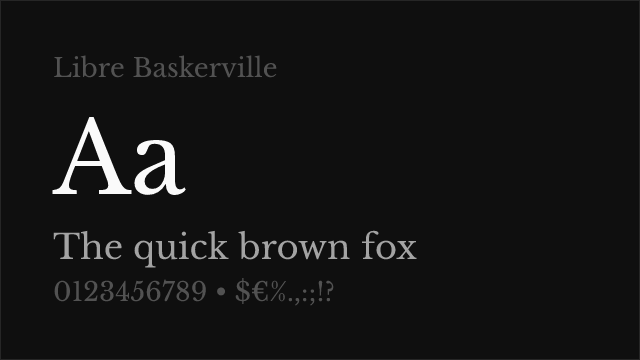
Libre Baskerville
| Tiempos | Libre Baskerville | Match |
|---|---|---|
| Regular (400) | Regular (400) | exact |
| Bold (700) | Bold (700) | exact |
Merriweather
| Tiempos | Merriweather | Match |
|---|---|---|
| Light (300) | Light (300) | close |
| Regular (400) | Regular (400) | exact |
| Bold (700) | Bold (700) | exact |
| Black (800) | Black (900) | close |
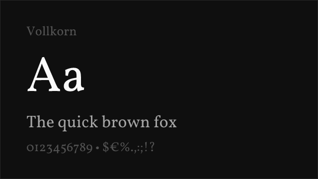
Vollkorn
| Tiempos | Vollkorn | Match |
|---|---|---|
| Regular (400) | Regular (400) | exact |
| Medium (500) | Medium (500) | exact |
| Semibold (600) | Semibold (600) | exact |
| Bold (700) | Bold (700) | exact |
Performance Guide
Production performance metrics for each alternative.
How to Use Lora
Copy these code snippets to quickly add Lora to your project.
CSS code for Lora
@import url('https://fonts.googleapis.com/css2?family=Lora:wght@100..900&display=swap');HTML code for Lora
<link rel="preconnect" href="https://fonts.googleapis.com">
<link rel="preconnect" href="https://fonts.gstatic.com" crossorigin>
<link href="https://fonts.googleapis.com/css2?family=Lora:wght@100..900&display=swap" rel="stylesheet">
Tailwind code for Lora
// tailwind.config.js
module.exports = {
  theme: {
    extend: {
      fontFamily: {
        'lora': ['Lora', 'sans-serif'],
      },
    },
  },
}

// Usage in HTML:
// <p class="font-lora">Your text here</p>
Next.js code for Lora
// Using next/font (Next.js 13+)
import { Lora } from 'next/font/google';

const lora = Lora({
  subsets: ['latin'],
  weight: ['100', '200', '300', '400', '500', '600', '700', '800', '900'],
});

export default function Component() {
  return (
    <p className={lora.className}>
      Your text here
    </p>
  );
}

// Or using inline styles with Google Fonts link:
// <p style={{ fontFamily: "'Lora'" }}>Your text</p>
Expo and React Native code for Lora
// Install: npx expo install @expo-google-fonts/lora expo-font
import { useFonts, Lora_400Regular } from '@expo-google-fonts/lora';

export default function App() {
  const [fontsLoaded] = useFonts({
    Lora_400Regular,
  });

  if (!fontsLoaded) return null;

  return (
    <Text style={{ fontFamily: 'Lora_400Regular' }}>
      Your text here
    </Text>
  );
}
Recommended Font Pairings
These free fonts pair well with Lora Tiempos for headlines, body text, or accent use.
Inter's rational neo-grotesque construction creates clean contemporary contrast against Tiempos's warm serif forms — both typefaces share screen-first engineering and professional positioning that suits news and editorial contexts
Work Sans's functional clarity complements Tiempos's editorial refinement, with the clean sans-serif headlines creating efficient contrast against Tiempos's serif body text without introducing stylistic friction
Source Sans 3's neutral grotesque character matches Tiempos's editorial seriousness — both typefaces prioritize readability and professional restraint, making them natural partners in news and magazine design systems
Browse Alternatives by Context
Find Tiempos alternatives filtered by specific use case, style, or language support.
Frequently Asked Questions
What is the best free alternative to Tiempos?
Lora is the best free alternative to Tiempos with a FontAlternatives similarity score of 85%. It shares similar proportions and characteristics while being available under the OFL-1.1 license for both personal and commercial use at no cost.
Is there a free version of Tiempos?
There is no official free version of Tiempos. However, Lora is available under the OFL-1.1 open-source license and achieves a FontAlternatives similarity score of 85%. It includes variable weights and supports latin, latin-extended.
What Google Font looks like Tiempos?
The Google Fonts most similar to Tiempos are Lora, Source Serif Pro, Literata. Among these alternatives, Lora offers the closest match with a FontAlternatives similarity score of 85% and includes variable weights for flexible typography options.
Can I use Lora commercially?
Yes, Lora can be used commercially. It is licensed under OFL-1.1, which allows free use in websites, applications, print materials, and commercial projects without purchasing a license or paying royalties.
Is Lora similar enough to Tiempos?
Lora achieves a FontAlternatives similarity score of 85% compared to Tiempos. While not identical, it offers comparable letterforms, proportions, and visual style. Most designers find it works excellently as a substitute in web and print projects.
What are the main differences between Tiempos and its free alternatives?
Free alternatives to Tiempos may differ in subtle details like letter spacing, curve refinements, and available weights. Premium fonts typically include more OpenType features, extended language support, and optimized screen rendering. However, for most projects, these differences are negligible.
Where can I download free alternatives to Tiempos?
Download Lora directly from Google Fonts. Click the "Get Font" button on any alternative listed above to visit the official download page. Google Fonts also provides convenient embed codes for seamless web integration.