Free Alternatives to Marblis Supporting Latin Extended
Need a free alternative to Marblis with Latin Extended script support? These 7 options include Latin Extended characters and share visual similarities with Marblis. Each is licensed for free personal and commercial use.
Top Picks
Comparison Table
| Font | Relevance ⓘ
How well this alternative fits the specific context (use-case or trait) of this page. Score 0–100 based on matching keywords, industries, and font characteristics. Alternatives scoring 25+ are highlighted.
| Similarity ⓘ
How visually similar this free font is to the premium original. Score 0–100 based on x-height, width, stroke contrast, use-case overlap, and language coverage.
Learn more → | Weights | Variable | License | Source |
|---|---|---|---|---|---|---|
| Inter | 0 | 82% | Variable | Yes | OFL-1.1 | Google Fonts ↗ |
| DM Sans | 0 | 79% | Variable | Yes | OFL-1.1 | Google Fonts ↗ |
| Work Sans | 0 | 77% | Variable | Yes | OFL-1.1 | Google Fonts ↗ |
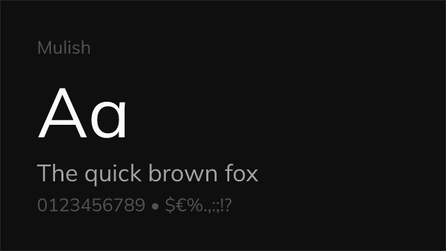
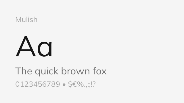
| Mulish | 0 | 76% | Variable | Yes | OFL-1.1 | Google Fonts ↗ |
| Rubik | 0 | 75% | Variable | Yes | OFL-1.1 | Google Fonts ↗ |
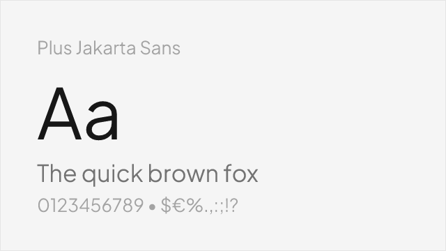
| Plus Jakarta Sans | 0 | 74% | Variable | Yes | OFL-1.1 | Google Fonts ↗ |
| Source Sans 3 | 0 | 73% | Variable | Yes | OFL-1.1 | Google Fonts ↗ |
All Alternatives (7)


[Google Fonts] · OFL-1.1 · Variable
Screen-optimized variable sans with optical sizing and extensive language support
Why it matches: Inter shares Marblis's neo-grotesk foundation with a tall x-height, open counters, and neutral character designed for functional clarity. Both typefaces prioritize reading efficiency over personality, making Inter the strongest overall substitute for screen-based applications. Inter's variable font with optical sizing provides size-specific optimization that compensates for Marblis's static-only format.
web and app interfacesdesign system foundationsdata-dense dashboardseditorial web content


[Google Fonts] · OFL-1.1 · Variable
Google-commissioned geometric sans with variable support and clean character
Why it matches: DM Sans captures Marblis's clean, approachable grotesque character with slightly more geometric construction. Both produce reliable body text with professional tone and comfortable reading texture. DM Sans's variable weight axis and generous x-height make it particularly effective for branding and marketing contexts where Marblis's corporate neutrality is valued.
brand identity systemsmarketing websitesmobile app interfacesstartup branding


[Google Fonts] · OFL-1.1 · Variable
Industrial-functional variable sans with American gothic lineage
Why it matches: Work Sans shares Marblis's commitment to functional typography built for sustained reading. Both feature clean, efficient letterforms without decorative personality. Work Sans's slightly wider proportions and American gothic character give text a more relaxed rhythm compared to Marblis's tighter grotesque metrics, but the overall professional tone is comparable.
editorial and content-heavy interfacestech company brandingresponsive web applicationscontent management systems
[Google Fonts] · OFL-1.1 · Variable
Minimalist sans-serif with variable weight axis and geometric underpinnings
Why it matches: Mulish shares Marblis's minimalist, unassuming character with rounded geometric features that soften the neo-grotesk foundation. Both typefaces aim for neutral functionality, reading as invisible infrastructure rather than design statements. Mulish's variable weight axis and comprehensive character set make it a practical substitute for brand systems that need Marblis's restraint.
minimalist brand systemsclean web applicationsmobile interfacesneutral corporate communications


[Google Fonts] · OFL-1.1 · Variable
Rounded geometric sans with variable support and friendly corporate character
Why it matches: Rubik provides Marblis's corporate utility with more visible warmth through its slightly rounded corners and geometric construction. Both typefaces serve brand systems that need to be professional without being cold. Rubik's friendly character makes it particularly effective for consumer-facing applications where Marblis's Helvetica-adjacent tone might feel too formal.
consumer-facing applicationsfriendly corporate brandingmobile-first interfaceseducational platforms

[Google Fonts] · OFL-1.1 · Variable
Contemporary geometric sans with variable axes and polished detailing
Why it matches: Plus Jakarta Sans captures Marblis's polished, contemporary grotesque aesthetic with slightly more geometric construction and refined detailing. Both typefaces suit modern brand systems that need clean, professional typography. Jakarta Sans's contemporary proportions and careful curve quality produce text with similar color and density to Marblis at body sizes.
modern brand identitySaaS and tech productsclean web designcontemporary corporate materials


[Google Fonts] · OFL-1.1 · Variable
Adobe's workhorse sans with exceptional hinting and broad platform support
Why it matches: Source Sans 3 matches Marblis's reliability as a workhorse text face that performs consistently across contexts. Both feature open apertures and humanist-inflected neutrality that avoids mechanical stiffness. Source Sans 3's superior hinting and broader platform optimization make it particularly strong for cross-platform deployments where Marblis's higher glyph count and OpenType features matter less.
cross-platform applicationsdocumentation systemsgovernment and institutional siteslong-form body text