Free Alternatives to Marblis

About Marblis
- Foundry
- Fincker Font Cuisine
- Classification
- sans-serif
- Style
- neo-grotesque
Brands Using Marblis
Brand systems requiring a modern Helvetica alternative with wider glyph coverage and OpenType features
Magazine and publication typography where even texture and comprehensive weight coverage are critical
Environmental graphics and signage requiring clear, functional grotesque typography
A contemporary sans for modern product and brand systems
 See Marblis live on these sites with FontSwap →
Marblis is a modern grotesque sans-serif typeface by Julien Fincker of Fincker Font Cuisine, a recent 2025 release. Positioned as a contemporary alternative to Helvetica, Marblis offers 20 styles (10 weights from Thin to Black, each with matching italics) with over 1,410 glyphs per style. It includes extensive OpenType features: ligatures, stylistic alternates, multiple numeral sets, and case-sensitive forms. It is the work of an established independent type designer with a substantial catalog behind it, and it is built as a reliable, neutral foundation for diverse design contexts.
Marblis requires a commercial license from Fincker Font Cuisine. It is available through fontcuisine.com and MyFonts, starting from EUR 50 per style. There is no free tier or Google Fonts availability. If you need a similar grotesque sans-serif without the license cost, this page covers the best open-source alternatives.
Why Marblis Matters
Helvetica has been the default corporate grotesque for six decades, but its dominance has created a market for alternatives that provide Helvetica's stability with contemporary refinement. Marblis enters this space with a specific proposition: the neutral, functional character of Helvetica combined with modern glyph coverage, OpenType features, and design choices informed by how typography is actually used today.
What distinguishes Marblis from the dozens of other Helvetica alternatives (Aktiv Grotesk, Akkurat, Graphik, GT America) is its combination of comprehensiveness and independence. Designed by a single typographer rather than a large foundry team, Marblis reflects a coherent vision without committee compromise. The 1,410+ glyphs per style include multiple numeral styles, stylistic alternates, and contextual forms that give designers control over typographic detail often absent from more commercialized neo-grotesques.
Neutrality is easy to describe and hard to engineer. A grotesque earns the label by making thousands of small decisions that individually go unnoticed: how far the counters open, how a stroke resolves at a junction, how much air sits between characters at text size. Get any of them wrong and the face acquires a tic — a slightly narrow e, an a that catches the eye — and the illusion of invisibility breaks. Marblis's ambition is to make those decisions so evenly that a reader never registers them, which is precisely the quality that makes a neutral grotesque so demanding to replace. When you shop for a free substitute, you are not matching a silhouette so much as matching a temperament.
For most teams the practical question is not whether Marblis is good — a comprehensive, well-drawn grotesque generally is — but whether its particular strengths are the ones your project will actually use. A brand that ships a print identity, a signage program, and multilingual packaging will lean on the ten weights, the extended glyph set, and the OpenType controls, and will feel the value of the license. A team building a marketing site and an app may touch only four weights and never open the alternates panel, in which case a free grotesque covers the same ground. The sections below are organized around that distinction, so you can weigh what Marblis offers against what your work demands.
Marblis also carries the weight of a catalog behind it. Julien Fincker is an established independent type designer and art director who publishes through his own foundry, Fincker Font Cuisine, and Marblis is one release among a body of work that includes families such as Garino, Grantig, Royalis, Nestor, Ardena, Spitzkant, Finador, and Bourget. That range matters when you are evaluating a grotesque: a designer who has drawn display faces, text faces, and more expressive families brings a trained eye to the restraint a neutral grotesque demands, and the decision to draw ten weights with matched italics and a 1,410-glyph character set is the choice of someone building for professional, systematic use rather than a single headline. Independence is part of the proposition too. Because Marblis is the product of one typographer rather than a large foundry team, it reflects a single, coherent point of view about how a contemporary grotesque should behave — consistent from Thin to Black, and consistent in the small decisions that a committee-drawn family can blur.
Design Characteristics
Marblis sits comfortably in the neo-grotesk tradition with contemporary refinements:
- Even stroke weight: Consistent weight distribution across characters prevents thin strokes from disappearing at small sizes, a common weakness of original Helvetica.
- Open apertures: Slightly more open than Helvetica's notoriously closed counters, improving legibility at text sizes without sacrificing the grotesque aesthetic.
- Straight t and f: The lowercase t and f use straight stems rather than curved forms, prioritizing clarity and mechanical precision in text settings. This choice aligns Marblis with the functional tradition of industrial grotesques.
- Soft curves in a and l: Despite the overall geometric discipline, the lowercase a and l feature subtly softened curves that add warmth to text blocks without breaking the neutral character. This balance of warmth and precision is central to Marblis's identity.
- 1,410+ glyphs per style: Comprehensive character coverage including multiple numeral sets (tabular, proportional, oldstyle), small caps, and stylistic alternates.
- Ligatures and contextual alternates: OpenType features that improve typographic texture in professional typesetting contexts.
- 10 weights: From Thin (hairline) to Black (heavy), with matched italics for every weight. This provides more granular control over typographic hierarchy than most free grotesques.
- Consistent metrics: Carefully aligned vertical metrics across all styles ensure reliable baseline alignment in multi-weight compositions.
Read together, these choices describe a face tuned for endurance rather than flair. The even stroke weight and consistent metrics are what let a designer set Thin captions next to Black headlines and trust that the two will share a baseline without manual nudging. The slightly opened apertures are the concession to reading — the detail that keeps the grotesque from tightening into illegibility the way strict mid-century models can. And the straight t and f set against the softened a and l are the small tension that stops the face from reading as purely mechanical. None of these is dramatic on its own. The point of a grotesque like this is that the decisions accumulate into a texture, not a signature.
When you audit a free alternative against Marblis, these are the traits to check, and roughly in this order. Set the two side by side at the same size and look first at the color of a full paragraph, then at the apertures of c, e, and a, then at how the italics are drawn. A substitute can match the overall weight and still miss the temperament if its counters run tighter or its italic is a mechanical slant rather than a true cut. The recommendations later in this guide are built on exactly that comparison.
The overall character is deliberately familiar. Marblis does not seek to reinvent the grotesque genre but to provide a reliable, well-crafted version of it that works in contemporary design contexts.
Where Marblis Excels
Marblis is built for the kind of work where the typography has to carry weight without calling attention to itself. Its comfort zone is the systematic project — the identity, the publication, the environment — where a single family has to behave consistently across dozens of applications and hold up under whatever a real layout throws at it.
- Corporate identity systems: The neutral, professional character suits brands that want typographic consistency without personality interference
- Editorial design: The comprehensive weight range and OpenType features support sophisticated typographic hierarchy
- Wayfinding and signage: The even stroke weight and open apertures ensure legibility across sizes and viewing conditions
- Packaging design: The extensive glyph set handles multilingual packaging requirements
- Brand systems needing stability: For organizations that want a reliable, unobtrusive grotesque that simply works
The common thread across these strengths is range and control. Ten weights give a designer room to build a hierarchy that reads clearly from a caption to a cover; the extended glyph set and OpenType features handle the edge cases — a tabular figure in a financial table, an alternate that resolves an awkward pair of letters, a diacritic a thinner family would leave undrawn. If your project touches several of these at once, that breadth is the real argument for licensing Marblis rather than approximating it.
Where It Struggles
No neutral grotesque is the right tool for every job, and Marblis is honest about where it gives ground.
- Brand differentiation: Like all neutral grotesques, Marblis does not make brands stand out typographically. If recognition through typography is the goal, a more distinctive family is needed.
- Screen-first projects: Without variable font support or screen-specific hinting, Marblis may not match the rendering quality of Inter or Source Sans 3 on digital screens.
- Budget-sensitive web projects: Loading multiple static font files is less efficient than using a single variable font file. For web-only projects, free variable alternatives offer better performance.
None of these is a flaw so much as a boundary. Marblis is a static, print-literate family drawn for systems that value consistency, and the places it struggles are the places where a different set of priorities — screen rendering, a single lightweight file, a loud brand voice — matters more than range and neutrality. Reading those boundaries in advance is what makes choosing a substitute straightforward: if your project lives where Marblis gives ground, a free grotesque built for that ground is not a compromise but the better tool.
How to Choose a Free Substitute
When evaluating alternatives to Marblis, prioritize:
- Text texture at body sizes: Set a full paragraph at 10-14px and evaluate the overall color. Marblis's value is in its consistent rhythm and density.
- Weight coverage: Marblis offers 10 weights. For basic use, ensure your substitute covers at least Light, Regular, Medium, and Bold.
- OpenType features: If you rely on Marblis's multiple numeral sets or stylistic alternates, check that your substitute offers comparable features. Inter has extensive OpenType support.
- Italic quality: Marblis ships true italics for all weights. Verify your substitute's italics are designed, not algorithmically slanted.
- Neutrality: The substitute should feel invisible. Test by setting body text and asking: does anyone notice the font? If yes, it is too distinctive.
Those five checks tell you whether a candidate is close. Which candidate to start with depends on where the type will live, and the seven free families on this page sort cleanly into a few lanes.
For screen-first work — an app, a dashboard, a design system — Inter is the default. It shares Marblis's neo-grotesque skeleton and neutral temperament, and it adds the two things Marblis lacks for digital work: a variable weight axis and optical sizing that tunes the shapes to the size they render at. If you need Marblis's invisibility inside an interface, this is the closest you get for free.
Source Sans 3 is the choice when the same text has to render identically across operating systems and devices. Its hinting and platform tuning are its whole argument. It trades some of Marblis's extended OpenType range for reliability at the pixel level, which is the right trade for documentation, government, and institutional sites where the reader's setup is unknown.
When the job is a brand rather than an interface, the geometric-leaning families earn their place. DM Sans keeps the clean, professional tone but warms it slightly with a more geometric construction, which suits marketing pages and startup identities. Plus Jakarta Sans pushes a step further into contemporary, polished geometry — a good fit for SaaS and product branding where you want the grotesque foundation to read as modern rather than mid-century. Rubik goes furthest toward friendliness, with rounded corners that make it the pick for consumer-facing and educational work where Marblis's corporate neutrality would feel too formal.
Two families sit deliberately in the quiet middle. Mulish shares Marblis's philosophy of type as invisible infrastructure, softened just enough by rounded geometric details to stay comfortable across a neutral brand system. Work Sans trades a little grotesque precision for American-gothic directness and a more relaxed rhythm, which makes it the easier read for content-heavy, editorial interfaces where reading stamina matters more than formality.
A useful way to decide is to name the one thing you most need to preserve. If it is layout behavior across weights, start with the family that gives you the widest variable range. If it is neutrality, test the candidate in body copy and see whether anyone notices it — the right answer is that no one does. If it is warmth or friendliness, accept that you are moving away from strict Marblis and choose the family that carries the tone you want. There is rarely a single correct substitute. There is the one that best protects the quality your project can least afford to lose.
Premium Font Neighbors
If Marblis's approach appeals to you, these premium grotesques occupy adjacent territory:
Cluster A: Contemporary Helvetica alternatives
- Helvetica Now (Monotype) — the official modernized Helvetica with optical sizing
- Aktiv Grotesk (Dalton Maag) — workhorse neo-grotesk with extensive language support
- Neue Haas Grotesk (Commercial Type) — Christian Schwartz's return to the original Helvetica source
- Söhne (Klim Type Foundry) — Akzidenz-Grotesk reimagined with contemporary proportions
Cluster B: Clean corporate grotesques
- Graphik (Commercial Type) — popular in tech for its clean, approachable grotesque character
- Univers (Linotype) — Adrian Frutiger's systematic neo-grotesk, the original comprehensive grotesque system
- Akkurat — a precise, cool grotesque often described as an exacting take on the genre
- Neue Montreal — a contemporary grotesque with a clean, minimal, distinctly modern character
Walking these neighbors is a fast way to clarify what you actually want from Marblis. If you are drawn to the exact mid-century grotesque feeling, the first cluster gets you closest. If what you value is the clean, contemporary corporate tone, the second cluster is nearer the mark — and it is worth noticing that several of these premium options solve the same problem the free families on this page solve, only at a license cost. Comparing them honestly often reveals that the free grotesque you already shortlisted covers most of what you were about to pay to approximate.
All fonts listed above are premium/commercial typefaces requiring paid licenses.
FAQ
What is the best free alternative to Marblis?
Inter is the closest free alternative at 82% similarity. It shares Marblis's neo-grotesk foundation, neutral character, and emphasis on functional clarity. Inter adds variable font support and optical sizing that Marblis lacks, making it the more technically capable option for screen-based projects.
How does Marblis compare to Helvetica Now?
Both are modernized interpretations of the Helvetica tradition, but from very different perspectives. Helvetica Now is Monotype's official update to the world's most famous typeface, carrying the Helvetica name and its brand recognition. Marblis is an independent designer's interpretation of the grotesque genre, offering more extensive OpenType features and a slightly more open character. Helvetica Now has more institutional authority; Marblis has more typographic flexibility.
Is Marblis a variable font?
No. Marblis is available only as static font files (20 styles: 10 weights × upright and italic). For projects requiring variable font technology, Inter or DM Sans provide variable alternatives with comparable grotesque aesthetics.
What are the OpenType features in Marblis?
Marblis includes standard ligatures, stylistic alternates, case-sensitive forms, multiple numeral styles (tabular, proportional, oldstyle), small caps, and contextual alternates. These features are accessible through OpenType-aware design applications and CSS font-feature-settings.
Is Marblis suitable for editorial design?
Yes. Marblis's 10-weight range, comprehensive glyph set, and OpenType features make it well-suited for editorial typography. The even stroke weight and consistent metrics produce reliable text color across columns and pages. For editorial projects that cannot justify the license, Source Sans 3 or Work Sans provide comparable editorial performance.
Who designed Marblis?
Marblis was designed by Julien Fincker, an established independent type designer and art director who publishes through his own foundry, Fincker Font Cuisine. He has a substantial catalog of typefaces to his name — families such as Garino, Grantig, Royalis, Nestor, Ardena, Spitzkant, Finador, and Bourget — spanning display, text, and more expressive designs. Marblis represents his take on the neutral grotesque genre: a comprehensive, single-designer family drawn with the restraint and consistency that systematic corporate and editorial work demands.
Which free Marblis alternative should I choose for a design system?
For a design system, prioritize a variable font so a single file can cover your whole weight scale and reflow predictably as you tune it. Inter is the strongest default here: it matches Marblis's neutral grotesque temperament, ships a full variable weight axis, and includes optical sizing that keeps small interface text legible. If your system has to render consistently across many operating systems, Source Sans 3's hinting makes it the more conservative pick. Both give you the neutral foundation a system needs — the layer users should never consciously notice.
Can a free font truly replace Marblis, or is it always a compromise?
It depends on which of Marblis's strengths your project relies on. If you use only four or five weights and never touch the extended glyph set or OpenType alternates, a free grotesque like Inter or DM Sans covers the same ground with no meaningful loss. The compromise appears at the edges: ten discrete weights, tabular and oldstyle numeral sets, small caps, and true italics across the whole family are where a comprehensive commercial face still pulls ahead. Match the substitute to the work you will actually do, and for most digital projects the free option is not a downgrade.
Is Marblis on Google Fonts?
No, Marblis is a premium font from Fincker Font Cuisine and is not available on Google Fonts.
The closest Google Fonts alternative is Inter with 82% similarity. Get it free on Google Fonts ↗
Free Alternatives (7)
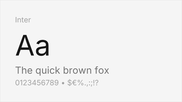
Screen-optimized variable sans with optical sizing and extensive language support
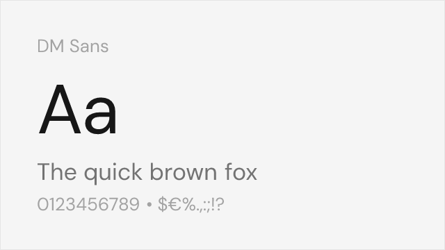
Google-commissioned geometric sans with variable support and clean character

Industrial-functional variable sans with American gothic lineage
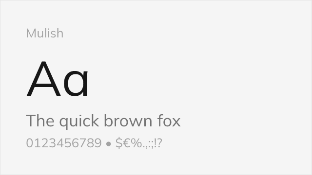
Minimalist sans-serif with variable weight axis and geometric underpinnings
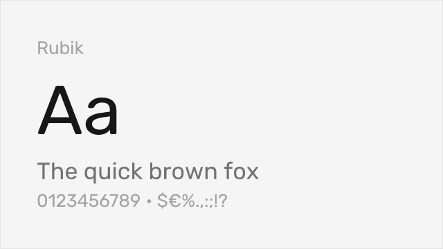
Rounded geometric sans with variable support and friendly corporate character
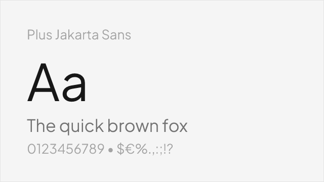
Contemporary geometric sans with variable axes and polished detailing

Adobe's workhorse sans with exceptional hinting and broad platform support
Compare the alternatives
See how Marblis compares to its top alternatives — and how those alternatives compare to each other — side by side.
See where Marblis is used in the wild and swap to free alternatives live.
Install FontSwap →Replacement Summary
Source: FontAlternatives.com
Premium font: Marblis
Best free alternative: Inter
FontAlternatives similarity score: 82%
Replacement difficulty: Medium
Best for: web and app interfaces, design system foundations, data-dense dashboards, editorial web content
Notable users: Corporate Identity Projects, Editorial Design, Wayfinding Systems
Not recommended when: Brand consistency with Corporate Identity Projects requires exact letterforms
What is the best free alternative to Marblis?
Inter is the best free alternative to Marblis with a FontAlternatives similarity score of 82%.
Inter shares similar proportions, stroke characteristics, and intended use with Marblis. It is available under the OFL-1.1 license, which permits both personal and commercial use at no cost.
This alternative works particularly well for: web and app interfaces, design system foundations, data-dense dashboards, editorial web content.
Can I safely replace Marblis with Inter?
Yes, with some considerations. Inter achieves a FontAlternatives similarity score of 82%, indicating good structural compatibility for most use cases.
Licensing: Inter is licensed under OFL-1.1, which allows commercial use without licensing fees or royalties.
Weight coverage: Most weights have close or exact matches available.
When should I NOT replace Marblis?
While Inter is a strong alternative, there are situations where replacing Marblis may not be appropriate:
- Optical precision requirements: Inter has measurable structural differences from Marblis that may be visible in precise design work.
- Strict compliance: Verify that OFL-1.1 terms meet your specific legal and compliance requirements.
Weight-Matching Guide
Map Marblis weights to their closest free alternatives for accurate font substitution.
Inter
| Marblis | Inter | Match |
|---|---|---|
| Thin (100) | Thin (100) | close |
| Regular (400) | Regular (400) | close |
| Medium (500) | Medium (500) | close |
| Bold (700) | Bold (700) | close |
DM Sans
| Marblis | DM Sans | Match |
|---|---|---|
| Light (300) | Light (300) | close |
| Regular (400) | Regular (400) | close |
| Medium (500) | Medium (500) | close |
| Bold (700) | Bold (700) | close |
Work Sans
| Marblis | Work Sans | Match |
|---|---|---|
| Light (300) | Light (300) | close |
| Regular (400) | Regular (400) | close |
| Medium (500) | Medium (500) | close |
| Bold (700) | Bold (700) | close |
Mulish
| Marblis | Mulish | Match |
|---|---|---|
| Light (300) | Light (300) | close |
| Regular (400) | Regular (400) | close |
| Medium (500) | Medium (500) | close |
| Bold (700) | Bold (700) | close |
Rubik
| Marblis | Rubik | Match |
|---|---|---|
| Light (300) | Light (300) | exact |
| Regular (400) | Regular (400) | close |
| Medium (500) | Medium (500) | close |
| Bold (700) | Bold (700) | close |
Plus Jakarta Sans
| Marblis | Plus Jakarta Sans | Match |
|---|---|---|
| Light (300) | Light (300) | close |
| Regular (400) | Regular (400) | close |
| Medium (500) | Medium (500) | close |
| Bold (700) | Bold (700) | close |
Source Sans 3
| Marblis | Source Sans 3 | Match |
|---|---|---|
| Light (300) | Light (300) | close |
| Regular (400) | Regular (400) | close |
| Medium (500) | Semi Bold (600) | substitute |
| Bold (700) | Bold (700) | close |
Performance Guide
Production performance metrics for each alternative.
How to Use Inter
Copy these code snippets to quickly add Inter to your project.
CSS code for Inter
@import url('https://fonts.googleapis.com/css2?family=Inter:wght@100..900&display=swap');HTML code for Inter
<link rel="preconnect" href="https://fonts.googleapis.com">
<link rel="preconnect" href="https://fonts.gstatic.com" crossorigin>
<link href="https://fonts.googleapis.com/css2?family=Inter:wght@100..900&display=swap" rel="stylesheet">
Tailwind code for Inter
// tailwind.config.js
module.exports = {
  theme: {
    extend: {
      fontFamily: {
        'inter': ['Inter', 'sans-serif'],
      },
    },
  },
}

// Usage in HTML:
// <p class="font-inter">Your text here</p>
Next.js code for Inter
// Using next/font (Next.js 13+)
import { Inter } from 'next/font/google';

const inter = Inter({
  subsets: ['latin'],
  weight: ['100', '200', '300', '400', '500', '600', '700', '800', '900'],
});

export default function Component() {
  return (
    <p className={inter.className}>
      Your text here
    </p>
  );
}

// Or using inline styles with Google Fonts link:
// <p style={{ fontFamily: "'Inter'" }}>Your text</p>
Expo and React Native code for Inter
// Install: npx expo install @expo-google-fonts/inter expo-font
import { useFonts, Inter_400Regular } from '@expo-google-fonts/inter';

export default function App() {
  const [fontsLoaded] = useFonts({
    Inter_400Regular,
  });

  if (!fontsLoaded) return null;

  return (
    <Text style={{ fontFamily: 'Inter_400Regular' }}>
      Your text here
    </Text>
  );
}
Recommended Font Pairings
These free fonts pair well with Inter Marblis for headlines, body text, or accent use.
Lora's calligraphic warmth provides excellent contrast with Marblis's clean grotesque lines, creating a balanced editorial pairing for magazines, blogs, and brand content
JetBrains Mono's monospace precision complements Marblis's functional grotesque aesthetic for technical documentation and developer-facing interfaces
Source Serif Pro's transitional authority creates classic contrast with Marblis's neutral grotesque, suitable for corporate documents, annual reports, and institutional communications
Browse Alternatives by Context
Find Marblis alternatives filtered by specific use case, style, or language support.
By Script
Frequently Asked Questions
What is the best free alternative to Marblis?
Inter is the best free alternative to Marblis with a FontAlternatives similarity score of 82%. It shares similar proportions and characteristics while being available under the OFL-1.1 license for both personal and commercial use at no cost.
Is there a free version of Marblis?
There is no official free version of Marblis. However, Inter is available under the OFL-1.1 open-source license and achieves a FontAlternatives similarity score of 82%. It includes variable weights and supports latin, latin-extended.
What Google Font looks like Marblis?
The Google Fonts most similar to Marblis are Inter, DM Sans, Work Sans. Among these alternatives, Inter offers the closest match with a FontAlternatives similarity score of 82% and includes variable weights for flexible typography options.
Can I use Inter commercially?
Yes, Inter can be used commercially. It is licensed under OFL-1.1, which allows free use in websites, applications, print materials, and commercial projects without purchasing a license or paying royalties.
Is Inter similar enough to Marblis?
Inter achieves a FontAlternatives similarity score of 82% compared to Marblis. While not identical, it offers comparable letterforms, proportions, and visual style. Most designers find it works excellently as a substitute in web and print projects.
What are the main differences between Marblis and its free alternatives?
Free alternatives to Marblis may differ in subtle details like letter spacing, curve refinements, and available weights. Premium fonts typically include more OpenType features, extended language support, and optimized screen rendering. However, for most projects, these differences are negligible.
Where can I download free alternatives to Marblis?
Download Inter directly from Google Fonts. Click the "Get Font" button on any alternative listed above to visit the official download page. Google Fonts also provides convenient embed codes for seamless web integration.