Free Alternatives to Tiempos with Modern Style
Tiempos is known for its modern aesthetic. If you're looking for a free serif font with a similar modern feel, these 8 alternatives offer comparable characteristics. We've identified 4 that are especially well-suited for this context. All are available under open-source licenses for unrestricted commercial use.
Top Picks
Comparison Table
| Font | Relevance ⓘ
How well this alternative fits the specific context (use-case or trait) of this page. Score 0–100 based on matching keywords, industries, and font characteristics. Alternatives scoring 25+ are highlighted.
| Similarity ⓘ
How visually similar this free font is to the premium original. Score 0–100 based on x-height, width, stroke contrast, use-case overlap, and language coverage.
Learn more → | Weights | Variable | License | Source |
|---|---|---|---|---|---|---|
| Literata | 41 | 80% | Variable | Yes | OFL-1.1 | Google Fonts ↗ |
| Lora | 27 | 85% | Variable | Yes | OFL-1.1 | Google Fonts ↗ |
| Source Serif Pro | 26 | 82% | Variable | Yes | OFL-1.1 | Google Fonts ↗ |
| Crimson Pro | 26 | 78% | Variable | Yes | OFL-1.1 | Google Fonts ↗ |
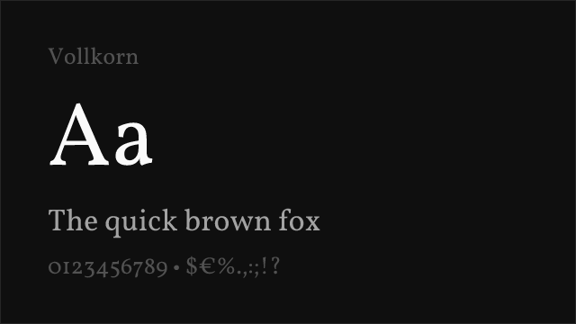
| Vollkorn | 24 | 72% | Variable | Yes | OFL-1.1 | Google Fonts ↗ |
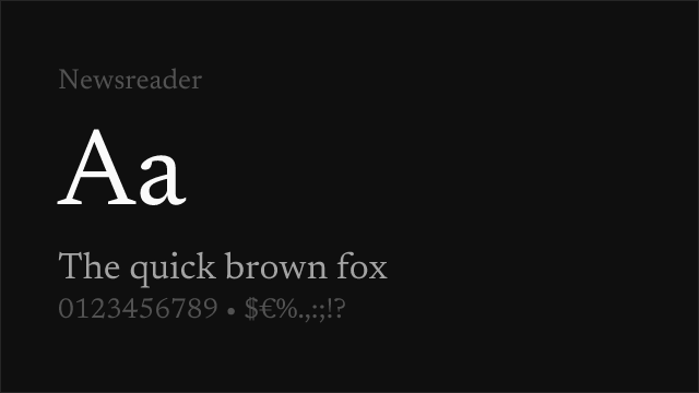
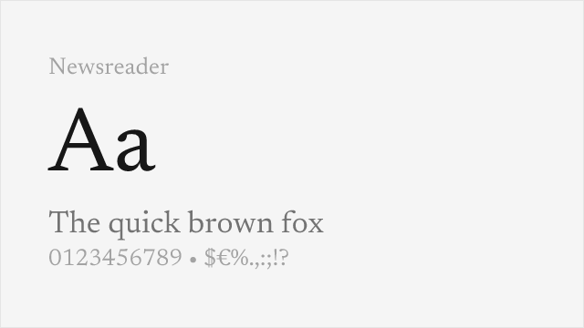
| Newsreader | 24 | 72% | Variable | Yes | OFL-1.1 | Google Fonts ↗ |
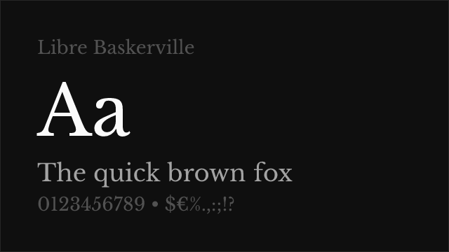
| Libre Baskerville | 15 | 76% | 2 | No | OFL-1.1 | Google Fonts ↗ |
| Merriweather | 15 | 74% | 4 | No | OFL-1.1 | Google Fonts ↗ |
Most Relevant (4)

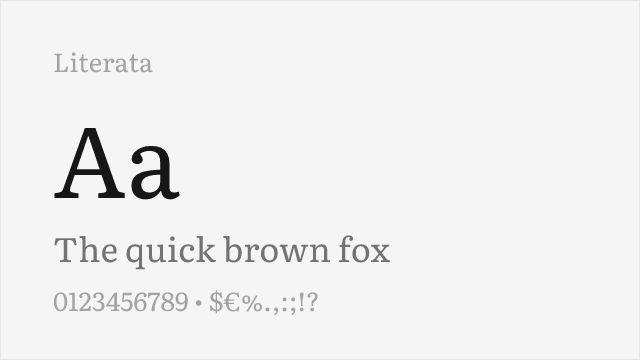
Google's reading-optimized serif with contemporary refinement and optical sizing
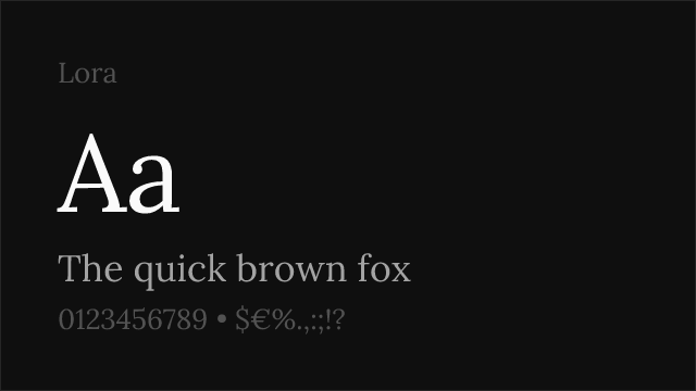

Closest editorial match with calligraphic warmth and contemporary refinement


Versatile transitional serif with excellent editorial performance and broad support


Refined old-style serif with classical elegance and comprehensive weight range
Other Alternatives (4)

Warm humanist serif with old-style character and excellent language coverage

Web-optimized transitional serif with dependable editorial performance


Robust screen-optimized serif with dependable editorial presence