Free Alternatives to Tiempos with Readable Style
Tiempos is known for its readable aesthetic. If you're looking for a free serif font with a similar readable feel, these 8 alternatives offer comparable characteristics. We've identified 8 that are especially well-suited for this context. All are available under open-source licenses for unrestricted commercial use.
Top Picks
Comparison Table
| Font | Relevance ⓘ
How well this alternative fits the specific context (use-case or trait) of this page. Score 0–100 based on matching keywords, industries, and font characteristics. Alternatives scoring 25+ are highlighted.
| Similarity ⓘ
How visually similar this free font is to the premium original. Score 0–100 based on x-height, width, stroke contrast, use-case overlap, and language coverage.
Learn more → | Weights | Variable | License | Source |
|---|---|---|---|---|---|---|
| Literata | 86 | 80% | Variable | Yes | OFL-1.1 | Google Fonts ↗ |
| Newsreader | 74 | 72% | Variable | Yes | OFL-1.1 | Google Fonts ↗ |
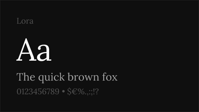
| Lora | 57 | 85% | Variable | Yes | OFL-1.1 | Google Fonts ↗ |
| Source Serif Pro | 56 | 82% | Variable | Yes | OFL-1.1 | Google Fonts ↗ |
| Vollkorn | 54 | 72% | Variable | Yes | OFL-1.1 | Google Fonts ↗ |
| Crimson Pro | 46 | 78% | Variable | Yes | OFL-1.1 | Google Fonts ↗ |
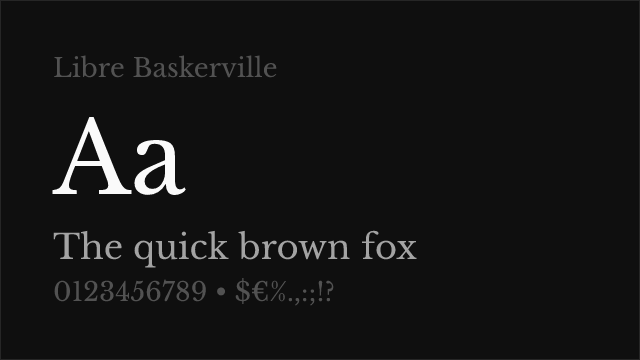
| Libre Baskerville | 35 | 76% | 2 | No | OFL-1.1 | Google Fonts ↗ |
| Merriweather | 35 | 74% | 4 | No | OFL-1.1 | Google Fonts ↗ |
All Alternatives (8)

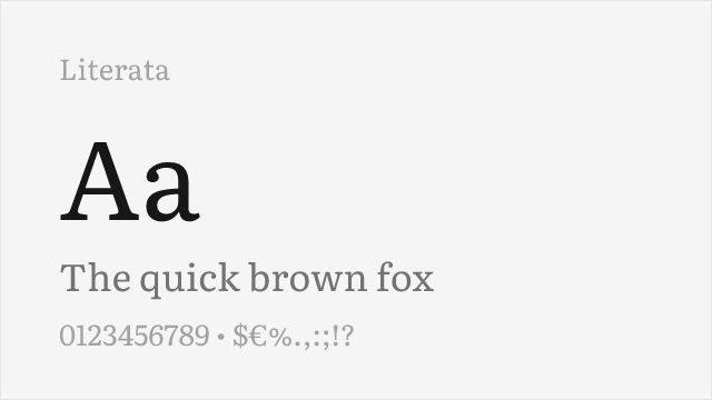
Google's reading-optimized serif with contemporary refinement and optical sizing
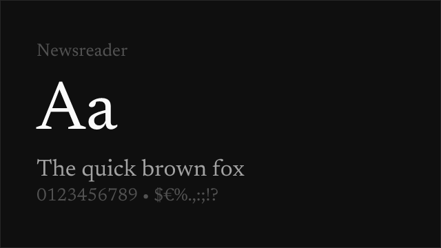
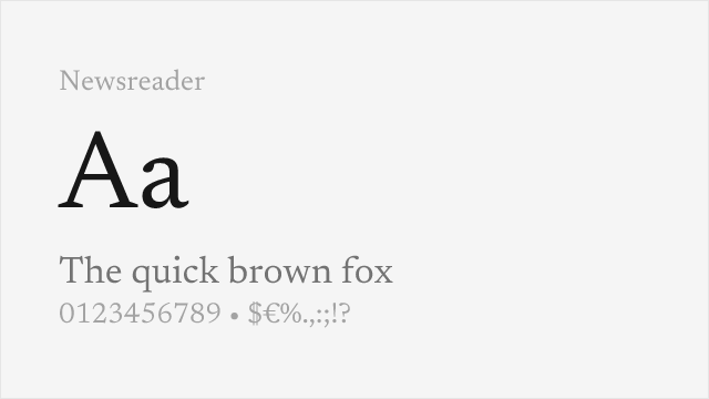

Closest editorial match with calligraphic warmth and contemporary refinement


Versatile transitional serif with excellent editorial performance and broad support
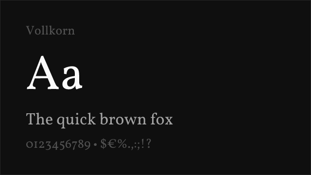

Warm humanist serif with old-style character and excellent language coverage


Refined old-style serif with classical elegance and comprehensive weight range

Web-optimized transitional serif with dependable editorial performance


Robust screen-optimized serif with dependable editorial presence