Free Alternatives to Volvo Centum Supporting Latin Extended
Need a free alternative to Volvo Centum with Latin Extended script support? These 7 options include Latin Extended characters and share visual similarities with Volvo Centum. Each is licensed for free personal and commercial use.
Top Picks
Comparison Table
| Font | Relevance ⓘ
How well this alternative fits the specific context (use-case or trait) of this page. Score 0–100 based on matching keywords, industries, and font characteristics. Alternatives scoring 25+ are highlighted.
| Similarity ⓘ
How visually similar this free font is to the premium original. Score 0–100 based on x-height, width, stroke contrast, use-case overlap, and language coverage.
Learn more → | Weights | Variable | License | Source |
|---|---|---|---|---|---|---|
| Inter | 0 | 82% | Variable | Yes | OFL-1.1 | Google Fonts ↗ |
| IBM Plex Sans | 0 | 80% | 7 | No | OFL-1.1 | Google Fonts ↗ |
| Source Sans 3 | 0 | 78% | Variable | Yes | OFL-1.1 | Google Fonts ↗ |
| Noto Sans | 0 | 78% | Variable | Yes | OFL-1.1 | Google Fonts ↗ |
| Public Sans | 0 | 75% | Variable | Yes | OFL-1.1 | Google Fonts ↗ |
| Barlow | 0 | 74% | 9 | No | OFL-1.1 | Google Fonts ↗ |
| Work Sans | 0 | 72% | Variable | Yes | OFL-1.1 | Google Fonts ↗ |
All Alternatives (7)


[Google Fonts] · OFL-1.1 · Variable
Modern UI sans-serif with exceptional screen rendering and variable font support
Why it matches: Inter shares Centum's emphasis on screen legibility through a tall x-height, open counters, and carefully tuned letter spacing. Both prioritize functional clarity over decorative personality, making Inter the strongest overall substitute for digital interfaces. Inter's optical sizing axis provides automatic adjustments at different sizes, echoing Centum's optimization for varied display contexts.
dashboard UI mockupsautomotive configurator interfacescorporate web applicationsdesign system prototyping


[Google Fonts] · OFL-1.1 · 7 weights
Engineered for UI clarity with strong glyph differentiation and corporate tone
Why it matches: IBM Plex Sans mirrors Centum's engineering-first approach to typography. Both typefaces prioritize glyph disambiguation (clear I/l/1 and 0/O differentiation) and maintain a corporate-neutral tone suitable for information-dense interfaces. Plex's rational grid structure echoes Centum's geometric underpinnings.
enterprise dashboardstechnical documentationdata-heavy interfacescorporate identity systems


[Google Fonts] · OFL-1.1 · Variable
Highly readable workhorse with open shapes and excellent hinting for screen display
Why it matches: Source Sans 3 balances humanist warmth with functional neutrality, similar to Centum's approach of being legible without being sterile. Both feature open apertures and generous counters that aid quick recognition. Adobe's extensive hinting ensures crisp rendering across devices, paralleling Centum's optimization for varied automotive display hardware.
long-form UI textdocumentation and help systemscross-platform applicationsgovernment and institutional sites


[Google Fonts] · OFL-1.1 · Variable
Unmatched multilingual coverage with neutral corporate character
Why it matches: Noto Sans is the closest match to Centum's multilingual ambitions. Volvo claims Centum supports over 800 languages; Noto Sans actually delivers on that promise with harmonized designs across hundreds of scripts. Both share a neutral neo-grotesk foundation, though Noto prioritizes universal consistency over brand distinctiveness.
multilingual automotive interfacesglobal corporate deploymentsfallback font strategycross-script consistency

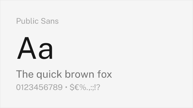
[Google Fonts] · OFL-1.1 · Variable
Government-grade neutrality and accessibility-first design
Why it matches: Public Sans shares Centum's commitment to functional clarity in high-stakes reading environments. Both were designed for contexts where misreading carries real consequences (driving vs. civic services). Public Sans's deliberate blandness and open apertures match Centum's philosophy of letting content speak without typographic distraction.
accessible interface designinstitutional and government portalssafety-critical signage mockupsform-heavy enterprise tools


[Google Fonts] · OFL-1.1 · 9 weights
DIN-adjacent signage aesthetic with California infrastructure DNA
Why it matches: Barlow captures the transportation and signage lineage that also informs Centum. Both typefaces descend from the tradition of functional grotesques designed to be read quickly at distance or in motion. Barlow's slightly condensed proportions and squared curves echo the industrial precision found in automotive instrument clusters.
wayfinding and signageautomotive marketing materialsdata-dense dashboardsspace-constrained UI layouts


[Google Fonts] · OFL-1.1 · Variable
American gothic functionality with variable font support and industrial character
Why it matches: Work Sans channels the same industrial-functional tradition that underpins Centum, but through an American gothic lens rather than Scandinavian minimalism. Both typefaces are built for work rather than display, prioritizing efficient space use and clear letterforms over typographic personality.
editorial and content-heavy interfacesstartup and tech brandingresponsive web applicationsdisplay headings with industrial feel