Free Alternatives to Volvo Centum

About Volvo Centum
- Foundry
- Dalton Maag
- Classification
- sans-serif
- Style
- neo-grotesque
Brands Using Volvo Centum
Being rolled out as Volvo's primary corporate typeface across brand communications, marketing, and in-vehicle HMI
Debut vehicle for Centum, across dashboard, infotainment, and head-up display
Planned rollout to showroom signage and environmental graphics as the typeface deploys
Planned rollout across Volvo's website, owner app, and online configurator
 See Volvo Centum live on these sites with FontSwap →
Volvo Centum is a bespoke sans-serif typeface designed by Dalton Maag for Volvo Cars, announced in December 2025. Named as a reference to Volvo's upcoming centennial in 2027, Centum is engineered specifically for glance-driven reading environments: vehicle dashboards, infotainment screens, and head-up displays where a driver's attention budget is measured in fractions of a second. It debuts in the Volvo EX60, which was revealed in January 2026.
Volvo Centum is not available for purchase, download, or licensing. It is a proprietary typeface exclusive to Volvo Cars. There is no retail distribution, no web font service, and no public license. If you need a similar aesthetic for your own projects, this page covers the best open-source alternatives and what to look for when choosing one.
Why Volvo Centum Matters
Typography in vehicles is not merely branding. It is a safety-relevant interface component. Every moment a driver spends reading a screen is a moment their eyes leave the road. Volvo Centum was designed around this constraint, applying principles from cognitive psychology and visual perception to reduce the time needed to decode on-screen text.
This is not abstract: in 2024, NHTSA recalled nearly 2.2 million Tesla vehicles because the warning light text on their instrument panels was too small to read, violating the Federal Motor Vehicle Safety Standards (Nos. 105 and 135) that govern brake-system telltales. Typography choices in vehicles carry regulatory weight.
ISO 15008 governs legibility requirements for in-vehicle displays, specifying minimum character heights, stroke widths, and contrast ratios. Centum was designed for exactly these conditions, optimizing for the specific circumstances under which drivers read: variable ambient light, vibration, viewing angles from 40-80cm, and the cognitive load of simultaneously operating a vehicle.
Centum also reflects a broader industry shift. As cars have turned into screens on wheels, carmakers have increasingly commissioned bespoke typefaces to control both brand and legibility — Volvo joins a group that already includes custom faces from most premium marques. A proprietary font lets a manufacturer tune every letterform to its own hardware, guarantee consistent rendering across a dozen display suppliers, and own a distinctive but functional voice that no competitor can license. For a company whose entire brand is built on safety, commissioning a typeface engineered specifically for safe reading is less a marketing flourish than a logical extension of the product itself.
Who is it for? In the narrowest sense, only Volvo — Centum is theirs alone. But the thinking behind it is for anyone designing a serious interface: a reminder that in high-stakes reading environments, the typeface is a functional component with measurable consequences, not a cosmetic afterthought.
Design Characteristics
Centum reads as a neo-grotesk but departs from the genre's typical emphasis on geometric purity in favor of legibility-first decisions:
- Wide apertures and open counters: Letters like
a,c,e,shave generous openings that prevent shapes from collapsing at small sizes or under glare - Glyph disambiguation: Clear differentiation between commonly confused characters (I/l/1, 0/O, 5/S, 6/b, 8/B) reduces misreading in speed-critical contexts like navigation prompts and speed displays
- Tabular numerals: Digits are designed for clarity and consistent width, critical for speedometers, range displays, and climate controls
- Controlled stroke weight: Even distribution prevents thin strokes from disappearing on low-contrast or sunlit screens
- Horizontal terminals: Clean, boxy curve endings give Centum a stable, confident presence without the visual noise of angled or ball terminals
- Spacing tuned for saccades: Letter spacing is optimized for the rapid eye movements (saccades) that characterize glance-based reading, maximizing words recognized per fixation
The overall aesthetic channels Scandinavian minimalism: calm, confident, and unadorned — typography engineered to perform under pressure, across languages, and at highway speed.
Automotive HMI Constraints
Choosing a font for an in-vehicle interface is fundamentally different from choosing one for a website or app. The constraints include:
- Viewing distance: Dashboard text is read at 40-80cm, not the 30-50cm typical of desktop monitors
- Vibration: Engine and road vibration cause micro-movements that can blur fine typographic details
- Ambient light: Direct sunlight, headlight glare, and night-mode transitions demand fonts that remain legible across extreme contrast ranges
- Cognitive load: The driver is simultaneously steering, monitoring traffic, and processing navigation. Font legibility directly competes with driving attention
- Localization length expansion: German, Finnish, and other languages can expand text length by 30-50% compared to English; the font must work in tight UI layouts across languages
- Mixed-script interfaces: A single screen may show Latin navigation text alongside CJK destination names or Arabic media metadata
- Subpixel rendering variability: Automotive display hardware varies widely in pixel density, subpixel layout, and antialiasing capability
Volvo claims Centum supports over 800 languages including Chinese, Arabic, Japanese, and Korean. For projects requiring similar coverage, Noto Sans is the practical open-source standard for multi-script consistency.
Where Volvo Centum Excels
Centum is a specialist, and inside its specialty it is exceptional:
- In-vehicle displays — dashboards, infotainment, and head-up displays are its entire reason for existing, tuned to the exact distances, lighting, and vibration of a moving car.
- Glance-driven, safety-critical reading — speed, range, navigation prompts, and warning text, where a shape must resolve in a fraction of a second and a misread carries real risk.
- Numeral-heavy instrumentation — tabular figures and disambiguated digits make it excel at the readouts that fill an instrument cluster.
- Multilingual automotive UI — a single interface that must show Latin, CJK, and Arabic without the texture changing.
- Brand consistency across Volvo — one voice from the marketing site to the dealer showroom to the dashboard.
The through-line is legibility under pressure: glare, motion, split-second attention, and mixed scripts. Centum earns its keep precisely where a general-purpose typeface would start to fail.
Where Volvo Centum Struggles
The most important limitation is not aesthetic — it is availability. Centum cannot be bought, downloaded, or licensed by anyone; it is exclusive to Volvo, so for every designer who admires it the honest answer is that they will never be able to use it, only approximate it. That single fact is why this page exists.
Beyond that, its strengths narrow its range. Centum was engineered to disappear — to be calm, neutral, and functional so that content and safety come first — which means it deliberately lacks the personality a brand often wants from a display or headline face. Set outside a cockpit, it can read as plain.
It is also brand-locked in a way most typefaces are not. Centum is Volvo; even if it were somehow available, using it elsewhere would borrow Volvo's identity rather than express your own. And it is new — announced in December 2025 and only reaching its first car, the EX60, in 2026 — so it has little real-world track record yet, and its claims about legibility gains, while grounded in sound principles, are still largely Volvo's own.
For anyone drawn to Centum, then, the practical task is not to obtain it but to reproduce what it does well with an open typeface — which is exactly what the criteria below are for.
How to Choose a Free Substitute
When evaluating alternatives to Centum, prioritize these criteria in order:
- Legibility at 10-14px and at distance: Test at the actual sizes and viewing conditions of your application. A font that looks great at 16px on a Retina display may fall apart on a 150dpi automotive panel
- Numeral and digit quality: Automotive and dashboard interfaces are numeral-heavy. Check tabular figure support, digit distinction (especially 6/8/9), and numeral spacing
- Hinting and screen rendering: Fonts with strong hinting (Inter, Source Sans 3) render more crisply on lower-resolution screens. Variable fonts with optical sizing (Inter) adapt automatically
- Character disambiguation: Test the I/l/1 and 0/O pairs at your target size. Some otherwise excellent fonts fail this basic legibility check
- Variable font availability: A single variable font file simplifies deployment and allows precise weight tuning for different UI contexts
- Language coverage and fallback strategy: If you need non-Latin scripts, pair your primary font with Noto Sans as a fallback to ensure consistent rendering
In practice, the choice usually resolves quickly. For most digital and interface work, Inter is the default recommendation: it shares Centum's screen-first, neo-grotesk clarity and ships as a well-hinted variable font. For enterprise and information-dense tooling where glyph disambiguation is paramount, IBM Plex Sans is the stronger pick. If the project is genuinely multilingual, build on Noto Sans so every script stays consistent. And if you specifically want Centum's transportation-and-signage heritage rather than its corporate neutrality, Barlow carries that DIN-adjacent, wayfinding character. None of them is Centum — but each captures a real slice of what makes Centum work, at no cost and with an open licence.
Premium Font Neighbors
If you like Centum's approach, these premium typefaces occupy adjacent territory:
Cluster A: Neo-grotesk stability (Centum's core vibe)
- Aktiv Grotesk (Dalton Maag) — the studio's own retail neo-grotesk; shares DNA with Centum
- Helvetica Now (Monotype) — the modernized Helvetica with optical sizing
- Univers (Linotype) — Adrian Frutiger's systematic neo-grotesk
- Akkurat (Lineto) — Swiss precision with contemporary proportions
- Graphik (Commercial Type) — popular in tech; clean, contemporary grotesque
- GT America (Grilli Type) — bridges American gothic and European grotesk
Cluster B: Transportation and instrumentation adjacency
- DIN (various foundries) — the German industrial standard; default for signage and engineering
- Frutiger (Linotype) — designed for Charles de Gaulle airport wayfinding; the archetype of legibility-first sans-serifs
All fonts in Cluster A and B are premium/commercial typefaces requiring paid licenses.
FAQ
Is Volvo Centum available for download?
No. Volvo Centum is a proprietary typeface exclusively designed for Volvo Cars by Dalton Maag. It is not available for purchase, download, or licensing through any font distributor. There is no legitimate source for the font files outside of Volvo's own systems.
What is the best free alternative to Volvo Centum?
Inter is the closest free alternative at 82% similarity. It shares Centum's screen-first optimization, neo-grotesk foundation, and emphasis on legibility at small sizes. Inter is available on Google Fonts with variable font support and extensive language coverage.
Can I use Volvo Centum commercially?
No. Volvo Centum is a bespoke typeface created exclusively for Volvo Cars. It cannot be used commercially by anyone outside of Volvo. For similar aesthetics, Inter, IBM Plex Sans, and Source Sans 3 are all licensed under OFL-1.1, which permits unrestricted commercial use.
Is Volvo Centum closer to DIN or Helvetica?
Centum occupies a middle ground. Its geometric underpinnings and industrial precision echo DIN, while its neutral neo-grotesk character and corporate tone are closer to Helvetica Now. Unlike either, Centum is specifically optimized for automotive HMI legibility rather than general-purpose use. For a DIN-like free alternative, try Barlow. For a Helvetica-like option, Inter or IBM Plex Sans are closer.
What makes a font safe for vehicle dashboards?
Key factors include: clear glyph disambiguation (I/l/1 and 0/O differentiation), generous apertures and counters, consistent stroke weight that survives low-contrast conditions, tabular numerals for instrument displays, strong hinting for varied screen hardware, and compliance with ISO 15008 legibility standards. The font must remain legible at small sizes, under glare, and when read in fractions of a second during driving.
What about non-Latin script support?
Volvo claims Centum supports over 800 languages including Chinese, Arabic, Japanese, and Korean. For open-source projects needing similar coverage, Google's Noto Sans family is the standard solution, with harmonized designs across hundreds of scripts. In practice, most multilingual automotive UIs use a primary Latin font with Noto Sans as a fallback for other scripts.
Who designed Volvo Centum?
Volvo Centum was designed by Dalton Maag, a London-based type design studio founded by Bruno Maag. The project was led by Zeynep Akay (Creative Director) and Pablo Bosch (Font Developer) at Dalton Maag, working with Matthew Hall (UX Creative Director) at Volvo Cars. Dalton Maag is also known for creating typefaces for Nokia, Amazon, BBC, and the Ubuntu operating system.
When will Volvo Centum appear in vehicles?
Volvo Centum was announced in December 2025 and debuts in the Volvo EX60 — revealed in January 2026 and entering production that spring — the electric successor to the XC60. It is expected to roll out across new and refreshed Volvo models as they launch. (The name nods to Volvo's centennial in 2027, 100 years after the company's first car in 1927.)
Is Volvo Centum on Google Fonts?
No, Volvo Centum is a premium font from Dalton Maag and is not available on Google Fonts.
The closest Google Fonts alternative is Inter with 82% similarity. Get it free on Google Fonts ↗
Free Alternatives (7)
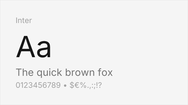
Modern UI sans-serif with exceptional screen rendering and variable font support
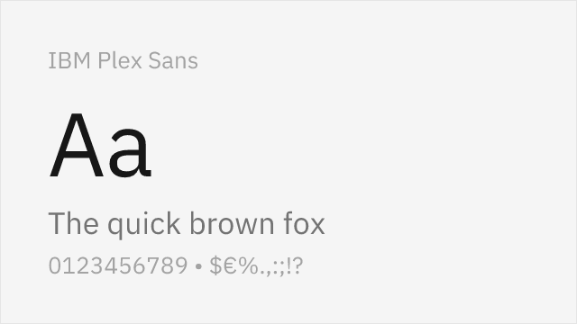
Engineered for UI clarity with strong glyph differentiation and corporate tone

Highly readable workhorse with open shapes and excellent hinting for screen display
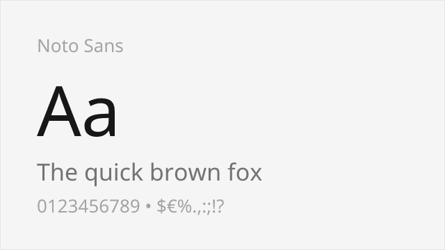
Unmatched multilingual coverage with neutral corporate character
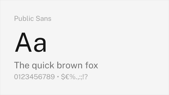
Government-grade neutrality and accessibility-first design
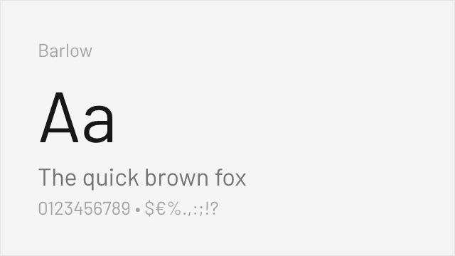
DIN-adjacent signage aesthetic with California infrastructure DNA

American gothic functionality with variable font support and industrial character
Compare the alternatives
See how Volvo Centum compares to its top alternatives — and how those alternatives compare to each other — side by side.
See where Volvo Centum is used in the wild and swap to free alternatives live.
Install FontSwap →Replacement Summary
Source: FontAlternatives.com
Premium font: Volvo Centum
Best free alternative: Inter
FontAlternatives similarity score: 82%
Replacement difficulty: Medium
Best for: dashboard UI mockups, automotive configurator interfaces, corporate web applications, design system prototyping
Notable users: Volvo Cars, Volvo EX60, Volvo Dealer Network
Not recommended when: Full weight range is critical - some weights require approximation
What is the best free alternative to Volvo Centum?
Inter is the best free alternative to Volvo Centum with a FontAlternatives similarity score of 82%.
Inter shares similar proportions, stroke characteristics, and intended use with Volvo Centum. It is available under the OFL-1.1 license, which permits both personal and commercial use at no cost.
This alternative works particularly well for: dashboard UI mockups, automotive configurator interfaces, corporate web applications, design system prototyping.
Can I safely replace Volvo Centum with Inter?
Yes, with some considerations. Inter achieves a FontAlternatives similarity score of 82%, indicating good structural compatibility for most use cases.
Licensing: Inter is licensed under OFL-1.1, which allows commercial use without licensing fees or royalties.
Weight coverage: Some weights require approximation. See the weight-matching guide below for details.
When should I NOT replace Volvo Centum?
While Inter is a strong alternative, there are situations where replacing Volvo Centum may not be appropriate:
- Optical precision requirements: Inter has measurable structural differences from Volvo Centum that may be visible in precise design work.
- Full weight range needed: Some Volvo Centum weights require approximation in Inter.
- Strict compliance: Verify that OFL-1.1 terms meet your specific legal and compliance requirements.
Weight-Matching Guide
Map Volvo Centum weights to their closest free alternatives for accurate font substitution.
Inter
| Volvo Centum | Inter | Match |
|---|---|---|
| Light | Light (300) | close |
| Regular | Regular (400) | close |
| Medium | Medium (500) | close |
| Bold | Semi Bold (600) | substitute |
IBM Plex Sans
| Volvo Centum | IBM Plex Sans | Match |
|---|---|---|
| Light | Light (300) | close |
| Regular | Regular (400) | close |
| Medium | Medium (500) | exact |
| Bold | Bold (700) | close |
Source Sans 3
| Volvo Centum | Source Sans 3 | Match |
|---|---|---|
| Light | Light (300) | close |
| Regular | Regular (400) | close |
| Medium | Semi Bold (600) | substitute |
| Bold | Bold (700) | close |
Noto Sans
| Volvo Centum | Noto Sans | Match |
|---|---|---|
| Light | Light (300) | close |
| Regular | Regular (400) | close |
| Medium | Medium (500) | close |
| Bold | Bold (700) | close |
Public Sans
| Volvo Centum | Public Sans | Match |
|---|---|---|
| Light | Light (300) | close |
| Regular | Regular (400) | close |
| Medium | Medium (500) | close |
| Bold | Bold (700) | close |
Barlow
| Volvo Centum | Barlow | Match |
|---|---|---|
| Light | Light (300) | close |
| Regular | Regular (400) | close |
| Medium | Medium (500) | close |
| Bold | Bold (700) | close |
Work Sans
| Volvo Centum | Work Sans | Match |
|---|---|---|
| Light | Light (300) | close |
| Regular | Regular (400) | close |
| Medium | Medium (500) | close |
| Bold | Bold (700) | close |
Performance Guide
Production performance metrics for each alternative.
How to Use Inter
Copy these code snippets to quickly add Inter to your project.
CSS code for Inter
@import url('https://fonts.googleapis.com/css2?family=Inter:wght@100..900&display=swap');HTML code for Inter
<link rel="preconnect" href="https://fonts.googleapis.com">
<link rel="preconnect" href="https://fonts.gstatic.com" crossorigin>
<link href="https://fonts.googleapis.com/css2?family=Inter:wght@100..900&display=swap" rel="stylesheet">
Tailwind code for Inter
// tailwind.config.js
module.exports = {
  theme: {
    extend: {
      fontFamily: {
        'inter': ['Inter', 'sans-serif'],
      },
    },
  },
}

// Usage in HTML:
// <p class="font-inter">Your text here</p>
Next.js code for Inter
// Using next/font (Next.js 13+)
import { Inter } from 'next/font/google';

const inter = Inter({
  subsets: ['latin'],
  weight: ['100', '200', '300', '400', '500', '600', '700', '800', '900'],
});

export default function Component() {
  return (
    <p className={inter.className}>
      Your text here
    </p>
  );
}

// Or using inline styles with Google Fonts link:
// <p style={{ fontFamily: "'Inter'" }}>Your text</p>
Expo and React Native code for Inter
// Install: npx expo install @expo-google-fonts/inter expo-font
import { useFonts, Inter_400Regular } from '@expo-google-fonts/inter';

export default function App() {
  const [fontsLoaded] = useFonts({
    Inter_400Regular,
  });

  if (!fontsLoaded) return null;

  return (
    <Text style={{ fontFamily: 'Inter_400Regular' }}>
      Your text here
    </Text>
  );
}
Recommended Font Pairings
These free fonts pair well with Inter Volvo Centum for headlines, body text, or accent use.
Source Serif Pro provides editorial warmth and reading comfort for long-form content, contrasting with Centum's clinical precision in headlines and UI elements
JetBrains Mono's monospace clarity complements Centum's functional aesthetic for technical documentation, VIN displays, and diagnostic interfaces common in automotive contexts
Fira Code's programming ligatures and clear glyph differentiation pair naturally with Centum's engineering-minded approach to typography
Browse Alternatives by Context
Find Volvo Centum alternatives filtered by specific use case, style, or language support.
By Script
Frequently Asked Questions
What is the best free alternative to Volvo Centum?
Inter is the best free alternative to Volvo Centum with a FontAlternatives similarity score of 82%. It shares similar proportions and characteristics while being available under the OFL-1.1 license for both personal and commercial use at no cost.
Is there a free version of Volvo Centum?
There is no official free version of Volvo Centum. However, Inter is available under the OFL-1.1 open-source license and achieves a FontAlternatives similarity score of 82%. It includes variable weights and supports latin, latin-extended.
What Google Font looks like Volvo Centum?
The Google Fonts most similar to Volvo Centum are Inter, IBM Plex Sans, Source Sans 3. Among these alternatives, Inter offers the closest match with a FontAlternatives similarity score of 82% and includes variable weights for flexible typography options.
Can I use Inter commercially?
Yes, Inter can be used commercially. It is licensed under OFL-1.1, which allows free use in websites, applications, print materials, and commercial projects without purchasing a license or paying royalties.
Is Inter similar enough to Volvo Centum?
Inter achieves a FontAlternatives similarity score of 82% compared to Volvo Centum. While not identical, it offers comparable letterforms, proportions, and visual style. Most designers find it works excellently as a substitute in web and print projects.
What are the main differences between Volvo Centum and its free alternatives?
Free alternatives to Volvo Centum may differ in subtle details like letter spacing, curve refinements, and available weights. Premium fonts typically include more OpenType features, extended language support, and optimized screen rendering. However, for most projects, these differences are negligible.
Where can I download free alternatives to Volvo Centum?
Download Inter directly from Google Fonts. Click the "Get Font" button on any alternative listed above to visit the official download page. Google Fonts also provides convenient embed codes for seamless web integration.
Video Resources
Curated videos about Volvo Centum and its alternatives.