Free Alternatives to DIN

About DIN
- Foundry
- Linotype
- Classification
- sans-serif
- Style
- industrial
Brands Using DIN
DIN 1451 (Mittelschrift/Engschrift) has set German road and autobahn signs since the 1930s
DIN 1451 originated as the lettering standard for German technical drawings and industry
FF DIN became a branding and editorial staple through the 2000s
A default typographic voice for engineering-led brands
 See DIN live on these sites with FontSwap →
See DIN in the Wild
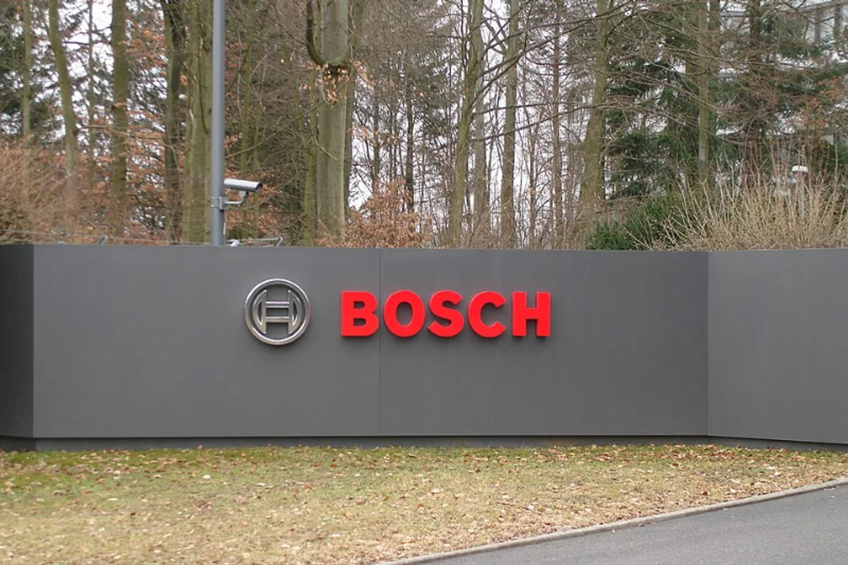
DIN is the industrial sans-serif that started as a government standard and became a design-world staple. Its roots are the German standards body, Deutsches Institut für Normung, which in the 1930s codified a plain, unambiguous alphabet — standardized as DIN 1451 — for railways, road signs, and technical drawing. Decades later, Albert-Jan Pool turned that utilitarian template into a full typographic family (FF DIN, 1995), and the design has been a fixture of automotive, technology, and editorial branding ever since.
Why DIN Matters
DIN is proof that constraint can be a style. It was never meant to be beautiful — it was meant to be readable at speed, reproducible by a sign-painter's stencil, and identical across every workshop in the country. That engineering brief gave it a look no marketing department could have invented: narrow, even, and completely unsentimental. When designers rediscovered it, that plainness read as honesty, and honesty is exactly what industrial and technical brands want to project.
The result is a typeface that signals precision without saying a word. A German carmaker, a power-tool manufacturer, a fintech dashboard, a techno record label — all reach for DIN because it carries the connotation of things that are engineered rather than merely made. It is also genuinely useful: its narrow proportions fit more characters per line than almost any other legible sans, which is why it thrives on signage, packaging, and data-dense interfaces where space is scarce.
There is a broader lesson in DIN's success, and it is why the typeface keeps coming back into fashion. Most trends in branding chase warmth, personality, or novelty, and all three age quickly. DIN offers the opposite proposition: it looks like it was chosen by an engineer, not a stylist, and that impression of function-over-fashion has proven remarkably durable. A brand set in DIN in 1998 does not look dated so much as deliberate, because the design was never trying to be of its moment in the first place. For anyone weighing longevity against trendiness, that timelessness is a large part of the appeal.
Who is it for? Brands and projects that want to look competent, current, and slightly technical, and that value clarity over warmth. It is a poor fit for anyone chasing softness or tradition — but for the engineered look, it is close to the reference standard.
Design Characteristics
Most typefaces are drawn to be looked at; DIN was drawn to be obeyed. Every decision in its letterforms traces back to a functional requirement — reproducibility, legibility, economy of space — and that discipline is exactly what gives it its distinctive, engineered personality. The traits below are less stylistic choices than solved problems:
- Narrow proportions: DIN's defining trait. Letters are noticeably condensed relative to most sans-serifs, packing more text into a given width without sacrificing legibility — the reason it dominates signage and labels.
- Even, near-monoline strokes: Minimal thick-thin contrast, a legacy of the standardized, easy-to-reproduce original. The result is a calm, uniform typographic color.
- Rational, geometric skeleton: Straight stems, simple curves, and open counters give DIN a constructed, engineered feel without tipping into pure geometry.
- High legibility at distance and small sizes: The forms were optimized for reading a road sign at speed and a dimension on a technical drawing up close — both demanding conditions.
- Restrained, unornamented terminals: Nothing decorative. Stroke endings are clean and functional, reinforcing the no-nonsense tone.
- A broad modern family: The digital revivals expanded the standard's handful of styles into full weight ranges from Light to Black, with italics, condensed cuts, and extended Latin coverage. Cyrillic is sold separately, as DIN Next Cyrillic and DIN 1451 Cyrillic.
History and Design
The original was not a typeface in the commercial sense — it was a specification. DIN 1451 defined a lettering standard for German administration, industry, and traffic, with variants tuned for engraving, stencils, and signage. Its whole purpose was consistency: any technician, anywhere, should be able to reproduce the same letters. That is why the forms are so plain — personality was the enemy of the brief.
The modern story begins with Albert-Jan Pool. Working from the DIN 1451 model, he drew FF DIN for FontFont in 1995, adding the weights, italics, and refinements the standard lacked and turning a technical alphabet into a versatile design family. FF DIN became one of the most popular typefaces of the 2000s, ubiquitous in branding and editorial work. The concept was revived again a decade later as DIN Next (Linotype, 2009), Akira Kobayashi's reworking, which broadened language support and added rounded and condensed variants. Between them, these revivals are why a 1930s standards document now sits in the type menu of nearly every design studio.
The cultural journey is worth pausing on, because it explains DIN's peculiar dual identity. For most of its life it was invisible infrastructure — the lettering on an autobahn sign that no one was meant to notice. Then, as designers in the 1990s and 2000s went looking for typefaces that felt authentic, technical, and free of the decorative excess of the era, DIN's very anonymity became its appeal. A face engineered to disappear into a road sign turned out to be the perfect vehicle for brands that wanted to look precise and unpretentious, and it spread from wayfinding into fashion, music, and technology branding. The same qualities that made it a good standard made it a good logo.
Where DIN Excels
DIN rewards contexts that value competence over charm. Wherever a brand or system needs to look precise, current, and quietly technical — and can spare the warmth to get there — DIN performs:
- Signage and wayfinding: Its original job, and still where it is strongest — legible at distance, space-efficient, and instantly authoritative.
- Automotive and industrial branding: The engineered connotation is practically built in; it is the default voice of German engineering.
- Technology and fintech: Dashboards, data displays, and product UIs benefit from its clarity and narrow footprint.
- Technical documentation: Manuals, specifications, and diagrams where unambiguous reading matters more than warmth.
- Editorial and music design: The industrial aesthetic has long been a favorite of magazines and electronic-music labels looking for a cool, contemporary edge.
Where DIN Struggles
The flip side of a typeface engineered for neutrality is that it brings very little warmth of its own, and there are jobs where that is a real handicap:
- Warm or human contexts: DIN is deliberately impersonal. For lifestyle, wellness, children's, or hospitality brands that need friendliness, its coolness works against you.
- Extended body text: The narrow proportions that help signage can tire the eye over long passages; DIN is happier in headlines, labels, and short blocks than in book-length reading.
- Tradition and heritage: It reads as modern and technical, so it is the wrong tool for anything that wants to feel established, classical, or old-world.
- Over-familiarity: FF DIN's popularity means it can feel like a default in some design circles; the look is safe but no longer surprising.
- Licensing cost: The quality digital cuts (FF DIN, DIN Next) are commercial and priced per use, which is exactly why the free alternatives below exist.
How to Choose a Free Substitute
DIN pulls in two directions — it is both an industrial geometric and a condensed face — so the right free substitute depends on which of those traits you actually need.
If you want the engineered, technical character, start with Exo: Natanael Gama's geometric sans shares DIN's precise, constructed feel and ships as a variable font with a full weight range. Saira is the next step, explicitly inspired by industrial design and, crucially, offering true condensed widths that echo DIN's proportions.
If DIN's narrowness is the point — headlines, signage, tight labels — reach for Oswald, whose condensed gothic proportions capture the silhouette better than any wider grotesque, or BenchNine for genuinely extreme condensation in data-dense layouts. For wayfinding and general-purpose use, Barlow brings a signage heritage of its own with multiple widths and a comprehensive weight range.
And if you need DIN's clarity but in running text or an interface, where its industrial stiffness becomes a liability, Fira Sans is the humanist compromise: warmer and more readable, at the cost of the engineered edge. Whichever you choose, test it at your real sizes — DIN substitutes that look convincing in a headline can drift far from the original once set as body copy, and the proportions are the first thing to check.
Premium Font Neighbors
If DIN's industrial clarity appeals but you want to explore commercial options, several premium families share its territory. Interstate (Tobias Frere-Jones) is the American cousin — drawn from US highway signage, it shares DIN's legible, functional DNA. Eurostile brings a more overtly geometric, mid-century industrial flavor, while Univers offers Adrian Frutiger's systematic, engineered take on the grotesque. Frutiger itself, designed for airport wayfinding, is the humanist signage benchmark. For an American-gothic direction, Trade Gothic, Franklin Gothic, and Agenda deliver condensed, workmanlike sans-serifs, and Bank Gothic supplies the squared, technical capitals that pair well with DIN's aesthetic.
FAQ
What is the best free alternative to DIN?
Exo is the best all-round free alternative, capturing DIN's industrial geometric character and technical precision with variable-font flexibility. If DIN's narrow, condensed proportions are what you specifically need, Oswald is the closer match for headlines and signage. Both are free on Google Fonts under the SIL Open Font License.
Is DIN free to use?
The original DIN 1451 standard is a public specification, but the quality digital families — FF DIN and DIN Next — are commercial typefaces licensed per use. There is no free tier for those cuts, which is why designers reach for open-source alternatives like Exo, Saira, and Oswald that approximate the look without a license fee.
Who designed the modern DIN typeface?
Albert-Jan Pool drew FF DIN — the influential 1995 FontFont family — building a full typeface from the DIN 1451 standard. The other major digital revival, DIN Next (Linotype, 2009), is Akira Kobayashi's work rather than Pool's. The underlying DIN 1451 lettering itself came from the German standards body in the 1930s, not from a single named designer.
Why does DIN look so "technical" or "German"?
Because it literally was a technical standard. DIN 1451 was created for German road signs, railways, and engineering drawings, prioritizing unambiguous, reproducible letterforms over any aesthetic. That utilitarian origin is exactly what reads today as precise, engineered, and characteristically German.
What makes DIN good for signage?
Two things: its narrow proportions fit more legible text into limited space, and its even strokes and open counters stay readable at distance and at speed. Those are the same qualities the free alternatives should be tested for — Oswald and Barlow both carry a signage heritage that suits wayfinding use.
Does DIN support Cyrillic?
Only in separate editions. DIN Next LT Pro itself is Latin only; Cyrillic is sold as DIN Next Cyrillic, and DIN 1451 has a Cyrillic MittelSchrift. Among the free alternatives, Fira Sans and Exo both offer broad language coverage if multilingual support is a requirement.
Which free DIN alternative has the most weights?
Exo, Saira, and Fira Sans all span a full range from Thin/Light to Black (roughly 100–900), giving far more hierarchy control than a two- or three-weight family. Exo and Saira are variable fonts, so they also allow fine weight tuning between the named steps.
Is DIN a good choice for body text?
Not really. DIN's narrow proportions and industrial evenness are ideal for headlines, signage, labels, and short blocks, but they can tire the eye over long passages, and the coolness that reads as "precise" in a headline can read as "cold" across a paragraph. If you need DIN's clarity for extended reading, a humanist alternative like Fira Sans is more comfortable, or pair DIN headlines with a warmer serif for the body.
DIN vs Helvetica — which should I use?
They solve different problems. Helvetica is a neutral, wide neo-grotesque built to be invisible; DIN is a narrow, engineered face built to look technical. Choose Helvetica when you want typography that recedes entirely, and DIN when you want the type itself to signal precision and industry. DIN's condensed proportions also fit noticeably more text per line, which matters for signage and dense interfaces.
Is DIN on Google Fonts?
No, DIN is a premium font from Linotype and is not available on Google Fonts.
The closest Google Fonts alternative is Exo with 85% similarity. Get it free on Google Fonts ↗
Free Alternatives (6)
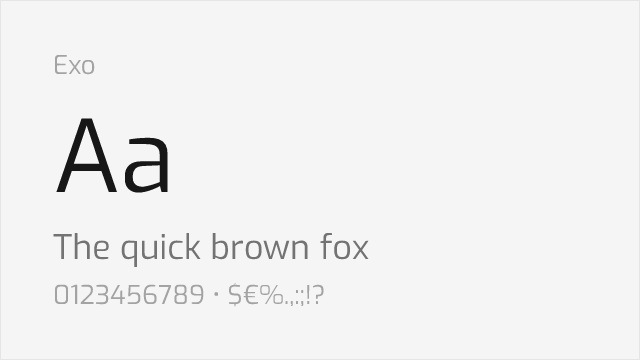
Shares industrial geometric character with similar technical aesthetic
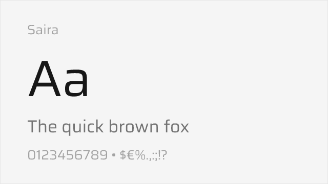
Comparable condensed proportions and industrial design origins
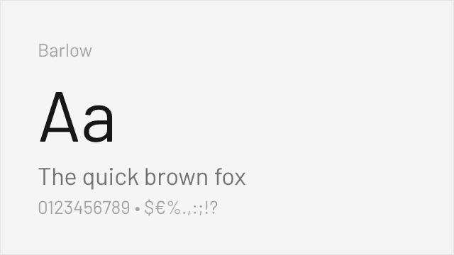
Similar industrial sans-serif feel with excellent weight range
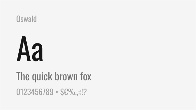
Condensed industrial sans with the narrow proportions DIN is known for
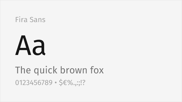
Humanist sans from Mozilla with 18 styles and extensive language support
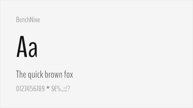
Condensed sans-serif with industrial character for data-heavy layouts
Compare the alternatives
See how DIN compares to its top alternatives — and how those alternatives compare to each other — side by side.
See where DIN is used in the wild and swap to free alternatives live.
Install FontSwap →Replacement Summary
Source: FontAlternatives.com
Premium font: DIN
Best free alternative: Exo
FontAlternatives similarity score: 85%
Replacement difficulty: Low
Best for: technology branding, gaming interfaces, automotive industry, industrial signage
Notable users: German road signage, Technical & engineering drawing, Editorial & music design
Not recommended when: Brand consistency with German road signage requires exact letterforms
What is the best free alternative to DIN?
Exo is the best free alternative to DIN with a FontAlternatives similarity score of 85%.
Exo shares similar proportions, stroke characteristics, and intended use with DIN. It is available under the OFL-1.1 license, which permits both personal and commercial use at no cost.
This alternative works particularly well for: technology branding, gaming interfaces, automotive industry, industrial signage.
Can I safely replace DIN with Exo?
Yes, Exo is a high-confidence replacement for DIN. The FontAlternatives similarity score of 85% indicates strong structural compatibility.
Licensing: Exo is licensed under OFL-1.1, which allows commercial use without licensing fees or royalties.
Weight coverage: All 5 weights have exact matches available.
When should I NOT replace DIN?
While Exo is a strong alternative, there are situations where replacing DIN may not be appropriate:
- Strict compliance: Verify that OFL-1.1 terms meet your specific legal and compliance requirements.
Weight-Matching Guide
Map DIN weights to their closest free alternatives for accurate font substitution.
Exo
| DIN | Exo | Match |
|---|---|---|
| Light | Light (300) | exact |
| Regular | Regular (400) | exact |
| Medium | Medium (500) | exact |
| Bold | Bold (700) | exact |
| Black | Black (900) | exact |
Saira
| DIN | Saira | Match |
|---|---|---|
| Light | Light (300) | exact |
| Regular | Regular (400) | exact |
| Medium | Medium (500) | exact |
| Bold | Bold (700) | exact |
Barlow
| DIN | Barlow | Match |
|---|---|---|
| Light | Light (300) | exact |
| Regular | Regular (400) | exact |
| Medium | Medium (500) | exact |
| Bold | Bold (700) | exact |
Oswald
| DIN | Oswald | Match |
|---|---|---|
| Light | Light (300) | close |
| Regular | Regular (400) | close |
| Medium | Medium (500) | close |
| Bold | Bold (700) | close |
Fira Sans
| DIN | Fira Sans | Match |
|---|---|---|
| Light | Light (300) | close |
| Regular | Regular (400) | exact |
| Medium | Medium (500) | exact |
| Bold | Bold (700) | exact |
BenchNine
| DIN | BenchNine | Match |
|---|---|---|
| Light | Light (300) | close |
| Regular | Regular (400) | close |
| Bold | Bold (700) | close |
Performance Guide
Production performance metrics for each alternative.
How to Use Exo
Copy these code snippets to quickly add Exo to your project.
CSS code for Exo
@import url('https://fonts.googleapis.com/css2?family=Exo:wght@100..900&display=swap');HTML code for Exo
<link rel="preconnect" href="https://fonts.googleapis.com">
<link rel="preconnect" href="https://fonts.gstatic.com" crossorigin>
<link href="https://fonts.googleapis.com/css2?family=Exo:wght@100..900&display=swap" rel="stylesheet">
Tailwind code for Exo
// tailwind.config.js
module.exports = {
  theme: {
    extend: {
      fontFamily: {
        'exo': ['Exo', 'sans-serif'],
      },
    },
  },
}

// Usage in HTML:
// <p class="font-exo">Your text here</p>
Next.js code for Exo
// Using next/font (Next.js 13+)
import { Exo } from 'next/font/google';

const exo = Exo({
  subsets: ['latin'],
  weight: ['100', '200', '300', '400', '500', '600', '700', '800', '900'],
});

export default function Component() {
  return (
    <p className={exo.className}>
      Your text here
    </p>
  );
}

// Or using inline styles with Google Fonts link:
// <p style={{ fontFamily: "'Exo'" }}>Your text</p>
Expo and React Native code for Exo
// Install: npx expo install @expo-google-fonts/exo expo-font
import { useFonts, Exo_400Regular } from '@expo-google-fonts/exo';

export default function App() {
  const [fontsLoaded] = useFonts({
    Exo_400Regular,
  });

  if (!fontsLoaded) return null;

  return (
    <Text style={{ fontFamily: 'Exo_400Regular' }}>
      Your text here
    </Text>
  );
}
Recommended Font Pairings
These free fonts pair well with Exo DIN for headlines, body text, or accent use.
Roboto Slab's mechanical slab serifs echo DIN's industrial heritage for a cohesive technical aesthetic
Merriweather's sturdy, screen-optimized serifs provide readable body text that balances DIN's engineered precision
Source Serif Pro's structured forms pair cleanly with DIN's industrial character for technical documentation and editorial layouts
Browse Alternatives by Context
Find DIN alternatives filtered by specific use case, style, or language support.
By Use Case
By Style
By Script
Frequently Asked Questions
What is the best free alternative to DIN?
Exo is the best free alternative to DIN with a FontAlternatives similarity score of 85%. It shares similar proportions and characteristics while being available under the OFL-1.1 license for both personal and commercial use at no cost.
Is there a free version of DIN?
There is no official free version of DIN. However, Exo is available under the OFL-1.1 open-source license and achieves a FontAlternatives similarity score of 85%. It includes variable weights and supports latin, latin-extended.
What Google Font looks like DIN?
The Google Fonts most similar to DIN are Exo, Saira, Barlow. Among these alternatives, Exo offers the closest match with a FontAlternatives similarity score of 85% and includes variable weights for flexible typography options.
Can I use Exo commercially?
Yes, Exo can be used commercially. It is licensed under OFL-1.1, which allows free use in websites, applications, print materials, and commercial projects without purchasing a license or paying royalties.
Is Exo similar enough to DIN?
Exo achieves a FontAlternatives similarity score of 85% compared to DIN. While not identical, it offers comparable letterforms, proportions, and visual style. Most designers find it works excellently as a substitute in web and print projects.
What are the main differences between DIN and its free alternatives?
Free alternatives to DIN may differ in subtle details like letter spacing, curve refinements, and available weights. Premium fonts typically include more OpenType features, extended language support, and optimized screen rendering. However, for most projects, these differences are negligible.
Where can I download free alternatives to DIN?
Download Exo directly from Google Fonts. Click the "Get Font" button on any alternative listed above to visit the official download page. Google Fonts also provides convenient embed codes for seamless web integration.