 Install FontSwap
Free Alternatives to DIN with Readable Style
DIN is known for its readable aesthetic. If you're looking for a free sans serif font with a similar readable feel, these 6 alternatives offer comparable characteristics. We've identified 6 that are especially well-suited for this context. All are available under open-source licenses for unrestricted commercial use.
Top Picks
Comparison Table
| Font | Relevance ⓘ
How well this alternative fits the specific context (use-case or trait) of this page. Score 0–100 based on matching keywords, industries, and font characteristics. Alternatives scoring 25+ are highlighted.
| Similarity ⓘ
How visually similar this free font is to the premium original. Score 0–100 based on x-height, width, stroke contrast, use-case overlap, and language coverage.
Learn more → | Weights | Variable | License | Source |
|---|---|---|---|---|---|---|
| Barlow | 51 | 78% | 9 | No | OFL-1.1 | Google Fonts ↗ |
| Exo | 47 | 85% | Variable | Yes | OFL-1.1 | Google Fonts ↗ |
| Saira | 46 | 82% | Variable | Yes | OFL-1.1 | Google Fonts ↗ |
| Fira Sans | 44 | 70% | 9 | No | OFL-1.1 | Google Fonts ↗ |
| BenchNine | 32 | 58% | 3 | No | OFL-1.1 | Google Fonts ↗ |
| Oswald | 25 | 75% | Variable | Yes | OFL-1.1 | Google Fonts ↗ |
All Alternatives (6)
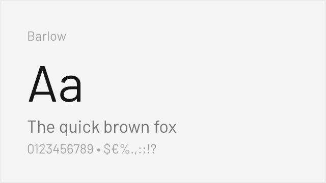
[Google Fonts] · OFL-1.1 · 9 weights
Similar industrial sans-serif feel with excellent weight range
Why it matches: Barlow brings California infrastructure aesthetics that parallel DIN's German signage heritage. Both were designed with wayfinding and legibility as primary concerns. Barlow's multiple widths (regular, semi-condensed, condensed) provide similar flexibility to DIN's application in space-limited contexts while adding subtle humanist warmth.
wayfinding systemsdata visualizationtechnology productspackaging design
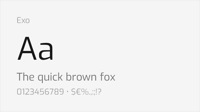
[Google Fonts] · OFL-1.1 · Variable
Shares industrial geometric character with similar technical aesthetic
Why it matches: Exo captures DIN's industrial geometric precision with a contemporary futuristic edge. Both feature consistent stroke widths, geometric foundations, and technical aesthetics suited for automotive and industrial contexts. Exo's variable font support and complete weight range from Thin to Black provide flexibility that matches DIN's comprehensive family.
technology brandinggaming interfacesautomotive industryindustrial signage
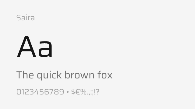
[Google Fonts] · OFL-1.1 · Variable
Comparable condensed proportions and industrial design origins
Why it matches: Saira mirrors DIN's industrial heritage with exceptional width variations including condensed variants ideal for space-constrained applications. Both typefaces share German industrial influence—DIN from actual German standardization, Saira from mid-century industrial lettering. Saira's condensed widths replicate DIN's signature space efficiency for signage and technical documentation.
automotive racingtechnical specificationscondensed headlinesdata tables
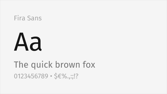
[Google Fonts] · OFL-1.1 · 9 weights
Humanist sans from Mozilla with 18 styles and extensive language support
Why it matches: Fira Sans, drawn by Erik Spiekermann's studio for Mozilla, is a humanist sans that trades DIN's rigid engineering for a warmer, more readable character while keeping the clarity technical work needs. It is not a narrow face, so it loses DIN's space efficiency, but for interfaces, documentation, and body text where DIN can feel stiff, Fira Sans delivers comparable legibility with a friendlier tone and a very broad weight and language range.
user interfacestechnical documentationmultilingual textlong-form reading
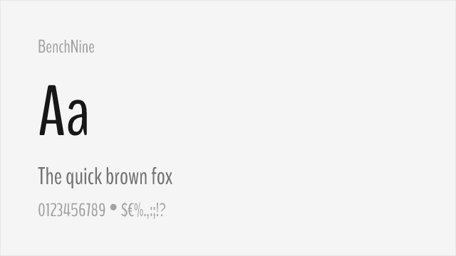
[Google Fonts] · OFL-1.1 · 3 weights
Condensed sans-serif with industrial character for data-heavy layouts
Why it matches: BenchNine is an ultra-condensed sans that echoes DIN's narrowness at the extreme end, useful when you need to fit type into genuinely tight bands — data tables, compact labels, dense dashboards. It is a lighter, more delicate design than DIN and works best at display sizes rather than body text, but for squeezing legible type into narrow columns it shares DIN's space-first priorities.
compact data layoutscondensed headlineslabels and captionsdashboard chrome
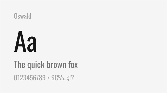
[Google Fonts] · OFL-1.1 · Variable
Condensed industrial sans with the narrow proportions DIN is known for
Why it matches: Oswald is the free font that best captures DIN's most recognizable trait — its narrow, space-efficient proportions. A reworking of the classic condensed gothic style, Oswald shares DIN's tall, tight, no-nonsense character and its knack for packing legible type into limited space, which makes it a natural stand-in for headlines, signage, and labels. It reads a little more editorial and a little less engineered than DIN, but the industrial silhouette is unmistakable.
condensed headlinessignage and wayfindingsports and athletic brandingspace-constrained layouts