Free Alternatives to Volvo Centum with Minimal Style
Volvo Centum is known for its minimal aesthetic. If you're looking for a free sans serif font with a similar minimal feel, these 7 alternatives offer comparable characteristics. We've identified 7 that are especially well-suited for this context. All are available under open-source licenses for unrestricted commercial use.
Top Picks
Comparison Table
| Font | Relevance ⓘ
How well this alternative fits the specific context (use-case or trait) of this page. Score 0–100 based on matching keywords, industries, and font characteristics. Alternatives scoring 25+ are highlighted.
| Similarity ⓘ
How visually similar this free font is to the premium original. Score 0–100 based on x-height, width, stroke contrast, use-case overlap, and language coverage.
Learn more → | Weights | Variable | License | Source |
|---|---|---|---|---|---|---|
| Inter | 86 | 82% | Variable | Yes | OFL-1.1 | Google Fonts ↗ |
| Source Sans 3 | 86 | 78% | Variable | Yes | OFL-1.1 | Google Fonts ↗ |
| Noto Sans | 86 | 78% | Variable | Yes | OFL-1.1 | Google Fonts ↗ |
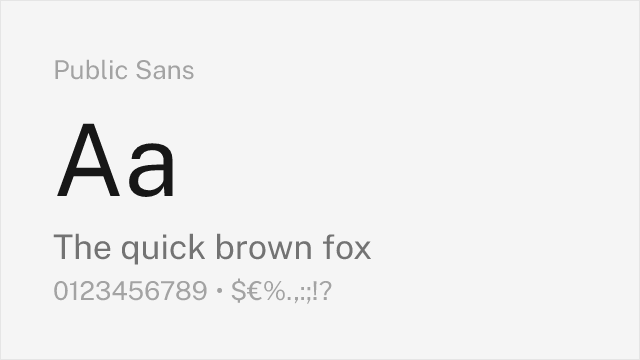
| Public Sans | 85 | 75% | Variable | Yes | OFL-1.1 | Google Fonts ↗ |
| Work Sans | 84 | 72% | Variable | Yes | OFL-1.1 | Google Fonts ↗ |
| IBM Plex Sans | 66 | 80% | 7 | No | OFL-1.1 | Google Fonts ↗ |
| Barlow | 65 | 74% | 9 | No | OFL-1.1 | Google Fonts ↗ |
All Alternatives (7)


Modern UI sans-serif with exceptional screen rendering and variable font support


Highly readable workhorse with open shapes and excellent hinting for screen display


Unmatched multilingual coverage with neutral corporate character

Government-grade neutrality and accessibility-first design


American gothic functionality with variable font support and industrial character


Engineered for UI clarity with strong glyph differentiation and corporate tone


DIN-adjacent signage aesthetic with California infrastructure DNA