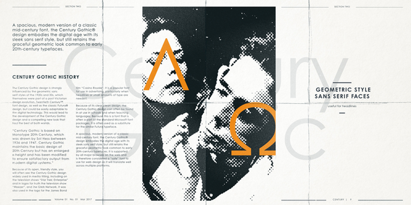
Century Gothic vs Poppins
Choosing between Century Gothic and Poppins comes down to whether you want the original tone or a practical open-source substitute. With 72% similarity, Poppins shares Century Gothic's geometric sans-serif foundation with circular letter forms and clean construction. If you need more weights than Century Gothic offers, Poppins is usually the more flexible family.
Design DNA
Design overlap:13%
Century Gothic
Poppins
Highlighted traits are shared between both fonts
Visual Comparison
Century Gothic
Premium
Poppins
FreeAa Bb Cc 123
The quick brown fox jumps over the lazy dog
ABCDEFGHIJKLMNOPQRSTUVWXYZ
abcdefghijklmnopqrstuvwxyz
0123456789 !@#$%^&*()
Feature Comparison
| Feature | Century Gothic | Poppins |
|---|---|---|
| Type | Premium | Free |
| Classification | sans-serif | sans-serif |
| Variable Font | No | No |
| Weights | Multiple | 100, 200, 300, 400, 500, 600, 700, 800, 900 |
| Italics | Yes | Yes |
| License | Commercial License Required | OFL-1.1 |
| Language Support | latin, latin-extended, cyrillic, greek | latin, latin-extended, devanagari |
| Source | Monotype | Google Fonts |
Best Use Cases
Typography for established businesses, enterprise software, and professional ser...
Typography for slide decks, keynotes, and presentation materials. Presentation f...
Fonts that establish strong brand identity with distinctive character and versat...
Typography optimized for printed materials, physical production, and offset or d...
Typography designed to grab attention at large sizes. Display fonts feature dist...
Typography designed specifically for titles, headers, and attention-grabbing tex...
Typography suited for magazines, newspapers, and long-form content. Editorial fo...
Fonts optimized for mobile interfaces with excellent small-size legibility, clea...
Typography for medical, wellness, and healthcare applications. Healthcare fonts ...
Performance Comparison
| Metric | Century Gothic | Poppins |
|---|---|---|
| Score | N/A | 59/100 |
| File Size | N/A | 162.4 KB |
| Weights | N/A | 9 |
| Italics | N/A | Yes |
| Variable Font | N/A | No |
| Language Groups | N/A | 3 |
| CDN Delivery | N/A | Yes |
| x-Height Ratio | N/A | 0.548 |
| Cap Height Ratio | N/A | 0.698 |
Where You'll See These Fonts
Century Gothic
- Microsoft Office documents
- Corporate presentations
- University publications
- Government communications
- Print advertisements
Which Should You Choose?
Consider: Century Gothic
- Shares Century Gothic's minimal character
- Particularly suited for tech branding and web applications
- 9 weight options for flexible typography
- Delivers a friendly, modern, clean aesthetic
- Popular in education-academia and healthcare-medical design
Recommended: Poppins
- Original design with refined typographic details
- Designed specifically for corporate and presentations
- Used by Microsoft Office documents, Corporate presentations
- Commercial license with professional support
Browse by Context
Free Alternatives to Consider
Other free alternatives to Century Gothic