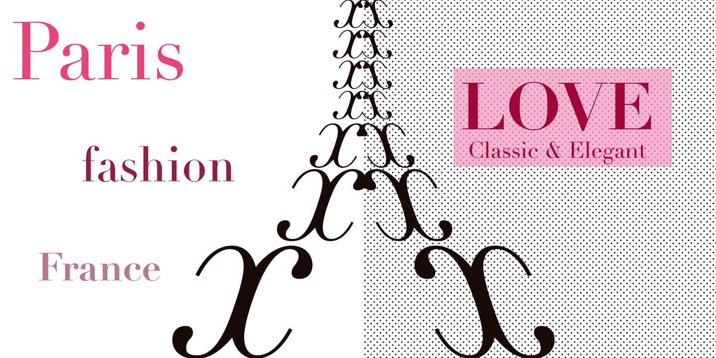
Didot vs Playfair Display
If you're evaluating Didot as a baseline, this comparison shows how Playfair Display stacks up in real projects. With 85% similarity, Playfair Display captures the essential Didone aesthetic—high contrast, elegant proportions, and sophisticated character—while adding subtle refinements for digital reproduction. High contrast is sensitive to rendering; check how the thin strokes behave at your intended sizes.
Design DNA
Design overlap:20%
Didot
Playfair Display
Highlighted traits are shared between both fonts
Visual Comparison
Didot
Premium
Playfair Display
FreeAa Bb Cc 123
The quick brown fox jumps over the lazy dog
ABCDEFGHIJKLMNOPQRSTUVWXYZ
abcdefghijklmnopqrstuvwxyz
0123456789 !@#$%^&*()
Feature Comparison
| Feature | Didot | Playfair Display |
|---|---|---|
| Type | Premium | Free |
| Classification | serif | serif |
| Variable Font | No | Yes |
| Weights | Multiple | Variable (100-900) |
| Italics | Yes | Yes |
| License | Commercial License Required | OFL-1.1 |
| Language Support | latin, latin-extended, cyrillic, greek | latin, latin-extended, cyrillic, vietnamese |
| Source | Linotype | Google Fonts |
Best Use Cases
Typography for fashion brands, style publications, and luxury apparel. Fashion f...
Typography suited for magazines, newspapers, and long-form content. Editorial fo...
Typography for luxury brands, high-end products, and premium services. Luxury fo...
Typography designed to grab attention at large sizes. Display fonts feature dist...
Fonts that establish strong brand identity with distinctive character and versat...
Typography designed specifically for titles, headers, and attention-grabbing tex...
Typography for creative work, artistic projects, and experimental design. Creati...
Typography for magazine design, periodicals, and print publications. Magazine fo...
Typography for established businesses, enterprise software, and professional ser...
Performance Comparison
| Metric | Didot | Playfair Display |
|---|---|---|
| Score | N/A | 62/100 |
| File Size | N/A | 228.2 KB |
| Weights | N/A | 9 (var) |
| Italics | N/A | Yes |
| Variable Font | N/A | Yes (2 axes) |
| Language Groups | N/A | 4 |
| CDN Delivery | N/A | Yes |
| x-Height Ratio | N/A | 0.514 |
| Cap Height Ratio | N/A | 0.708 |
Where You'll See These Fonts
Didot
- Harper's Bazaar
- CBS logo
- Giorgio Armani
- Zara branding
- French luxury brands
Which Should You Choose?
Consider: Didot
- Shares Didot's elegant character
- Particularly suited for fashion editorials and magazine headlines
- Variable font with continuous weight adjustment
- Supports 4 scripts including cyrillic and vietnamese
- Delivers a elegant, classic, sophisticated aesthetic
Recommended: Playfair Display
- Original design with refined typographic details
- Designed specifically for fashion and editorial
- Used by Harper's Bazaar, CBS logo
- Commercial license with professional support
Free Alternatives to Consider
Other free alternatives to Didot