Free Alternatives to Didot

About Didot
- Foundry
- Linotype
- Classification
- serif
- Style
- didone
Brands Using Didot
Magazine masthead and editorial display typography
Network logo wordmark
Earlier brand identity before geometric rebrand
Supporting typeface in luxury print materials
Didot is a group of typefaces named after the famous French printing and type-producing Didot family. The modern Linotype Didot, released in 1991 and designed by Adrian Frutiger, captures the refined elegance and dramatic contrast that made Didot typefaces emblematic of neoclassical printing. Where Bodoni represents Italian precision, Didot embodies French sophistication.
History and Design
The Didot family dominated French printing from the 18th through 19th centuries, creating a typographic dynasty that shaped European publishing. François-Ambroise Didot (1730-1804) established the foundations, but it was his son Firmin Didot (1764-1836) who developed the distinctive typefaces that bear the family name. The types are characterized by extreme contrast between thick and thin strokes, flat unbracketed serifs, and a vertical axis. These features define the "Modern" or Didone classification—the name itself a portmanteau of "Didot" and "Bodoni."
The Didots were more than type designers. They invented the point system still used today to measure type sizes, developed stereotyping techniques that revolutionized printing, and published landmarks of French literature. Their typefaces became synonymous with French intellectual and cultural life—Balzac, Hugo, and countless other literary giants appeared in Didot types.
The Didot aesthetic represents Enlightenment rationalism applied to typography. The mathematical precision, geometric construction, and extreme refinement reflect the same values that produced neoclassical architecture and revolutionary ideals. Unlike the organic warmth of earlier typefaces, Didot embraces systematic, almost clinical elegance.
Linotype Didot, designed by Adrian Frutiger in 1991, interprets the Didot aesthetic for contemporary use. Frutiger—creator of Univers and Frutiger—brought his systematic approach to the project, maintaining the dramatic contrast and elegant proportions while making subtle adjustments for improved reproduction and readability. The result honors Didot's legacy while addressing modern production requirements.
Why Didot Remains Relevant
Didot's association with French fashion and luxury has only strengthened over time. Harper's Bazaar's masthead, set in Didot since its founding, established the typeface as the voice of American fashion publishing. Giorgio Armani, Zara, and countless other fashion houses employ Didot-style letterforms to convey sophistication and refinement. The CBS television network's iconic "eye" logo uses Didot letterforms.
The extreme contrast creates immediate visual impact, making it ideal for display applications. The delicate hairlines and bold verticals command attention while projecting cultivated taste. Didot says "fashion" and "luxury" as clearly as any typeface can.
Use Cases
Didot excels in:
- Fashion publishing: Magazine mastheads and editorial headlines
- Luxury branding: High-end products and services
- Display typography: Headlines, posters, and large-format applications
- Cultural institutions: Art galleries, museums, and classical music
Finding Free Alternatives
Playfair Display offers a contemporary interpretation of the Didone style, capturing Didot's dramatic contrast with subtle refinements for screen rendering. Claus Eggers Sørensen designed it to bridge multiple traditions—Baskerville's transitional grace, Scotch Roman practicality, and Didone drama—creating a versatile display face. While not a direct copy of Didot, Playfair conveys similar elegance and sophistication, making it excellent for fashion and editorial applications. The comprehensive weight range from Regular to Black exceeds most commercial Didot families.
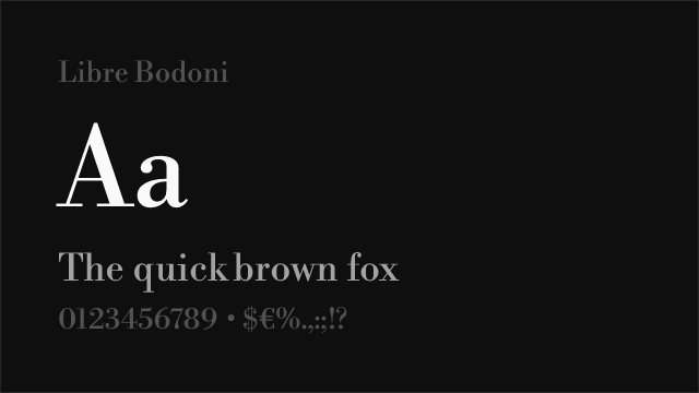
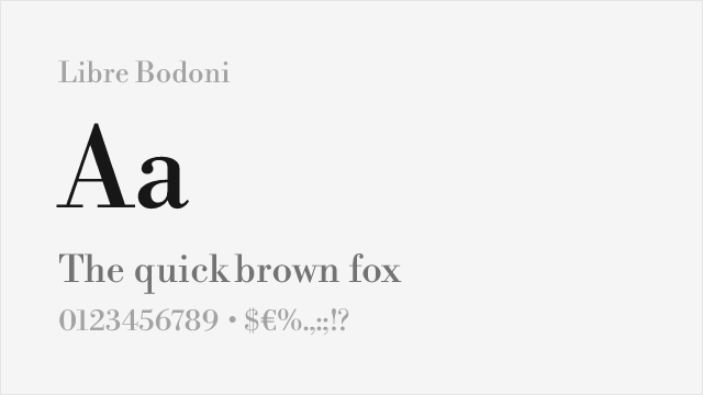
Libre Bodoni provides an alternative when closer adherence to historical Didone forms is desired. Though based on Italian rather than French sources, it shares the essential characteristics—extreme contrast, flat serifs, vertical stress—that define the classification. For applications where the Didone aesthetic matters more than specific national character, Libre Bodoni serves admirably.
Both alternatives require careful attention to size. The dramatic contrast that makes Didone typefaces striking at display sizes becomes problematic in body text, where hairlines may disappear or break up. Reserve these fonts for headlines, mastheads, and large format applications.
FAQ
What is the best free alternative to Didot?
Playfair Display is the best free alternative to Didot, offering a contemporary interpretation of the Didone style with dramatic contrast and elegant proportions. Designed by Claus Eggers Sørensen, it captures the sophisticated character of Didot while incorporating modern refinements optimized for digital display.
Can I use Playfair Display commercially?
Yes, Playfair Display is licensed under the SIL Open Font License (OFL-1.1), permitting commercial use without restrictions or fees. You can use it for fashion branding, editorial design, marketing materials, and products. Attribution is required only when redistributing the font files.
How similar is Playfair Display to Linotype Didot?
Playfair Display achieves approximately 85% similarity to Linotype Didot in overall character and aesthetic. Both feature high contrast, elegant proportions, and Didone styling. Playfair has slightly softer details and improved screen rendering, while Didot maintains stricter neoclassical precision.
What are the main differences between Didot and Playfair Display?
Didot features hairline-thin strokes and completely flat serifs in the purest Didone tradition. Playfair Display has marginally heavier hairlines and subtle bracketing for better screen rendering. Didot appears more severe and classical, while Playfair offers warmth within the same elegant framework.
Where can I download Playfair Display for free?
Playfair Display is available for free download from Google Fonts at fonts.google.com/specimen/Playfair+Display. The font includes regular through black weights with italics, plus a small caps variant. Variable font version available for optimal performance and flexibility.
Is Didot on Google Fonts?
No, Didot is a premium font from Linotype and is not available on Google Fonts.
The closest Google Fonts alternative is Playfair Display with 85% similarity. Get it free on Google Fonts ↗
Free Alternatives (2)


Contemporary interpretation with similar dramatic contrast for display use
High-contrast didone with elegant proportions suitable for display
Replacement Summary
Source: FontAlternatives.com
Premium font: Didot
Best free alternative: Playfair Display
FontAlternatives similarity score: 85%
Replacement difficulty: Low
Best for: fashion editorials, magazine headlines, wedding stationery, luxury branding
Notable users: Harper's Bazaar, CBS, Zara
Not recommended when: Brand consistency with Harper's Bazaar requires exact letterforms
What is the best free alternative to Didot?
Playfair Display is the best free alternative to Didot with a FontAlternatives similarity score of 85%.
Playfair Display shares similar proportions, stroke characteristics, and intended use with Didot. It is available under the OFL-1.1 license, which permits both personal and commercial use at no cost.
This alternative works particularly well for: fashion editorials, magazine headlines, wedding stationery, luxury branding.
Can I safely replace Didot with Playfair Display?
Yes, Playfair Display is a high-confidence replacement for Didot. The FontAlternatives similarity score of 85% indicates strong structural compatibility.
Licensing: Playfair Display is licensed under OFL-1.1, which allows commercial use without licensing fees or royalties.
Weight coverage: Most weights have close or exact matches available.
When should I NOT replace Didot?
While Playfair Display is a strong alternative, there are situations where replacing Didot may not be appropriate:
- Extended language support: Playfair Display has limited greek support compared to Didot.
- Brand consistency: Didot is commonly seen in Harper's Bazaar contexts where exact letterforms may be required.
- Strict compliance: Verify that OFL-1.1 terms meet your specific legal and compliance requirements.
Weight-Matching Guide
Map Didot weights to their closest free alternatives for accurate font substitution.
Playfair Display
| Didot | Playfair Display | Match |
|---|---|---|
| Regular | Regular (400) | close |
| Bold | Bold (700) | close |
| Black | Black (900) | close |
Performance Guide
Production performance metrics for each alternative.
How to Use Playfair Display
Copy these code snippets to quickly add Playfair Display to your project.
CSS code for Playfair Display
@import url('https://fonts.googleapis.com/css2?family=Playfair+Display:wght@100..900&display=swap');HTML code for Playfair Display
<link rel="preconnect" href="https://fonts.googleapis.com">
<link rel="preconnect" href="https://fonts.gstatic.com" crossorigin>
<link href="https://fonts.googleapis.com/css2?family=Playfair+Display:wght@100..900&display=swap" rel="stylesheet">
Tailwind code for Playfair Display
// tailwind.config.js
module.exports = {
  theme: {
    extend: {
      fontFamily: {
        'playfair-display': ['"Playfair Display"', 'sans-serif'],
      },
    },
  },
}

// Usage in HTML:
// <p class="font-playfair-display">Your text here</p>
Next.js code for Playfair Display
// Using next/font (Next.js 13+)
import { Playfair_Display } from 'next/font/google';

const playfair_display = Playfair_Display({
  subsets: ['latin'],
  weight: ['100', '200', '300', '400', '500', '600', '700', '800', '900'],
});

export default function Component() {
  return (
    <p className={playfair_display.className}>
      Your text here
    </p>
  );
}

// Or using inline styles with Google Fonts link:
// <p style={{ fontFamily: '"Playfair Display"' }}>Your text</p>
Expo and React Native code for Playfair Display
// Install: npx expo install @expo-google-fonts/playfair-display expo-font
import { useFonts, Playfair_Display_400Regular } from '@expo-google-fonts/playfair-display';

export default function App() {
  const [fontsLoaded] = useFonts({
    Playfair_Display_400Regular,
  });

  if (!fontsLoaded) return null;

  return (
    <Text style={{ fontFamily: 'Playfair_Display_400Regular' }}>
      Your text here
    </Text>
  );
}
Recommended Font Pairings
These free fonts pair well with Playfair Display Didot for headlines, body text, or accent use.
Montserrat's clean geometric forms provide readable body text that complements Didot's dramatic high-contrast display headlines
Raleway's elegant geometric proportions harmonize with Didot's sophisticated character for fashion and luxury editorial layouts
Lato's humanist warmth balances Didot's neoclassical precision, creating approachable body text beneath dramatic serif headlines
Frequently Asked Questions
What is the best free alternative to Didot?
Playfair Display is the best free alternative to Didot with a FontAlternatives similarity score of 85%. It shares similar proportions and characteristics while being available under the OFL-1.1 license for both personal and commercial use at no cost.
Is there a free version of Didot?
There is no official free version of Didot. However, Playfair Display is available under the OFL-1.1 open-source license and achieves a FontAlternatives similarity score of 85%. It includes variable weights and supports latin, latin-extended.
What Google Font looks like Didot?
The Google Fonts most similar to Didot are Playfair Display, Libre Bodoni. Among these alternatives, Playfair Display offers the closest match with a FontAlternatives similarity score of 85% and includes variable weights for flexible typography options.
Can I use Playfair Display commercially?
Yes, Playfair Display can be used commercially. It is licensed under OFL-1.1, which allows free use in websites, applications, print materials, and commercial projects without purchasing a license or paying royalties.
Is Playfair Display similar enough to Didot?
Playfair Display achieves a FontAlternatives similarity score of 85% compared to Didot. While not identical, it offers comparable letterforms, proportions, and visual style. Most designers find it works excellently as a substitute in web and print projects.
What are the main differences between Didot and its free alternatives?
Free alternatives to Didot may differ in subtle details like letter spacing, curve refinements, and available weights. Premium fonts typically include more OpenType features, extended language support, and optimized screen rendering. However, for most projects, these differences are negligible.
Where can I download free alternatives to Didot?
Download Playfair Display directly from Google Fonts. Click the "Get Font" button on any alternative listed above to visit the official download page. Google Fonts also provides convenient embed codes for seamless web integration.