Free Alternatives to Clarendon

About Clarendon
- Foundry
- Linotype
- Classification
- serif
- Style
- slab-serif
Brands Using Clarendon
Routed brown park signage set in Craw Clarendon Bold, later replaced by NPS Rawlinson Roadway
Cast brass locomotive nameplates used a heavy bold Clarendon variant
A custom Clarendon variation displays the dollar amounts and lettering on the show's wheel
Clarendon used for tram route numbers and fleet vehicle numbering
 See Clarendon live on these sites with FontSwap →
Clarendon is a bracketed slab serif designed by Robert Besley for the Fann Street Foundry in London in 1845. It was so successful that it gave its name to an entire category of typefaces, and its sturdy, friendly authority has since carried everything from Old West wanted posters to National Park signs to railway nameplates. Because the good digital versions are commercial and not bundled with any operating system, it is also one of the slab serifs designers most often want a free version of.
History and Design
Robert Besley designed Clarendon to solve a practical problem: reference books like dictionaries needed a typeface that could emphasize keywords and headings while harmonizing with the surrounding roman text. The existing Egyptian slabs were too blunt for this — their stark, rectangular serifs created harsh visual interruptions. Besley's innovation was the bracketed serif: thick slab serifs that curve elegantly into the stem rather than meeting it at a sharp angle.
That seemingly small refinement transformed the category. The brackets added visual softness while keeping the weight and presence that made slab serifs effective for emphasis. The design was such a success that Besley registered it under England's Ornamental Designs Act — one of the first typefaces to receive that kind of design protection.
The protection lasted only three years, and once it lapsed competitors produced their own versions immediately. That proliferation is why "Clarendon" became a category rather than a single font: any bracketed slab with similar construction could claim the name, and foundries across the 19th and 20th centuries each drew their own interpretation. The version most people license today is the 1950s Haas/Linotype revival by Hermann Eidenbenz.
Clarendon's cultural reach went far beyond dictionaries. The American West adopted it for wanted posters, where its bold presence commanded attention while staying readable. A heavy bold variant was cast into the brass nameplates of Great Western Railway locomotives, and in the United States the National Park Service used Craw Clarendon Bold for the brown routed park signs that a couple of generations of visitors grew up reading.
That last example is worth dwelling on, because it captures why Clarendon endured. Park signage has to work in the least forgiving conditions imaginable — read from a moving car, in rain or glare, by a tired family at the end of a long drive — and it has to feel welcoming rather than bureaucratic. Clarendon delivered both: legible at a distance thanks to its weight and open counters, and warm rather than officious thanks to its bracketed, ball-terminal softness. A face designed in 1845 to help dictionary readers find a word turned out to be perfectly suited to helping drivers find a trailhead more than a century later.
Design Characteristics
Clarendon's look comes down to a few defining traits:
- Bracketed slab serifs — the signature move: heavy, slab-like serifs that curve into the stem rather than joining at a right angle, giving strength without harshness.
- Low-to-moderate contrast — noticeably more even in weight than a Didone, but with a little more thick-thin variation than a purely geometric slab.
- Sturdy, upright structure — vertical stress and solid stems that read as stable and dependable.
- Generous x-height and open counters — which is why Clarendon stays legible at small sizes and from a distance, the reason it works so well on signs.
- A ball-terminal warmth — rounded terminals on letters like the a, c, and r that soften the overall impression.
Those brackets are the detail to watch when substituting: a geometric slab like Rockwell or Arvo borrows Clarendon's weight but not its warmth, while a bracketed contemporary slab like Zilla Slab captures the actual character.
It helps to know where Clarendon sits in the slab-serif family tree. The first slab serifs, the "Egyptians" of the early 1800s, were essentially fat, unbracketed rectangles bolted onto letters — powerful for posters but crude for anything smaller. Clarendon was the refinement: by softening the join between stem and serif, Besley kept the strength but added grace, creating a slab you could set at text sizes without wincing. Everything that followed — the geometric slabs of the Bauhaus era, the humanist slabs of today — is in some sense a response to the problem Clarendon first solved, which is why the name still anchors the whole category.
Why Clarendon Matters
Clarendon marks a pivotal moment in type history — the step from raw, industrial Egyptian display faces to a refined, versatile slab serif you could actually use for more than a poster. That refinement is why it has stayed in continuous use for nearly 180 years.
Its real gift is a specific emotional register: authority that is also approachable. A pure geometric slab can feel cold and mechanical; a Didone can feel aloof; Clarendon manages to look solid, trustworthy, and friendly all at once. That is a rare and valuable combination, and it is why the register shows up wherever an institution wants to feel both established and welcoming — a bank, a national park, a heritage brand.
Who is it for? Designers and brands that want warmth with backbone — heritage and lifestyle brands, packaging, editorial headlines, and any signage or identity that should feel sturdy and human rather than slick. It is the typeface you choose when "trustworthy" and "approachable" need to be true at the same time.
There is also a reason Clarendon keeps coming back into fashion. Every so often design cycles tire of thin, geometric minimalism and reach for something with more body and more history, and Clarendon — sturdy, characterful, and steeped in the past without being fussy — is a natural destination. Its revivals in craft branding, editorial redesigns, and packaging over the past decade are the latest chapter of a pattern that has repeated since the 1840s: when a project needs to feel solid and real, a bracketed slab is a dependable answer.
Where Clarendon Excels
Clarendon is happiest at display and identity sizes, where its bracketed strength reads as character:
- Brand identity — a strong, trustworthy voice with genuine historical depth that newer typefaces cannot fake.
- Signage and wayfinding — excellent legibility across sizes and distances, the reason the Park Service relied on it for decades.
- Editorial headlines and subheads — display type with personality and weight.
- Packaging — premium positioning with an approachable, human warmth.
- Americana and vintage design — authentic period character for anything retrospective, from whiskey labels to Western themes.
The common thread is character at a glance. Give Clarendon a headline, a sign, or a logo and its sturdy, friendly authority does the work immediately.
Where Clarendon Struggles
Clarendon's strengths are display strengths, and they thin out in a few places.
Set at small sizes in long passages, its weight and bracketed serifs create a dark, dense text color that tires the eye — Clarendon was built to emphasize text, not to be the body of it, and using it for paragraph after paragraph works against its nature. For running text, a lighter reading slab like Bitter is far more comfortable.
It also carries strong associations. Clarendon reads as heritage, Americana, and the mid-century institutional past, which is wonderful when that is the message and a liability when it is not; on a cutting-edge tech product it can feel nostalgic or folksy rather than forward-looking.
And "Clarendon" is famously a moving target. Because the name covers so many foundry versions — heavier and lighter, warmer and colder — two files both labeled Clarendon can look noticeably different, so matching an existing design means identifying the specific cut in use, not just grabbing any Clarendon. A faithful licensed version is also a commercial purchase, with no operating-system freebie.
How to Choose a Free Substitute
The right free slab depends on whether you want Clarendon's character or just its weight, and on how much text you are setting:
- Closest bracketed character → Zilla Slab. Drawn for Mozilla, it reproduces Clarendon's bracketed serifs and sturdy warmth better than any other free option — the default recommendation for branding and headlines.
- Comfortable body text → Bitter. A reading-first slab with a tall x-height that stays legible in long passages where Clarendon would go dark.
- A safe, ubiquitous workhorse → Roboto Slab. Sturdy and screen-ready with a full variable range; squarer serifs, but dependable everywhere.
- Friendlier, softer branding → Aleo. Lightly rounded slab details for approachable identities.
- Bold geometric headlines → Arvo. Blockier and more mechanical, good when you want pure weight and impact.
- Pixel-perfect web headings → Slabo 27px. Optically tuned for 27px display type.
A simple rule: for a logo or headline that needs Clarendon's specific warm-but-strong character, start with Zilla Slab; for body text, use Bitter instead, and never try to read a whole article in Clarendon itself.
Premium Font Neighbors
Clarendon sits at the head of the bracketed-slab tradition, with neighbors that help you pinpoint the exact feel you want:
- Rockwell is the geometric slab counterpoint — Clarendon's weight with unbracketed, mechanical serifs, colder and more industrial.
- Archer and Sentinel (both Hoefler & Co) are the modern, refined take on the bracketed slab — warmer, more elegant, and drawn as full text-and-display systems.
- Egyptienne and Serifa are Adrian Frutiger's mid-century slabs — systematic and even, bridging the Clarendon and geometric-slab worlds.
- Museo Slab is a contemporary, friendly slab popular in branding.
Comparing them clarifies the choice: the warm bracketed original (Clarendon, Archer, Sentinel), a cold geometric slab (Rockwell), or a systematic modern one (Egyptienne, Serifa) — with Zilla Slab and Bitter covering the warm end for free. If you find yourself drawn to the premium options, it is usually Archer or Sentinel's polish you are after; the free bracketed slabs get you most of the way to Clarendon's character without the licence.
FAQ
What is the best free alternative to Clarendon?
Zilla Slab is the best free alternative, at roughly 82% similarity. Designed by Typotheque for Mozilla's brand identity, it reproduces Clarendon's bracketed slab serifs and sturdy, warm character with excellent screen rendering, and it ships with five weights and italics under the SIL Open Font License. For body text specifically, Bitter is the more comfortable free slab.
Can I use Zilla Slab commercially?
Yes. Zilla Slab is licensed under the SIL Open Font License (OFL-1.1), which permits unlimited commercial use at no cost — websites, apps, print, branding, and products. Attribution is only required if you redistribute the font files themselves.
How similar is Zilla Slab to Clarendon?
Zilla Slab achieves about 82% similarity, capturing the bracketed slab serifs, sturdy construction, and readable proportions that define Clarendon. Zilla Slab was optimized for digital display and contemporary branding, so it reads a touch more modern than a traditional Clarendon revival while keeping the structural DNA.
What are the main differences between Clarendon and Zilla Slab?
Clarendon carries nearly 180 years of history, with versions from many foundries reflecting different eras and a strong Americana/heritage association. Zilla Slab is a single, unified, digital-first design. For most branding and headline uses the two are very close; Clarendon has the gravitas, Zilla Slab has the tech-forward freshness.
Is Clarendon a good choice for body text?
Not really. Clarendon's weight and bracketed serifs make it excellent for emphasis, headlines, and signage, but they create a dark, dense text color that tires the eye over long passages — it was designed to emphasize text, not to be it. For body copy in the same family, a reading-optimized slab like Bitter is a much better choice.
What's the difference between Clarendon and Rockwell?
Both are slab serifs, but they sit at opposite ends of the category. Clarendon has bracketed serifs — curved transitions between stem and serif — plus ball terminals and a touch of contrast, which make it warm and friendly. Rockwell has unbracketed, geometric slab serifs that meet the stem at a hard right angle, giving it a colder, more mechanical, industrial feel. Choose Clarendon (or Zilla Slab) for warmth; choose Rockwell (or the free Arvo) for geometric precision.
Where can I download Zilla Slab for free?
Zilla Slab is free from Google Fonts at fonts.google.com/specimen/Zilla+Slab, with five weights (Light through Bold) plus matching italics. Google Fonts provides embedding code and CSS for easy use, or you can download it for desktop use.
Is Clarendon on Google Fonts?
No, Clarendon is a premium font from Linotype and is not available on Google Fonts.
The closest Google Fonts alternative is Zilla Slab with 82% similarity. Get it free on Google Fonts ↗
Free Alternatives (6)
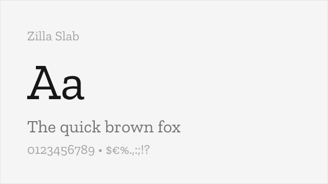
Mozilla's slab serif with contemporary refinement and strong branding presence
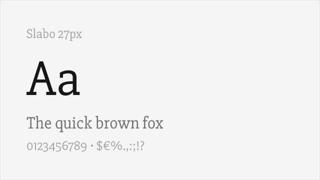
Web-optimized slab with bracketed serifs for excellent screen readability
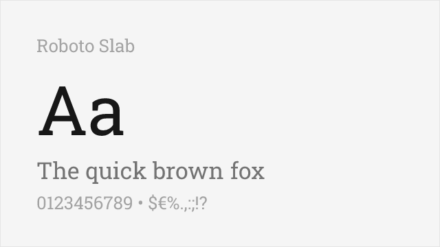
Sturdy, widely-used slab serif with a full variable weight range
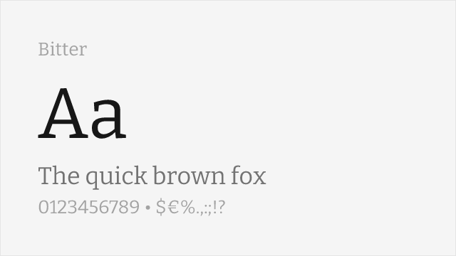
Contemporary slab serif designed for comfortable on-screen reading
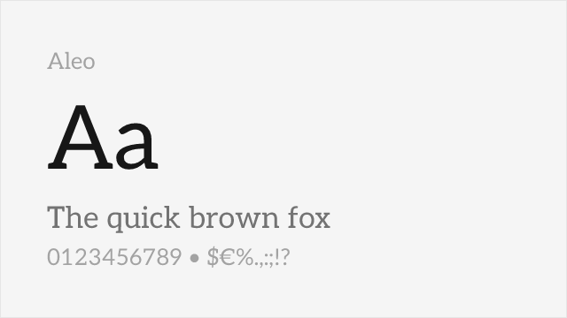
Semi-rounded slab with a touch of contrast and a full weight range
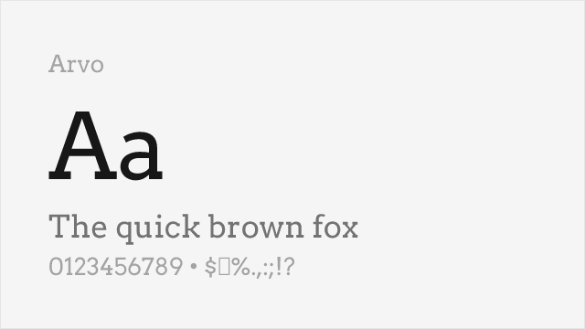
Geometric slab serif, clean and even, good for headlines
Compare the alternatives
See how Clarendon compares to its top alternatives — and how those alternatives compare to each other — side by side.
See where Clarendon is used in the wild and swap to free alternatives live.
Install FontSwap →Replacement Summary
Source: FontAlternatives.com
Premium font: Clarendon
Best free alternative: Zilla Slab
FontAlternatives similarity score: 82%
Replacement difficulty: Medium
Best for: tech branding, web headlines, digital products, open source projects
Notable users: U.S. National Park Service, Great Western Railway, Wheel of Fortune
Not recommended when: Brand consistency with U.S. National Park Service requires exact letterforms
What is the best free alternative to Clarendon?
Zilla Slab is the best free alternative to Clarendon with a FontAlternatives similarity score of 82%.
Zilla Slab shares similar proportions, stroke characteristics, and intended use with Clarendon. It is available under the OFL-1.1 license, which permits both personal and commercial use at no cost.
This alternative works particularly well for: tech branding, web headlines, digital products, open source projects.
Can I safely replace Clarendon with Zilla Slab?
Yes, with some considerations. Zilla Slab achieves a FontAlternatives similarity score of 82%, indicating good structural compatibility for most use cases.
Licensing: Zilla Slab is licensed under OFL-1.1, which allows commercial use without licensing fees or royalties.
Weight coverage: All 4 weights have exact matches available.
When should I NOT replace Clarendon?
While Zilla Slab is a strong alternative, there are situations where replacing Clarendon may not be appropriate:
- Optical precision requirements: Zilla Slab has measurable structural differences from Clarendon that may be visible in precise design work.
- Strict compliance: Verify that OFL-1.1 terms meet your specific legal and compliance requirements.
Weight-Matching Guide
Map Clarendon weights to their closest free alternatives for accurate font substitution.
Zilla Slab
| Clarendon | Zilla Slab | Match |
|---|---|---|
| Light | Light (300) | exact |
| Regular | Regular (400) | exact |
| Medium | Medium (500) | exact |
| Bold | Bold (700) | exact |
Slabo 27px
| Clarendon | Slabo 27px | Match |
|---|---|---|
| Regular | Regular (400) | close |
Roboto Slab
| Clarendon | Roboto Slab | Match |
|---|---|---|
| Regular | Regular (400) | close |
| Medium | Medium (500) | close |
| Bold | Bold (700) | close |
Bitter
| Clarendon | Bitter | Match |
|---|---|---|
| Regular | Regular (400) | close |
| Medium | Medium (500) | close |
| Bold | Bold (700) | close |
Aleo
| Clarendon | Aleo | Match |
|---|---|---|
| Regular | Regular (400) | close |
| Medium | Medium (500) | close |
| Bold | Bold (700) | close |
Arvo
| Clarendon | Arvo | Match |
|---|---|---|
| Regular | Regular (400) | close |
| Bold | Bold (700) | close |
Performance Guide
Production performance metrics for each alternative.
How to Use Zilla Slab
Copy these code snippets to quickly add Zilla Slab to your project.
CSS code for Zilla Slab
@import url('https://fonts.googleapis.com/css2?family=Zilla+Slab:wght@300;400;500;600;700&display=swap');HTML code for Zilla Slab
<link rel="preconnect" href="https://fonts.googleapis.com">
<link rel="preconnect" href="https://fonts.gstatic.com" crossorigin>
<link href="https://fonts.googleapis.com/css2?family=Zilla+Slab:wght@300;400;500;600;700&display=swap" rel="stylesheet">
Tailwind code for Zilla Slab
// tailwind.config.js
module.exports = {
  theme: {
    extend: {
      fontFamily: {
        'zilla-slab': ['"Zilla Slab"', 'sans-serif'],
      },
    },
  },
}

// Usage in HTML:
// <p class="font-zilla-slab">Your text here</p>
Next.js code for Zilla Slab
// Using next/font (Next.js 13+)
import { Zilla_Slab } from 'next/font/google';

const zilla_slab = Zilla_Slab({
  subsets: ['latin'],
  weight: ['300', '400', '500', '600', '700'],
});

export default function Component() {
  return (
    <p className={zilla_slab.className}>
      Your text here
    </p>
  );
}

// Or using inline styles with Google Fonts link:
// <p style={{ fontFamily: '"Zilla Slab"' }}>Your text</p>
Expo and React Native code for Zilla Slab
// Install: npx expo install @expo-google-fonts/zilla-slab expo-font
import { useFonts, Zilla_Slab_400Regular } from '@expo-google-fonts/zilla-slab';

export default function App() {
  const [fontsLoaded] = useFonts({
    Zilla_Slab_400Regular,
  });

  if (!fontsLoaded) return null;

  return (
    <Text style={{ fontFamily: 'Zilla_Slab_400Regular' }}>
      Your text here
    </Text>
  );
}
Recommended Font Pairings
These free fonts pair well with Zilla Slab Clarendon for headlines, body text, or accent use.
Open Sans's neutral sans-serif forms provide clean body text that lets Clarendon's bold slab serif headlines command attention
Source Sans Pro's professional clarity pairs naturally with Clarendon's authoritative slab serifs for corporate and editorial design
Lato's humanist warmth complements Clarendon's sturdy bracketed serifs, creating balanced layouts with approachable body text
Browse Alternatives by Context
Find Clarendon alternatives filtered by specific use case, style, or language support.
By Use Case
By Style
By Script
Frequently Asked Questions
What is the best free alternative to Clarendon?
Zilla Slab is the best free alternative to Clarendon with a FontAlternatives similarity score of 82%. It shares similar proportions and characteristics while being available under the OFL-1.1 license for both personal and commercial use at no cost.
Is there a free version of Clarendon?
There is no official free version of Clarendon. However, Zilla Slab is available under the OFL-1.1 open-source license and achieves a FontAlternatives similarity score of 82%. It includes 5 weights and supports latin, latin-extended.
What Google Font looks like Clarendon?
The Google Fonts most similar to Clarendon are Zilla Slab, Slabo 27px, Roboto Slab. Among these alternatives, Zilla Slab offers the closest match with a FontAlternatives similarity score of 82% and includes 5 weights for design flexibility.
Can I use Zilla Slab commercially?
Yes, Zilla Slab can be used commercially. It is licensed under OFL-1.1, which allows free use in websites, applications, print materials, and commercial projects without purchasing a license or paying royalties.
Is Zilla Slab similar enough to Clarendon?
Zilla Slab achieves a FontAlternatives similarity score of 82% compared to Clarendon. While not identical, it offers comparable letterforms, proportions, and visual style. Most designers find it works excellently as a substitute in web and print projects.
What are the main differences between Clarendon and its free alternatives?
Free alternatives to Clarendon may differ in subtle details like letter spacing, curve refinements, and available weights. Premium fonts typically include more OpenType features, extended language support, and optimized screen rendering. However, for most projects, these differences are negligible.
Where can I download free alternatives to Clarendon?
Download Zilla Slab directly from Google Fonts. Click the "Get Font" button on any alternative listed above to visit the official download page. Google Fonts also provides convenient embed codes for seamless web integration.