Free Alternatives to Archer

About Archer
- Foundry
- Hoefler&Co
- Classification
- serif
- Style
- slab-serif
Brands Using Archer
Modern brand communications and advertising
Magazine and lifestyle brand typography
Archer appeared on the film's promotional poster — Wes Anderson's departure from his usual Futura
A favorite for menus, packaging, and restaurant identities where warmth matters
Adopted as a main editorial typeface for the newspaper
 See Archer live on these sites with FontSwap →
Archer is the typeface that made slab serifs friendly. Designed by Tobias Frere-Jones and Jonathan Hoefler in 2001 and released commercially in 2008, it took a category known for industrial weight and Victorian sturdiness and gave it warmth, charm, and a little wink. The trick was the ball terminals: small rounded endings on letters like the a, c, f, j, r, and y that soften an otherwise geometric, sturdy skeleton. The result feels professional and personable at the same time, which is why Archer became a go-to for brands that want to look established without looking stern.
Why Archer Matters
Before Archer, a designer reaching for a slab serif was mostly choosing a mood: the mechanical authority of Rockwell, the Western nostalgia of Clarendon, the utilitarian bulk of a nineteenth-century Egyptian. What almost none of them offered was warmth.
Archer changed that.
Hoefler & Frere-Jones drew it in 2001 as a commission for Martha Stewart Living, and the brief captured a genuine contradiction. The magazine wanted type that felt editorial but approachable, authoritative but friendly. Traditional serifs read as too formal. Sans serifs lacked editorial gravitas. Ordinary slabs had the presence but projected sternness rather than welcome. Archer resolved all of this by grafting handwriting-inspired ball terminals onto a geometric slab, and in doing so it effectively invented the "friendly slab" as a working category.
That matters because personality is now something a slab serif is allowed to have. A whole generation of warm, rounded, approachable slabs owes a debt to Archer's proof that the genre could smile. When a brand wants to feel trustworthy and human at once — a bank softening its image, a food company selling comfort, a magazine talking to readers like friends — Archer is often the reference everyone points at, even when they cannot license it.
It also matters commercially. Archer's success at Martha Stewart Living showed the idea worked at scale, and other publishers, retailers, and consumer brands took notice. (Wells Fargo's brand communications are frequently cited as an Archer adopter, though, as with many corporate type stories, the specifics are worth confirming before you repeat them.)
Design Characteristics
Archer's charm is engineered, not accidental. A handful of deliberate decisions give it that unmistakable warm-but-serious voice:
- Ball terminals: The signature move. Rounded, drop-like endings on the a, c, f, j, r, and y reference the flourishes of handwriting and are the single fastest way to recognize Archer.
- Geometric skeleton: Underneath the friendliness sits a rational, near-geometric structure with even proportions, which keeps the face looking orderly and modern rather than merely cute.
- Bracketed slab serifs: The serifs curve gently into the stems instead of meeting them at a hard right angle, adding softness and a subtle editorial refinement.
- Moderate contrast: There is a little modulation between thick and thin strokes, more than a pure geometric slab like Rockwell, which gives text a warmer color on the page.
- Generous, even spacing: The face is comfortable and open, built to read well in the running text and captions of a magazine.
Then there is the range. Archer shipped as eight weights, from a whisper-thin Hairline up to a heavy Black, each with matching italics and small caps. Those weights were drawn individually rather than machine-interpolated, so the ball terminals and humanist touches stay correct whether you are setting a delicate Light headline or a commanding Black one.
That eight-weight spread is a big part of why Archer works as a complete editorial system. You can build an entire hierarchy — hairline captions, book-weight body, bold decks, black display — without ever leaving the family or losing the personality.
Where Archer Excels
Archer is at its best wherever a project needs to feel warm and credible at the same time.
- Lifestyle and consumer branding: It signals premium quality while staying accessible, which is exactly the register lifestyle brands live in.
- Editorial design: Magazine headlines, feature spreads, and pull quotes gain character without tipping into novelty. This is, after all, what it was born to do.
- Food and hospitality: Menus, packaging, and restaurant identities lean on its appetizing, inviting warmth.
- Retail and packaging: Brand voices that want to feel handcrafted and trustworthy rather than corporate and cold.
- Display and headlines: At large sizes the ball terminals and refined weights are fully visible, and the face has real presence.
The common thread is emotional tone. When the goal is to look established and reassuring without looking severe, Archer hits a note that very few serious typefaces can. It is friendly enough for a bakery and polished enough for a national magazine, and that flexibility is rare.
Archer also rewards confident, generous typography. Give it room, set it large, let the terminals breathe, and it delivers personality that a neutral face simply cannot.
Where Archer Struggles
No typeface is universal, and Archer's warmth comes with real trade-offs.
It is, first and foremost, a display and editorial face at heart. The refinement that makes Archer sing in a magazine headline can work against it in dense, small, low-resolution body text, where the delicate terminals and moderate contrast lose definition. It was drawn in an era, and for a medium — print — where those subtleties survived.
The personality is also a commitment. Those ball terminals are lovable, but they are not neutral. For interfaces, technical documentation, data-heavy dashboards, or any context that wants type to disappear, Archer's charm becomes a distraction rather than an asset.
Then there is cost and access. Archer is a premium Hoefler&Co family, licensed per weight and per platform, and it is not bundled with operating systems or offered on Google Fonts. For a small brand, a student project, or a fast-moving web build, the price and the web-font licensing terms are often the deciding factor, which is precisely why so many people go looking for a free substitute.
Finally, there is its ubiquity within its own niche. Archer defined the friendly-slab look so thoroughly that the look itself can now feel familiar. If your goal is to stand out rather than to reassure, the very quality that makes Archer safe can make it feel expected.
How to Choose a Free Substitute
There is no single "free Archer," because no free font copies the ball terminals exactly. The good news is that Archer's appeal breaks down into a few separable qualities — warmth, geometry, weight range, readability — and different free fonts nail different ones. Match the font to the job:
- Arvo (closest overall). Arvo is the nearest thing to a free Archer because it actually keeps the ball terminals on letters like a, c, f, and r. If your priority is that specific friendly-slab character, start here. The catch is a limited palette — essentially Regular and Bold with italics — so it suits headlines and short text more than a full hierarchy.
- Rokkitt (weight flexibility). When you need the range Arvo lacks, Rokkitt spans Thin to Black as a variable font. It drops the literal ball terminals but keeps rounded, friendly proportions, making it the better pick for building a complete editorial hierarchy on a budget.
- Roboto Slab (neutral and screen-first). Choose Roboto Slab when you want Archer's sturdy geometry but a cooler, more corporate tone. Its terminals are cut square rather than rounded, and its full 100-900 variable range makes it a dependable workhorse for interfaces and dashboards.
- Bitter (body text). If the real job is long-form reading, Bitter was drawn for the screen, with open counters and spacing tuned for small sizes. It sacrifices display flair for stamina, which is the right trade when you are setting paragraphs rather than headlines.
- Aleo (warmth, a softer route). Aleo reaches Archer's approachability through softly rounded serifs rather than ball terminals. It is a natural companion to Lato and a good call for friendly, humane branding where the exact detail matters less than the overall feel.
- Josefin Slab (elegant and display-first). For something more stylized, Josefin Slab brings tall, art-deco geometry that rhymes with Archer's confidence but trades warmth for period elegance. Keep it large; it is a headline face, not a text face.
A simple way to decide: if you want the character, pick Arvo; if you want the range, pick Rokkitt or Roboto Slab; if you want readable body copy, pick Bitter; if you want warmth without the specific terminals, pick Aleo; and if you want a distinctive display look, pick Josefin Slab.
Premium Font Neighbors
If you love Archer, it helps to know the rest of the slab-serif neighborhood, because "slab serif" covers a wide emotional range and Archer sits at the warm end of it.
Clarendon is the historical anchor — a nineteenth-century slab with strong bracketed serifs and a nostalgic, sturdy voice that Archer softened and modernized. Rockwell goes the other direction: a geometric, near-monoline slab with squared-off serifs and almost no warmth, the mechanical counterpoint to Archer's friendliness.
Sentinel is the closest sibling of all. Also from Hoefler&Co, it was drawn as a Clarendon-style workhorse with a full range of weights and, unlike many slabs, a proper italic, which makes it the more traditional, text-friendly companion to Archer's display charm.
Museo Slab occupies similar territory on the friendly-and-approachable side and is often cross-shopped with Archer for branding work. Adelle is a contemporary slab engineered specifically for immersive reading in newspapers and magazines, which makes it a strong reference when Archer's display personality is too much for long text. And Serifa, a mid-century geometric slab in the Univers lineage, offers a cleaner, more rational take for projects that want structure over sweetness.
Knowing these neighbors clarifies what you actually want from Archer. If it is warmth, Museo Slab and Aleo are in the conversation; if it is readable text, Sentinel and Adelle; if it is neutral geometry, Rockwell, Serifa, and Roboto Slab. Archer's particular magic is holding warmth and polish together, and seeing where its neighbors specialize is the fastest way to appreciate that balance.
FAQ
What is the best free alternative to Archer?
Arvo is the best free alternative to Archer. Designed by Anton Koovit and available on Google Fonts, it keeps the distinctive ball terminals on letters like a, c, f, and r that give Archer its friendly personality, along with a similar warm geometric construction. Its main limitation is a narrow weight range — essentially Regular and Bold with italics — so for a full hierarchy you may pair it with, or step up to, Rokkitt or Roboto Slab.
Why is Archer called a "friendly slab serif"?
Archer earned the "friendly slab" label because it added warmth to a category that had almost none. Its ball terminals — small rounded stroke endings borrowed from the look of handwriting — soften an otherwise geometric, sturdy slab skeleton. The result feels approachable and human while keeping the authority and presence of a serif, which is exactly the combination its Martha Stewart Living commission called for.
Who designed Archer, and when?
Archer was designed by Tobias Frere-Jones and Jonathan Hoefler in 2001 through their foundry, then Hoefler & Frere-Jones and now Hoefler&Co. It was commissioned as a custom typeface for Martha Stewart Living magazine and released commercially in 2008.
Does Archer have a variable font version?
No. Archer is a traditional family of eight individually drawn weights, from Hairline to Black, each with matching italics and small caps, rather than a single variable font. If continuous weight adjustment matters to you, several free alternatives offer it: Roboto Slab, Bitter, Aleo, and Josefin Slab all ship as variable fonts with wide weight ranges.
Is Archer free to use?
No. Archer is a commercial typeface from Hoefler&Co, licensed per weight and per platform, and it is not bundled with operating systems or offered on Google Fonts. Projects that want the Archer look without the license fee typically reach for a free substitute such as Arvo, Rokkitt, Roboto Slab, Bitter, Aleo, or Josefin Slab, all of which allow commercial use at no cost.
What fonts pair well with Archer?
Archer pairs naturally with clean geometric and humanist sans serifs that contrast its warm slab character. Montserrat offers crisp geometric structure for a modern editorial look, Open Sans brings friendly neutrality for digital and UI contexts, and Lato adds humanist warmth that harmonizes with Archer's approachable tone. In each case the sans handles body or interface text while Archer carries headlines and brand voice.
How many weights does Archer have?
Archer includes eight weights — Hairline, Thin, Light, Book, Medium, Semibold, Bold, and Black — each with matching italics and small caps. Because the weights were drawn individually rather than interpolated, the ball terminals and humanist details stay consistent across the whole range, which is what lets Archer function as a complete editorial system on its own.
Is Archer on Google Fonts?
No, Archer is a premium font from Hoefler&Co and is not available on Google Fonts.
The closest Google Fonts alternative is Arvo with 88% similarity. Get it free on Google Fonts ↗
Free Alternatives (6)
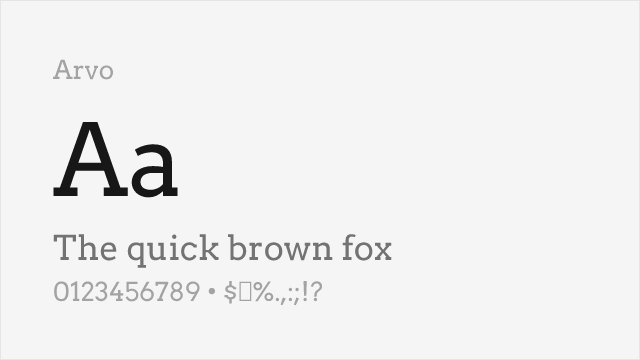
Friendly geometric slab with ball terminals and warm character
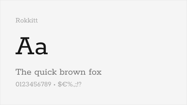
Clean geometric slab with friendly proportions and multiple weights
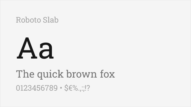
Neutral geometric slab with a full variable weight range and squared, not rounded, terminals
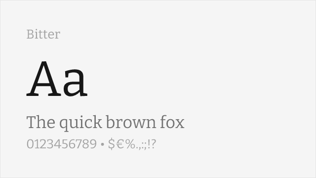
Screen-optimized contemporary slab with open counters, drawn for comfortable body text
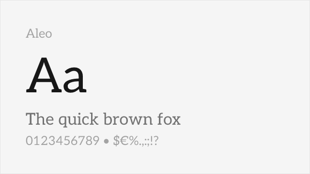
Warm semi-slab with softly rounded serifs and humanist touches, a natural Lato companion
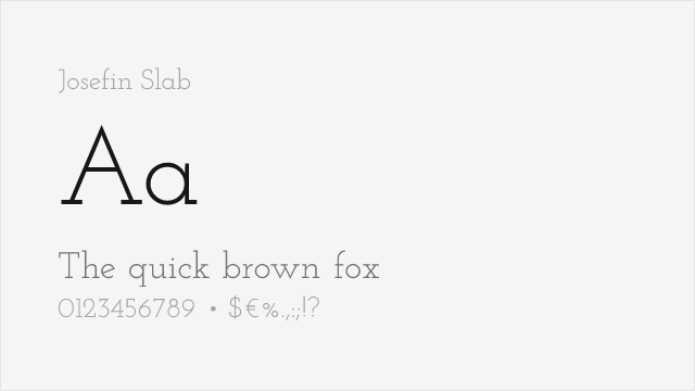
Elegant art-deco geometric slab with tall proportions and a display-first character
Compare the alternatives
See how Archer compares to its top alternatives — and how those alternatives compare to each other — side by side.
See where Archer is used in the wild and swap to free alternatives live.
Install FontSwap →Replacement Summary
Source: FontAlternatives.com
Premium font: Archer
Best free alternative: Arvo
FontAlternatives similarity score: 88%
Replacement difficulty: Low
Best for: lifestyle branding, food and hospitality, editorial headlines, friendly interfaces
Notable users: Wells Fargo, Martha Stewart Living, The Grand Budapest Hotel (2014)
Not recommended when: Brand consistency with Wells Fargo requires exact letterforms
What is the best free alternative to Archer?
Arvo is the best free alternative to Archer with a FontAlternatives similarity score of 88%.
Arvo shares similar proportions, stroke characteristics, and intended use with Archer. It is available under the OFL-1.1 license, which permits both personal and commercial use at no cost.
This alternative works particularly well for: lifestyle branding, food and hospitality, editorial headlines, friendly interfaces.
Can I safely replace Archer with Arvo?
Yes, Arvo is a high-confidence replacement for Archer. The FontAlternatives similarity score of 88% indicates strong structural compatibility.
Licensing: Arvo is licensed under OFL-1.1, which allows commercial use without licensing fees or royalties.
Weight coverage: Most weights have close or exact matches available.
When should I NOT replace Archer?
While Arvo is a strong alternative, there are situations where replacing Archer may not be appropriate:
- Strict compliance: Verify that OFL-1.1 terms meet your specific legal and compliance requirements.
Weight-Matching Guide
Map Archer weights to their closest free alternatives for accurate font substitution.
Arvo
| Archer | Arvo | Match |
|---|---|---|
| Book | Regular (400) | close |
| Bold | Bold (700) | exact |
Rokkitt
| Archer | Rokkitt | Match |
|---|---|---|
| Light | Light (300) | close |
| Book | Regular (400) | close |
| Medium | Medium (500) | close |
| Bold | Bold (700) | close |
Roboto Slab
| Archer | Roboto Slab | Match |
|---|---|---|
| Light | Light (300) | close |
| Book | Regular (400) | close |
| Medium | Medium (500) | close |
| Bold | Bold (700) | close |
Bitter
| Archer | Bitter | Match |
|---|---|---|
| Light | Light (300) | close |
| Book | Regular (400) | close |
| Medium | Medium (500) | close |
| Bold | Bold (700) | close |
Aleo
| Archer | Aleo | Match |
|---|---|---|
| Light | Light (300) | close |
| Book | Regular (400) | close |
| Medium | Medium (500) | close |
| Bold | Bold (700) | close |
Josefin Slab
| Archer | Josefin Slab | Match |
|---|---|---|
| Light | Light (300) | close |
| Book | Regular (400) | close |
| Medium | Medium (500) | close |
| Bold | Bold (700) | close |
Performance Guide
Production performance metrics for each alternative.
How to Use Arvo
Copy these code snippets to quickly add Arvo to your project.
CSS code for Arvo
@import url('https://fonts.googleapis.com/css2?family=Arvo:wght@400;700&display=swap');HTML code for Arvo
<link rel="preconnect" href="https://fonts.googleapis.com">
<link rel="preconnect" href="https://fonts.gstatic.com" crossorigin>
<link href="https://fonts.googleapis.com/css2?family=Arvo:wght@400;700&display=swap" rel="stylesheet">
Tailwind code for Arvo
// tailwind.config.js
module.exports = {
  theme: {
    extend: {
      fontFamily: {
        'arvo': ['Arvo', 'sans-serif'],
      },
    },
  },
}

// Usage in HTML:
// <p class="font-arvo">Your text here</p>
Next.js code for Arvo
// Using next/font (Next.js 13+)
import { Arvo } from 'next/font/google';

const arvo = Arvo({
  subsets: ['latin'],
  weight: ['400', '700'],
});

export default function Component() {
  return (
    <p className={arvo.className}>
      Your text here
    </p>
  );
}

// Or using inline styles with Google Fonts link:
// <p style={{ fontFamily: "'Arvo'" }}>Your text</p>
Expo and React Native code for Arvo
// Install: npx expo install @expo-google-fonts/arvo expo-font
import { useFonts, Arvo_400Regular } from '@expo-google-fonts/arvo';

export default function App() {
  const [fontsLoaded] = useFonts({
    Arvo_400Regular,
  });

  if (!fontsLoaded) return null;

  return (
    <Text style={{ fontFamily: 'Arvo_400Regular' }}>
      Your text here
    </Text>
  );
}
Recommended Font Pairings
These free fonts pair well with Arvo Archer for headlines, body text, or accent use.
Montserrat's geometric sans-serif forms provide clean contrast with Archer's warm slab serifs for lifestyle and editorial layouts
Open Sans's friendly neutrality complements Archer's approachable personality for web applications and digital brand communications
Lato's humanist warmth harmonizes with Archer's friendly slab serif character for hospitality and lifestyle brand typography
Browse Alternatives by Context
Find Archer alternatives filtered by specific use case, style, or language support.
By Use Case
By Style
By Script
Frequently Asked Questions
What is the best free alternative to Archer?
Arvo is the best free alternative to Archer with a FontAlternatives similarity score of 88%. It shares similar proportions and characteristics while being available under the OFL-1.1 license for both personal and commercial use at no cost.
Is there a free version of Archer?
There is no official free version of Archer. However, Arvo is available under the OFL-1.1 open-source license and achieves a FontAlternatives similarity score of 88%. It includes 2 weights and supports latin, latin-extended.
What Google Font looks like Archer?
The Google Fonts most similar to Archer are Arvo, Rokkitt, Roboto Slab. Among these alternatives, Arvo offers the closest match with a FontAlternatives similarity score of 88% and includes 2 weights for design flexibility.
Can I use Arvo commercially?
Yes, Arvo can be used commercially. It is licensed under OFL-1.1, which allows free use in websites, applications, print materials, and commercial projects without purchasing a license or paying royalties.
Is Arvo similar enough to Archer?
Arvo achieves a FontAlternatives similarity score of 88% compared to Archer. While not identical, it offers comparable letterforms, proportions, and visual style. Most designers find it works excellently as a substitute in web and print projects.
What are the main differences between Archer and its free alternatives?
Free alternatives to Archer may differ in subtle details like letter spacing, curve refinements, and available weights. Premium fonts typically include more OpenType features, extended language support, and optimized screen rendering. However, for most projects, these differences are negligible.
Where can I download free alternatives to Archer?
Download Arvo directly from Google Fonts. Click the "Get Font" button on any alternative listed above to visit the official download page. Google Fonts also provides convenient embed codes for seamless web integration.