Free Alternatives to Sentinel

About Sentinel
- Foundry
- Hoefler&Co
- Classification
- serif
- Style
- slab-serif
Brands Using Sentinel
Commissioned for the magazine; its trademark editorial slab-serif since 2004
Whole-bean coffee packaging serif (c. 2016); Starbucks later commissioned the custom typeface Lander to replace Sentinel
Used in Airbnbmag, Airbnb's print magazine (2017)
Table-of-contents typography in the magazine's 2013 redesign
 See Sentinel live on these sites with FontSwap →
Sentinel is a slab serif released by Hoefler&Co in 2009, drawn by Jonathan Hoefler and Tobias Frere-Jones. It belongs to the Clarendon genre — the sturdy, bracketed slab serifs whose lineage runs back through the Ionic and Scotch faces of the nineteenth century — but it was engineered as a modern workhorse rather than a museum revival. Earlier Clarendons were built to shout from a poster or a wanted notice. Sentinel was built to be read: a full range of weights, a true italic, and proportions tuned for paragraphs as much as for headlines.
Why Sentinel Matters
For most of its history the slab serif had a hole in the middle of it. The category was full of display faces — heavy, confident, made for a word or two at a time — and short on anything you could comfortably set a chapter in. If you wanted the authority of a slab but needed it to behave across a page, your options were thin.
Sentinel was Hoefler&Co's answer to that gap.
The firm took the Clarendon model, which readers already associate with trust and plain-spoken clarity, and asked what it would take to make it a genuine text family. That meant softening the contrast, opening the counters, and drawing each weight for the job it actually does rather than scaling one master up and down. The result reads as familiar and grounded without ever feeling like a costume. It looks like a face that has always existed, which is exactly the effect a workhorse is supposed to have.
There is a second reason Sentinel mattered, and it is easy to overlook. Historical Clarendons almost never had a real italic. When a nineteenth-century slab needed emphasis, it leaned the roman over into a slanted oblique and called it done. Sentinel drew a genuine cursive italic instead, with the shaped strokes and narrower proportions of true italic design. That one decision turned a display genre into something you can edit copy in — pull quotes, book titles, emphasis mid-sentence — without the type fighting you.
Brands noticed. A family that spans a delicate Light through a commanding Black, with matching italics at every step, can carry an entire identity by itself, which is why Sentinel keeps turning up in editorial and retail systems where a single typeface has to do the work of three.
Design Characteristics
Sentinel's look comes from a handful of deliberate choices, most of them inherited from the Clarendon tradition and then quietly modernized:
- Bracketed slab serifs: The serifs are hefty, but they join the stems with a curved bracket rather than a hard right angle. That bracket is the whole difference between Sentinel's warmth and the mechanical coolness of a geometric slab like Rockwell.
- Moderate contrast: There is a visible difference between thick and thin strokes — more than a true monoline slab, less than a Scotch text serif. It gives the type a subtle sparkle on the page without tipping into fussiness.
- Ionic and Scotch lineage: The sturdy construction and even color descend from the "Ionic" newspaper faces built for legibility under hard press conditions, which is a large part of why Sentinel holds up so well in dense text.
- A true italic, not an oblique: The italic is drawn rather than slanted, so emphasis reads as a real change of voice instead of a tilted roman.
- Optically tuned weights: The six weights — Light, Book, Medium, Semibold, Bold, and Black — are individually drawn. The Book weight opens its counters and lightens its serifs for reading; the Black tightens and thickens for impact.
- Generous, even proportions: A comfortable x-height and open counters keep the texture legible down into small text sizes.
Put together, these traits explain why Sentinel feels traditional and contemporary at once. It carries the memory of old Clarendon signage while behaving like a face designed for a laser printer and a high-resolution screen.
The quickest way to place it is by contrast: Sentinel is the warm, bracketed branch of the slab family, not the rigid, monoline one.
Where Sentinel Excels
Sentinel is at its best wherever a project needs authority and warmth in the same breath:
- Editorial and magazine text: Long features and departments where the type has to stay comfortable across thousands of words while still having a point of view.
- Book interiors: Non-fiction and reference work that wants a little more presence than a quiet oldstyle serif but still has to read cleanly page after page.
- Brand systems: Identities that need one family to cover a delicate wordmark, a body-copy paragraph, and a heavy headline, all with matching italics.
- Retail and packaging: The Clarendon warmth reads as trustworthy and a touch nostalgic, which suits catalogs, menus, and product labels.
- Corporate reports and long documents: Annual reports and whitepapers where a slab lends gravity without feeling cold.
The connective thread is range. Sentinel is one of the few slabs you can genuinely take from a footnote to a cover, and because its italic is real, you never have to break out of the family just to emphasize a word.
Where Sentinel Struggles
No workhorse is right for every stable, and Sentinel has clear limits:
- It is a licensed premium face. Sentinel is not free, and it is not bundled with any operating system. For a lot of teams that single fact is the reason they are reading a page about alternatives at all.
- Slabs carry more ink than sans-serifs. At very small sizes on low-resolution screens, the serifs and moderate contrast can thicken slightly where a clean grotesque would stay crisp.
- It has a period flavor. The Clarendon warmth that reads as trustworthy in a catalog can read as old-timey or self-consciously artisanal in the wrong context, and it does not recede the way a neutral sans does.
- There is no official variable font. Sentinel ships as discrete weights, so designers who want to interpolate weight continuously — as a growing number of free families now allow — have to reach outside it.
These are boundaries more than flaws. If you want type that vanishes, or type that scales continuously from a single file, Sentinel is the wrong tool, and knowing that actually makes choosing a substitute much easier.
How to Choose a Free Substitute
There is no free font that simply is Sentinel — no metric clone, no drop-in. What the free ecosystem offers instead is a spectrum, running from sturdy slabs that share Sentinel's construction to warm text serifs that share its reading experience. Which end you want depends on whether you care more about the slab silhouette or the paragraph.
Merriweather is the closest thing to a default. Eben Sorkin drew it for the screen, with sturdy near-slab serifs, a tall x-height, and a warmth that lines up neatly with Sentinel's. Its serifs are wedge-shaped rather than truly square, so it is not a strict slab, but for body text the reading experience is remarkably close. Reach for it first when the job is long-form text on the web.
Zilla Slab goes the other direction. Mozilla's brand face is an unambiguous, assertive slab with pronounced bracketed serifs, which makes it the better pick when you want the slab silhouette to be obvious — headlines, product branding, confident display lines — rather than to melt quietly into a paragraph.
Bitter splits the difference. It is a contemporary slab serif drawn specifically for on-screen reading, softer than Zilla Slab but more overtly a slab than Merriweather. As a variable font it also covers the widest weight range of the three, which helps when you are trying to echo Sentinel's full family from a single file.
It is worth saying plainly that Lora, Vollkorn, and Alegreya are text serifs, not true bracketed slabs. Their serifs are lighter and their contrast a little higher than a real Clarendon's, so none of them will reproduce Sentinel's blocky silhouette. What they will reproduce is the quality that matters most in running text: warm, sturdy, comfortable long-form reading with a genuine italic.
Within that group, the differences are about temperament. Pick Lora when you want a well-mannered contemporary serif with moderate contrast and calligraphic roots; it is the most conventionally elegant of the three and the closest in feel to a lighter Sentinel setting. Pick Vollkorn when you want density and heft; its wholegrain sturdiness sits nearer to Sentinel than most reading serifs, and its full variable range makes it flexible. Pick Alegreya when the writing itself has personality; its calligraphic rhythm gives long stretches of text a momentum that suits literary and cultural work, at the cost of the neutrality a corporate report might prefer.
A practical way to decide: if the silhouette matters, stay in the slab lane with Bitter, Zilla Slab, or Merriweather. If the paragraph matters more than the shape, a text serif like Lora, Vollkorn, or Alegreya will feel closer to reading Sentinel than a mismatched slab ever would.
Premium Font Neighbors
If Sentinel is the face you keep returning to, it helps to know the streets around it. These premium neighbors share either its Clarendon genes or its workhorse ambition:
- Clarendon is the ancestor of the whole branch — the 1845 original that gives the genre its name. Sentinel is essentially a modern, text-ready reimagining of what Clarendon started.
- Archer is Sentinel's Hoefler&Co sibling, a geometric slab with ball terminals and a friendlier, more optimistic tone. Where Sentinel is grounded and editorial, Archer is bright and approachable.
- Rockwell is the classic geometric slab: monoline and mechanical, with squared, essentially unbracketed serifs. Holding it next to Sentinel is the fastest way to see what "bracketed" buys you — Rockwell reads cooler and more rigid, Sentinel warmer and more humane.
- Museo Slab is a popular contemporary slab with a soft, semi-rounded personality, useful when you want slab structure in a gentler, more modern voice.
- Adelle is a slab drawn specifically for editorial text and immersive reading, arguably the closest in intent to Sentinel: a workhorse slab built for newspapers and magazines.
- Caslon, a step outside the slab family, is worth a look when Sentinel's slab silhouette is more than a project needs but its traditional, trustworthy tone is still the goal.
Walking these neighbors clarifies what you actually want from Sentinel: the Clarendon warmth (Clarendon, Adelle), the Hoefler&Co polish (Archer), or simply a sturdy editorial slab, which the free alternatives above deliver at no cost.
FAQ
What is the best free alternative to Sentinel?
Merriweather is the best all-around free alternative for Sentinel's core job of comfortable, long-form reading. Designed by Eben Sorkin for on-screen text, it shares Sentinel's warmth, sturdy serifs, and generous x-height. Its serifs are wedge-shaped rather than truly square, so it is not a strict slab, but for body copy the reading experience is close. If you specifically need the blocky slab silhouette, Bitter or Zilla Slab is the better match.
Is Sentinel a Clarendon?
Sentinel belongs to the Clarendon genre but is not the original Clarendon. It descends from the same nineteenth-century family of bracketed slab serifs — the Ionic and Scotch faces built for hard-working legibility — and reinterprets that model as a modern text family. The defining Clarendon traits are all there: sturdy bracketed serifs, moderate contrast, and an even, trustworthy color. What Sentinel adds is a full range of optically drawn weights and, crucially, a true italic that historical Clarendons lacked.
Does Sentinel have a true italic?
Yes, and it is one of the design's most important features. Most historical Clarendon and Ionic slabs never had a genuine italic; they simply slanted the roman into an oblique. Sentinel instead includes a drawn cursive italic with the narrower proportions and shaped strokes of true italic design. That is what makes it usable for editing-heavy work like books and magazines, where emphasis has to read as a real change of voice rather than a tilted roman.
Is Sentinel free to use?
No. Sentinel is a commercial typeface from Hoefler&Co and requires a license for desktop, web, or app use. It is not bundled with any operating system. That cost is why most projects that set out to "use Sentinel" end up choosing a free substitute such as Merriweather, Bitter, Zilla Slab, Lora, Vollkorn, or Alegreya, all of which are licensed for commercial use at no charge.
What is the difference between Sentinel and Rockwell?
Both are slab serifs, but they sit on opposite branches of the family. Rockwell is a geometric slab: monoline and mechanical, with squared serifs that meet the stems at a hard right angle. Sentinel is a Clarendon-genre slab: its serifs are bracketed with a curve, it carries moderate stroke contrast, and it is drawn for reading rather than display. The practical upshot is that Sentinel is warmer and more comfortable in text, while Rockwell reads as cooler and more industrial.
Which free font is closest to Sentinel for body text?
For running body text, Merriweather and Bitter are the two closest free options. Merriweather is the safest default for on-screen reading and pairs a near-slab warmth with excellent screen tuning. Bitter is more overtly a slab and, as a variable font, covers a wider weight range, which helps if you are trying to echo Sentinel's full family. If the writing calls for more character than a slab provides, Lora, Vollkorn, and Alegreya are warm text serifs that reproduce Sentinel's reading comfort even though they are not true bracketed slabs.
Can I pair a free sans-serif with these alternatives?
Yes. Sentinel and its slab-serif substitutes pair naturally with clean, neutral sans-serifs in headline-and-body systems. Source Sans, Open Sans, and Lato all provide the crisp, understated contrast that lets a warm slab or text serif carry the reading while the sans handles labels, UI, and decks.
Is Sentinel on Google Fonts?
No, Sentinel is a premium font from Hoefler&Co and is not available on Google Fonts.
The closest Google Fonts alternative is Merriweather with 80% similarity. Get it free on Google Fonts ↗
Free Alternatives (6)
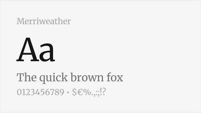
Screen-optimized slab with excellent readability and comprehensive weights
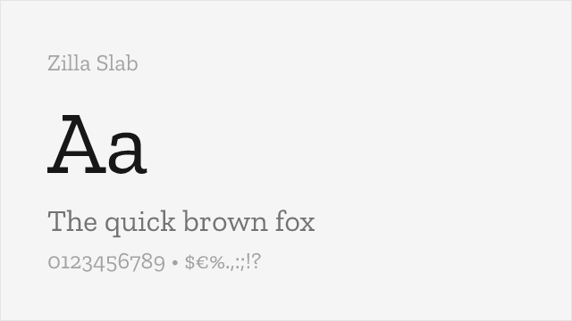
Contemporary slab serif with strong presence and digital optimization
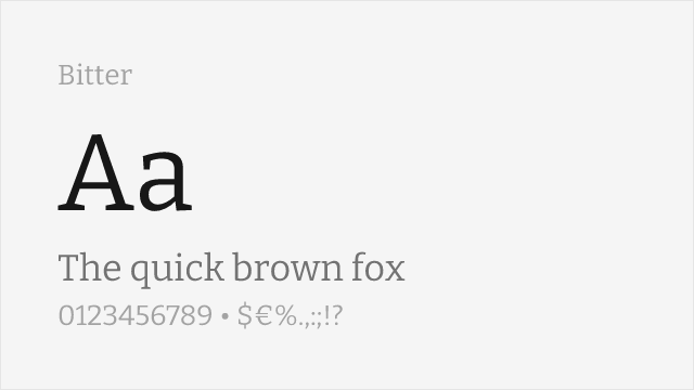
Screen-optimized slab serif with comparable editorial character
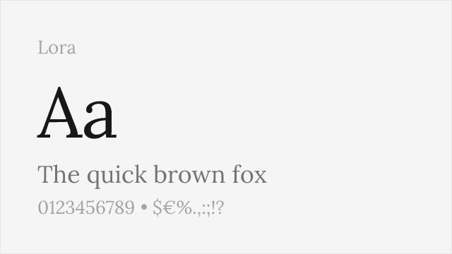
Well-made contemporary text serif with brackets and moderate contrast
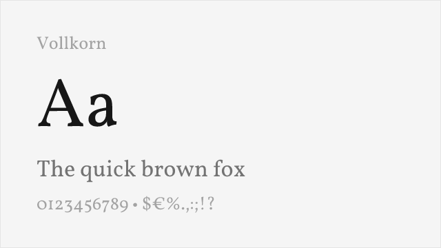
Sturdy free text serif with slab-ish weight and warmth
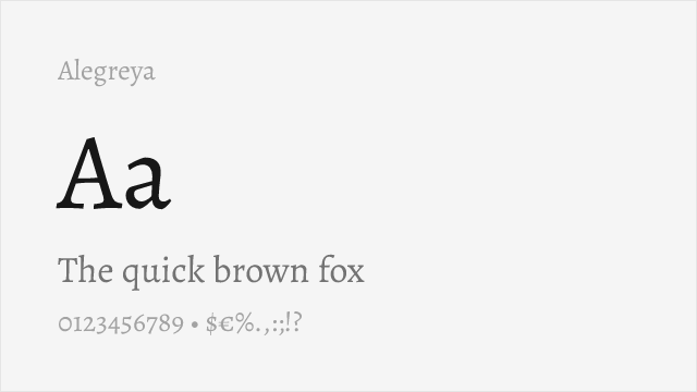
Calligraphic, warm text serif with strong personality for long-form
Compare the alternatives
See how Sentinel compares to its top alternatives — and how those alternatives compare to each other — side by side.
See where Sentinel is used in the wild and swap to free alternatives live.
Install FontSwap →Replacement Summary
Source: FontAlternatives.com
Premium font: Sentinel
Best free alternative: Merriweather
FontAlternatives similarity score: 80%
Replacement difficulty: Medium
Best for: web body text, long-form articles, digital publications, documentation
Notable users: Texas Monthly, Starbucks, Airbnb
Not recommended when: Brand consistency with Texas Monthly requires exact letterforms
What is the best free alternative to Sentinel?
Merriweather is the best free alternative to Sentinel with a FontAlternatives similarity score of 80%.
Merriweather shares similar proportions, stroke characteristics, and intended use with Sentinel. It is available under the OFL-1.1 license, which permits both personal and commercial use at no cost.
This alternative works particularly well for: web body text, long-form articles, digital publications, documentation.
Can I safely replace Sentinel with Merriweather?
Yes, with some considerations. Merriweather achieves a FontAlternatives similarity score of 80%, indicating good structural compatibility for most use cases.
Licensing: Merriweather is licensed under OFL-1.1, which allows commercial use without licensing fees or royalties.
Weight coverage: Most weights have close or exact matches available.
When should I NOT replace Sentinel?
While Merriweather is a strong alternative, there are situations where replacing Sentinel may not be appropriate:
- Optical precision requirements: Merriweather has measurable structural differences from Sentinel that may be visible in precise design work.
- Strict compliance: Verify that OFL-1.1 terms meet your specific legal and compliance requirements.
Weight-Matching Guide
Map Sentinel weights to their closest free alternatives for accurate font substitution.
Merriweather
| Sentinel | Merriweather | Match |
|---|---|---|
| Light | Light (300) | close |
| Book | Regular (400) | close |
| Bold | Bold (700) | exact |
| Black | Black (900) | exact |
Zilla Slab
| Sentinel | Zilla Slab | Match |
|---|---|---|
| Book | Regular (400) | close |
| Medium | Medium (500) | close |
| Bold | Bold (700) | close |
Bitter
| Sentinel | Bitter | Match |
|---|---|---|
| Book | Regular (400) | close |
| Medium | Medium (500) | close |
| Bold | Bold (700) | close |
Lora
| Sentinel | Lora | Match |
|---|---|---|
| Book | Regular (400) | close |
| Medium | Medium (500) | close |
| Bold | Bold (700) | close |
Vollkorn
| Sentinel | Vollkorn | Match |
|---|---|---|
| Book | Regular (400) | close |
| Medium | Medium (500) | close |
| Bold | Bold (700) | close |
Alegreya
| Sentinel | Alegreya | Match |
|---|---|---|
| Book | Regular (400) | close |
| Medium | Medium (500) | close |
| Bold | Bold (700) | close |
Performance Guide
Production performance metrics for each alternative.
How to Use Merriweather
Copy these code snippets to quickly add Merriweather to your project.
CSS code for Merriweather
@import url('https://fonts.googleapis.com/css2?family=Merriweather:wght@300;400;700;900&display=swap');HTML code for Merriweather
<link rel="preconnect" href="https://fonts.googleapis.com">
<link rel="preconnect" href="https://fonts.gstatic.com" crossorigin>
<link href="https://fonts.googleapis.com/css2?family=Merriweather:wght@300;400;700;900&display=swap" rel="stylesheet">
Tailwind code for Merriweather
// tailwind.config.js
module.exports = {
  theme: {
    extend: {
      fontFamily: {
        'merriweather': ['Merriweather', 'sans-serif'],
      },
    },
  },
}

// Usage in HTML:
// <p class="font-merriweather">Your text here</p>
Next.js code for Merriweather
// Using next/font (Next.js 13+)
import { Merriweather } from 'next/font/google';

const merriweather = Merriweather({
  subsets: ['latin'],
  weight: ['300', '400', '700', '900'],
});

export default function Component() {
  return (
    <p className={merriweather.className}>
      Your text here
    </p>
  );
}

// Or using inline styles with Google Fonts link:
// <p style={{ fontFamily: "'Merriweather'" }}>Your text</p>
Expo and React Native code for Merriweather
// Install: npx expo install @expo-google-fonts/merriweather expo-font
import { useFonts, Merriweather_400Regular } from '@expo-google-fonts/merriweather';

export default function App() {
  const [fontsLoaded] = useFonts({
    Merriweather_400Regular,
  });

  if (!fontsLoaded) return null;

  return (
    <Text style={{ fontFamily: 'Merriweather_400Regular' }}>
      Your text here
    </Text>
  );
}
Recommended Font Pairings
These free fonts pair well with Merriweather Sentinel for headlines, body text, or accent use.
Source Sans Pro's professional sans-serif forms provide clean headlines that complement Sentinel's warm slab serif body text for editorial layouts
Open Sans's neutral clarity pairs naturally with Sentinel's readable slab serifs for corporate communications and digital publications
Lato's humanist elegance harmonizes with Sentinel's refined slab serif character for sophisticated brand systems and long-form content
Browse Alternatives by Context
Find Sentinel alternatives filtered by specific use case, style, or language support.
By Use Case
By Script
Frequently Asked Questions
What is the best free alternative to Sentinel?
Merriweather is the best free alternative to Sentinel with a FontAlternatives similarity score of 80%. It shares similar proportions and characteristics while being available under the OFL-1.1 license for both personal and commercial use at no cost.
Is there a free version of Sentinel?
There is no official free version of Sentinel. However, Merriweather is available under the OFL-1.1 open-source license and achieves a FontAlternatives similarity score of 80%. It includes 4 weights and supports latin, latin-extended.
What Google Font looks like Sentinel?
The Google Fonts most similar to Sentinel are Merriweather, Zilla Slab, Bitter. Among these alternatives, Merriweather offers the closest match with a FontAlternatives similarity score of 80% and includes 4 weights for design flexibility.
Can I use Merriweather commercially?
Yes, Merriweather can be used commercially. It is licensed under OFL-1.1, which allows free use in websites, applications, print materials, and commercial projects without purchasing a license or paying royalties.
Is Merriweather similar enough to Sentinel?
Merriweather achieves a FontAlternatives similarity score of 80% compared to Sentinel. While not identical, it offers comparable letterforms, proportions, and visual style. Most designers find it works excellently as a substitute in web and print projects.
What are the main differences between Sentinel and its free alternatives?
Free alternatives to Sentinel may differ in subtle details like letter spacing, curve refinements, and available weights. Premium fonts typically include more OpenType features, extended language support, and optimized screen rendering. However, for most projects, these differences are negligible.
Where can I download free alternatives to Sentinel?
Download Merriweather directly from Google Fonts. Click the "Get Font" button on any alternative listed above to visit the official download page. Google Fonts also provides convenient embed codes for seamless web integration.