 Install FontSwap
Free Alternatives to Sentinel with Modern Style
Sentinel is known for its modern aesthetic. If you're looking for a free serif font with a similar modern feel, these 6 alternatives offer comparable characteristics. We've identified 2 that are especially well-suited for this context. All are available under open-source licenses for unrestricted commercial use.
Top Picks
Comparison Table
| Font | Relevance ⓘ
How well this alternative fits the specific context (use-case or trait) of this page. Score 0–100 based on matching keywords, industries, and font characteristics. Alternatives scoring 25+ are highlighted.
| Similarity ⓘ
How visually similar this free font is to the premium original. Score 0–100 based on x-height, width, stroke contrast, use-case overlap, and language coverage.
Learn more → | Weights | Variable | License | Source |
|---|---|---|---|---|---|---|
| Zilla Slab | 55 | 75% | 5 | No | OFL-1.1 | Google Fonts ↗ |
| Bitter | 25 | 75% | Variable | Yes | OFL-1.1 | Google Fonts ↗ |
| Lora | 24 | 72% | Variable | Yes | OFL-1.1 | Google Fonts ↗ |
| Vollkorn | 24 | 68% | Variable | Yes | OFL-1.1 | Google Fonts ↗ |
| Alegreya | 23 | 66% | Variable | Yes | OFL-1.1 | Google Fonts ↗ |
| Merriweather | 16 | 80% | 4 | No | OFL-1.1 | Google Fonts ↗ |
Most Relevant (2)
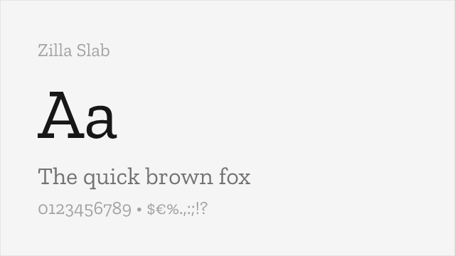
[Google Fonts] · OFL-1.1 · 5 weights
Contemporary slab serif with strong presence and digital optimization
Why it matches: Zilla Slab provides a more assertive slab serif character while maintaining readability. Both feature bracketed construction and professional refinement. Zilla Slab works better for headlines and branding where Sentinel's subtlety isn't needed, offering bold presence with digital optimization.
tech brandingweb headlinesdigital productsassertive typography
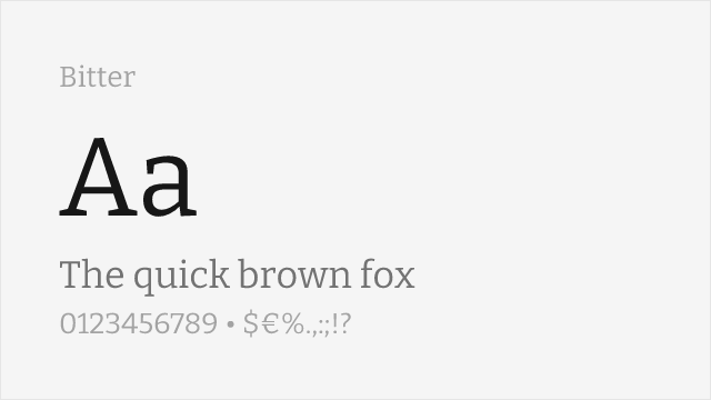
[Google Fonts] · OFL-1.1 · Variable
Screen-optimized slab serif with comparable editorial character
Why it matches: Bitter is a contemporary slab serif drawn for comfortable on-screen reading, which puts it squarely in Sentinel's territory. Its slab structure is softer than Zilla Slab's but more overtly a slab than Merriweather's, so it echoes Sentinel's bracketed warmth while staying legible at text sizes. As a variable font it also covers the widest weight range of the free slabs here, which helps when you want to approximate Sentinel's full family.
web body texteditorial layoutsdigital publicationslong-form reading
Other Alternatives (4)
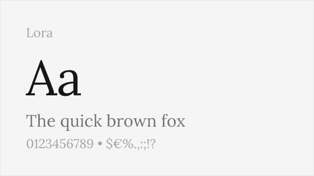
[Google Fonts] · OFL-1.1 · Variable
Well-made contemporary text serif with brackets and moderate contrast
Why it matches: Lora is a well-made contemporary text serif with bracketed serifs and moderate contrast, which gives it a Clarendon-adjacent reading feel close to a lighter Sentinel setting. It is honestly a serif rather than a true slab, so it won't reproduce Sentinel's blocky silhouette, but it delivers the quality that matters most for text: warm, well-mannered, comfortable long-form reading with a genuine italic.
editorial body textblog and article textbook interiorsrefined branding
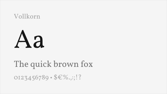
[Google Fonts] · OFL-1.1 · Variable
Sturdy free text serif with slab-ish weight and warmth
Why it matches: Vollkorn is a sturdy free text serif whose density and warmth sit closer to Sentinel than most reading serifs. The name means "wholegrain," and the face has a substantial, slightly slab-adjacent heft that suits body copy. It is still a serif rather than a true bracketed slab, so treat it as a match for Sentinel's reading comfort rather than its silhouette.
book typographyacademic publishingdense editorial textmultilingual body text
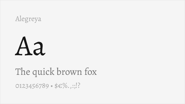
[Google Fonts] · OFL-1.1 · Variable
Calligraphic, warm text serif with strong personality for long-form
Why it matches: Alegreya is a calligraphic, warm text serif with real personality, drawn originally for literature and long-form reading. Where Sentinel carries its warmth through slab construction, Alegreya carries it through a lively calligraphic rhythm, so the shared quality is atmosphere rather than silhouette. It is a text serif, not a bracketed slab, and it suits writing that wants some character of its own.
literary and book textcultural and editorial worklong-form readingexpressive branding
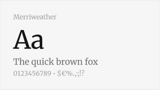
[Google Fonts] · OFL-1.1 · 4 weights
Screen-optimized slab with excellent readability and comprehensive weights
Why it matches: Merriweather shares Sentinel's commitment to comfortable extended reading with sturdy serifs and generous x-height. Both prioritize readability over display impact, with refined details that work at text sizes. While Merriweather's serifs are slightly wedge-shaped rather than true slabs, the reading experience is remarkably similar.
web body textlong-form articlesdigital publicationsdocumentation