Free Alternatives to Garamond

About Garamond
- Foundry
- Adobe
- Classification
- serif
- Style
- old-style
Brands Using Garamond
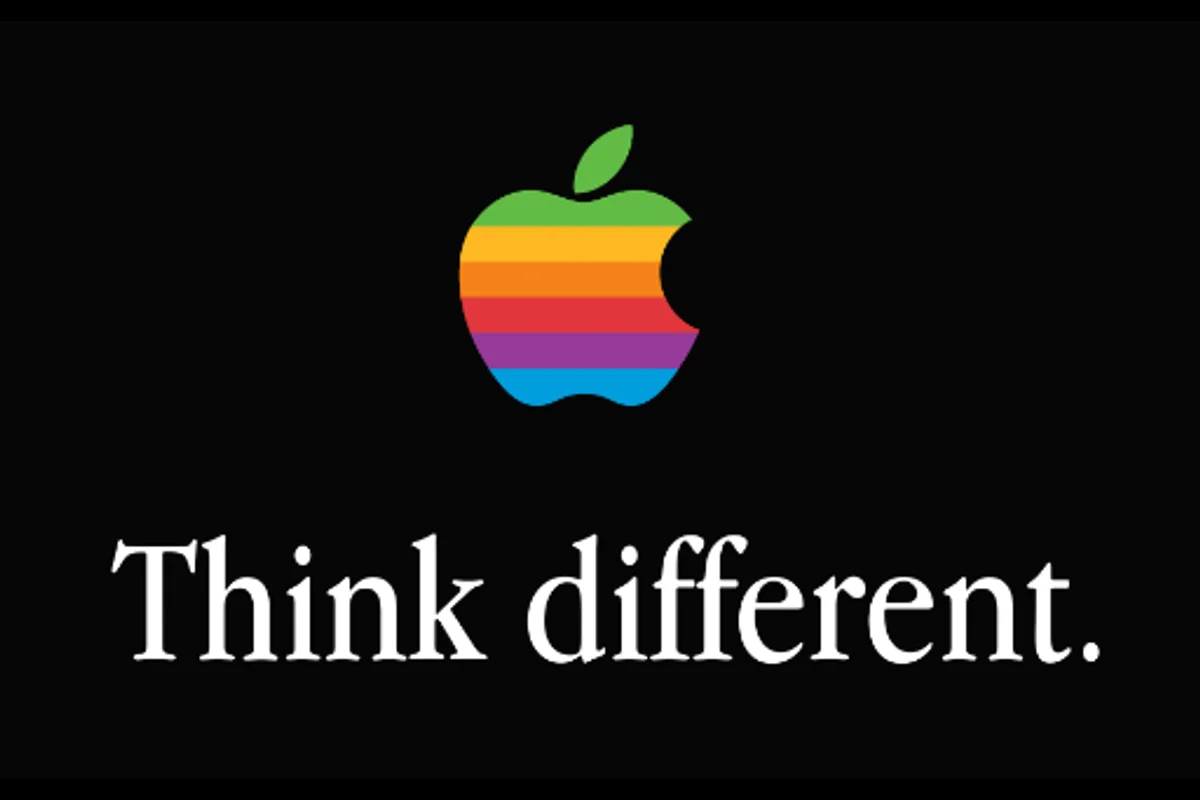
Apple Garamond (a custom condensed ITC Garamond) in Think Different and marketing, 1984-2002
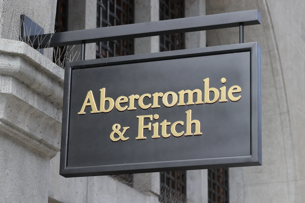
Retail branding and in-store signage
US (Scholastic) editions set in Adobe Garamond
Brand identity for the culinary arts institution
Body text in select editorial features
 See Garamond live on these sites with FontSwap →
See Garamond in the Wild
Garamond is not one typeface but a family of old-style serifs named after Claude Garamont, the 16th-century Parisian punchcutter whose types set the standard for Western book printing. Nearly five centuries later, Garamond remains the default choice for literary publishing — and, because the good digital cuts are commercial, one of the serifs designers most often need a free version of.
History and Design
Claude Garamont cut his types in Paris in the 1530s and 1540s, during the French Renaissance. Working from the Venetian models of Aldus Manutius and Nicolas Jenson, he refined them into something more elegant and more even: cleaner curves, better-fitted spacing, and a calm, readable rhythm that printers across Europe quickly adopted. His roman types, and the italics of his contemporary Robert Granjon, became the reference for the whole "old-style" or "Garalde" category of serifs.
The name has since become slippery. For centuries, types actually cut by Jean Jannon in the 17th century were misattributed to Garamont, so a number of "Garamonds" descend from Jannon rather than the original. Modern digital versions range from scholarly reconstructions to loose interpretations, and they vary widely — ITC Garamond (with its tall x-height) looks very different from Adobe Garamond or Stempel Garamond.
This matters more than it sounds. Because there is no single authoritative "Garamond," the name marks a lineage rather than a specific design — a category of humanist old-style serifs that trace back to one punchcutter's Parisian workshop. Understanding that lineage is the key to substitution: what you are usually matching is not an exact set of outlines but a feeling of Renaissance reading comfort, which several free faces can supply.
The most respected modern revival is Adobe Garamond, drawn by Robert Slimbach in 1989 from original Garamont punches held at the Plantin-Moretus Museum in Antwerp. Slimbach captured the warmth and humanist detail of the source while adding modern spacing and broad language support, pairing the roman with an italic based on Granjon's — exactly as the historical practice would have it. When people say "Garamond" in a design context today, Adobe Garamond is very often what they mean.
Why Garamond Matters
Garamond endures for a simple reason: it is one of the most comfortable typefaces ever made to read for hours. The moderate contrast, open counters, and gentle serifs guide the eye along a line without fatigue, which is precisely what a novel or a dissertation demands.
It is also economical. Garamond's proportions fit a lot of text into a page while staying legible, which publishers love — more words per signature means fewer pages and lower printing costs. That efficiency even became a minor news story in 2014, when a student's science-fair project suggested governments could save on ink by switching documents to Garamond; the specific figures were widely disputed, but the underlying point — that Garamond's lighter, finer strokes lay down less ink than heavier faces — is sound.
Who is it for? Anyone whose work is reading. Book designers, academic and literary publishers, and editorial teams reach for Garamond first. Beyond the page, luxury and heritage brands borrow its Renaissance provenance to signal tradition, craft, and quality — the reason it turns up on wine labels, fashion houses, and premium packaging.
That heritage cuts both ways, and it is worth being honest about it. Garamond carries five centuries of association with books, scholarship, and refinement, which is a gift when a brand wants to feel established and a liability when it wants to feel new. Choosing Garamond is a statement about where you stand — with tradition, craft, and the long history of the printed word — and brands that pick it are usually making that statement on purpose.
Design Characteristics
The features that mark a true old-style Garamond:
- Low-to-moderate stroke contrast — thicks and thins differ gently, giving an even, warm text color.
- Bracketed serifs — the serifs flow into the stems on a curve rather than meeting at a sharp angle, a hallmark of the old-style category.
- Angled stress — the thin parts of round letters fall on a diagonal, echoing the tilt of a broad-nib pen; this is what makes Garamond feel humane rather than mechanical.
- Modest x-height — smaller than most modern serifs, which lends elegance but means Garamond sets "small" and needs a slightly larger point size on screen.
- Small, elegant details — the tear-drop terminals, the small hook on the a, and Granjon-based italics give it its unmistakable literary refinement.
For choosing a free alternative, x-height and contrast are the tells: EB Garamond matches both closely; a higher-contrast face like Cormorant is gorgeous at display sizes but too delicate for small text.
Where Garamond Excels
Garamond is a text typeface first, and it is superb wherever sustained reading matters:
- Book design — the classic choice for novels and literary fiction, comfortable page after page.
- Academic and scholarly publishing — journals, monographs, and dissertations, where density and legibility both count.
- Editorial and long-form — magazine features and essays that ask the reader to stay a while.
- Luxury and heritage branding — wine, fashion, and premium goods that want to feel timeless and crafted.
- Formal stationery — invitations and certificates, where Garamond's provenance reads as gravitas.
Literary publishing is the clearest home. Walk a bookshop and a large share of the novels you pull down are set in a Garamond or one of its close relatives, chosen because the type should vanish and leave only the author's voice. That invisibility is the highest compliment a book face can earn, and it is exactly what Garamond was built to do — hold thousands of words without ever calling attention to itself.
The common thread is the printed or long-read page. Garamond rewards generous margins, careful leading, and a reader who is settling in.
Where Garamond Struggles
Garamond's virtues are print virtues, and screens are less kind to it.
Its low x-height and fine, contrasting strokes were optimized for ink on paper. At small sizes on a display — especially older or low-resolution screens — those thin strokes can thin out or shimmer, and the small x-height makes text look smaller than its point size suggests. You compensate by sizing up and by choosing a cut drawn for the screen, but a delicate Garamond is rarely the right call for dense UI text or captions.
The name itself is a hazard. Because "Garamond" covers everything from faithful revivals to Jannon-based cuts to the anomalous ITC Garamond, two files both labeled "Garamond" can look markedly different and set to different widths. Matching an existing document means identifying which Garamond it actually uses, not just grabbing any file with the name.
And it is unmistakably traditional. Garamond signals heritage and calm authority, which is exactly wrong when a brand wants to feel contemporary, energetic, or disruptive. For those jobs a modern serif — or a sans — will serve better than dressing the work in five centuries of history.
How to Choose a Free Substitute
The right free Garamond depends on where the type will live and how big it will be:
- Authentic Garamond for books and print → EB Garamond. A scholarly revival from the same historical sources; the definitive free choice for body text.
- Display headlines and luxury titles → Cormorant Garamond. Higher contrast and dramatic elegance at large sizes — beautiful in a masthead, too fine for small text.
- Long-form reading, slightly more modern → Crimson Pro. An old-style book serif with a calm, even texture and a full variable range.
- Documents, reports, and interface text → Source Serif. Cleaner and more transitional, Adobe's own open-source workhorse.
- On-screen editorial and blogs → Newsreader. Drawn for the web, with optical sizes tuned to article reading.
- Multilingual projects → Noto Serif. Not a Garamond, but a consistent serif texture across a huge range of scripts.
A simple rule: for a book, use EB Garamond; for a headline, use Cormorant Garamond; for a website article, Crimson Pro or Newsreader will render more reliably than a delicate historical revival. And always confirm which Garamond you are actually trying to match before you pick a stand-in.
One more practical note: because Garamond's substitutes span old-style to transitional, they diverge most in italics and in the fine display details. If your project leans on italics — pull quotes, book titles, emphasis — set a paragraph of each candidate's italic before deciding, since that is where the family character, inherited from Granjon, shows most clearly.
Premium Font Neighbors
Garamond sits at the head of a long line of old-style and text serifs, and its neighbors help pinpoint what you want:
- Sabon is a Garamond derivative in the strictest sense — Jan Tschichold designed it in the 1960s from Garamont's forms to work identically across hot metal, Linotype, and film, and it remains a favorite for book work.
- Adobe Garamond Premier and other Garamont revivals refine the same source with optical sizes for display, subhead, and caption.
- Minion is Robert Slimbach's own later old-style — warmer and more even, drawn for the digital age.
- Bembo reaches further back to the Aldine models Garamont learned from, a shade more archaic.
- Caslon and Baskerville are the great English serifs that followed — Caslon a sturdier old-style, Baskerville the transitional step toward higher contrast.
Comparing them clarifies the choice: a true Garamond descendant (Sabon, Garamont revivals), the same reading comfort in a more modern serif (Minion), or a different classic tradition entirely (Caslon, Baskerville) — with EB Garamond and Crimson Pro covering most of it for free. The lesson of the neighborhood is reassuring: Garamond's reading comfort is not locked inside one expensive file. It is a property of the whole old-style tradition, and the best free revivals inherit it honestly.
FAQ
What is the best free alternative to Garamond?
EB Garamond is the best free alternative, at roughly 92% similarity. Created by Georg Duffner (and expanded by Octavio Pardo) from the 1592 Égenolff-Berner specimen, it faithfully reproduces Claude Garamont's original forms and is ideal for book design, editorial work, and academic publishing. For long-form text with a slightly more modern finish, Crimson Pro is the next-best free choice.
Can I use EB Garamond commercially?
Yes. EB Garamond is licensed under the SIL Open Font License (OFL-1.1), which permits unlimited commercial use at no cost — in print, on websites, in apps, and in products. Attribution is only required if you redistribute the font files themselves, not when you use the font in a design.
How similar is EB Garamond to Adobe Garamond?
EB Garamond achieves about 92% similarity to Adobe Garamond, sharing the old-style proportions, gentle bracketed serifs, angled stress, and modest x-height. Adobe Garamond has more refined optical adjustments and professional spacing; EB Garamond differs slightly in a few letterforms and metrics. For most book and editorial work the two are effectively interchangeable.
What are the main differences between Garamond and EB Garamond?
Adobe Garamond offers additional optical sizes and extensive OpenType features developed by professional type designers, along with tighter spacing. EB Garamond has a few alternate letterforms and slightly looser fit, but reproduces the historical character faithfully. In practice, EB Garamond provides comparable quality for the vast majority of uses.
Which Garamond does Harry Potter use?
The US (Scholastic) editions of the Harry Potter series are set in Adobe Garamond for the body text — a good example of Garamond's dominance in literary book design. A free EB Garamond setting produces a very close approximation of that classic reading experience.
Is Garamond good for websites and screens?
Garamond can look beautiful on screen at generous sizes, but its low x-height and fine strokes were optimized for print, so at small sizes and on low-resolution displays it can feel thin or small. For web body text, a screen-tuned serif in the same family — Crimson Pro, Newsreader, or Source Serif — usually renders more reliably than a delicate Garamond revival.
Where can I download EB Garamond for free?
EB Garamond is free from Google Fonts at fonts.google.com/specimen/EB+Garamond, including roman and italic styles and a variable font spanning Regular to ExtraBold. You can self-host it via CSS, use it through Google Fonts or Adobe Fonts, or install it on Windows, macOS, and Linux for desktop use.
Is Garamond on Google Fonts?
No, Garamond is a premium font from Adobe and is not available on Google Fonts.
The closest Google Fonts alternative is EB Garamond with 92% similarity. Get it free on Google Fonts ↗
Free Alternatives (6)
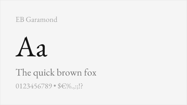
Exceptional revival based on Claude Garamont's original 16th-century designs
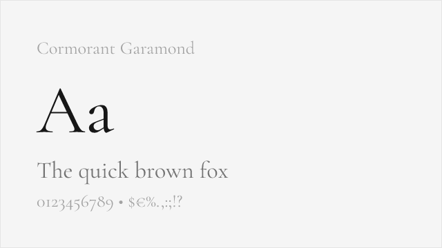
More decorative interpretation with higher contrast for display use
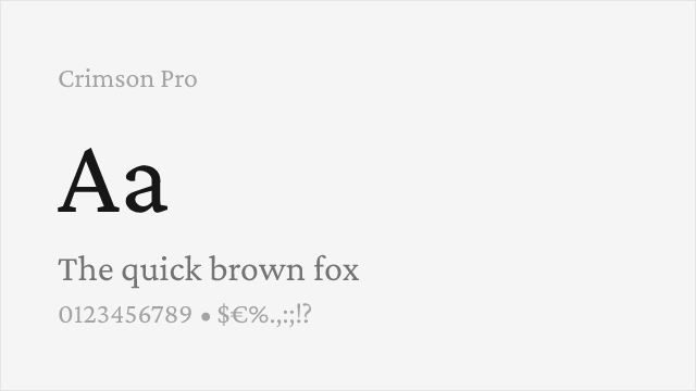
Old-style book serif in the Garamond tradition, built for reading
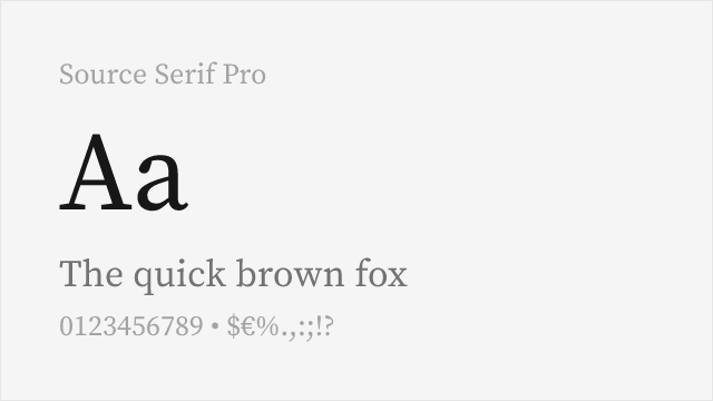
Adobe's open-source transitional serif, versatile for text and screen
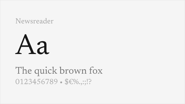
Old-style-inspired serif for on-screen reading, with optical sizes
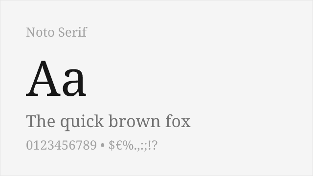
Google pan-Unicode serif with variable weight and width
Compare the alternatives
See how Garamond compares to its top alternatives — and how those alternatives compare to each other — side by side.
See where Garamond is used in the wild and swap to free alternatives live.
Install FontSwap →Replacement Summary
Source: FontAlternatives.com
Premium font: Garamond
Best free alternative: EB Garamond
FontAlternatives similarity score: 92%
Replacement difficulty: Low
Best for: book design, academic publishing, editorial design, literary fiction
Notable users: Apple, Abercrombie & Fitch, Harry Potter
Not recommended when: Brand consistency with Apple requires exact letterforms
What is the best free alternative to Garamond?
EB Garamond is the best free alternative to Garamond with a FontAlternatives similarity score of 92%.
EB Garamond shares similar proportions, stroke characteristics, and intended use with Garamond. It is available under the OFL-1.1 license, which permits both personal and commercial use at no cost.
This alternative works particularly well for: book design, academic publishing, editorial design, literary fiction.
Can I safely replace Garamond with EB Garamond?
Yes, EB Garamond is a high-confidence replacement for Garamond. The FontAlternatives similarity score of 92% indicates strong structural compatibility.
Licensing: EB Garamond is licensed under OFL-1.1, which allows commercial use without licensing fees or royalties.
Weight coverage: All 3 weights have exact matches available.
When should I NOT replace Garamond?
While EB Garamond is a strong alternative, there are situations where replacing Garamond may not be appropriate:
- Strict compliance: Verify that OFL-1.1 terms meet your specific legal and compliance requirements.
Weight-Matching Guide
Map Garamond weights to their closest free alternatives for accurate font substitution.
EB Garamond
| Garamond | EB Garamond | Match |
|---|---|---|
| Regular | Regular (400) | exact |
| Semibold | SemiBold (600) | exact |
| Bold | Bold (700) | exact |
Cormorant Garamond
| Garamond | Cormorant Garamond | Match |
|---|---|---|
| Regular | Regular (400) | close |
| Semibold | SemiBold (600) | close |
| Bold | Bold (700) | close |
Crimson Pro
| Garamond | Crimson Pro | Match |
|---|---|---|
| Regular | Regular (400) | close |
| Semibold | SemiBold (600) | close |
| Bold | Bold (700) | exact |
Source Serif Pro
| Garamond | Source Serif Pro | Match |
|---|---|---|
| Regular | Regular (400) | close |
| Semibold | SemiBold (600) | close |
| Bold | Bold (700) | exact |
Newsreader
| Garamond | Newsreader | Match |
|---|---|---|
| Regular | Regular (400) | close |
| Semibold | SemiBold (600) | close |
| Bold | Bold (700) | close |
Noto Serif
| Garamond | Noto Serif | Match |
|---|---|---|
| Regular | Regular (400) | close |
| Semibold | SemiBold (600) | close |
| Bold | Bold (700) | close |
Performance Guide
Production performance metrics for each alternative.
How to Use EB Garamond
Copy these code snippets to quickly add EB Garamond to your project.
CSS code for EB Garamond
@import url('https://fonts.googleapis.com/css2?family=EB+Garamond:wght@100..900&display=swap');HTML code for EB Garamond
<link rel="preconnect" href="https://fonts.googleapis.com">
<link rel="preconnect" href="https://fonts.gstatic.com" crossorigin>
<link href="https://fonts.googleapis.com/css2?family=EB+Garamond:wght@100..900&display=swap" rel="stylesheet">
Tailwind code for EB Garamond
// tailwind.config.js
module.exports = {
  theme: {
    extend: {
      fontFamily: {
        'eb-garamond': ['"EB Garamond"', 'sans-serif'],
      },
    },
  },
}

// Usage in HTML:
// <p class="font-eb-garamond">Your text here</p>
Next.js code for EB Garamond
// Using next/font (Next.js 13+)
import { EB_Garamond } from 'next/font/google';

const eb_garamond = EB_Garamond({
  subsets: ['latin'],
  weight: ['100', '200', '300', '400', '500', '600', '700', '800', '900'],
});

export default function Component() {
  return (
    <p className={eb_garamond.className}>
      Your text here
    </p>
  );
}

// Or using inline styles with Google Fonts link:
// <p style={{ fontFamily: '"EB Garamond"' }}>Your text</p>
Expo and React Native code for EB Garamond
// Install: npx expo install @expo-google-fonts/eb-garamond expo-font
import { useFonts, EB_Garamond_400Regular } from '@expo-google-fonts/eb-garamond';

export default function App() {
  const [fontsLoaded] = useFonts({
    EB_Garamond_400Regular,
  });

  if (!fontsLoaded) return null;

  return (
    <Text style={{ fontFamily: 'EB_Garamond_400Regular' }}>
      Your text here
    </Text>
  );
}
Recommended Font Pairings
These free fonts pair well with EB Garamond Garamond for headlines, body text, or accent use.
Open Sans's clean neutrality lets Garamond's old-style elegance shine as the primary reading face
Lato's humanist warmth harmonizes with Garamond's classical proportions for a cohesive editorial feel
Source Sans Pro's readable simplicity pairs well with Garamond's refined serifs in academic and editorial settings
Browse Alternatives by Context
Find Garamond alternatives filtered by specific use case, style, or language support.
By Use Case
By Script
Frequently Asked Questions
What is the best free alternative to Garamond?
EB Garamond is the best free alternative to Garamond with a FontAlternatives similarity score of 92%. It shares similar proportions and characteristics while being available under the OFL-1.1 license for both personal and commercial use at no cost.
Is there a free version of Garamond?
There is no official free version of Garamond. However, EB Garamond is available under the OFL-1.1 open-source license and achieves a FontAlternatives similarity score of 92%. It includes variable weights and supports latin, latin-extended.
What Google Font looks like Garamond?
The Google Fonts most similar to Garamond are EB Garamond, Cormorant Garamond, Crimson Pro. Among these alternatives, EB Garamond offers the closest match with a FontAlternatives similarity score of 92% and includes variable weights for flexible typography options.
Can I use EB Garamond commercially?
Yes, EB Garamond can be used commercially. It is licensed under OFL-1.1, which allows free use in websites, applications, print materials, and commercial projects without purchasing a license or paying royalties.
Is EB Garamond similar enough to Garamond?
EB Garamond achieves a FontAlternatives similarity score of 92% compared to Garamond. While not identical, it offers comparable letterforms, proportions, and visual style. Most designers find it works excellently as a substitute in web and print projects.
What are the main differences between Garamond and its free alternatives?
Free alternatives to Garamond may differ in subtle details like letter spacing, curve refinements, and available weights. Premium fonts typically include more OpenType features, extended language support, and optimized screen rendering. However, for most projects, these differences are negligible.
Where can I download free alternatives to Garamond?
Download EB Garamond directly from Google Fonts. Click the "Get Font" button on any alternative listed above to visit the official download page. Google Fonts also provides convenient embed codes for seamless web integration.