Free Alternatives to Bodoni

About Bodoni
- Classification
- serif
- Style
- didone
Brands Using Bodoni
The pre-2017 brand wordmark, set in Bodoni
Wordmark and brand typography
A default choice for high-contrast elegance in fashion and cosmetics identities
Feature headlines, pull quotes, and posters wanting dramatic contrast
 See Bodoni live on these sites with FontSwap →
See Bodoni in the Wild
Bodoni is a series of serif typefaces first designed by Giambattista Bodoni in the late 18th century. Characterized by flat, unbracketed serifs and extreme contrast between thick and thin strokes, Bodoni represents the pinnacle of the "Modern" or Didone classification and remains synonymous with elegance and sophistication. When fashion, luxury, and drama converge, Bodoni is often the typeface of choice.
History and Design
Giambattista Bodoni (1740-1813) worked as a printer at the Stamperia Reale in Parma, Italy, where he developed his revolutionary typefaces. Working in parallel with the Didot family's rationalist types in France, and drawing on the rationalist spirit of the Enlightenment, Bodoni pushed the contrast between thick and thin strokes to unprecedented extremes. His hairline serifs and geometric precision created a dazzling effect on the page.
Bodoni's approach represented a dramatic departure from the warm, humanist typefaces that preceded it. Where Caslon and Garamond featured gentle curves and moderate contrast, Bodoni embraced mathematical precision. The vertical stress, unbracketed serifs, and extreme thick-thin variation created letterforms of striking elegance—and considerable printing challenges. The delicate hairlines required exceptional paper and presswork to reproduce faithfully.
The types found immediate favor among European aristocracy and publishers of luxury editions. Bodoni himself produced spectacular books, including editions of Homer and Virgil that remain landmarks of printing history. His Manuale Tipografico, published posthumously in 1818, showcased his complete type collection and served as a reference for generations of type designers.
ITC Bodoni, designed in 1994 by a team including Sumner Stone, Jim Parkinson, and Janice Fishman, reinterpreted the original for modern use with three optical sizes. This approach acknowledges that Bodoni's dramatic contrast requires different treatments at different sizes—heavier hairlines for text sizes, more delicate proportions for display.
That optical-size problem is central to understanding every Bodoni ever made. A hairline that looks exquisite at 72 points on fine paper becomes invisible at 9 points on newsprint, so a single set of outlines cannot serve both roles. Bodoni himself cut different sizes as genuinely different designs, thickening the thins for smaller text; the great sin of early digital Bodonis was to scale one display drawing to every size and let the hairlines vanish. The best modern versions — ITC Bodoni's three optical sizes, and among the free faces Bodoni Moda's optical axis — restore that size-sensitivity, which is why they are the ones to reach for when the type will not always be large.
It is also worth distinguishing Bodoni from its French contemporary, Didot. Firmin Didot arrived at a very similar high-contrast, vertical-stress, unbracketed-serif model at almost the same moment, and the two are so close that designers often treat them as interchangeable for fashion work. The differences are subtle — Didot's serifs and hairlines tend to be even finer and its proportions a touch more delicate, while Bodoni can feel marginally more robust and geometric — but both belong to the same Enlightenment-era revolution that redefined what a serif could be.
Why Bodoni Matters
Bodoni matters because it invented a whole way of looking sophisticated. When Giambattista Bodoni pushed stroke contrast to its limit in the late 1700s, he was not just drawing letters; he was creating a visual language of refinement, precision, and status that the design world has drawn on ever since. To set a word in Bodoni is to borrow two centuries of association with luxury, fashion, and cultural authority — a shortcut to elegance that few typefaces can match.
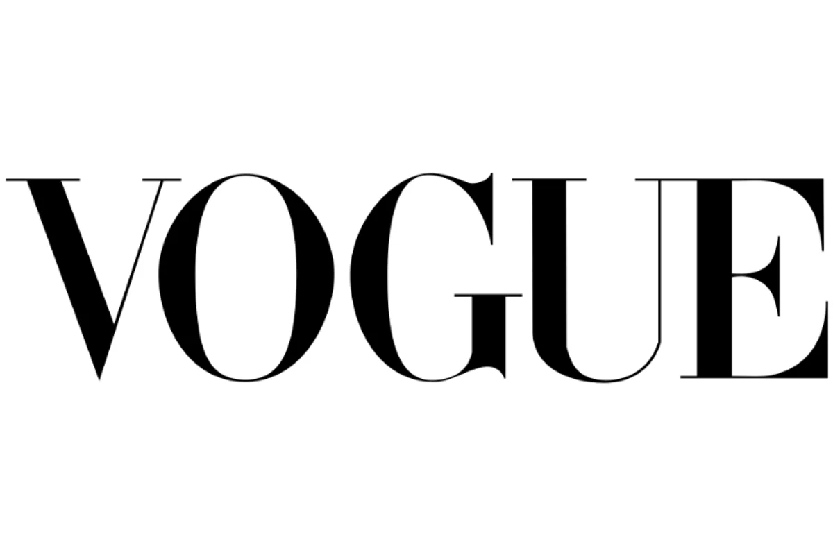
Bodoni's extreme contrast creates an unmistakable visual signature. The typeface appears in fashion magazines, luxury advertisements, and cultural institutions worldwide. More than any single logo, it is the whole high-contrast Didone look — Bodoni together with its near-identical French cousin Didot — that became the defining language of high fashion. The most famous fashion mastheads, Vogue and Harper's Bazaar, are both set in Didot, but they are icons of exactly the style Bodoni helped invent, and the two faces are used almost interchangeably for luxury and editorial work.
The typeface projects sophistication, refinement, and aspirational glamour. When brands want to signal luxury, Bodoni delivers. Calvin Klein used it for its pre-2017 wordmark, Zara set its identity in it, and countless other fashion and beauty houses have employed Bodoni or Didot in their branding. The typeface has appeared on album covers, movie posters, and in museum graphics worldwide, its high-contrast elegance a reliable signal of prestige.
Who is it for? Projects that want to feel elegant, luxurious, dramatic, or high-fashion — fashion and beauty branding, cultural institutions, editorial mastheads, event and wedding design, and anything trading on aspiration and refinement. It is a poor fit for warm, friendly, playful, or utilitarian work, and a genuinely bad choice for extended body text or low-resolution screens, where its delicate hairlines cannot survive. Bodoni is a specialist in glamour, and outside that lane it struggles.
Design Characteristics
Bodoni is the definitive "Modern" or Didone serif, and its every feature pushes toward one goal: maximum contrast, maximum drama. It is the typographic equivalent of high fashion — striking, precise, and a little severe:
- Extreme stroke contrast: The defining trait. The difference between the thick main strokes and the hairline thins is dramatic, creating a dazzling, high-fashion shimmer on the page.
- Flat, unbracketed serifs: The serifs are thin, straight lines that meet the stems at a sharp right angle, with no gentle transitional curve — a hallmark of the Modern classification.
- Vertical stress: The axis of the letters is perfectly upright, abandoning the angled, pen-derived stress of old-style faces like Garamond for rationalist, geometric precision.
- Geometric, constructed forms: Bodoni feels drawn with a compass and ruler rather than a pen, reflecting the Enlightenment rationalism of its era.
- Delicate hairlines: Those beautiful thins are also its greatest weakness — they can thin out or disappear entirely at small sizes and on low-resolution screens, which is why optical sizing matters so much for Bodoni.
- A wide range of interpretations: From delicate text cuts to the ultra-heavy Poster Bodoni, the name covers a spectrum of designs, all sharing the high-contrast DNA.
Where Bodoni Excels
Bodoni is a display face at heart, and it is at its best wherever elegance, drama, and aspiration are the goal — large, on good paper or a sharp screen, where its delicate contrast can shine:
- Fashion and luxury: Magazine mastheads, luxury branding, and fashion editorials — its natural home and the source of its cultural meaning.
- Display typography: Headlines, posters, and large-format work where the contrast reads as dramatic rather than fragile.
- Editorial design: Feature headlines and pull quotes that need a sophisticated, high-end voice.
- Cultural institutions: Museums, galleries, and performing-arts branding, where refinement and gravitas matter.
- Beauty and cosmetics: Packaging and identity for premium products that trade on elegance and aspiration.
Where Bodoni Struggles
The extreme contrast that makes Bodoni beautiful also makes it fragile and specialized. Almost all of its weaknesses trace back to those hairlines:
- Body text and small sizes: The thin strokes weaken and break up below display sizes, making Bodoni hard to read and prone to a spotty, uneven texture in running text.
- Low-resolution screens: On anything less than a sharp, high-DPI display, the hairlines can disappear or shimmer, which is why screen-tuned revivals with heavier thins exist.
- Warm or approachable briefs: Bodoni is elegant but cool and formal; it brings no warmth or friendliness to projects that need to feel human and welcoming.
- Cheap reproduction: On poor paper or with heavy ink spread, the fine details clog and the whole effect collapses — Bodoni rewards quality production and punishes the lack of it.
- Overuse in fashion: Its ubiquity in luxury and fashion means it can read as a cliché of "expensive," so it takes care to make it feel fresh rather than default.
How to Choose a Free Substitute
Bodoni's drama is genuinely reproducible in free type, but the trick is matching both the contrast and the intended size, because Didone hairlines are so size-sensitive.
For the closest, most faithful match, Libre Bodoni is a true open revival, and Bodoni Moda adds an optical-size axis that automatically thickens the hairlines at small sizes — the single most useful feature for anyone worried about legibility. Playfair Display is the popular, screen-friendly interpretation, with slightly heavier thins that survive typical resolutions. For a more characterful, contemporary take, Fraunces brings high contrast with a quirkier elegance and a full variable range; for warm, luxurious display work, Cormorant is a delicate high-contrast serif; and for editorial text that needs a whisper of Bodoni's refinement at reading sizes, Newsreader is the practical choice.
The one rule that matters most: match the size. If your Bodoni lives only in large headlines, any of the faithful revivals will dazzle. If it needs to work smaller — captions, subheads, body — reach for Bodoni Moda's optical sizing or step down to a lower-contrast serif like Newsreader, because a strict Didone set small will simply fall apart. Test at your real size before committing, and never judge a Bodoni substitute from a headline-only specimen.
Premium Font Neighbors
Bodoni sits at the summit of the high-contrast serif world, so its neighbors are the other Didones and dramatic display serifs. Didot is its great French rival and closest cousin — the two are often used interchangeably for fashion, though Didot's hairlines are, if anything, even more delicate. Chronicle Display, Canela, and Tiempos Headline are the modern editorial serifs that carry Bodoni-like contrast into contemporary branding and publishing. For classic serifs in the surrounding tradition, Baskerville is the transitional face that preceded the Moderns, and Caslon and Garamond are the warm old-style serifs Bodoni reacted against — useful neighbors when you want elegance with more warmth. Freight Text rounds out the set as a versatile editorial serif for the text roles Bodoni cannot fill.
FAQ
What is the best free alternative to Bodoni?
Libre Bodoni is the best free alternative to Bodoni, offering faithful reproduction of Bodoni's characteristic high contrast and unbracketed serifs. Created by Impallari Type, it includes regular and bold weights with true italics. For display-focused applications, Playfair Display provides comparable elegance with modern refinements.
Can I use Libre Bodoni commercially?
Yes, Libre Bodoni is licensed under the SIL Open Font License (OFL-1.1), permitting commercial use without fees or restrictions. You can incorporate it into logos, marketing materials, products, and applications. Attribution is required only if you redistribute the font files themselves.
How similar is Libre Bodoni to ITC Bodoni?
Libre Bodoni achieves approximately 88% similarity to ITC Bodoni, capturing the essential dramatic contrast and elegant proportions. Both feature hairline serifs and the characteristic Didone aesthetic. ITC Bodoni offers optical sizes optimized for different applications, while Libre Bodoni provides a single design.
What are the main differences between Bodoni and Playfair Display?
Bodoni features extremely thin hairlines and flat serifs, while Playfair Display has slightly heavier hairlines and subtle bracketing for improved screen rendering. Playfair is warmer and more contemporary, while Bodoni maintains stricter geometric precision. Both share high contrast and elegant proportions.
Where can I download Libre Bodoni for free?
Libre Bodoni is available for free download from Google Fonts at fonts.google.com/specimen/Libre+Bodoni. The package includes regular, medium, bold, and their italic variants. Google Fonts provides CSS snippets, download options, and documentation for web implementation. Bodoni Moda, Playfair Display, Fraunces, Cormorant Garamond, and Newsreader are all on Google Fonts too.
Which free Bodoni alternative works best at small sizes?
Bodoni Moda is the best choice for small or variable sizes because it includes an optical-size axis that automatically thickens the hairlines as the type gets smaller — directly addressing the biggest weakness of Didone faces. Playfair Display also renders more reliably than a strict Bodoni thanks to slightly heavier thins. For genuine body text, step down to a lower-contrast editorial serif like Newsreader, which keeps a hint of Bodoni's refinement while staying readable.
Why is Bodoni associated with fashion?
Bodoni's extreme contrast reads as elegant, precise, and expensive, which made it a natural fit for the fashion world. The Didone style it pioneered became the very language of fashion — the Vogue and Harper's Bazaar mastheads (both actually set in its cousin Didot) are the icons of that look — and a long line of fashion and beauty brands adopted Bodoni and Didot almost interchangeably. The look signals refinement and aspiration instantly, which is exactly what luxury branding wants, so the high-contrast Didone became shorthand for high fashion.
Is Bodoni good for body text?
Not really. Bodoni is a display face; its delicate hairlines thin out and become hard to read below headline sizes, and in long passages the high contrast creates a distracting, uneven texture often called "dazzle." For body text, use a Bodoni-style face only for headlines and pull quotes, and set the running text in a lower-contrast serif or a neutral sans — Newsreader among the free options, or pair Bodoni headlines with a calm sans like Montserrat.
Is Bodoni on Google Fonts?
No, Bodoni is a premium font from ITC (International Typeface Corporation) and is not available on Google Fonts.
The closest Google Fonts alternative is Libre Bodoni with 88% similarity. Get it free on Google Fonts ↗
Free Alternatives (6)
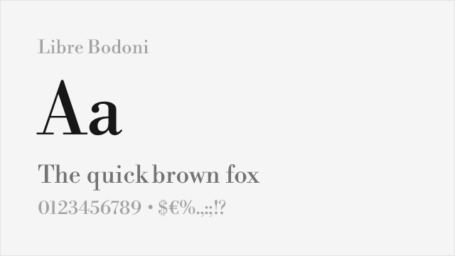
Faithful open-source revival with excellent weight range
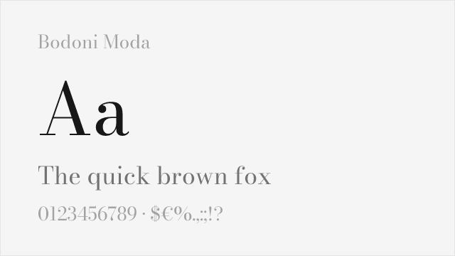
Google Fonts Bodoni revival with optical sizing and wide weight range
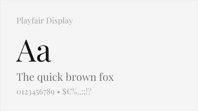
Contemporary interpretation capturing Bodoni's dramatic contrast
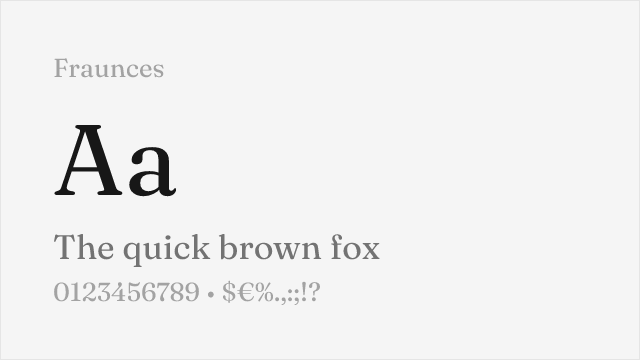
Contemporary high-contrast display serif with a variable weight range
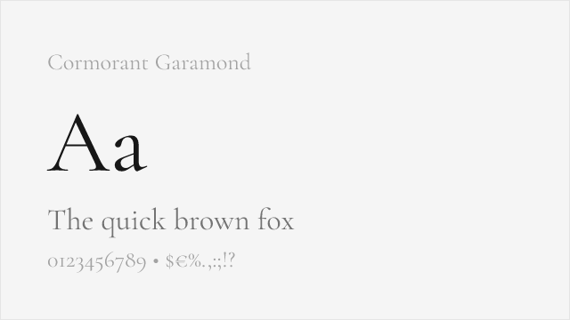
Elegant high-contrast display serif in the old-style-into-modern tradition
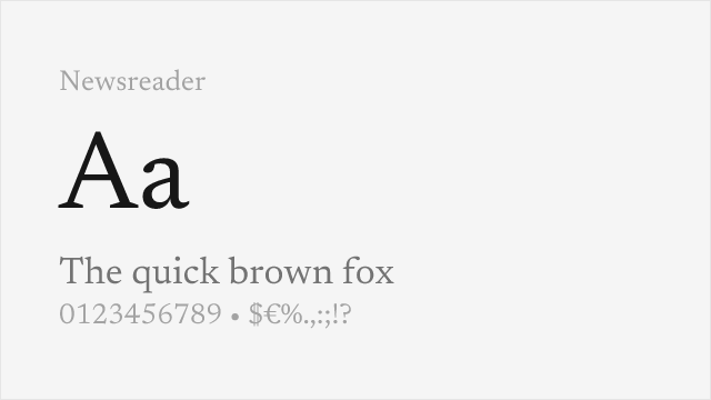
Contemporary editorial serif with moderate-to-high contrast for text and display
Compare the alternatives
See how Bodoni compares to its top alternatives — and how those alternatives compare to each other — side by side.
See where Bodoni is used in the wild and swap to free alternatives live.
Install FontSwap →Replacement Summary
Source: FontAlternatives.com
Premium font: Bodoni
Best free alternative: Libre Bodoni
FontAlternatives similarity score: 88%
Replacement difficulty: Low
Best for: fashion editorials, display headlines, luxury branding, poster design
Notable users: Calvin Klein, Zara, Luxury fashion & beauty branding
Not recommended when: Brand consistency with Calvin Klein requires exact letterforms
What is the best free alternative to Bodoni?
Libre Bodoni is the best free alternative to Bodoni with a FontAlternatives similarity score of 88%.
Libre Bodoni shares similar proportions, stroke characteristics, and intended use with Bodoni. It is available under the OFL-1.1 license, which permits both personal and commercial use at no cost.
This alternative works particularly well for: fashion editorials, display headlines, luxury branding, poster design.
Can I safely replace Bodoni with Libre Bodoni?
Yes, Libre Bodoni is a high-confidence replacement for Bodoni. The FontAlternatives similarity score of 88% indicates strong structural compatibility.
Licensing: Libre Bodoni is licensed under OFL-1.1, which allows commercial use without licensing fees or royalties.
Weight coverage: All 3 weights have exact matches available.
When should I NOT replace Bodoni?
While Libre Bodoni is a strong alternative, there are situations where replacing Bodoni may not be appropriate:
- Strict compliance: Verify that OFL-1.1 terms meet your specific legal and compliance requirements.
Weight-Matching Guide
Map Bodoni weights to their closest free alternatives for accurate font substitution.
Libre Bodoni
| Bodoni | Libre Bodoni | Match |
|---|---|---|
| Book | Regular (400) | exact |
| Medium | Medium (500) | exact |
| Bold | Bold (700) | exact |
Bodoni Moda
| Bodoni | Bodoni Moda | Match |
|---|---|---|
| Book | Regular (400) | exact |
| Bold | Bold (700) | exact |
| Black | Black (900) | exact |
Playfair Display
| Bodoni | Playfair Display | Match |
|---|---|---|
| Regular | Regular (400) | close |
| Medium | Medium (500) | close |
| Bold | Bold (700) | close |
| Black | Black (900) | close |
Fraunces
| Bodoni | Fraunces | Match |
|---|---|---|
| Regular | Regular (400) | close |
| Bold | Bold (700) | close |
| Black | Black (900) | close |
Cormorant Garamond
| Bodoni | Cormorant Garamond | Match |
|---|---|---|
| Regular | Regular (400) | close |
| Medium | Medium (500) | close |
| Bold | Bold (700) | close |
Newsreader
| Bodoni | Newsreader | Match |
|---|---|---|
| Regular | Regular (400) | close |
| Medium | Medium (500) | close |
| Bold | Bold (700) | close |
Performance Guide
Production performance metrics for each alternative.
How to Use Libre Bodoni
Copy these code snippets to quickly add Libre Bodoni to your project.
CSS code for Libre Bodoni
@import url('https://fonts.googleapis.com/css2?family=Libre+Bodoni:wght@100..900&display=swap');HTML code for Libre Bodoni
<link rel="preconnect" href="https://fonts.googleapis.com">
<link rel="preconnect" href="https://fonts.gstatic.com" crossorigin>
<link href="https://fonts.googleapis.com/css2?family=Libre+Bodoni:wght@100..900&display=swap" rel="stylesheet">
Tailwind code for Libre Bodoni
// tailwind.config.js
module.exports = {
  theme: {
    extend: {
      fontFamily: {
        'libre-bodoni': ['"Libre Bodoni"', 'sans-serif'],
      },
    },
  },
}

// Usage in HTML:
// <p class="font-libre-bodoni">Your text here</p>
Next.js code for Libre Bodoni
// Using next/font (Next.js 13+)
import { Libre_Bodoni } from 'next/font/google';

const libre_bodoni = Libre_Bodoni({
  subsets: ['latin'],
  weight: ['100', '200', '300', '400', '500', '600', '700', '800', '900'],
});

export default function Component() {
  return (
    <p className={libre_bodoni.className}>
      Your text here
    </p>
  );
}

// Or using inline styles with Google Fonts link:
// <p style={{ fontFamily: '"Libre Bodoni"' }}>Your text</p>
Expo and React Native code for Libre Bodoni
// Install: npx expo install @expo-google-fonts/libre-bodoni expo-font
import { useFonts, Libre_Bodoni_400Regular } from '@expo-google-fonts/libre-bodoni';

export default function App() {
  const [fontsLoaded] = useFonts({
    Libre_Bodoni_400Regular,
  });

  if (!fontsLoaded) return null;

  return (
    <Text style={{ fontFamily: 'Libre_Bodoni_400Regular' }}>
      Your text here
    </Text>
  );
}
Recommended Font Pairings
These free fonts pair well with Libre Bodoni Bodoni for headlines, body text, or accent use.
Montserrat's geometric stability provides a clean modern base that lets Bodoni's dramatic contrast command attention
Raleway's elegant thin weights create a sophisticated companion to Bodoni's high-contrast display presence
Lato's warm humanist forms offer readable body text that balances Bodoni's ornate, fashion-forward character
Browse Alternatives by Context
Find Bodoni alternatives filtered by specific use case, style, or language support.
By Use Case
By Script
Frequently Asked Questions
What is the best free alternative to Bodoni?
Libre Bodoni is the best free alternative to Bodoni with a FontAlternatives similarity score of 88%. It shares similar proportions and characteristics while being available under the OFL-1.1 license for both personal and commercial use at no cost.
Is there a free version of Bodoni?
There is no official free version of Bodoni. However, Libre Bodoni is available under the OFL-1.1 open-source license and achieves a FontAlternatives similarity score of 88%. It includes variable weights and supports latin, latin-extended.
What Google Font looks like Bodoni?
The Google Fonts most similar to Bodoni are Libre Bodoni, Bodoni Moda, Playfair Display. Among these alternatives, Libre Bodoni offers the closest match with a FontAlternatives similarity score of 88% and includes variable weights for flexible typography options.
Can I use Libre Bodoni commercially?
Yes, Libre Bodoni can be used commercially. It is licensed under OFL-1.1, which allows free use in websites, applications, print materials, and commercial projects without purchasing a license or paying royalties.
Is Libre Bodoni similar enough to Bodoni?
Libre Bodoni achieves a FontAlternatives similarity score of 88% compared to Bodoni. While not identical, it offers comparable letterforms, proportions, and visual style. Most designers find it works excellently as a substitute in web and print projects.
What are the main differences between Bodoni and its free alternatives?
Free alternatives to Bodoni may differ in subtle details like letter spacing, curve refinements, and available weights. Premium fonts typically include more OpenType features, extended language support, and optimized screen rendering. However, for most projects, these differences are negligible.
Where can I download free alternatives to Bodoni?
Download Libre Bodoni directly from Google Fonts. Click the "Get Font" button on any alternative listed above to visit the official download page. Google Fonts also provides convenient embed codes for seamless web integration.