 Install FontSwap
Free Alternatives to Bodoni with Expressive Style
Bodoni is known for its expressive aesthetic. If you're looking for a free serif font with a similar expressive feel, these 6 alternatives offer comparable characteristics. We've identified 2 that are especially well-suited for this context. All are available under open-source licenses for unrestricted commercial use.
Top Picks
Comparison Table
| Font | Relevance ⓘ
How well this alternative fits the specific context (use-case or trait) of this page. Score 0–100 based on matching keywords, industries, and font characteristics. Alternatives scoring 25+ are highlighted.
| Similarity ⓘ
How visually similar this free font is to the premium original. Score 0–100 based on x-height, width, stroke contrast, use-case overlap, and language coverage.
Learn more → | Weights | Variable | License | Source |
|---|---|---|---|---|---|---|
| Fraunces | 74 | 70% | Variable | Yes | OFL-1.1 | Google Fonts ↗ |
| Bodoni Moda | 31 | 82% | Variable | Yes | OFL-1.1 | Google Fonts ↗ |
| Libre Bodoni | 18 | 88% | Variable | Yes | OFL-1.1 | Google Fonts ↗ |
| Playfair Display | 16 | 78% | Variable | Yes | OFL-1.1 | Google Fonts ↗ |
| Cormorant Garamond | 13 | 66% | Variable | Yes | OFL-1.1 | Google Fonts ↗ |
| Newsreader | 12 | 60% | Variable | Yes | OFL-1.1 | Google Fonts ↗ |
Most Relevant (2)
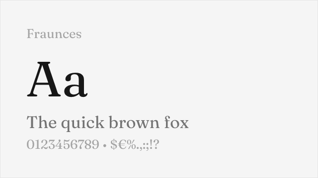
[Google Fonts] · OFL-1.1 · Variable
Contemporary high-contrast display serif with a variable weight range
Why it matches: Fraunces is a contemporary display serif with genuine high contrast and a characterful, slightly quirky elegance. It is not a strict Didone — its details are softer and more playful than Bodoni's severe geometry — but for dramatic, fashion-adjacent headlines it delivers comparable contrast and sophistication, plus a full variable weight range Bodoni's free revivals lack.
editorial headlinesfashion and lifestyle brandingdisplay and posterslogotypes
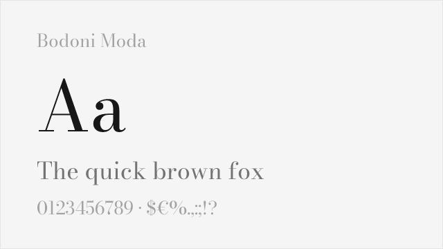
[Google Fonts] · OFL-1.1 · Variable
Google Fonts Bodoni revival with optical sizing and wide weight range
Why it matches: Bodoni Moda is a modern Bodoni revival purpose-built for Google Fonts. It shares the high contrast, flat serifs, and vertical stress that define the Didone classification. The optical size axis automatically adjusts contrast for different sizes — reducing hairline thinning at small sizes while preserving full drama at display sizes.
fashion editorialsluxury brandingdisplay headlinesresponsive design
Other Alternatives (4)
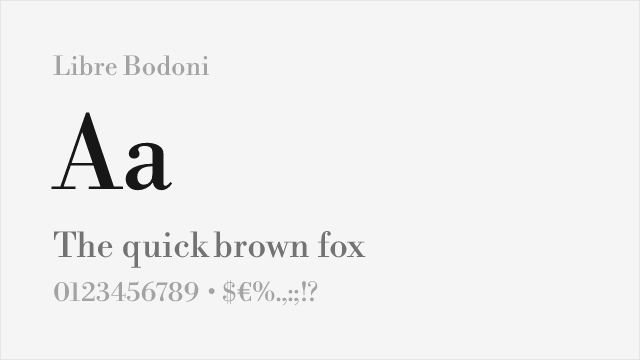
[Google Fonts] · OFL-1.1 · Variable
Faithful open-source revival with excellent weight range
Why it matches: Libre Bodoni faithfully reproduces Bodoni's defining characteristics—the extreme contrast between thick and thin strokes, flat unbracketed serifs, and vertical stress. Both share the dramatic elegance that made Bodoni synonymous with fashion and luxury. Libre Bodoni's variable font technology allows fine weight adjustment while maintaining the essential Didone aesthetic.
fashion editorialsdisplay headlinesluxury brandingposter design
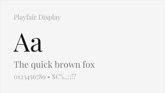
[Google Fonts] · OFL-1.1 · Variable
Contemporary interpretation capturing Bodoni's dramatic contrast
Why it matches: Playfair Display captures Bodoni's high contrast and elegant proportions while adding subtle refinements for digital screens. The slightly heavier hairlines and gentle bracketing improve rendering at typical screen resolutions. Both share the sophisticated, aspirational quality essential for fashion and editorial applications, though Playfair feels warmer and more contemporary.
editorial headlineswedding stationerylifestyle brandingrestaurant menus
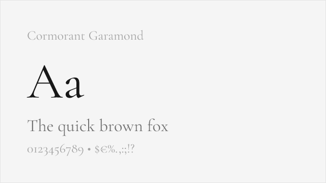
[Google Fonts] · OFL-1.1 · Variable
Elegant high-contrast display serif in the old-style-into-modern tradition
Why it matches: Cormorant is a refined, high-contrast display serif — technically a Garamond relative, but drawn with such delicate hairlines and elegant proportions that it shares Bodoni's aspirational, luxurious feel at large sizes. It is warmer and less geometric than a true Didone, but for wedding, fashion, and luxury display work it reaches for the same register.
luxury and fashion brandingwedding and event stationeryeditorial displayelegant headlines
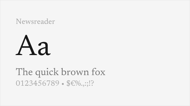
[Google Fonts] · OFL-1.1 · Variable
Contemporary editorial serif with moderate-to-high contrast for text and display
Why it matches: Newsreader is a contemporary serif drawn for editorial reading, with enough contrast and elegance to nod toward the Didone tradition while staying far more usable at text sizes than a true Bodoni. It is the practical pick when you want a whisper of Bodoni's refinement in running text or long-form editorial rather than only in a headline.
long-form editorialmagazine text and headlinesdigital publishingrefined body text