Free Alternatives to Chronicle Display

About Chronicle Display
- Foundry
- Hoefler&Co
- Classification
- serif
- Style
- scotch
Brands Using Chronicle Display
Feature article headlines and section headers in print magazine
Editorial identity including masthead-adjacent display typography
Editorial display typography for feature stories and literary journalism
Feature headlines and editorial display typography in premium print and digital magazines
Chronicle Display is a high-contrast Scotch Roman serif designed by Jonathan Hoefler and released by Hoefler&Co. Part of the broader Chronicle family — which includes Chronicle Text for body copy and Chronicle Deck for subheads — Chronicle Display represents the pinnacle of the system: a typeface engineered for maximum impact at headline sizes, where its dramatic thick-thin contrast and refined proportions transform editorial pages into visual events. The Scotch Roman tradition, which originated in early 19th-century Scottish and American type foundries, provides Chronicle Display with a structural vocabulary that is simultaneously classical and surprisingly modern.
Chronicle Display requires a paid license from Hoefler&Co. Licensing is available through typography.com with separate desktop, web, and app tiers. There is no free trial or open-source version. If your budget cannot accommodate Hoefler&Co's licensing model, this page covers the strongest open-source alternatives — though Chronicle Display's particular refinement of Scotch Roman proportions makes it a distinctive typeface that free alternatives approximate rather than replicate.
Why Chronicle Display Matters
Chronicle Display occupies a singular position in contemporary editorial typography. When publications like The New Republic and Harper's Magazine use it for feature headlines, the typeface brings a specific combination of qualities: it reads as classic without feeling dated, dramatic without becoming decorative, and authoritative without appearing stuffy. That balance — which is far harder to achieve than it appears — is what makes Chronicle Display the default choice for publications that need their headlines to project editorial seriousness and visual sophistication simultaneously.
The Scotch Roman lineage is central to understanding Chronicle Display's appeal. Scotch Romans were the dominant text and display faces of 19th-century American publishing — newspapers, magazines, and books all relied on their sturdy construction and reliable readability. By the late 20th century, most Scotch Romans had been displaced by Didones, old-style revivals, and the sans-serif revolution. Hoefler's achievement with Chronicle was to recognize the untapped potential in the Scotch Roman model and reinterpret it with contemporary precision.
Chronicle Display's contrast is high but carefully managed. Unlike Didone faces (Bodoni, Didot) where hairline thins can become fragile, Chronicle Display maintains enough substance in its thin strokes to remain robust across printing conditions and screen resolutions. The ball terminals are refined but never fussy. The serifs are bracketed with a curve that transitions smoothly from stem to serif, avoiding the abrupt joins that plague many high-contrast faces.
This construction makes Chronicle Display remarkably versatile for an editorial display face. It works at 72-point poster sizes and at 24-point deck sizes without requiring optical adjustments — though Hoefler&Co does offer Chronicle Deck and Chronicle Text for those intermediate and small sizes. Esquire, The New Republic, and Harper's Magazine have all deployed Chronicle Display precisely because it delivers editorial impact without the fragility or preciousness of more extreme display serifs.
Design Characteristics
Chronicle Display's design reflects a deeply informed engagement with the Scotch Roman tradition:
- Dramatic but controlled contrast: The difference between thick and thin strokes is pronounced — enough to create visual drama at headline sizes — but the thins retain sufficient weight to avoid the fragility of Didone extremes, ensuring reliability across print and screen reproduction
- Refined ball terminals: The terminals on letters like
a,c,f, andrare carefully shaped spheres that add elegance without decorative excess, a signature of the Scotch Roman tradition that distinguishes Chronicle Display from both Didones and old-style faces - Bracketed serifs with smooth transitions: Serifs connect to stems through graceful bracketed curves rather than abrupt angles, creating a warmer, more approachable character than the unbracketed serifs of Modern faces while maintaining sharpness at display sizes
- Moderate x-height: The lowercase proportions favor readability over compactness, allowing Chronicle Display to function effectively at deck and subhead sizes in addition to primary headlines
- Open counters and apertures: Letters like
a,e, andcmaintain generous internal spaces, preventing the closed, heavy appearance that afflicts many high-contrast serifs when set in bold weights - Sturdy vertical stress: The axis of contrast follows a near-vertical orientation, characteristic of the Scotch Roman model and contributing to Chronicle Display's upright, authoritative posture
- Carefully proportioned capitals: Uppercase letters are slightly shorter than typical for contemporary display faces, allowing them to integrate with lowercase text without overpowering it — a proportion derived from 19th-century American printing practice
Where Chronicle Display Excels
Chronicle Display is at its best in contexts that demand editorial authority with visual refinement:
- Magazine feature headlines: The primary use case — Chronicle Display transforms cover lines and feature headlines into visual anchors that draw readers into stories
- Premium editorial publications: Esquire, The New Republic, Harper's Magazine, and similar publications rely on its ability to convey both intellectual seriousness and visual sophistication
- Fashion and luxury editorial: The high contrast and refined proportions align with the visual language of fashion publishing without the coldness of Didone alternatives
- Book jacket and cover design: The display proportions and range of weights provide the hierarchy needed for complex title treatments
- Long-form journalism mastheads: Chronicle Display signals editorial credibility in contexts where the publication's visual identity must project authority
- High-end hospitality and restaurant branding: The warm elegance translates well to menus, signage, and identity systems for premium hospitality brands
Where Chronicle Display Struggles
Chronicle Display was engineered for headlines, and its Scotch Roman heritage creates natural boundaries:
- Body text at small sizes: Chronicle Display is engineered for headlines — at text sizes below 18px, the high contrast causes thin strokes to break up on screen, and the proportions become cramped (use Chronicle Text instead)
- Casual or friendly brand contexts: The editorial authority that makes Chronicle Display effective in magazines reads as overly formal for brands targeting younger, more casual audiences
- Dense data-driven layouts: Tables, dashboards, and information-dense interfaces need serifs with more even stroke weight and compact proportions
- Low-resolution or poor printing conditions: The high contrast that makes Chronicle Display dramatic on quality paper or high-resolution screens becomes a liability on newsprint or low-DPI displays
- Projects requiring extensive language support: Chronicle Display covers Latin scripts only — multilingual projects beyond Western European languages need a fallback or different typeface entirely
- Digital-first products with variable font requirements: Chronicle Display ships as static files only. Hoefler&Co has been slow to adopt variable font technology across their catalog, and Chronicle Display is no exception — lacking the responsive flexibility that variable font alternatives provide for modern web workflows
How to Choose a Free Substitute
When evaluating Chronicle Display alternatives, prioritize these criteria:
- Contrast level: Chronicle Display's defining characteristic is its dramatic thick-thin contrast at display sizes. Your alternative needs visible contrast that creates editorial impact at 24px and above. Playfair Display and Cormorant Garamond come closest; lower-contrast options like Crimson Pro will shift the editorial tone toward restraint
- Ball terminal refinement: Chronicle Display's Scotch Roman ball terminals are a visual signature. Look for free serifs with terminal treatments that add elegance rather than neutrality — Playfair Display's balls are the closest match
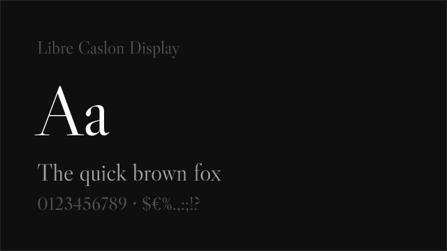
- Display-size performance: Test your alternative at 36-72px. Many free serifs are optimized for text sizes and appear rough or under-refined at display scales. Libre Caslon Display and Playfair Display are specifically designed for large-size use
- Weight range for editorial hierarchy: Magazine layouts typically need at least Regular, Bold, and Black for headline-deck-pullquote hierarchies. Playfair Display's variable range (400-900) and Crimson Pro's nine weights both satisfy this requirement
- Pairing compatibility with sans-serifs: Chronicle Display pairs naturally with restrained grotesques and neo-grotesques. Verify that your serif alternative creates clean typographic contrast with your chosen sans-serif rather than competing for attention
Premium Font Neighbors
If Chronicle Display's editorial authority resonates but you want to explore adjacent options:
Cluster A: Editorial display serifs with Scotch Roman heritage
- Miller Display (Carter & Cone / Font Bureau) — Matthew Carter's Scotch Roman revival; slightly more restrained than Chronicle Display but from the same tradition
- Escrow (Hoefler&Co) — another Hoefler Scotch Roman, narrower and more compressed than Chronicle Display
- Mencken (Font Bureau) — a Scotch Roman designed for editorial use with similar authority and display proportions
Cluster B: High-contrast editorial serifs for premium publishing
- Freight Display (GarageFonts) — widely used display serif with similar editorial positioning but old-style rather than Scotch Roman proportions
- Heldane (Klim Type Foundry) — contemporary editorial serif with refined display variants and a more modern personality
- Austin (Commercial Type) — high-contrast Scotch Roman with a fashion-forward sensibility; a direct stylistic competitor to Chronicle Display
- Sentinel (Hoefler&Co) — slab-serif companion in the Hoefler ecosystem; shares Chronicle's editorial DNA with a different structural approach
FAQ
Is Chronicle Display free?
No. Chronicle Display is a premium typeface from Hoefler&Co, available through typography.com. Desktop, web, and app licenses are priced separately. There is no free trial or open-source version. For open-source alternatives, Playfair Display (83% similarity) is the closest free match.
What is the best free alternative to Chronicle Display?
Playfair Display is the closest free alternative at 83% similarity. Both share Scotch Roman heritage and high-contrast display proportions. Playfair Display adds variable font support and Cyrillic coverage. However, Chronicle Display's specific refinement — the ball terminal precision, the controlled bracketing, the display-optimized proportions — represents a level of craft that Playfair Display approximates but does not fully replicate.
What is the difference between Chronicle Display, Chronicle Deck, and Chronicle Text?
Chronicle Display is designed for headlines at 24pt and above, with maximum contrast and refined display proportions. Chronicle Deck is an intermediate optical size for subheads and pull quotes (14-24pt), with slightly reduced contrast and adjusted spacing. Chronicle Text is the body copy variant, with lower contrast, sturdier construction, and wider spacing for comfortable reading at text sizes. Each optical size is a separate design, not just a scaled version.
What is a Scotch Roman typeface?
Scotch Roman typefaces originated in Scottish and American foundries in the early 1800s. They sit between the old-style faces (Garamond, Caslon) and the Modern faces (Bodoni, Didot) — featuring higher contrast than old-style but less extreme than Didone, with ball terminals and bracketed serifs. Chronicle Display is a contemporary reinterpretation of this tradition.
Can I use Chronicle Display on the web?
Yes, with a web font license from Hoefler&Co. Web licenses are priced by monthly page views and include self-hosted font files. Chronicle Display is also available through typography.com's cloud delivery system. It is not available on Google Fonts or Adobe Fonts.
Who designed Chronicle Display?
Jonathan Hoefler at Hoefler&Co (formerly Hoefler & Frere-Jones). Hoefler is one of the most acclaimed American type designers, known for typefaces that engage deeply with historical models while meeting contemporary design needs. The Chronicle family is among his most significant contributions to editorial typography.
Does Chronicle Display support Cyrillic?
No. Chronicle Display supports Latin and Latin Extended scripts only. For editorial projects requiring Cyrillic, Playfair Display offers comparable display character with full Cyrillic support. EB Garamond provides Cyrillic along with Greek and Vietnamese coverage for multilingual editorial projects.
Why is Chronicle Display rated as "medium" difficulty to replace?
While Chronicle Display's Scotch Roman proportions and high contrast are distinctive, the general category of high-contrast editorial display serifs is well-served by open-source options. Playfair Display, in particular, shares enough Scotch Roman DNA to serve as a credible editorial substitute. The specific refinement — the ball terminal shaping, the bracketed serif curves, the optical size tuning — is what separates Chronicle Display, but the overall editorial function can be approximated.
What publications use Chronicle Display?
Chronicle Display has been used prominently by Esquire, The New Republic, and Harper's Magazine, among other editorial publications. Its adoption by these titles reflects its ability to project editorial authority and visual sophistication in competitive newsstand environments.
How does Chronicle Display compare to Didot or Bodoni?
Chronicle Display, Didot, and Bodoni all feature high stroke contrast, but they come from different traditions. Bodoni and Didot are Modern/Didone faces with unbracketed serifs, vertical stress, and extreme hairline thins. Chronicle Display is a Scotch Roman with bracketed serifs, refined ball terminals, and more robust thins. In practice, Chronicle Display is more versatile and forgiving — it performs across a wider range of printing and screen conditions without the fragility that makes Didones challenging.
Is Chronicle Display on Google Fonts?
No, Chronicle Display is a premium font from Hoefler&Co and is not available on Google Fonts.
The closest Google Fonts alternative is Playfair Display with 83% similarity. Get it free on Google Fonts ↗
Free Alternatives (8)


Closest free match with similar Scotch Roman-influenced high-contrast display character

Caslon revival with refined display proportions suited to editorial headlines


High-contrast display serif with classical elegance and broad weight range

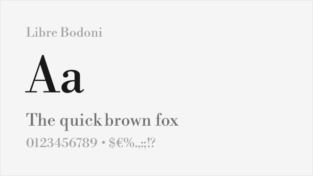
Bodoni-derived display serif with matching high contrast and editorial poise


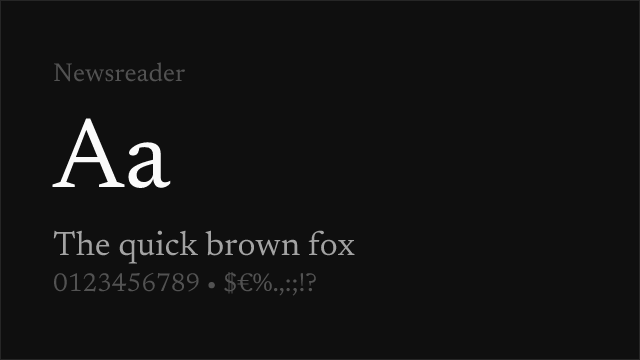
Scholarly display serif with refined proportions and extensive language support

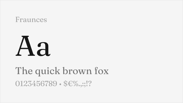
Quirky old-style serif with optical size axis and distinctive editorial personality


Refined old-style serif with broad weight range for editorial hierarchy
See where Chronicle Display is used in the wild and swap to free alternatives live.
Install FontSwap →Replacement Summary
Source: FontAlternatives.com
Premium font: Chronicle Display
Best free alternative: Playfair Display
FontAlternatives similarity score: 83%
Replacement difficulty: Medium
Best for: magazine and editorial headlines, luxury brand display typography, high-contrast editorial layouts, fashion and lifestyle publications
Notable users: Esquire, The New Republic, Harper's Magazine
Not recommended when: Brand consistency with Esquire requires exact letterforms
What is the best free alternative to Chronicle Display?
Playfair Display is the best free alternative to Chronicle Display with a FontAlternatives similarity score of 83%.
Playfair Display shares similar proportions, stroke characteristics, and intended use with Chronicle Display. It is available under the OFL-1.1 license, which permits both personal and commercial use at no cost.
This alternative works particularly well for: magazine and editorial headlines, luxury brand display typography, high-contrast editorial layouts, fashion and lifestyle publications.
Can I safely replace Chronicle Display with Playfair Display?
Yes, with some considerations. Playfair Display achieves a FontAlternatives similarity score of 83%, indicating good structural compatibility for most use cases.
Licensing: Playfair Display is licensed under OFL-1.1, which allows commercial use without licensing fees or royalties.
Weight coverage: All 4 weights have exact matches available.
When should I NOT replace Chronicle Display?
While Playfair Display is a strong alternative, there are situations where replacing Chronicle Display may not be appropriate:
- Optical precision requirements: Playfair Display has measurable structural differences from Chronicle Display that may be visible in precise design work.
- Brand consistency: Chronicle Display is commonly seen in Magazine feature headlines and cover lines contexts where exact letterforms may be required.
- Strict compliance: Verify that OFL-1.1 terms meet your specific legal and compliance requirements.
Weight-Matching Guide
Map Chronicle Display weights to their closest free alternatives for accurate font substitution.
Playfair Display
| Chronicle Display | Playfair Display | Match |
|---|---|---|
| Regular (400) | Regular (400) | exact |
| Semi Bold (600) | SemiBold (600) | exact |
| Bold (700) | Bold (700) | exact |
| Black (900) | Black (900) | exact |
Libre Caslon Display
| Chronicle Display | Libre Caslon Display | Match |
|---|---|---|
| Regular (400) | Regular (400) | exact |
Cormorant Garamond
| Chronicle Display | Cormorant Garamond | Match |
|---|---|---|
| Light (300) | Light (300) | close |
| Regular (400) | Regular (400) | exact |
| Semi Bold (600) | SemiBold (600) | close |
| Bold (700) | Bold (700) | exact |
Libre Bodoni
| Chronicle Display | Libre Bodoni | Match |
|---|---|---|
| Regular (400) | Regular (400) | exact |
| Medium (500) | Medium (500) | close |
| Bold (700) | Bold (700) | exact |
EB Garamond
| Chronicle Display | EB Garamond | Match |
|---|---|---|
| Regular (400) | Regular (400) | exact |
| Medium (500) | Medium (500) | exact |
| Semi Bold (600) | SemiBold (600) | close |
| Bold (700) | Bold (700) | exact |
Fraunces
| Chronicle Display | Fraunces | Match |
|---|---|---|
| Light (300) | Light (300) | close |
| Regular (400) | Regular (400) | close |
| Bold (700) | Bold (700) | close |
| Black (900) | Black (900) | close |
Crimson Pro
| Chronicle Display | Crimson Pro | Match |
|---|---|---|
| Light (300) | Light (300) | close |
| Regular (400) | Regular (400) | exact |
| Semi Bold (600) | SemiBold (600) | exact |
| Bold (700) | Bold (700) | exact |
Performance Guide
Production performance metrics for each alternative.
How to Use Playfair Display
Copy these code snippets to quickly add Playfair Display to your project.
CSS code for Playfair Display
@import url('https://fonts.googleapis.com/css2?family=Playfair+Display:wght@100..900&display=swap');HTML code for Playfair Display
<link rel="preconnect" href="https://fonts.googleapis.com">
<link rel="preconnect" href="https://fonts.gstatic.com" crossorigin>
<link href="https://fonts.googleapis.com/css2?family=Playfair+Display:wght@100..900&display=swap" rel="stylesheet">
Tailwind code for Playfair Display
// tailwind.config.js
module.exports = {
  theme: {
    extend: {
      fontFamily: {
        'playfair-display': ['"Playfair Display"', 'sans-serif'],
      },
    },
  },
}

// Usage in HTML:
// <p class="font-playfair-display">Your text here</p>
Next.js code for Playfair Display
// Using next/font (Next.js 13+)
import { Playfair_Display } from 'next/font/google';

const playfair_display = Playfair_Display({
  subsets: ['latin'],
  weight: ['100', '200', '300', '400', '500', '600', '700', '800', '900'],
});

export default function Component() {
  return (
    <p className={playfair_display.className}>
      Your text here
    </p>
  );
}

// Or using inline styles with Google Fonts link:
// <p style={{ fontFamily: '"Playfair Display"' }}>Your text</p>
Expo and React Native code for Playfair Display
// Install: npx expo install @expo-google-fonts/playfair-display expo-font
import { useFonts, Playfair_Display_400Regular } from '@expo-google-fonts/playfair-display';

export default function App() {
  const [fontsLoaded] = useFonts({
    Playfair_Display_400Regular,
  });

  if (!fontsLoaded) return null;

  return (
    <Text style={{ fontFamily: 'Playfair_Display_400Regular' }}>
      Your text here
    </Text>
  );
}
Recommended Font Pairings
These free fonts pair well with Playfair Display Chronicle Display for headlines, body text, or accent use.
Source Sans 3's rational, clean proportions provide an ideal functional counterpart to Chronicle Display's dramatic editorial serifs — the contrast between ornate display headlines and restrained sans-serif body text is a proven editorial formula
Inter's screen-optimized neo-grotesque forms create clear typographic hierarchy beneath Chronicle Display's commanding headlines, a pairing that works for digital-first editorial platforms blending longform content with interface elements
Work Sans's moderate proportions and editorial heritage complement Chronicle Display's refined display character, creating balanced layouts where the serif commands attention in headlines while the sans-serif handles supporting text and navigation
Browse Alternatives by Context
Find Chronicle Display alternatives filtered by specific use case, style, or language support.
By Script
Frequently Asked Questions
What is the best free alternative to Chronicle Display?
Playfair Display is the best free alternative to Chronicle Display with a FontAlternatives similarity score of 83%. It shares similar proportions and characteristics while being available under the OFL-1.1 license for both personal and commercial use at no cost.
Is there a free version of Chronicle Display?
There is no official free version of Chronicle Display. However, Playfair Display is available under the OFL-1.1 open-source license and achieves a FontAlternatives similarity score of 83%. It includes variable weights and supports latin, latin-extended.
What Google Font looks like Chronicle Display?
The Google Fonts most similar to Chronicle Display are Playfair Display, Libre Caslon Display, Cormorant Garamond. Among these alternatives, Playfair Display offers the closest match with a FontAlternatives similarity score of 83% and includes variable weights for flexible typography options.
Can I use Playfair Display commercially?
Yes, Playfair Display can be used commercially. It is licensed under OFL-1.1, which allows free use in websites, applications, print materials, and commercial projects without purchasing a license or paying royalties.
Is Playfair Display similar enough to Chronicle Display?
Playfair Display achieves a FontAlternatives similarity score of 83% compared to Chronicle Display. While not identical, it offers comparable letterforms, proportions, and visual style. Most designers find it works excellently as a substitute in web and print projects.
What are the main differences between Chronicle Display and its free alternatives?
Free alternatives to Chronicle Display may differ in subtle details like letter spacing, curve refinements, and available weights. Premium fonts typically include more OpenType features, extended language support, and optimized screen rendering. However, for most projects, these differences are negligible.
Where can I download free alternatives to Chronicle Display?
Download Playfair Display directly from Google Fonts. Click the "Get Font" button on any alternative listed above to visit the official download page. Google Fonts also provides convenient embed codes for seamless web integration.