Free Alternatives to Baskerville

About Baskerville
- Foundry
- Monotype
- Classification
- serif
- Style
- transitional
Brands Using Baskerville
A modified Baskerville in the federal corporate identity (the "Canada" wordmark)
Brand name set in ITC New Baskerville
One of the built-in reading typefaces on Kindle e-readers
A centuries-old staple of literary, scholarly, and reference typography
 See Baskerville live on these sites with FontSwap →
Baskerville is a transitional serif typeface designed by John Baskerville in Birmingham, England, in the 1750s. Positioned between old-style typefaces like Garamond and modern faces like Bodoni, Baskerville represents a crucial evolution in type design with its refined letterforms and improved contrast. This transitional masterpiece bridged the gap between Renaissance typography and modern rationalism.
History and Design
John Baskerville (1706-1775) was a writing master and printer who obsessed over every aspect of book production. He developed improved printing presses, created smoother papers (the forerunner of wove paper), and designed type that could showcase these innovations. His typeface featured sharper serifs, more vertical stress, and greater contrast than contemporary old-style faces—characteristics that would later define the modern style.
Baskerville spent years perfecting his types, cutting punches with unprecedented precision. The results were letterforms of remarkable clarity: crisp serifs, elegant curves, and balanced proportions that seemed to hover between the warmth of humanist designs and the precision of what would come later. His famous 1757 edition of Virgil's works demonstrated the typeface's capabilities.
Baskerville's types were initially criticized in England as too refined and sharp for comfortable reading. Some complained the high contrast strained the eyes. However, Benjamin Franklin admired them greatly, defending Baskerville in a famous letter where he tricked a critic into praising Baskerville's work when presented as Caslon. The designs found success in America and continental Europe before gaining belated appreciation in Britain.
After Baskerville's death, his punches and matrices were purchased by the French writer Beaumarchais to print his celebrated complete edition of the works of Voltaire. The types then passed through various hands and fell into obscurity for well over a century — the original punches were eventually rediscovered and are now held by Cambridge University Press — before Monotype revived the design in the 1920s, ensuring Baskerville's legacy for modern designers.
It is worth dwelling on what made Baskerville radical, because it explains the design's whole character. Baskerville was not primarily a type designer; he was a perfectionist printer who treated the book as a total system. To show his letters at their best, he engineered smoother, whiter paper (the ancestor of wove paper), blacker and glossier ink, and hot-pressing to give pages a smooth finish — innovations as important as the type itself. His crisp, higher-contrast letters were designed to exploit exactly those improvements: on rough paper with heavy ink, such fine serifs would have clogged, but on his own polished sheets they read with startling clarity. Baskerville, in other words, is inseparable from the quality of its reproduction, which is precisely why its digital hairlines still demand good paper or a sharp screen to look their best.
Why Baskerville Matters
Baskerville's cultural significance extends beyond typography. An informal 2012 experiment run by filmmaker Errol Morris in The New York Times suggested that readers judged statements set in Baskerville as slightly more believable than the same statements in other fonts. This "Baskerville effect," while based on a small online study and much debated since, is often cited as evidence that a typeface's air of authority can subtly shape how trustworthy its message feels. Participants rated identical statements as marginally more "agreeable" and "truthful" when set in Baskerville than in Comic Sans, Helvetica, or Georgia.
The typeface strikes an ideal balance between elegance and readability, making it suitable for extended reading while maintaining refinement for prestigious applications. Its transitional nature—neither too historical nor too modern—gives it remarkable versatility across contexts. Government institutions favor Baskerville for its trustworthy, authoritative character, and the same qualities have kept it a fixture of book publishing for more than two hundred and fifty years. Few typefaces have proven so durable precisely by refusing to be fashionable: Baskerville reads as timeless rather than dated because it never belonged to any single era's trends in the first place, which is a large part of why it remains a safe, dignified default whenever seriousness is required.
Modern digital versions include Monotype Baskerville, ITC New Baskerville, and Baskerville MT. Apple includes Baskerville in macOS, making it accessible to designers worldwide. Each revival interprets the original with slight variations, but all maintain the essential transitional character.
Who is it for? Projects that want to feel refined, credible, and classically authoritative — books, academic and scholarly work, institutional and government communications, prestige branding, and any long-form reading that benefits from a calm, elegant text face. It is a poor fit for contemporary-tech, playful, or attention-grabbing work, where its historical dignity reads as traditional or reserved. Think of Baskerville as the typographic equivalent of a well-cut classic suit: exactly right when the occasion calls for seriousness and taste, out of place when it calls for novelty or noise.
Design Characteristics
Baskerville is the definitive transitional serif, sitting precisely between the warm old-style faces before it and the severe Moderns that followed — and its features all reflect that in-between refinement:
- Increased stroke contrast: More difference between thick and thin than an old-style Garamond, but far less extreme than a Bodoni — enough to feel elegant without becoming fragile.
- Near-vertical stress: The axis of the letters is closer to upright than the angled, pen-derived stress of old-style faces, a step toward rationalist geometry.
- Crisp, gently bracketed serifs: Sharper and finer than old-style serifs, but still softened where they meet the stem, keeping them warmer than a Modern's flat serifs.
- Wide, open, rounded forms: Generous counters and gracefully rounded bowls give Baskerville exceptional clarity and a calm, dignified reading texture.
- Balanced, unhurried proportions: Nothing is exaggerated; the result is a face that feels authoritative and trustworthy rather than showy.
- A refined italic: Baskerville's italic is notably elegant and lively, drawn with a genuine calligraphic flourish rather than as a slanted roman, and its swashy capitals in particular are among the most admired in any classical typeface — reason enough to reach for a faithful cut when the italic will be prominent.
Where Baskerville Excels
Baskerville's balance of elegance and readability makes it a workhorse for serious, considered text — anywhere a document wants to feel authoritative, credible, and refined:
- Book design: Literary fiction, histories, and quality paperbacks, where its comfortable reading texture shines over hundreds of pages.
- Academic publishing: Journals, dissertations, and scholarly works that benefit from its dignified, trustworthy character.
- Corporate and institutional communications: Annual reports, formal documents, and government publications wanting gravitas.
- Editorial design: Magazine features and quality journalism, especially where credibility matters.
- Prestige and luxury branding: Refined wordmarks and identities that want classical elegance over contemporary edge.
Where Baskerville Struggles
Baskerville is versatile, but it is unmistakably classical and formal, and that character limits it in some contexts:
- Contemporary or tech branding: Its historical dignity reads as traditional, so it fights a modern, minimal, or cutting-edge identity.
- Warmth and friendliness: More refined and formal than a warm old-style like Garamond, it can feel a touch cool or serious for playful, casual, or consumer-friendly work.
- Very small sizes on low-res screens: The increased contrast means hairlines can thin out on poor displays — the exact problem the web-optimized Libre Baskerville was drawn to solve.
- Loud display work: Baskerville is quietly authoritative rather than attention-grabbing; for a bold, shouting headline, it is the wrong register.
- Standing out: Because it is a system font on Apple platforms and a long-standing default for "serious" text, Baskerville can read as safe or unremarkable if used without care.
How to Choose a Free Substitute
Baskerville is one of the better-served classical serifs in free type, and the right choice depends mostly on whether you need it for the screen or the page.
For the closest match, optimized for the web, Libre Baskerville is the clear pick — Pablo Impallari thickened the hairlines specifically so they survive screen rendering, which makes it excellent for digital body text. If you want a warmer, book-like feel with far more weights, EB Garamond and Crimson Pro are superb for long-form reading (both lean a little more old-style than transitional). For clean, systematic work across screen and print, Source Serif is the dependable modern option; Average is a quiet, well-made text serif; and Lora is the popular contemporary choice for web body text with a touch of calligraphic warmth.
The key decision is contrast versus robustness. A faithful Baskerville is beautiful but its hairlines are delicate, so for screen and small sizes prefer the web-tuned Libre Baskerville or a lower-contrast face like Source Serif or Lora; reserve the more contrast-y options for print or large sizes. As always, set a real paragraph at your real size and check how the thins hold up before you commit.
Premium Font Neighbors
Baskerville sits at the hinge of serif history, so its neighbors span both directions. Looking back, Caslon and Garamond are the warm old-style faces Baskerville refined, and Bembo, Minion, and Sabon are the other pillars of the classical book-serif tradition — all warmer and less contrast-y than Baskerville, useful when you want elegance with more humanity. Looking forward, Bodoni and Didot are the high-contrast Moderns that Baskerville's increased contrast anticipated. Times New Roman rounds out the set as the ubiquitous transitional-adjacent workhorse — less refined than Baskerville, but occupying similar territory as a default serious serif.
FAQ
What is the best free alternative to Baskerville?
Libre Baskerville is the best free alternative to Baskerville, specifically designed for optimal web readability by Pablo Impallari. It captures the refined elegance and transitional characteristics of Baskerville while incorporating modern improvements for digital screens. The font works exceptionally well for long-form content.
Can I use Libre Baskerville commercially?
Yes, Libre Baskerville is licensed under the SIL Open Font License (OFL-1.1), which permits unlimited commercial use. You can use it for websites, applications, print materials, and products without licensing fees. Attribution is only required if you redistribute the font files.
How similar is Libre Baskerville to Monotype Baskerville?
Libre Baskerville achieves approximately 90% similarity to Monotype Baskerville, capturing the essential transitional character with refined serifs and balanced contrast. Libre Baskerville was optimized specifically for screen readability, resulting in slightly heavier hairlines and adjusted spacing compared to print-focused versions.
What are the main differences between Baskerville and Libre Baskerville?
Monotype Baskerville offers more weights, optical sizes, and refined details developed over decades. Libre Baskerville provides three styles (regular, italic, bold) optimized for web use with slightly heavier hairlines for screen clarity. Both maintain the transitional aesthetic and professional appearance.
Where can I download Libre Baskerville for free?
Libre Baskerville is available for free download from Google Fonts at fonts.google.com/specimen/Libre+Baskerville. The font includes regular, bold, and italic styles. Google Fonts provides easy embedding options, CSS snippets, and comprehensive documentation for implementation. EB Garamond, Crimson Pro, Source Serif, Average, and Lora are all on Google Fonts too.
What is the "Baskerville effect"?
The "Baskerville effect" refers to a widely reported finding, popularized by an experiment run in The New York Times by filmmaker Errol Morris in 2012, that readers judged identical statements as slightly more believable when set in Baskerville than in several other fonts, including Comic Sans, Helvetica, and Georgia. It is often cited as evidence that a typeface's air of authority and formality can subtly influence how trustworthy its message feels, though the effect is small and much debated.
Is Baskerville good for body text?
Yes — it is one of the classic choices for extended reading. Baskerville balances elegance with genuine readability, and its calm, open forms make comfortable text over long passages, which is why it has been a staple of book and academic typography for over two centuries. For screen body text specifically, use the web-optimized Libre Baskerville or a lower-contrast serif so the hairlines stay crisp at small sizes.
What fonts pair well with Baskerville?
Baskerville pairs cleanly with a neutral or geometric sans-serif for headings and captions — something like Montserrat, Work Sans, or a humanist sans gives modern contrast against Baskerville's classical body text. When keeping an all-serif palette, use Baskerville's own bold and italic for hierarchy rather than mixing in a second serif, which preserves the refined, unified feel that is much of its appeal.
Is Baskerville on Google Fonts?
No, Baskerville is a premium font from Monotype and is not available on Google Fonts.
The closest Google Fonts alternative is Libre Baskerville with 90% similarity. Get it free on Google Fonts ↗
Free Alternatives (6)
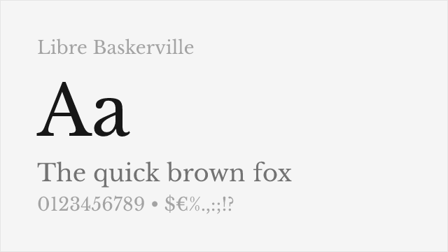
Excellent web-optimized revival with improved screen readability
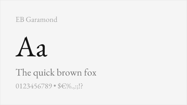
Similar transitional character with refined details for book design
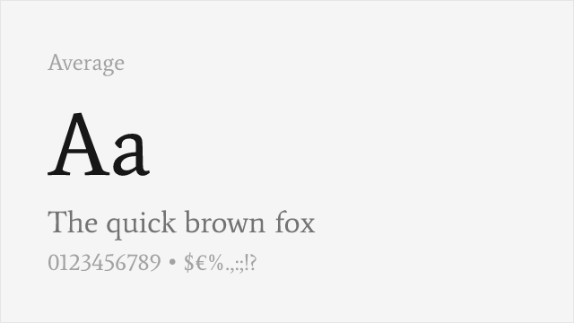
Measured text serif averaging classical traditions into a balanced reading face
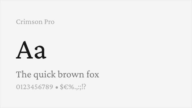
Book-oriented serif with a full variable weight axis for extended reading
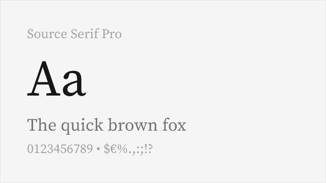
Adobe's clean, systematic serif engineered for screen and print
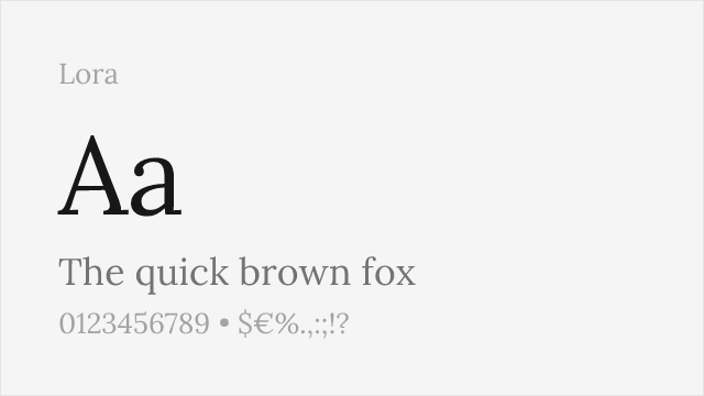
Contemporary serif with brushstroke contrast, comfortable on screen
Compare the alternatives
See how Baskerville compares to its top alternatives — and how those alternatives compare to each other — side by side.
See where Baskerville is used in the wild and swap to free alternatives live.
Install FontSwap →Replacement Summary
Source: FontAlternatives.com
Premium font: Baskerville
Best free alternative: Libre Baskerville
FontAlternatives similarity score: 90%
Replacement difficulty: Low
Best for: web body text, digital publications, corporate websites, academic content
Notable users: Government of Canada, Kate Spade, Amazon Kindle
Not recommended when: Brand consistency with Government of Canada requires exact letterforms
What is the best free alternative to Baskerville?
Libre Baskerville is the best free alternative to Baskerville with a FontAlternatives similarity score of 90%.
Libre Baskerville shares similar proportions, stroke characteristics, and intended use with Baskerville. It is available under the OFL-1.1 license, which permits both personal and commercial use at no cost.
This alternative works particularly well for: web body text, digital publications, corporate websites, academic content.
Can I safely replace Baskerville with Libre Baskerville?
Yes, Libre Baskerville is a high-confidence replacement for Baskerville. The FontAlternatives similarity score of 90% indicates strong structural compatibility.
Licensing: Libre Baskerville is licensed under OFL-1.1, which allows commercial use without licensing fees or royalties.
Weight coverage: All 2 weights have exact matches available.
When should I NOT replace Baskerville?
While Libre Baskerville is a strong alternative, there are situations where replacing Baskerville may not be appropriate:
- Strict compliance: Verify that OFL-1.1 terms meet your specific legal and compliance requirements.
Weight-Matching Guide
Map Baskerville weights to their closest free alternatives for accurate font substitution.
Libre Baskerville
| Baskerville | Libre Baskerville | Match |
|---|---|---|
| Regular | Regular (400) | exact |
| Bold | Bold (700) | exact |
EB Garamond
| Baskerville | EB Garamond | Match |
|---|---|---|
| Regular | Regular (400) | close |
| Medium | Medium (500) | close |
| SemiBold | SemiBold (600) | close |
| Bold | Bold (700) | close |
Average
| Baskerville | Average | Match |
|---|---|---|
| Regular | Regular (400) | close |
Crimson Pro
| Baskerville | Crimson Pro | Match |
|---|---|---|
| Regular | Regular (400) | close |
| Medium | Medium (500) | close |
| Bold | Bold (700) | close |
Source Serif Pro
| Baskerville | Source Serif Pro | Match |
|---|---|---|
| Regular | Regular (400) | close |
| Bold | Bold (700) | close |
Lora
| Baskerville | Lora | Match |
|---|---|---|
| Regular | Regular (400) | close |
| Medium | Medium (500) | close |
| Bold | Bold (700) | close |
Performance Guide
Production performance metrics for each alternative.
How to Use Libre Baskerville
Copy these code snippets to quickly add Libre Baskerville to your project.
CSS code for Libre Baskerville
@import url('https://fonts.googleapis.com/css2?family=Libre+Baskerville:wght@400;700&display=swap');HTML code for Libre Baskerville
<link rel="preconnect" href="https://fonts.googleapis.com">
<link rel="preconnect" href="https://fonts.gstatic.com" crossorigin>
<link href="https://fonts.googleapis.com/css2?family=Libre+Baskerville:wght@400;700&display=swap" rel="stylesheet">
Tailwind code for Libre Baskerville
// tailwind.config.js
module.exports = {
  theme: {
    extend: {
      fontFamily: {
        'libre-baskerville': ['"Libre Baskerville"', 'sans-serif'],
      },
    },
  },
}

// Usage in HTML:
// <p class="font-libre-baskerville">Your text here</p>
Next.js code for Libre Baskerville
// Using next/font (Next.js 13+)
import { Libre_Baskerville } from 'next/font/google';

const libre_baskerville = Libre_Baskerville({
  subsets: ['latin'],
  weight: ['400', '700'],
});

export default function Component() {
  return (
    <p className={libre_baskerville.className}>
      Your text here
    </p>
  );
}

// Or using inline styles with Google Fonts link:
// <p style={{ fontFamily: '"Libre Baskerville"' }}>Your text</p>
Expo and React Native code for Libre Baskerville
// Install: npx expo install @expo-google-fonts/libre-baskerville expo-font
import { useFonts, Libre_Baskerville_400Regular } from '@expo-google-fonts/libre-baskerville';

export default function App() {
  const [fontsLoaded] = useFonts({
    Libre_Baskerville_400Regular,
  });

  if (!fontsLoaded) return null;

  return (
    <Text style={{ fontFamily: 'Libre_Baskerville_400Regular' }}>
      Your text here
    </Text>
  );
}
Recommended Font Pairings
These free fonts pair well with Libre Baskerville Baskerville for headlines, body text, or accent use.
Montserrat's geometric sans-serif forms provide modern contrast to Baskerville's classical transitional serifs for editorial layouts
Open Sans's neutral humanist character pairs cleanly with Baskerville's refined serifs for digital publications and corporate communications
Source Sans Pro's systematic clarity complements Baskerville's sophisticated character for professional documents and academic content
Browse Alternatives by Context
Find Baskerville alternatives filtered by specific use case, style, or language support.
By Use Case
By Script
Frequently Asked Questions
What is the best free alternative to Baskerville?
Libre Baskerville is the best free alternative to Baskerville with a FontAlternatives similarity score of 90%. It shares similar proportions and characteristics while being available under the OFL-1.1 license for both personal and commercial use at no cost.
Is there a free version of Baskerville?
There is no official free version of Baskerville. However, Libre Baskerville is available under the OFL-1.1 open-source license and achieves a FontAlternatives similarity score of 90%. It includes 2 weights and supports latin, latin-extended.
What Google Font looks like Baskerville?
The Google Fonts most similar to Baskerville are Libre Baskerville, EB Garamond, Average. Among these alternatives, Libre Baskerville offers the closest match with a FontAlternatives similarity score of 90% and includes 2 weights for design flexibility.
Can I use Libre Baskerville commercially?
Yes, Libre Baskerville can be used commercially. It is licensed under OFL-1.1, which allows free use in websites, applications, print materials, and commercial projects without purchasing a license or paying royalties.
Is Libre Baskerville similar enough to Baskerville?
Libre Baskerville achieves a FontAlternatives similarity score of 90% compared to Baskerville. While not identical, it offers comparable letterforms, proportions, and visual style. Most designers find it works excellently as a substitute in web and print projects.
What are the main differences between Baskerville and its free alternatives?
Free alternatives to Baskerville may differ in subtle details like letter spacing, curve refinements, and available weights. Premium fonts typically include more OpenType features, extended language support, and optimized screen rendering. However, for most projects, these differences are negligible.
Where can I download free alternatives to Baskerville?
Download Libre Baskerville directly from Google Fonts. Click the "Get Font" button on any alternative listed above to visit the official download page. Google Fonts also provides convenient embed codes for seamless web integration.