 Install FontSwap
Free Alternatives to Baskerville Supporting Latin Extended
Need a free alternative to Baskerville with Latin Extended script support? These 6 options include Latin Extended characters and share visual similarities with Baskerville. Each is licensed for free personal and commercial use.
Top Picks
Comparison Table
| Font | Relevance ⓘ
How well this alternative fits the specific context (use-case or trait) of this page. Score 0–100 based on matching keywords, industries, and font characteristics. Alternatives scoring 25+ are highlighted.
| Similarity ⓘ
How visually similar this free font is to the premium original. Score 0–100 based on x-height, width, stroke contrast, use-case overlap, and language coverage.
Learn more → | Weights | Variable | License | Source |
|---|---|---|---|---|---|---|
| Libre Baskerville | 0 | 90% | 2 | No | OFL-1.1 | Google Fonts ↗ |
| EB Garamond | 0 | 72% | Variable | Yes | OFL-1.1 | Google Fonts ↗ |
| Average | 0 | 68% | 1 | No | OFL-1.1 | Google Fonts ↗ |
| Crimson Pro | 0 | 66% | Variable | Yes | OFL-1.1 | Google Fonts ↗ |
| Source Serif Pro | 0 | 64% | Variable | Yes | OFL-1.1 | Google Fonts ↗ |
| Lora | 0 | 60% | Variable | Yes | OFL-1.1 | Google Fonts ↗ |
All Alternatives (6)
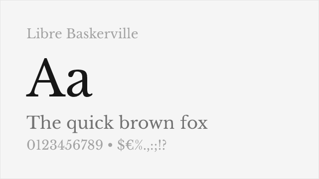
[Google Fonts] · OFL-1.1 · 2 weights
Excellent web-optimized revival with improved screen readability
Why it matches: Libre Baskerville captures the essential transitional character of Baskerville with its refined serifs, increased stroke contrast, and vertical stress. Pablo Impallari specifically optimized it for screen readability, making hairlines slightly heavier for clarity at typical web sizes. Both share the dignified, trustworthy presence that makes Baskerville effective for academic and corporate communications.
web body textdigital publicationscorporate websitesacademic content
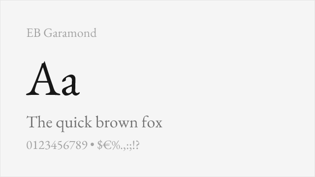
[Google Fonts] · OFL-1.1 · Variable
Similar transitional character with refined details for book design
Why it matches: While EB Garamond is technically an old-style serif rather than transitional, it shares Baskerville's refined character and suitability for extended reading. Both feature elegant proportions and excellent book design applications. EB Garamond offers more historical warmth, making it a viable alternative when Baskerville's crispness feels too formal.
book designliterary fictioneditorial featuresclassical texts
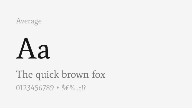
[Google Fonts] · OFL-1.1 · 1 weights
Measured text serif averaging classical traditions into a balanced reading face
Why it matches: Average shares Baskerville's commitment to readable text typography, designed through careful study of historical serif traditions. Both produce comfortable text blocks for extended reading. Average's single weight limits its flexibility compared to Baskerville's range, but its balanced proportions serve similar body text roles.
body textacademic contentweb typographyeditorial design
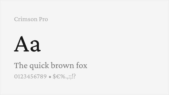
[Google Fonts] · OFL-1.1 · Variable
Book-oriented serif with a full variable weight axis for extended reading
Why it matches: Crimson Pro was drawn specifically for book typography, and it shares Baskerville's calm, readable temperament for long passages. It leans a little more old-style than transitional, so it is warmer and softer than a strict Baskerville, but for comfortable body text with far more weights than the free Baskerville revival offers, it is one of the best free choices.
book and long-form textacademic publishingeditorial bodydigital reading
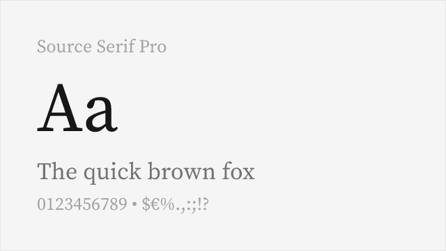
[Google Fonts] · OFL-1.1 · Variable
Adobe's clean, systematic serif engineered for screen and print
Why it matches: Source Serif is Adobe's open-source serif, drawn in the transitional tradition Baskerville helped define — even, rational, and legible. It is cleaner and more contemporary than a period Baskerville, with the irregularities sanded down, which makes it a dependable, systematic free choice for text across screen and print with a wide weight range.
documentation and reportsUI body textcorporate publishingmultilingual content
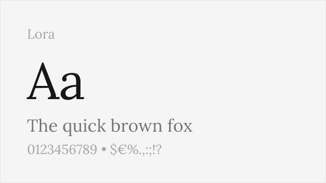
[Google Fonts] · OFL-1.1 · Variable
Contemporary serif with brushstroke contrast, comfortable on screen
Why it matches: Lora is a well-made contemporary serif with moderate contrast and a subtle calligraphic quality, tuned for comfortable on-screen reading. It is more modern and a little warmer than Baskerville, but for editorial and web body text that wants a refined, readable serif without a strict historical revival, it is a reliable and popular free option.
web body textblogs and editorialbrandinglong-form reading