Free Alternatives to Caslon

About Caslon
- Foundry
- Adobe
- Classification
- serif
- Style
- old-style
Brands Using Caslon
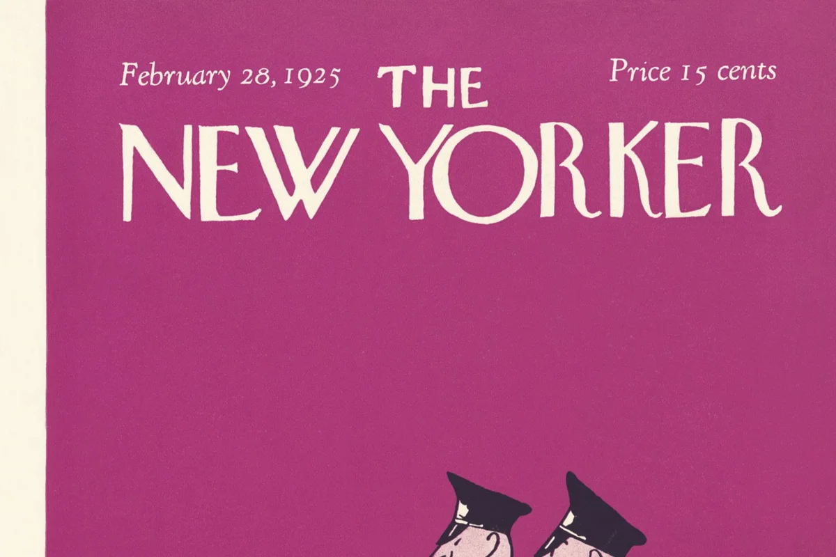
Adobe Caslon set the magazine's body text for long-form articles
Official university publications and stationery
The 1776 Dunlap broadside was printed in Caslon types
Adobe Caslon is one of USC's two official brand typefaces
 See Caslon live on these sites with FontSwap →
See Caslon in the Wild
Caslon is the name given to the serif typefaces cut by William Caslon I in early-18th-century London, and to the long line of revivals that followed. The most widely used digital version is Adobe Caslon Pro, drawn by Carol Twombly in 1990 from Caslon's own specimen sheets. For more than 250 years the design has been the quiet workhorse of English-language typography — the face printers reached for when they wanted the type to disappear and the words to carry.
Why Caslon Matters
There is an old rule among printers: "When in doubt, use Caslon." It is a strange thing to say about a typeface, and it is exactly the point. Caslon does not have a signature flourish or a trademark letter you can pick out of a lineup. What it has is a century of proof that it works — for books, for constitutions, for magazines, for anything that has to be read at length without fatigue.
That reputation is the reason Caslon is still specified today, and it is the reason so many designers go looking for a free substitute. Good digital Caslon is commercial and not bundled with any operating system, so the demand for an open alternative is real and constant. The face carries a specific cultural weight — unpretentious, literary, faintly historical — that a generic system serif cannot supply.
The history behind that weight is unusually long. William Caslon I (1692–1766) opened his London type foundry around 1720, and his son, grandson, and great-grandson kept the business running for generations. Caslon's types quickly became the default for English-language printing on both sides of the Atlantic — chosen not for novelty but for their sheer usability. Benjamin Franklin was an enthusiastic customer, and the first printings of the Declaration of Independence and the Constitution were set in Caslon — part of why it is sometimes called "the type of the American Revolution." It fell out of fashion in the nineteenth century, then came back again and again; every generation of designers seems to rediscover that it simply works.
The Many Caslons
One thing to understand before you shop for a substitute: "Caslon" is a genre, not a single font. Because the original was so influential and so widely copied, dozens of revivals carry the name, and they differ significantly. Adobe Caslon (Carol Twombly, 1990) is the workhorse text version most people mean. Big Caslon and ITC Founder's Caslon push toward the display end; Williams Caslon Text aims for fidelity to the metal; LTC Caslon and others each interpret the specimens their own way.
The practical upshot is that "matching Caslon" depends on which Caslon you started from. A faithful text revival like Adobe Caslon maps cleanly onto the Libre Caslon family; a high-contrast display Caslon is closer in spirit to a sharper face. Identify the size and cut you are actually replacing before you judge how close a free option gets.
Design Characteristics
Caslon is an old-style serif, which means moderate stroke contrast, bracketed serifs, and an oblique axis inherited from the broad-nib pen. But the trait that actually defines it is a productive kind of irregularity. Letters do not sit on a perfectly even baseline; stress angles wander slightly; the counters and proportions have small inconsistencies that a more mechanical face would sand away.
Those imperfections are not defects. They give a block of Caslon text a lively, shimmering texture that keeps the eye moving comfortably through long passages. The moderate x-height and well-cut counters hold legibility across a wide range of sizes, from footnotes to running heads.
The design changes character with size. At text sizes it is sturdy and warm. At display sizes — think a chapter opening or a title page — the hairlines thin out and the serifs sharpen, and Caslon turns crisp and elegant. This is why the best digital families ship separate text and display cuts: one design cannot be optimal at both extremes, and the free alternatives split along the same line.
The italic deserves its own mention. Caslon's italic is noticeably livelier than its roman — more slope, more calligraphic swing, and a set of letterforms with real personality. It reads as a genuine companion rather than a mechanically slanted version of the upright, which is one reason the family works so well for emphasis inside running text. When you evaluate a free alternative, look hard at its italic; a slanted-roman "oblique" is the fastest way to lose the Caslon feel.
Twombly's Adobe Caslon Pro was built by studying Caslon's surviving specimen sheets rather than any single set of punches, and it added the machinery the metal originals never had: small caps, oldstyle figures, swash italics, fractions, and extended language coverage across Latin, Greek, and Cyrillic. The letterforms stay faithful to Caslon's specimens; the OpenType features make it a complete working family for contemporary book and editorial work.
Where Caslon Excels
Caslon is at its best in extended reading. Its natural home is book design — literary fiction, histories, biographies, and general trade publishing — where a warm, self-effacing text face is worth more than any amount of personality. University presses and scholarly journals lean on it for the same reason.
- Book design: novels, narrative nonfiction, and reference works
- Editorial: magazine features and long-form articles
- Academic publishing: journals, monographs, and dissertations
- Corporate communications: annual reports and formal correspondence
It also carries an unspoken signal. When a reader encounters Caslon, they unconsciously associate it with carefully edited, thoughtfully produced writing. The New Yorker has set its articles in Adobe Caslon for years; that association with quality is part of what you buy when you specify it.
The face is at its strongest in print, where high-resolution output lets the fine details and subtle irregularities do their work. In a printed book, at a comfortable reading size, Caslon produces an even, warm gray column that few faces match. That is also where its historical resonance pays off: a novel, a poetry collection, or a museum catalog set in Caslon inherits three centuries of association with serious literature without a word being said. If your project wants to feel considered and permanent rather than trendy, that inherited authority is difficult to buy any other way.
Where Caslon Struggles
Caslon is a text face first, and it shows the strain when you push it outside that role. Set very small on a low-resolution screen, its fine hairlines can thin out and break up — the exact problem the screen-tuned revivals were built to solve. If most of your traffic reads on phones, a Caslon revival optimized for the screen will serve you better than a faithful print cut.
It is also a poor fit for interfaces and dense data. Its warmth and slight irregularity, so valuable in a paragraph, become noise in a table, a form label, or a navigation bar, where a neutral sans is the correct tool.
And it is not a loud typeface. If your brief calls for a headline that grabs someone by the collar, Caslon will not do it — even the display cut is elegant rather than emphatic. For maximum impact you want contrast: pair Caslon with a strong sans or a heavier display face rather than asking it to shout.
How to Choose a Free Substitute
Start with where the type will live, because that decides everything.
If you are setting body text on the web, the single best free match is Libre Caslon Text. Pablo Impallari drew it specifically for text sizes, thickening the hairlines just enough to survive on screen while keeping Caslon's warmth. For headlines and titles, add its sibling Libre Caslon Display — together they give you a matched Caslon family across the whole page, which is the closest free equivalent to owning the commercial text-and-display pair.
If you need more weights than the Libre Caslon family offers — for tighter hierarchy, bold callouts, or a full type scale — reach for a variable book serif instead. Crimson Pro (200–900) comes at Caslon from the book-design tradition and holds a paragraph together beautifully. EB Garamond is the move when a French old-style warmth is acceptable and you want scholarly polish with variable weights.
If your priority is predictable behavior across screen and print at scale — a large corporate site, documentation, multilingual content — Source Serif is the pragmatic pick: cleaner and more uniform than Caslon, but a well-engineered cousin. And if you want the literary English feel with strong screen tuning, Libre Baskerville answers Caslon from the next chapter of type history, purpose-built for the web.
Whatever you choose, confirm three things before you commit: that the weights you need actually exist in the family, that the italic is a true drawn italic rather than a slanted roman, and that the language coverage matches your content. Caslon revivals vary widely on all three. It is worth setting a real paragraph of your own copy in each candidate at the size you will actually ship, rather than judging from a specimen headline — old-style faces earn or lose their reputation in the body, not in the display line, and the difference between a good substitute and a great one only shows up once there is enough text to build a rhythm.
Premium Font Neighbors
If you have the budget and Caslon is not quite right, several commercial serifs live in the same neighborhood. Adobe Garamond, Sabon, Bembo, and Minion Pro are the other pillars of the old-style book-serif world — each warmer or cooler, but all built for the same long-reading job. Baskerville is the transitional face that historically answered Caslon and reads a touch more formal. For a higher-contrast, more decorative direction, Bodoni moves into modern-serif territory, while Archer and Sentinel offer slab-serif warmth when you want more structure and presence than an old-style face provides.
FAQ
What is the best free alternative to Caslon?
Libre Caslon Text is the best free alternative for body text. Created by Pablo Impallari, it captures Caslon's warmth and baroque details while thickening the hairlines for screen clarity. For headlines, pair it with Libre Caslon Display to get a matched Caslon family across your whole layout.
Can I use Libre Caslon Text commercially?
Yes. Libre Caslon Text is licensed under the SIL Open Font License (OFL-1.1), which permits commercial use without fees. You can use it on websites, in publications, in applications, and in products. Attribution is required only if you redistribute the font files themselves.
How similar is Libre Caslon Text to Adobe Caslon?
Libre Caslon Text reaches roughly 88% similarity to Adobe Caslon Pro, preserving the old-style character and baroque details. It was drawn for text sizes with heavier hairlines for screen legibility, so it reads slightly more contemporary. Adobe Caslon offers more weights, small caps, and a dedicated display cut.
Which free Caslon alternative has the most weights?
Crimson Pro and Source Serif both ship as variable fonts spanning weights from 200 to 900, giving you far more hierarchy control than the Libre Caslon family, which is limited to Regular and Bold. Choose Crimson Pro for a more book-like, old-style feel and Source Serif for a cleaner, more systematic one.
Is there a free Caslon for headlines and large sizes?
Yes — Libre Caslon Display is the display cut, with the thin hairlines and sharpened serifs that Caslon shows above roughly 24 points. Use it for titles and headlines and set Libre Caslon Text underneath for body copy so the two share a consistent design.
What fonts pair well with Caslon?
A geometric or humanist sans makes the cleanest contrast. Montserrat works well for headlines over Caslon body text, Source Sans pairs naturally for corporate and academic documents, and Open Sans is a reliable neutral choice for interface elements alongside Caslon's warmer serif.
Where can I download these free Caslon alternatives?
All of them are on Google Fonts: Libre Caslon Text, Libre Caslon Display, EB Garamond, Crimson Pro, Source Serif, and Libre Baskerville. Each provides webfont embedding code and desktop downloads under open licenses, so you can test them in your own layout before committing.
Is Caslon on Google Fonts?
No, Caslon is a premium font from Adobe and is not available on Google Fonts.
The closest Google Fonts alternative is Libre Caslon Text with 88% similarity. Get it free on Google Fonts ↗
Free Alternatives (6)
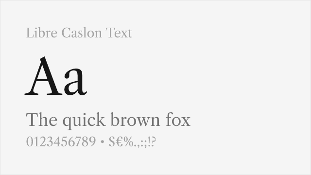
Optimized for body text with improved screen readability
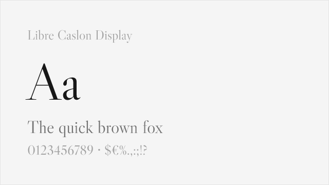
Display cut with the fine hairlines Caslon shows at large sizes
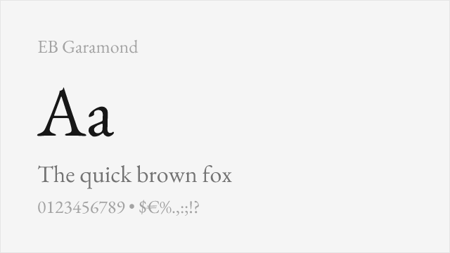
Similar old-style character with excellent scholarly credentials
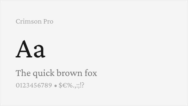
Book-oriented old-style with a full variable weight axis
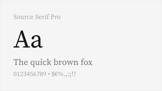
Adobe's open-source serif, engineered for screen and print alike
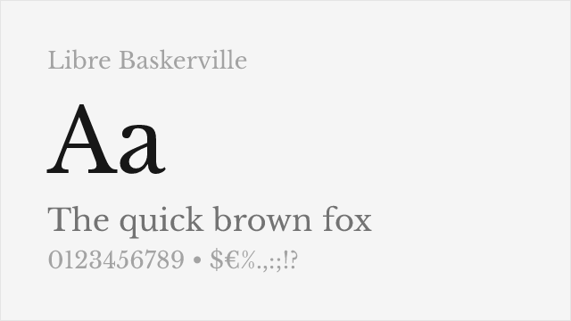
Transitional serif in the same English printing lineage
Compare the alternatives
See how Caslon compares to its top alternatives — and how those alternatives compare to each other — side by side.
See where Caslon is used in the wild and swap to free alternatives live.
Install FontSwap →Replacement Summary
Source: FontAlternatives.com
Premium font: Caslon
Best free alternative: Libre Caslon Text
FontAlternatives similarity score: 88%
Replacement difficulty: Low
Best for: book design, web body text, editorial design, corporate documents
Notable users: The New Yorker, University of Virginia, US Declaration of Independence
Not recommended when: Brand consistency with The New Yorker requires exact letterforms
What is the best free alternative to Caslon?
Libre Caslon Text is the best free alternative to Caslon with a FontAlternatives similarity score of 88%.
Libre Caslon Text shares similar proportions, stroke characteristics, and intended use with Caslon. It is available under the OFL-1.1 license, which permits both personal and commercial use at no cost.
This alternative works particularly well for: book design, web body text, editorial design, corporate documents.
Can I safely replace Caslon with Libre Caslon Text?
Yes, Libre Caslon Text is a high-confidence replacement for Caslon. The FontAlternatives similarity score of 88% indicates strong structural compatibility.
Licensing: Libre Caslon Text is licensed under OFL-1.1, which allows commercial use without licensing fees or royalties.
Weight coverage: All 2 weights have exact matches available.
When should I NOT replace Caslon?
While Libre Caslon Text is a strong alternative, there are situations where replacing Caslon may not be appropriate:
- Strict compliance: Verify that OFL-1.1 terms meet your specific legal and compliance requirements.
Weight-Matching Guide
Map Caslon weights to their closest free alternatives for accurate font substitution.
Libre Caslon Text
| Caslon | Libre Caslon Text | Match |
|---|---|---|
| Regular | Regular (400) | exact |
| Bold | Bold (700) | exact |
Libre Caslon Display
| Caslon | Libre Caslon Display | Match |
|---|---|---|
| Regular | Regular (400) | exact |
EB Garamond
| Caslon | EB Garamond | Match |
|---|---|---|
| Regular | Regular (400) | exact |
| Semibold | SemiBold (600) | close |
| Bold | Bold (700) | exact |
Crimson Pro
| Caslon | Crimson Pro | Match |
|---|---|---|
| Regular | Regular (400) | exact |
| Semibold | SemiBold (600) | close |
| Bold | Bold (700) | exact |
Source Serif Pro
| Caslon | Source Serif Pro | Match |
|---|---|---|
| Regular | Regular (400) | exact |
| Semibold | SemiBold (600) | close |
| Bold | Bold (700) | exact |
Libre Baskerville
| Caslon | Libre Baskerville | Match |
|---|---|---|
| Regular | Regular (400) | close |
| Bold | Bold (700) | exact |
Performance Guide
Production performance metrics for each alternative.
How to Use Libre Caslon Text
Copy these code snippets to quickly add Libre Caslon Text to your project.
CSS code for Libre Caslon Text
@import url('https://fonts.googleapis.com/css2?family=Libre+Caslon+Text:wght@400;700&display=swap');HTML code for Libre Caslon Text
<link rel="preconnect" href="https://fonts.googleapis.com">
<link rel="preconnect" href="https://fonts.gstatic.com" crossorigin>
<link href="https://fonts.googleapis.com/css2?family=Libre+Caslon+Text:wght@400;700&display=swap" rel="stylesheet">
Tailwind code for Libre Caslon Text
// tailwind.config.js
module.exports = {
  theme: {
    extend: {
      fontFamily: {
        'libre-caslon-text': ['"Libre Caslon Text"', 'sans-serif'],
      },
    },
  },
}

// Usage in HTML:
// <p class="font-libre-caslon-text">Your text here</p>
Next.js code for Libre Caslon Text
// Using next/font (Next.js 13+)
import { Libre_Caslon_Text } from 'next/font/google';

const libre_caslon_text = Libre_Caslon_Text({
  subsets: ['latin'],
  weight: ['400', '700'],
});

export default function Component() {
  return (
    <p className={libre_caslon_text.className}>
      Your text here
    </p>
  );
}

// Or using inline styles with Google Fonts link:
// <p style={{ fontFamily: '"Libre Caslon Text"' }}>Your text</p>
Expo and React Native code for Libre Caslon Text
// Install: npx expo install @expo-google-fonts/libre-caslon-text expo-font
import { useFonts, Libre_Caslon_Text_400Regular } from '@expo-google-fonts/libre-caslon-text';

export default function App() {
  const [fontsLoaded] = useFonts({
    Libre_Caslon_Text_400Regular,
  });

  if (!fontsLoaded) return null;

  return (
    <Text style={{ fontFamily: 'Libre_Caslon_Text_400Regular' }}>
      Your text here
    </Text>
  );
}
Recommended Font Pairings
These free fonts pair well with Libre Caslon Text Caslon for headlines, body text, or accent use.
Montserrat's geometric sans-serif headlines create clean contrast with Caslon's warm old-style body text for balanced editorial layouts
Open Sans provides neutral interface typography that pairs naturally with Caslon's readable serif character for web applications
Source Sans Pro's professional sans-serif forms complement Caslon's classical warmth for corporate and academic documents
Browse Alternatives by Context
Find Caslon alternatives filtered by specific use case, style, or language support.
By Use Case
By Style
By Script
Frequently Asked Questions
What is the best free alternative to Caslon?
Libre Caslon Text is the best free alternative to Caslon with a FontAlternatives similarity score of 88%. It shares similar proportions and characteristics while being available under the OFL-1.1 license for both personal and commercial use at no cost.
Is there a free version of Caslon?
There is no official free version of Caslon. However, Libre Caslon Text is available under the OFL-1.1 open-source license and achieves a FontAlternatives similarity score of 88%. It includes 2 weights and supports latin, latin-extended.
What Google Font looks like Caslon?
The Google Fonts most similar to Caslon are Libre Caslon Text, Libre Caslon Display, EB Garamond. Among these alternatives, Libre Caslon Text offers the closest match with a FontAlternatives similarity score of 88% and includes 2 weights for design flexibility.
Can I use Libre Caslon Text commercially?
Yes, Libre Caslon Text can be used commercially. It is licensed under OFL-1.1, which allows free use in websites, applications, print materials, and commercial projects without purchasing a license or paying royalties.
Is Libre Caslon Text similar enough to Caslon?
Libre Caslon Text achieves a FontAlternatives similarity score of 88% compared to Caslon. While not identical, it offers comparable letterforms, proportions, and visual style. Most designers find it works excellently as a substitute in web and print projects.
What are the main differences between Caslon and its free alternatives?
Free alternatives to Caslon may differ in subtle details like letter spacing, curve refinements, and available weights. Premium fonts typically include more OpenType features, extended language support, and optimized screen rendering. However, for most projects, these differences are negligible.
Where can I download free alternatives to Caslon?
Download Libre Caslon Text directly from Google Fonts. Click the "Get Font" button on any alternative listed above to visit the official download page. Google Fonts also provides convenient embed codes for seamless web integration.