 Install FontSwap
Free Alternatives to Caslon with Old Style Style
Caslon is known for its old style aesthetic. If you're looking for a free serif font with a similar old style feel, these 6 alternatives offer comparable characteristics. We've identified 6 that are especially well-suited for this context. All are available under open-source licenses for unrestricted commercial use.
Top Picks
Comparison Table
| Font | Relevance ⓘ
How well this alternative fits the specific context (use-case or trait) of this page. Score 0–100 based on matching keywords, industries, and font characteristics. Alternatives scoring 25+ are highlighted.
| Similarity ⓘ
How visually similar this free font is to the premium original. Score 0–100 based on x-height, width, stroke contrast, use-case overlap, and language coverage.
Learn more → | Weights | Variable | License | Source |
|---|---|---|---|---|---|---|
| Libre Caslon Text | 38 | 88% | 2 | No | OFL-1.1 | Google Fonts ↗ |
| Libre Caslon Display | 36 | 80% | 1 | No | OFL-1.1 | Google Fonts ↗ |
| EB Garamond | 35 | 75% | Variable | Yes | OFL-1.1 | Google Fonts ↗ |
| Crimson Pro | 34 | 72% | Variable | Yes | OFL-1.1 | Google Fonts ↗ |
| Source Serif Pro | 34 | 68% | Variable | Yes | OFL-1.1 | Google Fonts ↗ |
| Libre Baskerville | 33 | 64% | 2 | No | OFL-1.1 | Google Fonts ↗ |
All Alternatives (6)
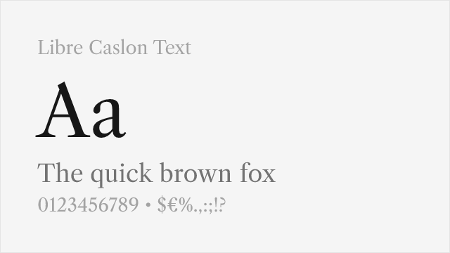
[Google Fonts] · OFL-1.1 · 2 weights
Optimized for body text with improved screen readability
Why it matches: Libre Caslon Text captures the essential warmth and baroque details of Caslon with slightly heavier hairlines optimized for screen readability. Both share the characteristic irregular letterforms that create comfortable reading texture, the gentle contrast, and the pragmatic, unpretentious character that made Caslon the workhorse of English printing. The text optimization makes it ideal for modern digital applications.
book designweb body texteditorial designcorporate documents
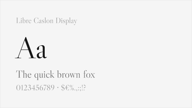
[Google Fonts] · OFL-1.1 · 1 weights
Display cut with the fine hairlines Caslon shows at large sizes
Why it matches: Libre Caslon Display is the headline companion to Libre Caslon Text, and it is the closest free match for the way Adobe Caslon behaves above about 24 points. The thin hairlines, sharpened serifs, and higher contrast echo the crispness Caslon reveals in display settings. Where the Text cut fills in for readability, Display leans into the refinement, which is exactly the trade you want when the letters are large enough to show it.
headlineseditorial titlesbook coversposters
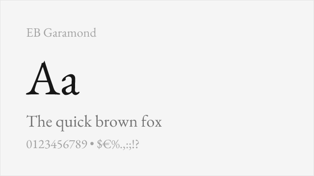
[Google Fonts] · OFL-1.1 · Variable
Similar old-style character with excellent scholarly credentials
Why it matches: EB Garamond shares Caslon's old-style classification with similar warmth and readability for extended text. While based on French rather than English precedents, both feature humanist proportions and historical character suitable for book design. EB Garamond's scholarly rigor and variable font support make it a versatile alternative when more weights are needed.
academic publishingliterary fictionmultilingual documentsclassical texts
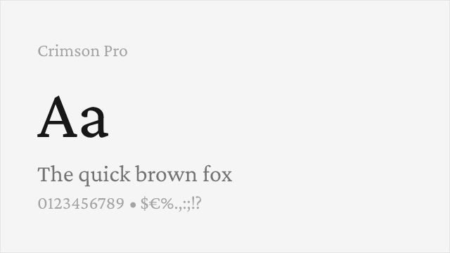
[Google Fonts] · OFL-1.1 · Variable
Book-oriented old-style with a full variable weight axis
Why it matches: Crimson Pro was drawn specifically for book typography, and it lands close to Caslon's temperament: moderate contrast, generous readability, and a calm, unfussy color on the page. It is less overtly historical than a Caslon revival, but it holds a long paragraph together the same way. The full 200 to 900 variable axis is the practical draw here, giving you far more hierarchy control than any Caslon revival on Google Fonts.
book designlong-form editorialacademic textdigital reading
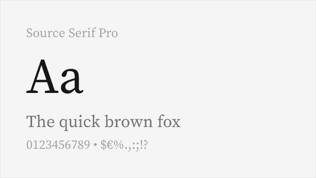
[Google Fonts] · OFL-1.1 · Variable
Adobe's open-source serif, engineered for screen and print alike
Why it matches: Source Serif is Adobe's own open-source serif, and it shares design DNA with the transitional-to-old-style tradition Caslon sits inside. It is more even and more contemporary than Caslon — the irregularities are sanded down — but it keeps the warmth and the comfortable reading rhythm. When you need a free serif that behaves predictably across screen and print with a wide weight range, this is the pragmatic pick.
corporate documentsUI body textreportsmultilingual content
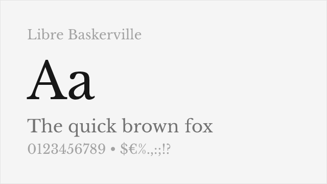
[Google Fonts] · OFL-1.1 · 2 weights
Transitional serif in the same English printing lineage
Why it matches: Libre Baskerville sits one generation downstream from Caslon in the story of English type — Baskerville was the transitional face that answered Caslon's old-style — so the two share a clear family resemblance in the Latin tradition. Libre Baskerville's higher contrast and more vertical stress make it a touch more formal, but its tall x-height and open spacing give you the same readable, literary feel for web body text.
web body textblogseditorialliterary sites