 Install FontSwap
Free Alternatives to Garamond with Old Style Style
Garamond is known for its old style aesthetic. If you're looking for a free serif font with a similar old style feel, these 6 alternatives offer comparable characteristics. We've identified 6 that are especially well-suited for this context. All are available under open-source licenses for unrestricted commercial use.
Top Picks
Comparison Table
| Font | Relevance ⓘ
How well this alternative fits the specific context (use-case or trait) of this page. Score 0–100 based on matching keywords, industries, and font characteristics. Alternatives scoring 25+ are highlighted.
| Similarity ⓘ
How visually similar this free font is to the premium original. Score 0–100 based on x-height, width, stroke contrast, use-case overlap, and language coverage.
Learn more → | Weights | Variable | License | Source |
|---|---|---|---|---|---|---|
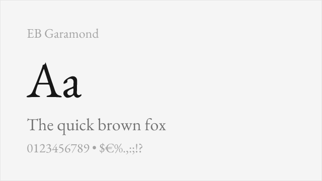
| EB Garamond | 38 | 92% | Variable | Yes | OFL-1.1 | Google Fonts ↗ |
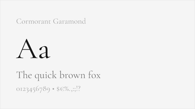
| Cormorant Garamond | 37 | 85% | Variable | Yes | OFL-1.1 | Google Fonts ↗ |
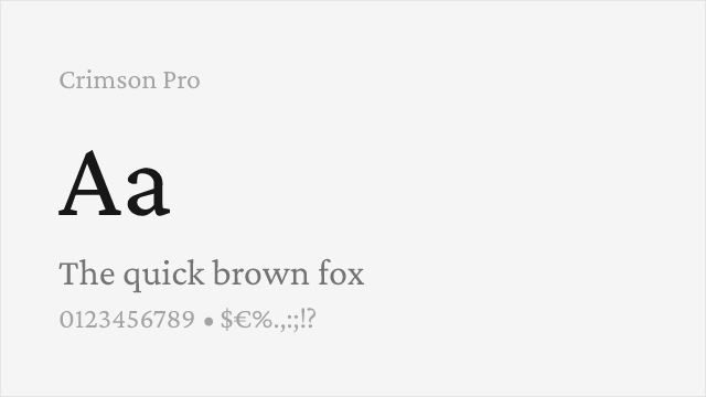
| Crimson Pro | 36 | 78% | Variable | Yes | OFL-1.1 | Google Fonts ↗ |
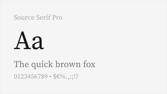
| Source Serif Pro | 33 | 65% | Variable | Yes | OFL-1.1 | Google Fonts ↗ |
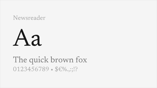
| Newsreader | 32 | 62% | Variable | Yes | OFL-1.1 | Google Fonts ↗ |
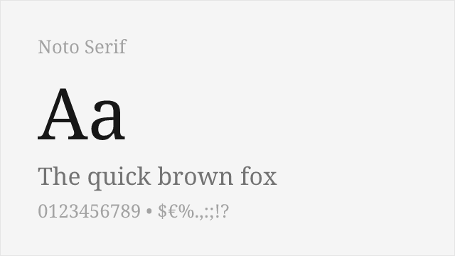
| Noto Serif | 32 | 60% | Variable | Yes | OFL-1.1 | Google Fonts ↗ |
All Alternatives (6)
[Google Fonts] · OFL-1.1 · Variable
Exceptional revival based on Claude Garamont's original 16th-century designs
Why it matches: EB Garamond is the most faithful open-source Garamond revival available, based on original 16th-century specimens from the Plantin-Moretus Museum. Both share the characteristic old-style proportions, gentle bracketed serifs, moderate x-height, and the warm humanist qualities that define classic Garamond. The scholarly accuracy of EB Garamond makes it virtually interchangeable with Adobe Garamond for book design and editorial applications.
book designacademic publishingeditorial designliterary fiction
[Google Fonts] · OFL-1.1 · Variable
More decorative interpretation with higher contrast for display use
Why it matches: Cormorant Garamond reinterprets the Garamond aesthetic with increased stroke contrast and refined details optimized for display typography. While sharing the essential Garamond DNA—graceful curves, classical proportions, and elegant character—Cormorant adds dramatic flair that makes it stunning at large sizes. It's ideal when you want Garamond sophistication with more visual impact for headlines and titles.
display headlineseditorial featuresluxury brandingwedding stationery
[Google Fonts] · OFL-1.1 · Variable
Old-style book serif in the Garamond tradition, built for reading
Why it matches: Crimson Pro is an old-style serif drawn explicitly in the tradition of the Garalde faces that Garamond defined — gentle bracketed serifs, moderate contrast, a calm humanist rhythm made for long reading. It is a touch more contemporary and even than Garamond, but for book and editorial text it hits the same warm, classical register.
book textlong-form editorialacademic publishing
[Google Fonts] · OFL-1.1 · Variable
Adobe's open-source transitional serif, versatile for text and screen
Why it matches: Source Serif is Adobe's own open-source text serif. It leans more transitional than old-style, but it shares Garamond's job — comfortable, even-textured reading at length. It is cleaner and more neutral than a true Garamond, which makes it a dependable, license-free choice for documents and screens.
documentationUI body textreports
[Google Fonts] · OFL-1.1 · Variable
Old-style-inspired serif for on-screen reading, with optical sizes
Why it matches: Newsreader is a serif built for on-screen editorial reading, drawing on old-style models close to Garamond's lineage. It brings a warm, literary texture with optical sizing, so it holds Garamond's reading-serif spirit while being engineered for long articles on the web.
digital publishingarticle body textblogs
[Google Fonts] · OFL-1.1 · Variable
Google pan-Unicode serif with variable weight and width
Why it matches: Noto Serif is Google's pan-Unicode workhorse: a neutral, sturdy serif that shares Garamond's bracketed-serif structure without its Renaissance character. Its value is coverage and consistency — if a project spans many languages and scripts, Noto Serif keeps a Garamond-adjacent serif texture everywhere.
multilingual publishingglobal websitesdocuments