 Install FontSwap
Free Alternatives to Archer with Geometric Style
Archer is known for its geometric aesthetic. If you're looking for a free serif font with a similar geometric feel, these 6 alternatives offer comparable characteristics. All are available under open-source licenses for unrestricted commercial use.
Top Picks
Comparison Table
| Font | Relevance ⓘ
How well this alternative fits the specific context (use-case or trait) of this page. Score 0–100 based on matching keywords, industries, and font characteristics. Alternatives scoring 25+ are highlighted.
| Similarity ⓘ
How visually similar this free font is to the premium original. Score 0–100 based on x-height, width, stroke contrast, use-case overlap, and language coverage.
Learn more → | Weights | Variable | License | Source |
|---|---|---|---|---|---|---|
| Arvo | 18 | 88% | 2 | No | OFL-1.1 | Google Fonts ↗ |
| Rokkitt | 16 | 78% | Variable | Yes | OFL-1.1 | Google Fonts ↗ |
| Roboto Slab | 15 | 74% | Variable | Yes | Apache-2.0 | Google Fonts ↗ |
| Bitter | 14 | 72% | Variable | Yes | OFL-1.1 | Google Fonts ↗ |
| Aleo | 14 | 70% | Variable | Yes | OFL-1.1 | Google Fonts ↗ |
| Josefin Slab | 14 | 68% | Variable | Yes | OFL-1.1 | Google Fonts ↗ |
All Alternatives (6)
[Google Fonts] · OFL-1.1 · 2 weights
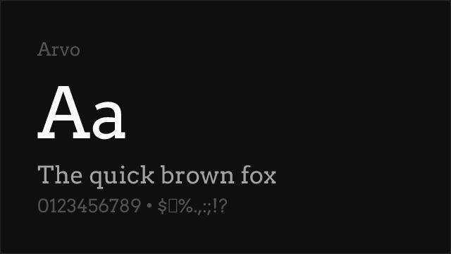
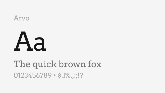
Friendly geometric slab with ball terminals and warm character
Why it matches: Arvo shares Archer's distinctive friendly character through similar ball terminals on letters like 'a', 'c', 'f', and 'r'. Both feature geometric slab construction softened by these rounded details, creating warmth unusual for the slab serif category. Arvo captures Archer's approachable personality without premium pricing.
lifestyle brandingfood and hospitalityeditorial headlinesfriendly interfaces
[Google Fonts] · OFL-1.1 · Variable
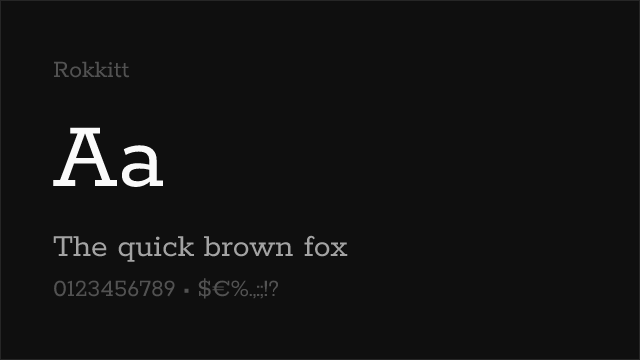
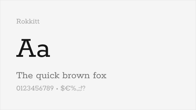
Clean geometric slab with friendly proportions and multiple weights
Why it matches: Rokkitt provides comprehensive weight range from Thin to Black with friendly geometric proportions. While lacking Archer's distinctive ball terminals, Rokkitt achieves similar warmth through rounded corners and generous spacing. The variable font version enables precise weight tuning that Archer's fixed weights cannot match.
web headlinesUI designresponsive typographyeditorial design
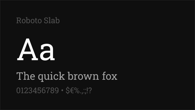
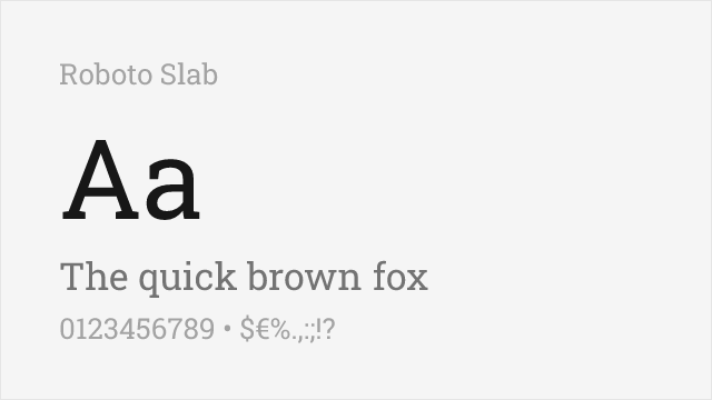
[Google Fonts] · Apache-2.0 · Variable
Neutral geometric slab with a full variable weight range and squared, not rounded, terminals
Why it matches: Roboto Slab shares Archer's geometric backbone and even, sturdy proportions, so text set in it carries the same confident, contemporary weight. The clear difference is the terminals: where Archer rounds its strokes into friendly balls, Roboto Slab cuts them square, trading a little warmth for neutrality. That makes it a strong match when you want Archer's structure and readability but a more understated, corporate tone. Its full 100-900 variable range also outruns Archer's fixed weights for fine-grained hierarchy.
digital interfacescorporate brandingdashboards and data labelsresponsive headlines
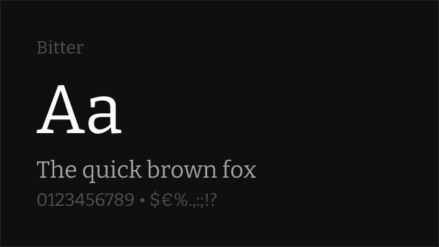
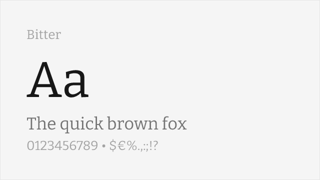
[Google Fonts] · OFL-1.1 · Variable
Screen-optimized contemporary slab with open counters, drawn for comfortable body text
Why it matches: Bitter was drawn specifically to stay legible on screens, which is exactly where Archer's print-tuned refinement can feel too delicate. It keeps the sturdy slab-serif silhouette and a warm, readable texture, but its open counters and generous spacing hold up in long paragraphs at small sizes. You lose Archer's signature ball terminals, yet gain a family built for running text rather than display. For a site that wants Archer's approachable slab feel in the body copy, Bitter is the practical pick.
long-form articlesblog and editorial body textreading appsprint-to-screen projects
[Google Fonts] · OFL-1.1 · Variable
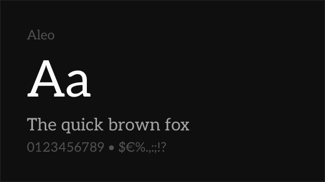
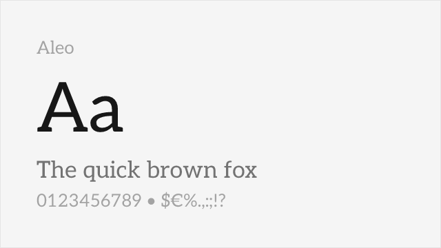
Warm semi-slab with softly rounded serifs and humanist touches, a natural Lato companion
Why it matches: Aleo is one of the friendlier free slabs, and that warmth is precisely what draws people to Archer. Its serifs are softly rounded rather than strictly squared, giving letters an approachable, semi-organic feel that echoes Archer's inviting personality even without literal ball terminals. The proportions sit close to Archer's, so headlines carry a similar confident-but-welcoming tone. With a full variable range and true italics, it also covers more hierarchy than Archer's fixed cuts.
approachable brandingeditorial headlineseducation and nonprofit sitesfriendly interfaces
[Google Fonts] · OFL-1.1 · Variable
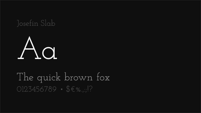
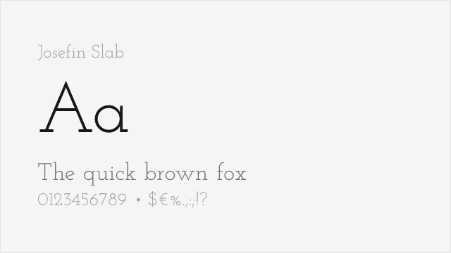
Elegant art-deco geometric slab with tall proportions and a display-first character
Why it matches: Josefin Slab and Archer both grow from geometric roots, but Josefin leans hard into 1930s art-deco elegance rather than editorial warmth. Its tall, refined proportions and clean geometry give headlines a distinctive vintage-modern character that rhymes with Archer's stylish confidence. It is the most display-oriented option here, best kept to large sizes where its delicate details read. Pick it when you want a slab with poise and period charm rather than Archer's cozy approachability.
display headlinesfashion and lifestyle brandingevent and wedding materialsvintage-inspired design