 Install FontSwap
Free Alternatives to Archer for Editorial
Looking for a free serif font for editorial projects? Archer by Hoefler&Co is a popular choice, but its licensing cost can be prohibitive. We've curated 6 free alternatives that work well in editorial contexts. We've identified 4 that are especially well-suited for this context. Each alternative is scored by visual similarity and contextual relevance, and ships under an open-source license for both personal and commercial use.
Top Picks
Comparison Table
| Font | Relevance ⓘ
How well this alternative fits the specific context (use-case or trait) of this page. Score 0–100 based on matching keywords, industries, and font characteristics. Alternatives scoring 25+ are highlighted.
| Similarity ⓘ
How visually similar this free font is to the premium original. Score 0–100 based on x-height, width, stroke contrast, use-case overlap, and language coverage.
Learn more → | Weights | Variable | License | Source |
|---|---|---|---|---|---|---|
| Bitter | 35 | 72% | Variable | Yes | OFL-1.1 | Google Fonts ↗ |
| Arvo | 29 | 88% | 2 | No | OFL-1.1 | Google Fonts ↗ |
| Rokkitt | 28 | 78% | Variable | Yes | OFL-1.1 | Google Fonts ↗ |
| Aleo | 27 | 70% | Variable | Yes | OFL-1.1 | Google Fonts ↗ |
| Josefin Slab | 23 | 68% | Variable | Yes | OFL-1.1 | Google Fonts ↗ |
| Roboto Slab | 7 | 74% | Variable | Yes | Apache-2.0 | Google Fonts ↗ |
Most Relevant (4)
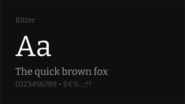
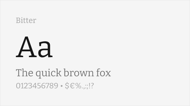
Screen-optimized contemporary slab with open counters, drawn for comfortable body text
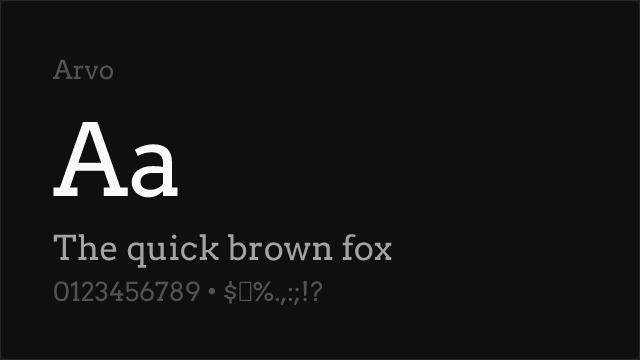
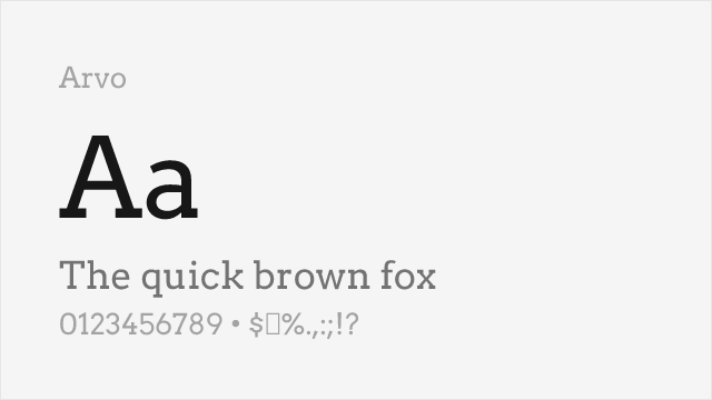
Friendly geometric slab with ball terminals and warm character
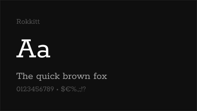
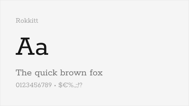
Clean geometric slab with friendly proportions and multiple weights
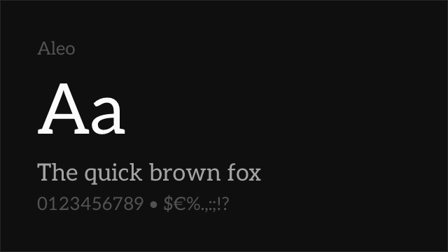
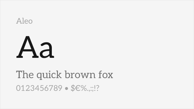
Warm semi-slab with softly rounded serifs and humanist touches, a natural Lato companion
Other Alternatives (2)
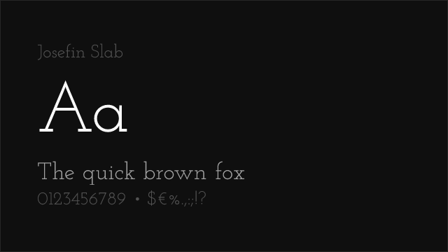
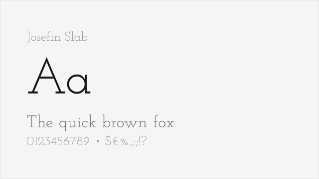
Elegant art-deco geometric slab with tall proportions and a display-first character
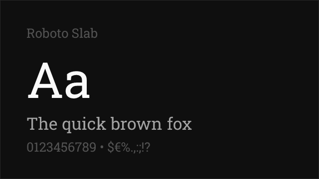
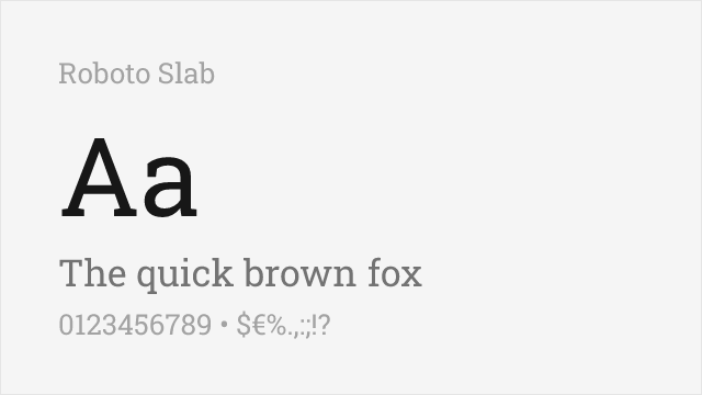
Neutral geometric slab with a full variable weight range and squared, not rounded, terminals