Free Alternatives to Rockwell

About Rockwell
- Foundry
- Monotype
- Classification
- serif
- Style
- slab-serif
Brands Using Rockwell
Rockwell used across the record books' branding and titling
Used historically in the London DLR's identity and wayfinding
A 20th-century workhorse for bold headlines, posters, and packaging
Its sturdy geometric slabs suit rugged, utilitarian, and heritage-industrial branding
 See Rockwell live on these sites with FontSwap →
Rockwell is a geometric slab serif released by Monotype in 1934, and for much of the twentieth century it was the sound a headline made when it meant business. Its slabs are heavy, square, and unapologetic. The strokes barely change weight from one part of a letter to the next, the bowls are close to true circles, and the serifs meet the stems at a right angle with none of the softening bracket you see on a Clarendon. The result is a face that reads as sturdy, rational, and built to be seen from across a room, which is where it spent most of its working life: on posters, packaging, and advertising that needed to command attention without looking crude. Because Rockwell is a licensed Monotype family and is not bundled with modern operating systems, most people who want its look today are really choosing between paying for the original and reaching for one of the free slab serifs covered below.
Why Rockwell Matters
Rockwell belongs to a specific moment in type history. In the late 1920s and early 1930s, foundries across Europe revived the slab serif, the nineteenth-century "Egyptian" style that had powered Victorian advertising before falling out of fashion, and rebuilt it on geometric principles. Stempel's Memphis arrived in 1929 and set the revival in motion, Beton and Cairo and others followed, and Monotype answered in 1934 with Rockwell.
What separated these revivals from their Victorian ancestors was discipline. Instead of idiosyncratic, hand-cut display letters, the new slabs applied the same rational geometry that Futura had recently brought to the sans serif: circles, straight lines, and even weight throughout. Rockwell took those rules and pushed the serifs to their most literal conclusion, squaring them off into blunt rectangles that give the face its blocky, almost engineered silhouette.
That geometric rigor is why Rockwell still looks deliberate rather than nostalgic. A Victorian slab feels like a relic; Rockwell feels like a decision.
The name does a lot of quiet work, too. "Rockwell" reads as solid and dependable, and the letterforms deliver on the promise. This is a face that projects permanence, which is exactly why generations of advertisers reached for it when they wanted a product to feel established and worth trusting. It became a workhorse of mid-century commercial art, setting headlines, product names, and book jackets where the brief was strength rather than subtlety.
Rockwell's real importance, though, is in what it made ordinary. For decades its heavy square serifs were one of the default ways to say "bold and industrial" in print, and that ubiquity is precisely why the shape still feels familiar even to people who have never heard its name. When a modern brand wants a rugged, utilitarian, slightly retro slab, it is usually chasing the territory Rockwell defined.
Design Characteristics
Rockwell's look comes from a small set of consistent decisions, and once you can name them you can spot the face anywhere:
- Monoline strokes. There is almost no contrast between thick and thin. Vertical stems, horizontal bars, and the curves of the bowls all sit at close to the same weight, which gives text an even, solid color on the page.
- Unbracketed slab serifs. The serifs are simple rectangles that join the stems at a hard right angle. There is no curved bracket easing the transition, and that bluntness is the single most recognizable thing about the design.
- Geometric bowls. Round letters like the o, c, and e are built on near-perfect circles, echoing the geometric-sans logic of the era rather than the ovals of a traditional serif.
- Near-square proportions. Many letters sit inside a squarish box, reinforcing the sturdy, architectural feel and helping the face lock up into dense, blocky headlines.
- The serifed apex. The capital A carries a small slab serif sitting on its apex rather than a bare point, a detail that quickly gives Rockwell away once you know to look for it.
- A weight range built for impact. The family runs from Light through Regular and Bold to Extra Bold, with condensed cuts, but its center of gravity is unmistakably in the heavier weights, where the slabs read as most confident.
Put together, these traits make Rockwell feel less like handwriting rendered in metal and more like something assembled from drafting tools. That is the source of both its strength and its limits: the same rigid geometry that makes a poster headline look monumental makes a paragraph of body text look stiff.
It is worth saying plainly that Rockwell was drawn for display. Its details are tuned to be admired at size, and they reward large settings the way few text faces do.
Where Rockwell Excels
Rockwell is at its best wherever type is meant to be seen before it is read:
- Posters and display. Large sizes are Rockwell's native habitat. The heavy slabs and even weight hold together into shapes that carry across a room, which is why the face became a staple of advertising art.
- Headlines and packaging. Product names and cover lines gain instant authority from Rockwell's blunt, confident forms. It signals substance without any decorative fuss.
- Rugged and heritage branding. The industrial squareness suits outdoor, utilitarian, workwear, and heritage-industrial identities, where a face that looks machined and durable is exactly the point.
- Logos and wordmarks. Set a short word in a heavy Rockwell weight and it reads as a solid, self-contained mark. The uniform stroke weight keeps letters looking engineered and intentional.
- Editorial features and pull quotes. Used sparingly at large sizes, Rockwell gives magazine spreads a strong, architectural accent against lighter body text.
The common thread is scale. Rockwell wants to be big, and nearly everything it does well follows from giving it room. At poster and headline sizes the serifed apex, the square serifs, and the circular bowls all become assets, adding character and structure that a more neutral face would leave on the table.
Where Rockwell Struggles
The qualities that make Rockwell commanding at size are the same ones that get in its way elsewhere:
- Long-form body text. The heavy slabs and even, monoline color that look purposeful in a headline turn dark and tiring across paragraphs. Rockwell was never meant to carry pages of running text, and it shows.
- Small sizes and screens. The blunt serifs and tight, blocky forms lose definition at small sizes and on low-resolution displays, where they can clog and blur. Faces drawn specifically for the screen handle those conditions far better.
- Soft or friendly tone. Rockwell's strict geometry reads as strong, even severe. When a brand needs warmth, playfulness, or approachability, the face's rigidity works against the message.
- Delicate hierarchies. With its weight sitting in the heavier styles, Rockwell is less suited to the fine, multi-step hierarchies that a large text family provides. It is a hammer, not a set of jeweler's tools.
- Overexposure. Decades of advertising use mean Rockwell can read as generic retro if it is dropped in without intent. It rewards a designer who chooses it for a reason.
None of this is a flaw so much as a boundary. Rockwell is a display face that occasionally moonlights, and knowing where that boundary sits is what makes choosing a free substitute straightforward rather than guesswork.
How to Choose a Free Substitute
There is no single "free Rockwell," because the right stand-in depends on what you are asking the type to do. The six alternatives below cover the realistic range, from faithful display matches to practical text companions.
Roboto Slab is the closest all-round match and the safe default. It shares Rockwell's monoline construction and unbracketed rectangular serifs, ships a full variable weight axis, and was tuned for the screen, so it holds Rockwell's character in digital work far more reliably than the original would. If you only try one option, start here.
Rokkitt is the pick when you want Rockwell's geometry with modern flexibility. Its near-monoline strokes and squared serifs sit close to Rockwell's spirit, and its variable axis runs from hairline to black in a single file, which makes it excellent for responsive headlines that need to shift weight across breakpoints.
Bitter approaches Rockwell from the reading side. It keeps a sturdy slab build but was engineered for screen text, with open counters that stay legible at small sizes, so it is the one to choose when slab character has to carry actual body copy rather than just a headline.
Arvo trades some of Rockwell's severity for friendliness. Its ball terminals and slightly softer geometry keep the weight and presence while easing the industrial edge, which suits lifestyle, food, and hospitality work where strict Rockwell would feel too stern.
Zilla Slab is the humanist option. Drawn by Typotheque for Mozilla, it holds slab-serif confidence but warms the proportions and adds true italics, making it a strong choice for brand systems that need strength without coldness and want headlines and text to share a family.
Slabo 27px is the specialist. It is a geometric slab optimized to render crisply at 27 pixels, and within that narrow brief it looks superb, but it ships in a single Regular weight, so treat it as a fixed-size heading or label face rather than a full replacement.
A simple way to decide: if the job is a headline or display, choose by shape and reach for Roboto Slab or Rokkitt; if the type has to be read at length or at small sizes, choose by legibility and reach for Bitter; and if the tone needs softening, move toward Arvo or Zilla Slab. Match the substitute to the task, not just to the specimen.
Premium Font Neighbors
If Rockwell appeals to you, several other commercial slab serifs occupy the same block and are worth knowing, each solving a slightly different problem:
- Clarendon is the bracketed cousin. Where Rockwell squares its serifs off bluntly, Clarendon curves them into the stem, giving a warmer, more traditional slab that trades some of Rockwell's engineered edge for approachability.
- Serifa is Adrian Frutiger's take on the geometric slab, essentially a slab-serif sibling to his Univers. It is more refined and even-tempered than Rockwell, useful when you want the category without the bluntness.
- Egyptienne, also a Frutiger design, softens the slab further with bracketed serifs tuned for text, making it more comfortable at reading sizes than a strict geometric slab.
- Sentinel, from Hoefler & Co., is a modern slab built to work from captions to display, with a full range of weights and true italics. It is the choice when you need Rockwell-style strength with the flexibility of a complete text family.
- Museo Slab is a contemporary, slightly softer geometric slab that has become a web favorite, warmer than Rockwell but clearly in the same lineage.
- Archer brings a friendlier, ball-terminal warmth to the geometric slab, showing how far the category can move toward charm while keeping the underlying structure.
Comparing these clarifies what you actually want from Rockwell. If it is the blunt, geometric display strength, Roboto Slab and Rokkitt deliver it for free; if it is the broader idea of a confident slab serif, one of these premium neighbors, or their free counterparts, may fit the job better than Rockwell itself.
FAQ
What is the best free alternative to Rockwell?
Roboto Slab is the best all-round free alternative to Rockwell. Designed by Christian Robertson for Google, it shares Rockwell's geometric slab construction, monoline strokes, and unbracketed rectangular serifs, while adding screen optimization and a variable weight axis from Thin (100) to Black (900). For most projects that want Rockwell's look without the license, Roboto Slab is the natural first choice.
Is Rockwell free, or do I need to license it?
Rockwell is a commercial typeface owned by Monotype, and it is not free, nor is it bundled with Windows or macOS. Any professional use of the genuine article requires a license. Because of that, most projects that set out to "use Rockwell" end up choosing a free substitute such as Roboto Slab, Rokkitt, or Bitter, all of which allow commercial use at no cost under open-source licenses.
Which free slab serif is closest to Rockwell's geometry?
Roboto Slab and Rokkitt are the closest on pure geometry. Both are built on near-monoline strokes with squared, largely unbracketed serifs, echoing Rockwell's engineered, architectural feel. Rokkitt adds a full variable weight axis in a single file, while Roboto Slab offers the broadest weight range and the most screen tuning, so the better pick depends on whether you value variable flexibility or maximum weight coverage.
Can I use Rockwell for body text?
It is not recommended. Rockwell was drawn as a display face, and its heavy, even slabs turn dark and tiring across long passages, especially at small sizes or on screens. If you need slab-serif character in body copy, Bitter is the better tool, because it keeps a sturdy slab build but was engineered for comfortable screen reading, with open counters that hold up where Rockwell would clog.
What makes Rockwell different from Clarendon?
The serifs. Rockwell's are blunt rectangles that meet the stems at a hard right angle with no bracket, which gives it its geometric, machined look. Clarendon's serifs curve into the stem with a bracket, producing a warmer, more traditional slab. Rockwell reads as engineered and industrial; Clarendon reads as sturdy but friendlier. For a free face in Clarendon's warmer, lightly bracketed territory, Zilla Slab is a good starting point.
Does Rockwell have a variable font version?
The classic Rockwell family is not a variable font; it ships as a set of discrete weights from Light to Extra Bold, plus condensed cuts. If you specifically want variable slab serifs with a Rockwell-like feel, the free options cover it well: Rokkitt and Bitter both offer full variable weight axes from 100 to 900, letting you tune weight precisely for responsive layouts.
When should I choose Zilla Slab or Arvo over a stricter Rockwell match?
Choose Zilla Slab or Arvo when the tone matters more than an exact geometric match. Both keep slab-serif strength while softening Rockwell's severity: Arvo with rounded ball terminals, Zilla Slab with warmer humanist proportions and true italics. They suit lifestyle, hospitality, and brand work that wants presence without the cold, industrial edge that strict Rockwell brings.
Is Rockwell on Google Fonts?
No, Rockwell is a premium font from Monotype and is not available on Google Fonts.
The closest Google Fonts alternative is Roboto Slab with 85% similarity. Get it free on Google Fonts ↗
Free Alternatives (6)
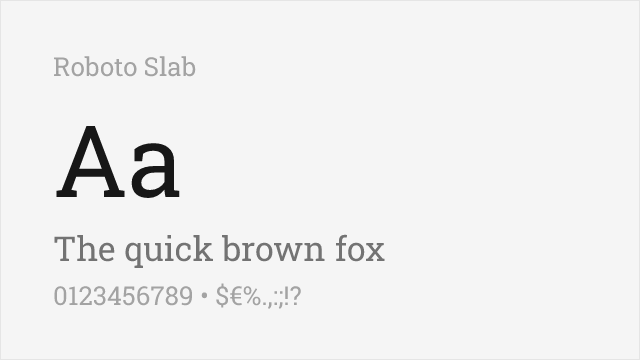
Modern geometric slab with excellent web support and variable font option
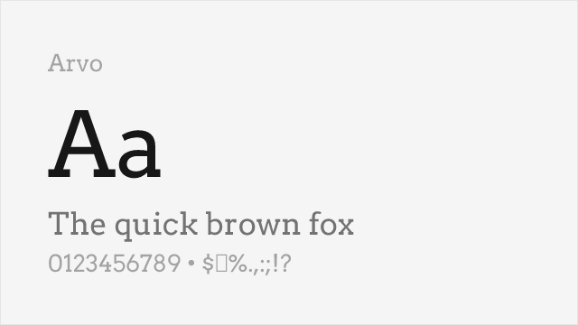
Friendly geometric slab with good readability and distinctive character
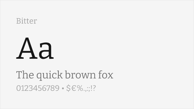
Screen-optimized slab serif with similar sturdy construction
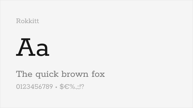
Geometric slab with a full variable weight axis, close to Rockwell's monoline spirit
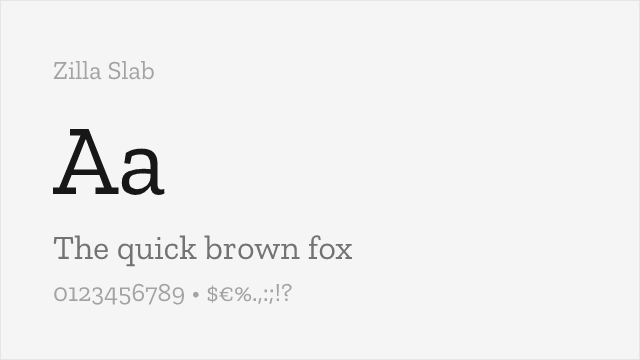
Mozilla's humanist slab — warmer and less rigid than Rockwell, with true italics
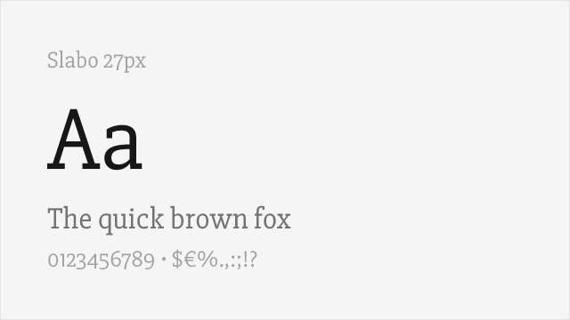
Single-weight geometric slab tuned for text at 27px — no bold, so plan accordingly
Compare the alternatives
See how Rockwell compares to its top alternatives — and how those alternatives compare to each other — side by side.
See where Rockwell is used in the wild and swap to free alternatives live.
Install FontSwap →Replacement Summary
Source: FontAlternatives.com
Premium font: Rockwell
Best free alternative: Roboto Slab
FontAlternatives similarity score: 85%
Replacement difficulty: Low
Best for: digital interfaces, contemporary branding, web headlines, app design
Notable users: Guinness World Records, Docklands Light Railway, Poster & display advertising
Not recommended when: Brand consistency with Guinness World Records requires exact letterforms
What is the best free alternative to Rockwell?
Roboto Slab is the best free alternative to Rockwell with a FontAlternatives similarity score of 85%.
Roboto Slab shares similar proportions, stroke characteristics, and intended use with Rockwell. It is available under the Apache-2.0 license, which permits both personal and commercial use at no cost.
This alternative works particularly well for: digital interfaces, contemporary branding, web headlines, app design.
Can I safely replace Rockwell with Roboto Slab?
Yes, Roboto Slab is a high-confidence replacement for Rockwell. The FontAlternatives similarity score of 85% indicates strong structural compatibility.
Licensing: Roboto Slab is licensed under Apache-2.0, which allows commercial use without licensing fees or royalties.
Weight coverage: Most weights have close or exact matches available.
When should I NOT replace Rockwell?
While Roboto Slab is a strong alternative, there are situations where replacing Rockwell may not be appropriate:
- Strict compliance: Verify that Apache-2.0 terms meet your specific legal and compliance requirements.
Weight-Matching Guide
Map Rockwell weights to their closest free alternatives for accurate font substitution.
Roboto Slab
| Rockwell | Roboto Slab | Match |
|---|---|---|
| Light | Light (300) | close |
| Regular | Regular (400) | exact |
| Bold | Bold (700) | exact |
| Extra Bold | ExtraBold (800) | close |
Arvo
| Rockwell | Arvo | Match |
|---|---|---|
| Regular | Regular (400) | exact |
| Bold | Bold (700) | exact |
Bitter
| Rockwell | Bitter | Match |
|---|---|---|
| Light | Light (300) | close |
| Regular | Regular (400) | exact |
| Bold | Bold (700) | exact |
Rokkitt
| Rockwell | Rokkitt | Match |
|---|---|---|
| Light | Light (300) | close |
| Regular | Regular (400) | exact |
| Bold | Bold (700) | exact |
Zilla Slab
| Rockwell | Zilla Slab | Match |
|---|---|---|
| Light | Light (300) | exact |
| Regular | Regular (400) | exact |
| Bold | Bold (700) | exact |
Slabo 27px
| Rockwell | Slabo 27px | Match |
|---|---|---|
| Regular | Regular (400) | exact |
Performance Guide
Production performance metrics for each alternative.
How to Use Roboto Slab
Copy these code snippets to quickly add Roboto Slab to your project.
CSS code for Roboto Slab
@import url('https://fonts.googleapis.com/css2?family=Roboto+Slab:wght@100..900&display=swap');HTML code for Roboto Slab
<link rel="preconnect" href="https://fonts.googleapis.com">
<link rel="preconnect" href="https://fonts.gstatic.com" crossorigin>
<link href="https://fonts.googleapis.com/css2?family=Roboto+Slab:wght@100..900&display=swap" rel="stylesheet">
Tailwind code for Roboto Slab
// tailwind.config.js
module.exports = {
  theme: {
    extend: {
      fontFamily: {
        'roboto-slab': ['"Roboto Slab"', 'sans-serif'],
      },
    },
  },
}

// Usage in HTML:
// <p class="font-roboto-slab">Your text here</p>
Next.js code for Roboto Slab
// Using next/font (Next.js 13+)
import { Roboto_Slab } from 'next/font/google';

const roboto_slab = Roboto_Slab({
  subsets: ['latin'],
  weight: ['100', '200', '300', '400', '500', '600', '700', '800', '900'],
});

export default function Component() {
  return (
    <p className={roboto_slab.className}>
      Your text here
    </p>
  );
}

// Or using inline styles with Google Fonts link:
// <p style={{ fontFamily: '"Roboto Slab"' }}>Your text</p>
Expo and React Native code for Roboto Slab
// Install: npx expo install @expo-google-fonts/roboto-slab expo-font
import { useFonts, Roboto_Slab_400Regular } from '@expo-google-fonts/roboto-slab';

export default function App() {
  const [fontsLoaded] = useFonts({
    Roboto_Slab_400Regular,
  });

  if (!fontsLoaded) return null;

  return (
    <Text style={{ fontFamily: 'Roboto_Slab_400Regular' }}>
      Your text here
    </Text>
  );
}
Recommended Font Pairings
These free fonts pair well with Roboto Slab Rockwell for headlines, body text, or accent use.
Roboto's clean geometric sans-serif forms provide neutral body text that balances Rockwell's bold slab serif presence in digital layouts
Open Sans's friendly neutrality pairs well with Rockwell's geometric slabs, creating accessible layouts with strong headline impact
Source Sans Pro's professional clarity complements Rockwell's architectural slab serifs for corporate and advertising typography
Browse Alternatives by Context
Find Rockwell alternatives filtered by specific use case, style, or language support.
By Use Case
By Style
By Script
Frequently Asked Questions
What is the best free alternative to Rockwell?
Roboto Slab is the best free alternative to Rockwell with a FontAlternatives similarity score of 85%. It shares similar proportions and characteristics while being available under the Apache-2.0 license for both personal and commercial use at no cost.
Is there a free version of Rockwell?
There is no official free version of Rockwell. However, Roboto Slab is available under the Apache-2.0 open-source license and achieves a FontAlternatives similarity score of 85%. It includes variable weights and supports latin, latin-extended.
What Google Font looks like Rockwell?
The Google Fonts most similar to Rockwell are Roboto Slab, Arvo, Bitter. Among these alternatives, Roboto Slab offers the closest match with a FontAlternatives similarity score of 85% and includes variable weights for flexible typography options.
Can I use Roboto Slab commercially?
Yes, Roboto Slab can be used commercially. It is licensed under Apache-2.0, which allows free use in websites, applications, print materials, and commercial projects without purchasing a license or paying royalties.
Is Roboto Slab similar enough to Rockwell?
Roboto Slab achieves a FontAlternatives similarity score of 85% compared to Rockwell. While not identical, it offers comparable letterforms, proportions, and visual style. Most designers find it works excellently as a substitute in web and print projects.
What are the main differences between Rockwell and its free alternatives?
Free alternatives to Rockwell may differ in subtle details like letter spacing, curve refinements, and available weights. Premium fonts typically include more OpenType features, extended language support, and optimized screen rendering. However, for most projects, these differences are negligible.
Where can I download free alternatives to Rockwell?
Download Roboto Slab directly from Google Fonts. Click the "Get Font" button on any alternative listed above to visit the official download page. Google Fonts also provides convenient embed codes for seamless web integration.