 Install FontSwap
Free Alternatives to Rockwell Supporting Latin Extended
Need a free alternative to Rockwell with Latin Extended script support? These 6 options include Latin Extended characters and share visual similarities with Rockwell. Each is licensed for free personal and commercial use.
Top Picks
Comparison Table
| Font | Relevance ⓘ
How well this alternative fits the specific context (use-case or trait) of this page. Score 0–100 based on matching keywords, industries, and font characteristics. Alternatives scoring 25+ are highlighted.
| Similarity ⓘ
How visually similar this free font is to the premium original. Score 0–100 based on x-height, width, stroke contrast, use-case overlap, and language coverage.
Learn more → | Weights | Variable | License | Source |
|---|---|---|---|---|---|---|
| Roboto Slab | 0 | 85% | Variable | Yes | Apache-2.0 | Google Fonts ↗ |
| Arvo | 0 | 75% | 2 | No | OFL-1.1 | Google Fonts ↗ |
| Bitter | 0 | 72% | Variable | Yes | OFL-1.1 | Google Fonts ↗ |
| Rokkitt | 0 | 70% | Variable | Yes | OFL-1.1 | Google Fonts ↗ |
| Zilla Slab | 0 | 66% | 5 | No | OFL-1.1 | Google Fonts ↗ |
| Slabo 27px | 0 | 62% | 1 | No | OFL-1.1 | Google Fonts ↗ |
All Alternatives (6)
[Google Fonts] · Apache-2.0 · Variable
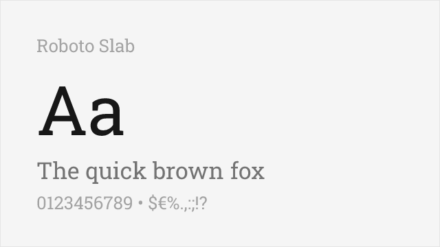
Modern geometric slab with excellent web support and variable font option
Why it matches: Roboto Slab shares Rockwell's geometric slab serif foundation with similar monoweight construction and unbracketed rectangular serifs. Both feature sturdy, architectural letterforms that project strength and reliability. Roboto Slab's Google optimization makes it ideal for digital projects while maintaining Rockwell's essential bold character.
digital interfacescontemporary brandingweb headlinesapp design
[Google Fonts] · OFL-1.1 · 2 weights
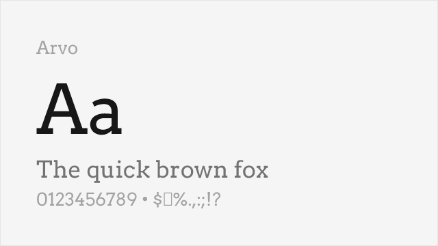
Friendly geometric slab with good readability and distinctive character
Why it matches: Arvo offers a friendlier interpretation of the geometric slab serif with ball terminals that soften the typically stern aesthetic. While less architecturally rigid than Rockwell, Arvo captures similar boldness and presence. For projects needing Rockwell's weight class with added warmth, Arvo provides an approachable alternative.
lifestyle brandingfood packaginghospitalityeditorial headlines
[Google Fonts] · OFL-1.1 · Variable
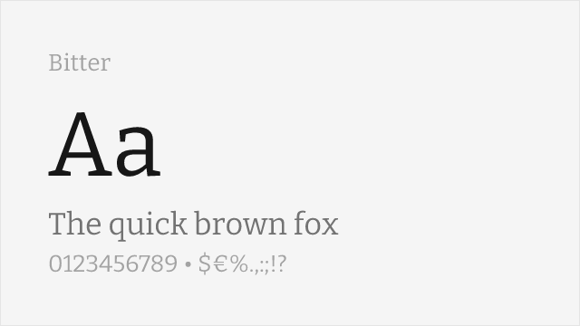
Screen-optimized slab serif with similar sturdy construction
Why it matches: Bitter was engineered for reading on screens, and its sturdy slab construction keeps much of Rockwell's solidity while opening the counters for legibility at small sizes. It is less overtly geometric than Rockwell, leaning editorial rather than architectural, but it holds a page of running text far better. With a full variable axis and true italics, it is the most practical pick when Rockwell-adjacent slabs need to carry body copy, not just headlines.
long-form readingblog and article bodyeditorial textscreen interfaces
[Google Fonts] · OFL-1.1 · Variable
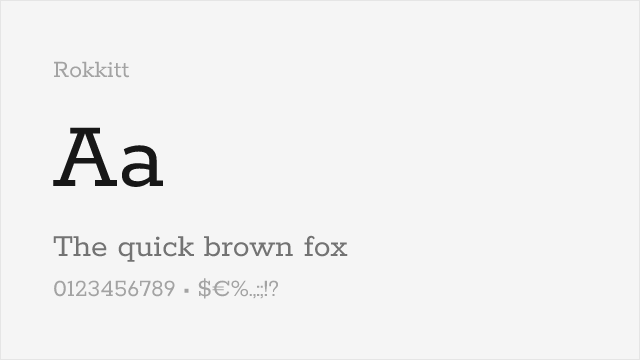
Geometric slab with a full variable weight axis, close to Rockwell's monoline spirit
Why it matches: Rokkitt is the closest of the free options to Rockwell's core idea: a geometric slab built from near-monoline strokes and squared-off serifs. It keeps the sturdy, rational feel while adding a complete variable weight axis from Thin to Black, so you can dial in exactly the weight a headline needs. Its terminals run a touch friendlier than Rockwell's strict geometry, but the underlying skeleton is unmistakably the same family of shapes.
web headlinesresponsive typographytech brandingeditorial display
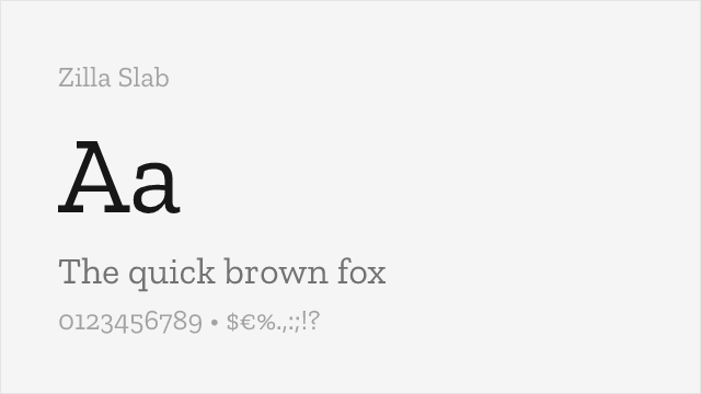
[Google Fonts] · OFL-1.1 · 5 weights
Mozilla's humanist slab — warmer and less rigid than Rockwell, with true italics
Why it matches: Zilla Slab shares Rockwell's slab-serif confidence but softens the geometry into something more humanist. Where Rockwell is strict and mechanical, Zilla Slab adds warmth and a lightly bracketed serif, which makes it more comfortable at text sizes and friendlier in brand work. It covers Light through Bold and includes genuine italics, so it handles editorial hierarchy that Rockwell alone would struggle with.
brand identityproduct marketingheadlines with bodyeditorial
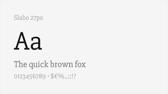
[Google Fonts] · OFL-1.1 · 1 weights
Single-weight geometric slab tuned for text at 27px — no bold, so plan accordingly
Why it matches: Slabo 27px echoes Rockwell's geometric slab structure but was drawn for one job: rendering crisply at 27 pixels on screen. That size-specific tuning gives it clean, well-defined serifs where a general-purpose slab would blur. The catch is that it ships in a single Regular weight, so it can stand in for Rockwell in a fixed-size heading or label, but it cannot build a weighted hierarchy on its own.
fixed-size web headingsnavigation labelssection titlescaptions